Here’s a sample example of using the correlation coefficient to analyze data.
Download the Practice Workbook
Download this practice workbook below.
Overview of Data Analysis with Correlation Coefficient
A correlation coefficient is a statistical measure that quantifies the strength and direction of the relationship between two variables. It provides a numerical value that indicates how closely the variables are related to each other. The correlation coefficient ranges from -1 to 1.
What Is a Pearson Correlation Coefficient?
The Spearman correlation is a derivative of the Pearson correlation coefficient in nonparametric form.
This value actually determines the linear correlation between two sets of data, often denoted by rs or ⲣ.
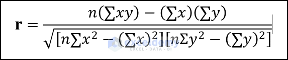
The Pearson Product Moment Correlation determines the linear relationship between continuous variables. The general expression of Pearson correlation is:
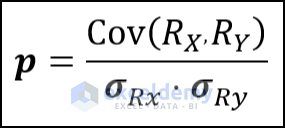
RX and RY are the values that are actually ranked already and are the standard deviations of the datasets.
Spearman correlation evaluates the monotonic relationship between the values. The full form of the Spearman Coefficient is
This version is a slightly modified version of Pearson’s equation:
- R(x) and R(y) denotes the rank of the x and y variables.
- R(x) and R(y) are the mean ranks.
The Pearson coefficient and the Spearman correlation are pretty close. If there is an outlier, you may need to use the Spearman correlation.
Use of Spearman correlation:
- If your data has outliers and you are certain that they can influence the result. Then using the Spearman Correlation is the wise decision. Because outliers can’t affect the Spearman Correlation as it does to Pearson correlation. because Spearman uses the rank of the values instead of actual values.
- If the data are in a non-linear relationship or not fully distributed. Then the Spearman coefficient is better than the Pearson coefficient.
- If one of the variables is ordinal, then you better use the Spearman Correlation than the Pearson coefficient.
The range of Spearman correlation coefficient values ranges from +1 to 1:
- 1 indicates a perfect correlation with data. This means both datasets are matched.
- -1 indicates perfectly negative correlated data
- 0 denotes the absence of a correlation between the data.
How to Perform Excel Data Analysis Correlation: 4 Useful Ways
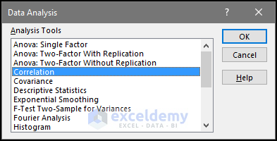
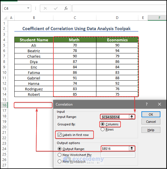
Method 1 – Using the Data Analysis ToolPak for Data Analysis Correlation in Excel
- Enable the Analysis ToolPak in your Excel Add-in settings.
- The Data Analysis command is now available in the Data Tab. Click on it.

- You’ll get a pop-up window.
- Select Correlation.
- Click OK.
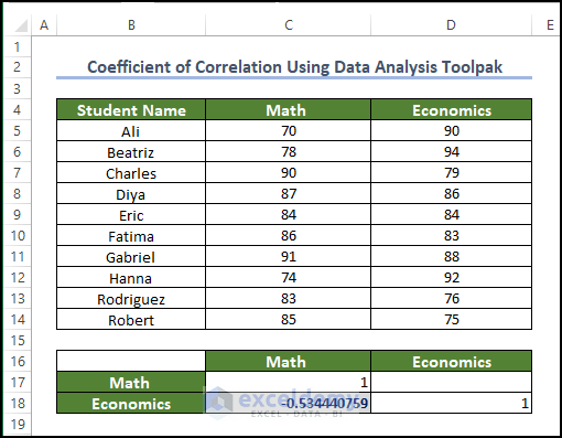
- For the Input range, select C4:D14.
- Select Columns in the Grouped by.
- Check the Labels in the first-row box.
- Select the output range or box in the Output options. We selected B16 as our output.
- Click OK.
- The correlation coefficient value is now present in cell B16.
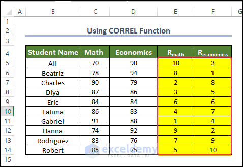
Method 2 – Using the CORREL Function for Data Analysis Correlation in Excel
- Enter the following formula in the cell E5:
=RANK.AVG(C5,$C$5:$C$14,0)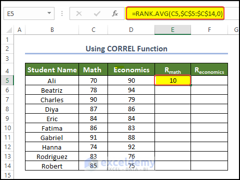
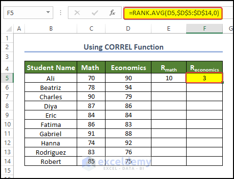
- Enter the following formula in cell F5:
=RANK.AVG(D5,$D$5:$D$14,0)
- Select E5 and F5 together.
- Drag the Fill Handle to cell F14.
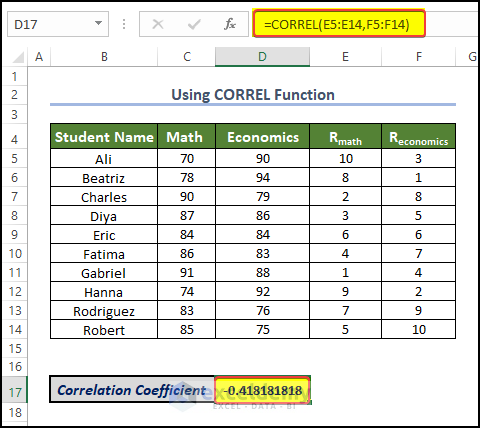
- Use the following formula in D17 (the result cell).
=CORREL(E5:E14,F5:F14)
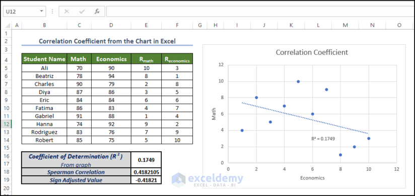
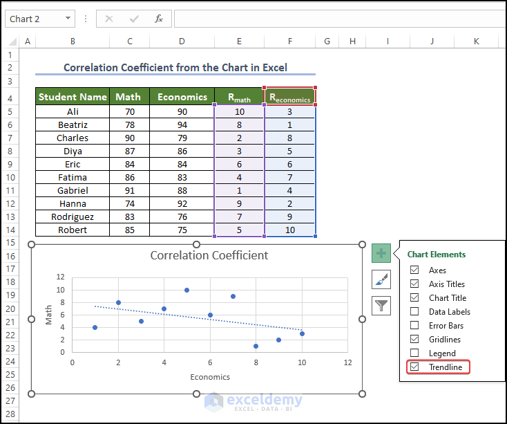
Method 3 – Using Charts to Get Correlation Values Between Two Columns
- Get the R values from the Math and Economics scores as shown in the previous method.
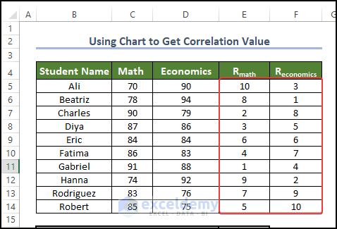
- Select the range E5:F14.
- Go to Insert.
- Choose Insert Scatter and select Scatter.
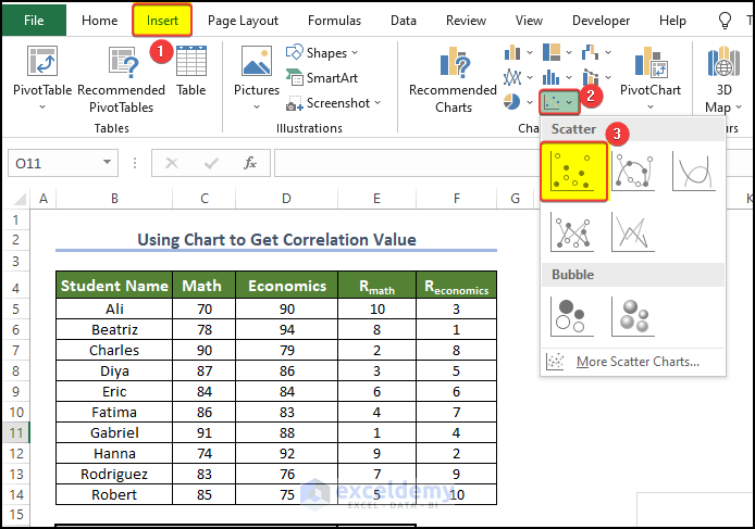
- You’ll get a scatter plot chart.
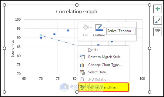
- Click on the Plus icon on the side of the chart and check the Trendline box.
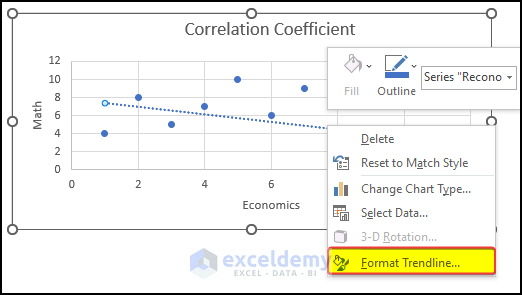
- Right-click on the Trendline and click on Format Trendline.
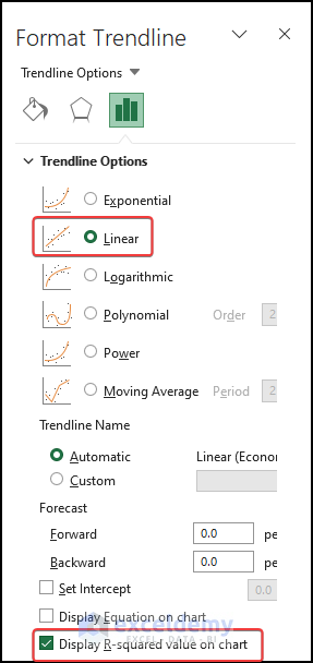
- In the Format Trendline menu, check Display R-Squared Value in the Chart.
- Keep the Linear option selected.
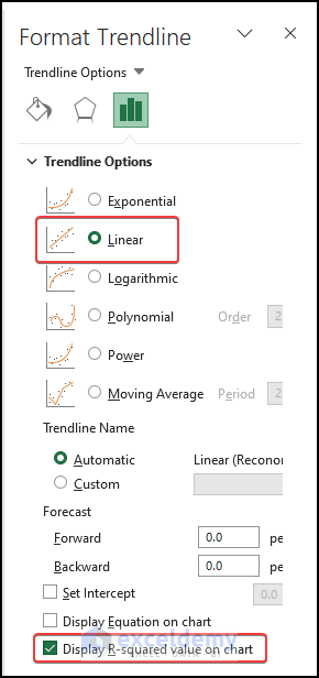
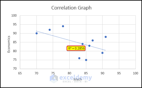
- You will notice the R-squared value is now visible in the plot area.
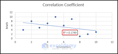
- Place the value in the cell E16.
- Enter the following formula in the cell E18:
=SQRT(E16)
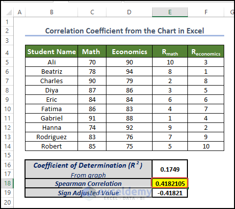
- The correlation value is now present in cell E18.
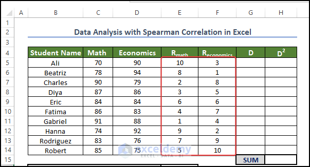
Method 4 – Calculate the Pearson Coefficient
- Calculate the RMath or REconomics values as in Method 2.
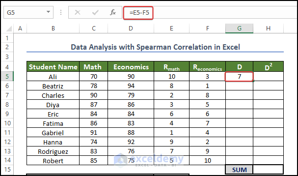
- Enter the following formula in cell G5:
=E5-F5
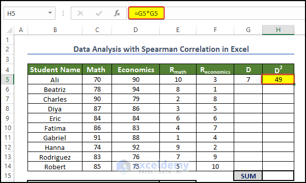
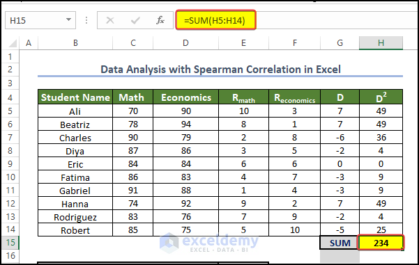
- Enter the following formula in cell H5:
=G5*G5
- Select G5 and H5 together.
- Fill the range G5:H14 by dragging the fill handle to cell H14.
- Enter the following formula in cell H15:
=SUM(H5:H14)
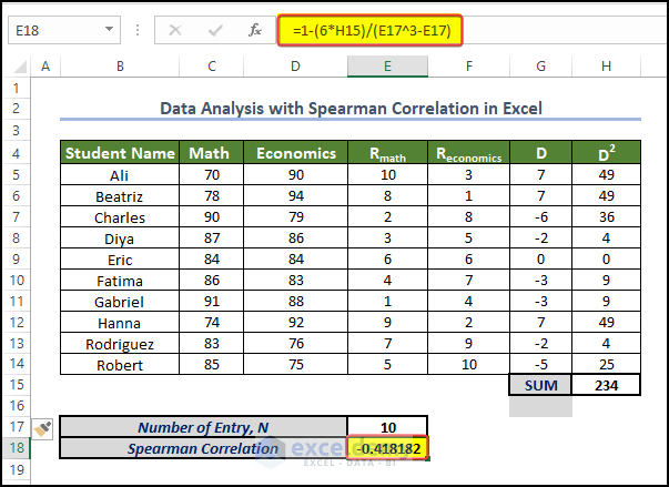
- Enter the following formula in cell E18 and press Enter.
=1-(6*H15)/(E17^3-E17)
- The Spearman Correlation value is now present in the cell E18.
How to Plot a Correlation Graph in Excel
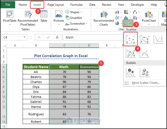
- Select the range C4:D14.
- Go to Insert and choose Insert Scatter and Bubble Plots.
- Pick Scatter.
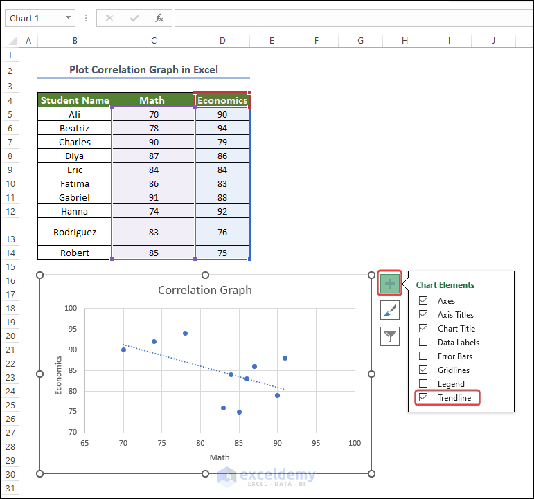
- You will get a scatter plot with plot points for Math and Economics.
- Click on the Plus icon on the side of the chart and check the Trendline box. This will make the trendline appear on the plot area.
- Right-click on the trendline and select Format Trendline.
- Select Linear in Trendline Options.
- Check R-squared value on the chart.
- The R-squared value is now present in the Trendline.
How to Interpret the Output Result
Magnitude: The absolute value of the correlation coefficient indicates the strength of the relationship. The closer the coefficient is to -1 or +1, the stronger the relationship. Values close to 0 suggest a weak or no relationship.
Sign: The correlation coefficient’s sign (+/-) shows the relationship’s direction. A positive sign means both variables increase together, while a negative sign means one variable goes up while the other goes down.
Statistical Significance: Consider the statistical significance of the correlation coefficients. A low p-value (e.g., less than 0.05) indicates a significant relationship, suggesting that the observed correlation is unlikely to have occurred by chance. A high p-value suggests weak evidence against the null hypothesis of no correlation.
Scatter Plots: Complement the analysis with scatter plots to visualize the relationships between variables. Plot the variables on a graph, with one variable on the x-axis and the other on the y-axis. Examine the overall pattern and the dispersion of data points. If there is a strong correlation, the points will tend to align along a clear trend line.
Consider the Context: Remember that correlation does not imply causation. While a correlation coefficient indicates an association between variables, it does not establish a cause-and-effect relationship. Consider the context of your dataset and any additional factors or variables that may influence the relationships observed.
Disadvantages of Using Correlation to Do Data Analysis
Causation vs. Association: Correlation measures the strength and direction of the linear relationship between variables but does not establish causation. A high correlation does not necessarily imply a cause-and-effect relationship. There may be confounding variables or other underlying factors influencing the observed correlation.
Non-linear Relationships: Correlation coefficients, such as Pearson’s correlation, are specifically designed to measure linear relationships. If the relationship between variables is non-linear, the correlation coefficient may not accurately represent the strength and direction of the relationship. In such cases, alternative correlation measures or nonlinear modeling techniques may be more appropriate.
Outliers: Correlation coefficients can be sensitive to outliers, which are extreme values that deviate significantly from the overall pattern of the data. Outliers can distort the correlation coefficient and lead to misleading interpretations. It is important to identify and handle outliers appropriately before conducting correlation analysis.
Restricted to Linear Relationships: Correlation analysis focuses on linear relationships and may overlook other types of relationships. It may not capture complex or nonlinear associations between variables. Exploratory data analysis and other techniques, such as regression analysis or machine learning algorithms, may be necessary to uncover more nuanced relationships.
Dependence on Data Distribution: Correlation coefficients can be affected by the distribution of the data. If the data is skewed or has outliers, the correlation coefficient may not accurately reflect the relationship between variables. Transforming the data or using non-parametric correlation measures can be helpful in such cases.
Limited to Quantitative Variables: Correlation analysis is primarily suited for analyzing quantitative variables. It may not be applicable or meaningful for categorical or ordinal variables. In such cases, alternative statistical techniques, such as chi-square tests or rank correlation measures, should be used.
Spurious Correlations: Sometimes, two variables may appear to be strongly correlated purely by chance. These spurious correlations can occur when two unrelated variables happen to show a pattern that resembles a relationship. Careful consideration of context, domain knowledge, and replication of findings is important to avoid drawing incorrect conclusions based on spurious correlations.
Things to Remember
Correlation does not imply causation: Correlation assesses the intensity and direction of the linear relationship between variables, but it does not demonstrate a cause-and-effect link. Be wary about inferring causality based only on correlation.
Consider the context: Correlation analysis should always be interpreted in the context of the specific dataset and research question. Understand the variables being analyzed and their relevance to the overall analysis.
Stay Cautious about the Outliers: Outliers can have a major impact on correlation coefficients. Identify and treat outliers correctly to ensure they do not adversely influence the analysis.
Non-linear relationships may require alternative measures: Correlation coefficients, such as Pearson’s correlation, are developed for linear correlations. If the relationship is non-linear, consider employing alternate correlation measurements or researching non-linear modeling techniques.
Sample size matters: Correlation coefficients grow more dependable as the sample size increases. Small sample numbers may result in less robust or relevant correlation results. Consider the suitability of the sample size for the analysis.
Spurious correlations may occur: Spurious correlations can develop when two variables appear to be associated solely by chance or due to common underlying sources. Be cautious about forming conclusions based merely on association without considering the underlying causes or conducting further inquiry.
Correlation is sensitive to data distribution: Correlation coefficients can be modified by the distribution of the data. Skewed data, outliers, or non-normal distributions can alter the correlation values. Consider the data distribution and, if necessary, consider data transformations to meet the assumptions of the correlation analysis.
Statistical significance: Using p-values, determine the statistical significance of the correlation coefficients. A low p-value implies that there is a significant relationship, whereas a high p-value shows that there is poor evidence against the null hypothesis of no correlation. Statistical significance, on the other hand, should be understood in conjunction with effect magnitude and practical significance.
Frequently Asked Question
1. What is a good correlation in Excel?
Positive Correlation: If the correlation coefficient is positive (closer to +1), it indicates a positive relationship between the variables. As one variable increases, the other tends to increase as well. The closer the coefficient is to +1, the stronger the positive correlation.
Negative Correlation: If the correlation coefficient is negative (closer to -1), it indicates a negative relationship between the variables. As one variable increases, the other tends to decrease. The closer the coefficient is to -1, the stronger the negative correlation.
No Correlation: If the correlation coefficient is close to 0, it suggests no or a weak linear relationship between the variables. However, it’s important to note that there might still be other types of relationships or associations that are not captured by the correlation coefficient.
Strength of Correlation: Generally, correlation coefficients close to -1 or +1 (absolute values) indicate a stronger correlation, whereas coefficients closer to 0 indicate a weaker or no correlation. However, the interpretation of a “strong” or “weak” correlation can vary depending on the field and the specific research question.
2. Is a 50% correlation good?
A correlation coefficient of 0.5 (50%) can be considered moderate to moderately strong, depending on the field of study and the specific research question. It suggests that there is a moderately positive linear relationship between the two variables being examined. However, it is important to note that correlation does not imply causation. The strength and significance of the correlation also depend on factors such as sample size, variability of data, and the specific research context.
3. How do I calculate correlation?
Correlation can provide insights into the relationship between variables, but it does not allow for accurate predictions on its own. Additional factors and appropriate statistical techniques are necessary for accurate predictions.
Get FREE Advanced Excel Exercises with Solutions!
