
Image courtesy of Freepik
In this article, we will show how to build dynamic dashboards with PivotTables & Slicers in Excel.
Step 1: Prepare Your Data
Before creating a dashboard, it’s important to structure your data properly.
Requirements for your dataset:
- Must be in tabular format (no merged cells).
- Each column should have a clear, unique header.
- No blank rows or columns.
- Ensure all columns have appropriate formatting:
- Date column as Short Date.
- Unit Price and Total Sales as Currency.
- Units Sold as a Number with no Decimals.
- Convert to an Excel Table:
- Select all data or press Ctrl+A.
- Press Ctrl+T or go to the Insert tab >> select Table.
- Check on My table has headers.
- Click OK.

- Name your table:
- With any cell in the table selected,
- Go to the Table Design tab >> change Table Name to SalesData.

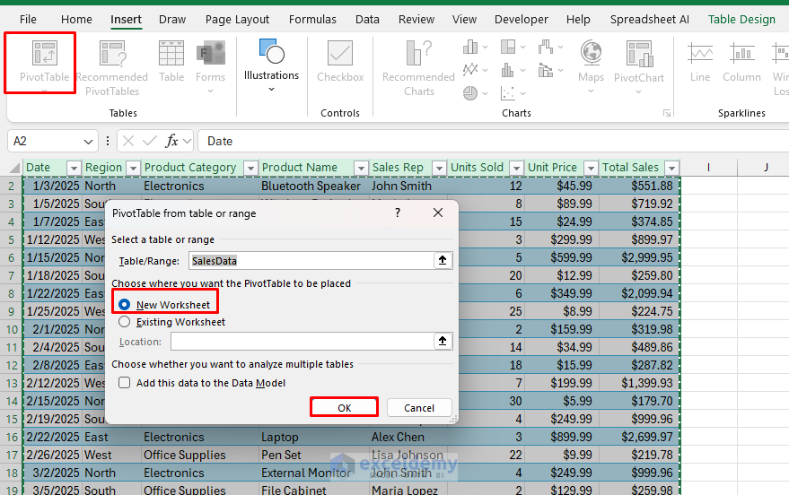
Step 2: Create Your First PivotTable
Let’s create a PivotTable showing sales by Region and Product Category.
- Click anywhere in your SalesData table.
- Go to the Insert tab >> select PivotTable.
- Ensure the table range or name is correct and select New Worksheet.
- Click OK.
- In the PivotTable Fields pane:
- Drag the Region field to the Rows area.
- Drag the Product Category field to the Columns area.
- Drag the Total Sales field to the Values area.
- Now, the first PivotTable will show how much revenue each product category generates in each region.

Step 3: Add Slicer and Timeline
Now, add slicers and timeliners to filter this data interactively.
Insert Slicer:
- Select any cell of the PivotTable.
- Go to the PivotTable Analyze tab >> select Insert Slicer.
- Select Sales Rep and Date.
- Click OK.

Insert Timeline:
- Select any cell of the PivotTable.
- Go to the PivotTable Analyze tab >> select Insert Timeline.
- Select Date.
- Click OK.

- Position the slicers and timeline beside your PivotTable.

Test your slicers and timeliners by clicking different sales reps and watching how the PivotTable updates automatically!

Step 4: Create Additional PivotTables
Let’s add two more PivotTables to our dashboard.
PivotTable 2: Monthly Sales Trend
- Click anywhere in your SalesData table.
- Go to the Insert tab >> select PivotTable.
- Ensure the table range is correct and select New Worksheet.
- Click OK.

- In the PivotTable Fields pane:
- Drag Date to the Rows area. It will show.
- Months (Date)
- Days (Date)
- Date
- Drag Total Sales to the Values area.
- Drag Date to the Rows area. It will show.

PivotTable 3: Top Products by Units Sold
- Create another PivotTable on the same worksheet as PivotTable 3.
- In the PivotTable Fields pane:
- Drag Product Name to the Rows area.
- Drag Units Sold to the Values area.

Step 5: Connect Multiple PivotTables to the Same Slicers
Let’s connect our existing slicers to all PivotTables:
- Right-click on the Sales Rep slicer.
- Select Report Connections.
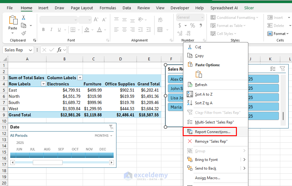
- Check all PivotTables in the list.
- Click OK.

- Repeat for the Date slicer.

Now, when you click on a specific sales rep or date range, all three PivotTables will update simultaneously!
Step 6: Create PivotCharts
Transform your PivotTables into visual charts.
For the Region/Category PivotTable:
- Click anywhere in the PivotTable.
- Go to PivotTable Analyze tab >> select PivotChart.
- Select Clustered Column chart.
- Click OK.
- Format the chart:
- Add chart titles.
- Customize axes.
- Remove unnecessary elements (e.g., gridlines, legends if not needed).

For the Monthly Sales Trend:
- Click anywhere in the PivotTable.
- Go to PivotTable Analyze tab >> select PivotChart.
- Select Line with Markers chart.
- Click OK.
For the Top Products:
- Click anywhere in the PivotTable.
- Go to PivotTable Analyze tab >> select PivotChart.
- Select Bar chart.
- Click OK.
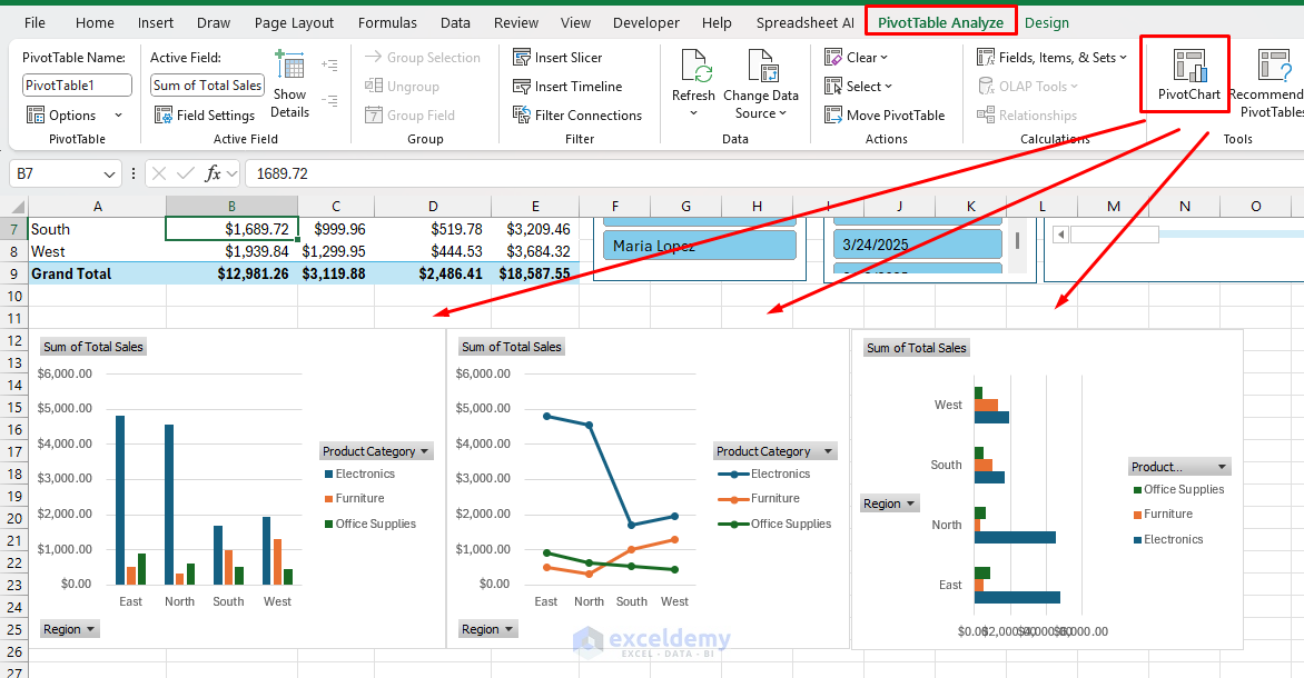
Any change in your PivotTable will be reflected in your PivotChart automatically.
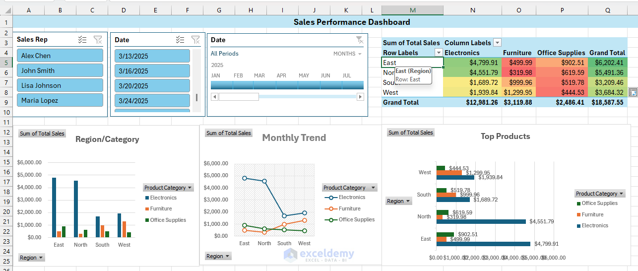
Step 7: Design Your Dashboard Layout
Now let’s organize everything into a cohesive dashboard.
- Rename your dashboard worksheet to Sales Dashboard.
- Position your charts:
- Region/Category chart at the left.
- Monthly Trend chart in the middle.
- Top Products chart on the right.
- Place slicers at the top for easy access.
- Add a title using a text box: Sales Performance Dashboard.

Step 8: Enhance with Formatting
Let’s make the dashboard more visually appealing:
- Apply conditional formatting to the Region/Category PivotTable:
- Select the data cells.
- Go to the Home tab >> from Conditional Formatting >> from Color Scales >> select Green-Yellow-Red.
- Format the Monthly Trend chart:
- Click on the chart.
- Go to the Chart Design >> select Style 5 (or any style you prefer).
- Add chart title: Monthly Sales Trend.
- Format the Top Products chart:
- Add data labels.
- Go to the Chart Design >> select Add Chart Element >> select Data Labels.
- Sort in descending order.
- Add chart title: Top Products.
Check Interactivity:

Troubleshooting Tips
- If dates aren’t grouped properly, ensure they’re formatted as dates in the source data.
- If slicers aren’t updating all PivotTables, double-check the Report Connections.
- Consider using “Defer Layout Update” in the PivotTable options for performance issues with larger datasets.
Advanced Techniques
Create a calculated field showing profit margin:
- Click on your PivotTable.
- Go to PivotTable Analyze tab >> from Fields, Items, & Sets >> select Calculated Field.
- Name it Profit and enter the following formula.
=[Total Sales]*0.3
- Click Add and OK.
Add a dynamic title that changes with selections:
- Use GETPIVOTDATA() to pull the currently filtered total.
- Insert the following formula.
="Sales Dashboard: "&TEXT(GETPIVOTDATA("Total Sales",$A$3),"$#,##0")
Download Workbook
Conclusion
By following the above steps, you can create professional and interactive dashboards that allow users to easily analyze sales data. You can use PivotTables to summarize and analyze data, and PivotCharts to visualize data. Interactive slicers and timelines help to automatically filter data. Dynamic Excel dashboards refresh easily when data is added. This kind of dashboard is useful for sales reports, KPI tracking, inventory analysis, and more.
Get FREE Advanced Excel Exercises with Solutions!

Perfect Mdm please share data file for better practice.
Hello Usman,
Thank you, Usman! Glad you found it helpful. I’ve just shared the data file in the Download section or you can dlownload it from here: Dynamic Dashboards with PivotTables & Slicers in Excel. Let me know if you have any questions while practicing!
Regards
ExcelDemy
Hello Shamima and thanks for the great tutorial! It was easy to follow and showed me everything I needed to learn.
Would you mind explaining further about the dynamic title. Where does that formula go, and do we use it exactly as you have typed it?
Hello Vandy,
About the dynamic title, the formula goes into a normal worksheet cell (outside of the PivotTable area). You can then link that cell to a text box or shape to display it as a dynamic title above your PivotTable or dashboard.
A simple way to do this is to reference the slicer or pivot filter cell directly in a formula and then link it to a text box. For example, if your slicer is filtering by “Region” and the selected value shows in cell B2, you could write something like:
=”Sales Performance Dashboard for ” & B2
Then insert a text box, click inside it, and link it to that formula cell. This way the title updates automatically whenever the slicer changes.
Regards
ExcelDemy