
Excel is well-known for data analysis, but there are plenty of tools for statistical analysis. Excel is a surprisingly powerful statistics engine. The Data Analysis ToolPak transforms Excel into a professional statistical analysis platform. You can run advanced analyses like ANOVA, regression, t-tests, and more without needing coding skills or specialized software.
In this tutorial, we will show seven statistical tools you might not know are in Excel and how to use them.
Getting Started: Enable Data Analysis ToolPak
Before using these tools, activate the ToolPak (it is installed but disabled by default).
- Go to the File tab >> select Options >> select Add-ins
- At the bottom, from Manage >> select Excel Add-ins >> click Go…

-
- Check Analysis ToolPak >> click OK

- You’ll find it under the Data tab >> Data Analysis on the ribbon

1. Descriptive Statistics (Fast Profile of Your Data)
Descriptive statistics is the first step in any analysis. It offers a quick look at a numeric range to get the mean, median, standard deviation, min/max, skewness, kurtosis, confidence interval, etc.
Steps:
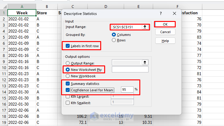
- Go to the Data tab >> select Data Analysis >> select Descriptive Statistics >> click OK

-
- Select Input Range: select the Sales column (e.g., C1:C151)
- Check Labels in first row if you include headers
- Select Output options: pick a blank cell (or choose New Worksheet Ply:)
- Tick Summary statistics
- Tick Confidence Level for Mean: 95%
- Click OK
Output:

Interpretation:
- Average level: Mean = 89.54k, Median = 89.3k → sales are centered around 90k and fairly symmetric
- Variability: Std. Dev. = 9.13k (≈10% of mean) → moderate week-to-week fluctuation
- Range: Sales span 70.1k to 108k → spread of ~38k across weeks
- Distribution shape: Skewness ≈ 0, Kurtosis < 0 → roughly symmetric, slightly flatter than normal
- Confidence interval (95%): True mean lies between 88.1k and 91.0k
2. Correlation Matrix: Uncover Hidden Relationships
Use a correlation matrix to quantify linear association (–1 to +1) between variables and see how two variables move together.
Steps:
- Go to the Data tab >> select Data Analysis >> select Correlation >> click OK
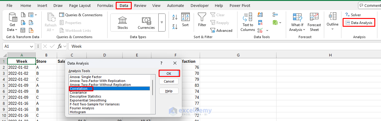
-
- Select Input Range: select Sales, Ad_Spend, Price, and Satisfaction columns
- Select Grouped by: Columns
- Check Labels in first row
- Choose an Output option: New Worksheet Ply
- Click OK

Output: You will get a correlation matrix.

Interpretation:
- Sales & Ad_Spend (0.14): Weak positive link → more ad spend is associated with slightly higher sales, but the effect is small
- Sales & Price (–0.32): Moderate negative correlation → higher prices tend to reduce sales
- Sales & Customer_Satisfaction (0.10): Very weak positive → higher satisfaction is slightly linked with better sales
Notes:
- r ≈ +1: strong positive linear relationship
- r ≈ 0: little linear relationship (non-linear relationships may still exist)
- r ≈ –1: strong negative linear relationship
Pro tip: Follow with a scatter chart to visually confirm linearity.
3. Two-Sample t-Tests: Compare Groups Like a Pro
The t-test is fundamental for comparing two groups—comparing sales performance between regions, testing the effectiveness of two marketing campaigns, or analyzing before-and-after scenarios. Choose the test type based on design/variances.
- Paired Two-Sample for Means: For before/after measurements on the same subjects
- Two-Sample Assuming Equal Variances: For independent groups with similar spread
- Two-Sample Assuming Unequal Variances: The safest choice when unsure about variance equality
Steps to Compute Q1 & Q2 Averages:
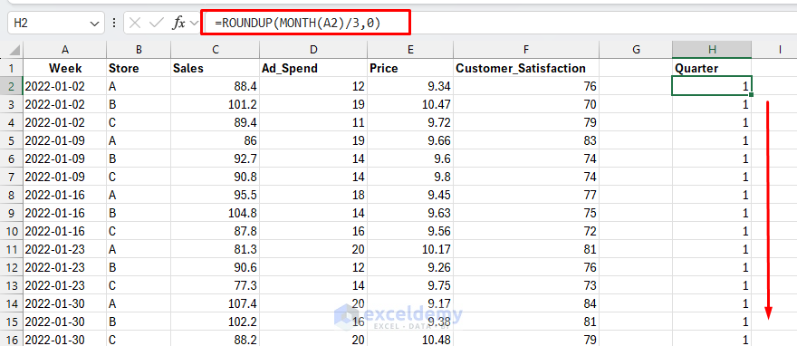
- Add a column and name it Quarter, where Q1 = Jan–Mar, Q2 = Apr–Jun
=ROUNDUP(MONTH(A2)/3,0)
Extract all Q1 and Q2 Weekly Sales for Store A:
- In column I (Q1_StoreA), insert the following formula
=FILTER(C:C,(B:B="A")*(H:H=1))
This formula spills all Store A sales in Q1.
- In column J (Q2_StoreA), insert the following formula
=FILTER(C:C,(B:B="A")*(H:H=2))
This formula spills all Store A sales in Q2.

Run the t-test:
- Go to the Data tab >> select Data Analysis >> select t-Test: Paired Two-Sample for Means >> click OK

-
- Select Variable 1 Range: Q1_StoreA
- Select Variable 2 Range: Q2_StoreA
- Set Hypothesized Mean Difference: 0
- Choose Output Range: New Worksheet Ply
- Check Labels in first row
- Set Alpha: 0.05
- Click OK

Output:

Interpretation:
- Not significant. Because p = 0.664 > 0.05, we don’t have evidence that Store A’s mean weekly sales changed from Q1 to Q2
- The sample means differ by only ~1.54 k$ (88.785 − 87.246), which is small relative to week-to-week variability (variances ≈ 71–74)
Pro tip: For independent samples, first run the F-Test to check equal vs. unequal variance, then pick the appropriate two-sample t-test.
4. ANOVA: Single-Factor (Compare 3+ Group Means)
While t-tests compare two groups, ANOVA (analysis of variance) handles three or more groups at once—comparing performance across multiple departments, testing several product variants, or analyzing regional differences.
Types Available:
- Single-Factor ANOVA: Compares groups based on one variable (e.g., sales across five regions)
- Two-Factor with Replication: Analyzes two variables simultaneously with multiple observations per cell
- Two-Factor without Replication: For a single observation per combination of the two factors
Arrange your data in side-by-side columns per group, or keep a single column per group and select multiple ranges. If your data is “long” (Group/Score), quickly pivot to Columns: A, B, C for groups with their scores underneath.
Reshape Data:
- Put sales in separate columns (one column for each store)
- You can use the FILTER function to filter the sales of each store in different columns
=FILTER(C:C, B:B="A")
=FILTER(C:C, B:B="B")
=FILTER(C:C, B:B="C")

- Or create a pivot-style table with Sales of A, B, and C in separate columns
- Use PivotTable: Rows = Week, Columns = Store, Values = Sales
Steps to Use ANOVA:
- Go to the Data tab >> select Data Analysis >> select ANOVA: Single Factor >> click OK

-
- Select Input Range: select the entire block (e.g., columns for Store A, B, C)
- Select Grouped by: Columns
- Check Labels in first row
- Set Alpha: 0.05 (default)
- Select Output options: New Worksheet Ply
- Click OK

Output:

Interpretation:
- Look at the p-value in the ANOVA table. If p < 0.05, at least one group differs
- Since F = 47.1 > F crit = 3.06 and p-value < 0.05, the result is highly significant
- That means average weekly sales are not the same across stores—at least one store’s mean is significantly different
Bonus: Explore ANOVA: Two-Factor With Replication when you have two factors (e.g., Treatment × Day) and repeated measures per cell.
5. F-Test Two-Sample for Variances
Use the F-test to check whether two independent samples have equal variance (an assumption used by the equal-variances two-sample t-test).
Steps:
- Go to the Data tab >> select Data Analysis >> select F-Test Two-Sample for Variances >> click OK

-
- Select Variable 1 Range: Store A Sales
- Select Variable 2 Range: Store B Sales
- Check Labels if included
- Set Alpha: 0.05
- Select Output options: New Worksheet Ply
- Click OK
Output:
Interpretation:
- The difference in variances between Store A and Store B is not statistically significant
- That means sales variability (week-to-week fluctuation) is similar across the two stores
- Because p > 0.05, you can assume equal variances when running the two-sample t-test (equal variances) for comparing Store A vs. Store B means
Caution: F-tests are sensitive to non-normality. If distributions look skewed or heavy-tailed, prefer robust approaches or Welch’s t-test by default.
6. Regression Analysis: Predict and Understand Relationships
Regression analysis reveals how variables relate to each other and enables prediction—essential for forecasting, understanding drivers of performance, and making data-driven decisions. You can model a linear relationship, estimate effect sizes, and build forecasts.
Steps:
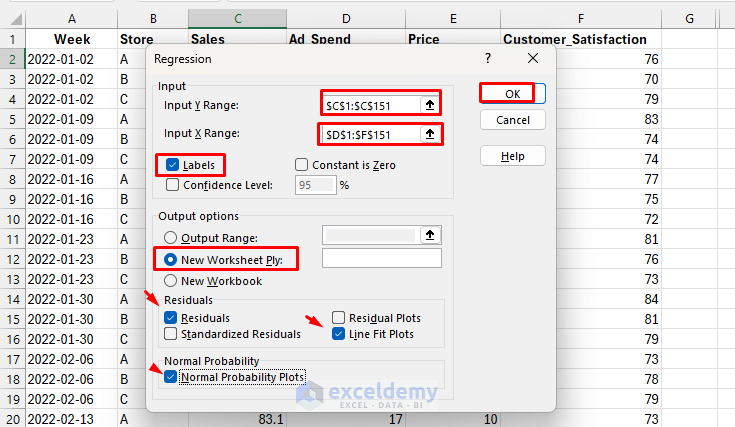
- Go to the Data tab >> select Data Analysis >> select Regression >> click OK

-
- Select Y Range: Sales
- Select X Range: Ad_Spend, Price, Satisfaction
- Check Labels if included
- Select Output options: New Worksheet Ply
- Tick Residuals, Line Fit Plots, Normal Probability Plots
- Click OK
Output:

Interpretation:
- R²: Model explains 12.9% of sales variance
- Coefficients: Price has a strong negative impact; Ad_Spend and Satisfaction effects are weak
- p-values: Only Price (p < 0.001) is statistically significant
- Residual plots: Residuals are roughly normal with moderate spread; assumptions mostly hold
Pricing strategy appears to be the key driver here; ad spending and satisfaction, as measured, don’t show strong impacts in this dataset.
Pro tip: For multiple predictors, add more X columns and select the entire X block.
7. Moving Average & Exponential Smoothing (Time-Series Smoothing)
Smooth noisy time series to highlight trends and short-term patterns. These tools remove short-term noise and make forecasting easier.
Moving Average:
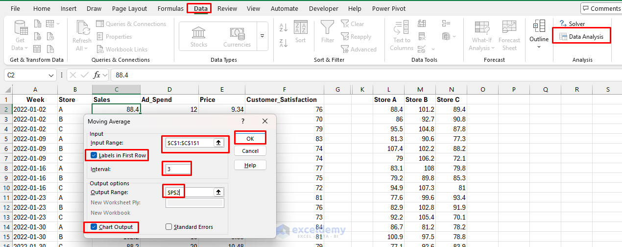
- Go to the Data tab >> select Data Analysis >> Moving Average >> click OK
- Select Input Range: Sales
- Select Interval: try 3 (or 4/6 depending on seasonality)
- Check Labels
- Choose Output option: P2
- Tick Chart Output
- Click OK
Output:

Interpretation:
- The blue actuals fluctuate → weekly noise
- The orange moving average filters out spikes, showing the general level of sales
- With weekly data, a 4-week MA ≈ monthly smoothing; a 12-week MA ≈ quarterly smoothing
Exponential Smoothing:
- Go to the Data tab >> select Data Analysis >> Exponential Smoothing >> click OK
- Select Input Range: Sales
- Damping factor (α): start with 0.3 (closer to 1 = more reactive)
- Check Labels
- Choose Output option: R2
- Tick Chart Output
- Click OK

Output:
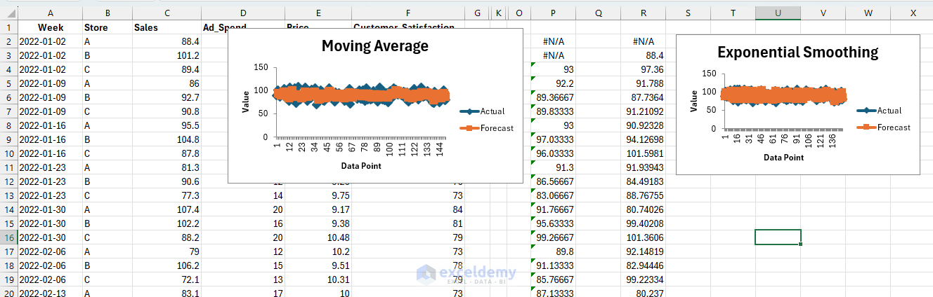
Interpretation:
- The orange exponential smoothing line also reduces noise
- Compared to MA, it reacts more quickly to recent changes in sales because the weight given to the newest observation is higher
- Less lag than MA, but potentially a bit noisier depending on α

Pro tip: For full forecasting workflows (trend/seasonality), consider the FORECAST.ETS functions, but the ToolPak’s quick smoothers are great for first-pass signal finding.
Conclusion
These are seven statistical tools you might not have known were in Excel. They transform Excel from a spreadsheet program into a statistical powerhouse. You don’t need expensive, specialized software for professional-grade analysis—it has been in Excel all along, waiting to be discovered. The Data Analysis ToolPak makes statistical analysis accessible. Whether you’re optimizing operations, validating hypotheses, or forecasting trends, these tools provide the analytical rigor to support confident, data-driven decisions.
Get FREE Advanced Excel Exercises with Solutions!
