
Image by Editor
Microsoft Access offers robust tools for storing and querying data and for creating visual representations such as bar charts, pie charts, and line graphs. These tools make it easier to analyze trends, identify patterns, and communicate insights clearly.
In this tutorial, we will show you how to visualize your data effectively in Microsoft Access.
Step 1: Prepare Your Data
Before creating visualizations, ensure your data is:
- Structured and Clean: Data should be well-organized in tables with clear field names.
- Consistent: Check data for inconsistencies or missing values and rectify them.
- Normalized: Normalize your database to avoid redundancy and maintain data integrity.
Let’s consider a sales dataset to show how to visualize your data effectively in Microsoft Access.
Step 2: Create Summary Queries
You need summary queries to prepare the data for charting.
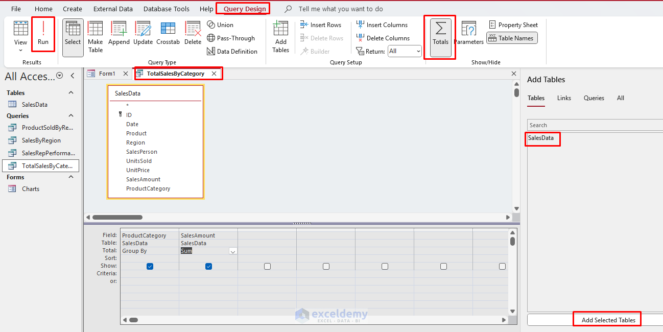
Query 1: Total Revenue by Product Category
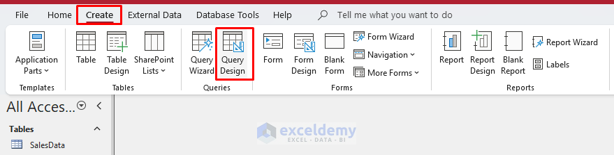
- Go to the Create tab >> select Query Design.
- Add the SalesData table.
- Add fields: Product Category and SalesAmount fields to the grid.
- Click the Totals button (Σ).
- In the Total row:
- Select Group By for Product Category.
- Select Sum for SalesAmount.
- Run the query.
- Save as TotalSalesByCategory.
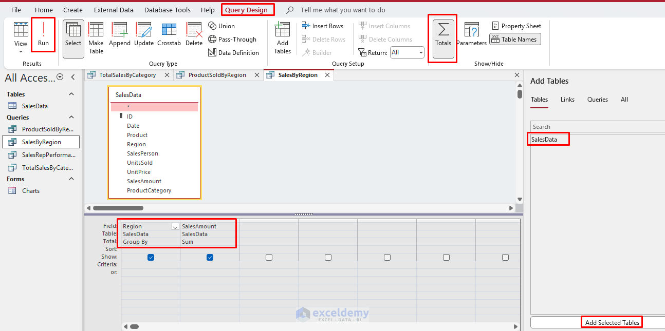
Query 2: Sales by Region
- Go to the Create tab >> select Query Design.
- Add the SalesData table.
- Add fields: Region and Sales Amount fields to the grid.
- Click the Totals button (Σ).
- In the Total row:
- Select Group By for Region.
- Select Sum for SalesAmount.
- Run the query.
- Save as SalesByRegion.
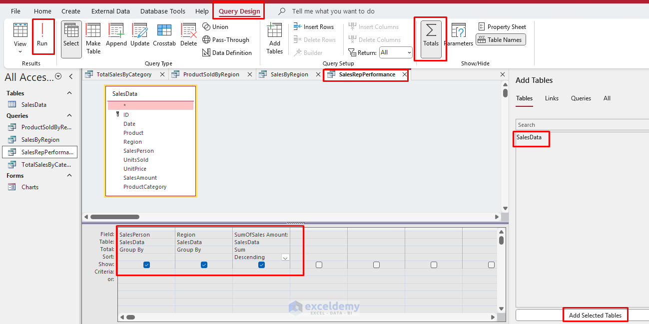
Query 3: Sales Rep Performance
- Go to the Create tab >> select Query Design.
- Add the SalesData table.
- Add fields: SalesPerson, Region, and SalesAmount fields to the grid.
- Click the Totals button (Σ).
- In the Total row:
- Select Group By for SalesPerson.
- Select Group By for Region.
- Select Sum for SalesAmount.
- Add a sort on SalesAmount (Descending).
- Run the query.
- Save as SalesRepPerformance.
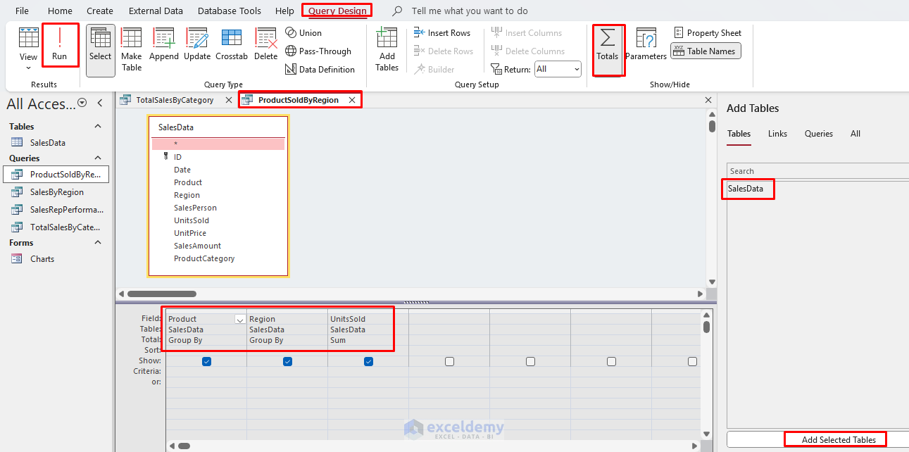
Query 4: Products Sold(Units) by Region
Let’s create a query to show the product units sold by region.
- Go to the Create tab >> select Query Design.
- Add the SalesData table.
- Add fields: Product, Region, and Unit Sold fields to the grid.
- Click the Totals button (Σ).
- In the Total row:
- Select Group By for Product.
- Select Group By for Region.
- Select Sum for UnitsSold.
- Run the query.
- Save as ProductSoldByRegion.
Step 3: Use Modern Chart to Visualize Data Effectively
Create a Column Chart
- Go to the Create tab >> select Form Design.
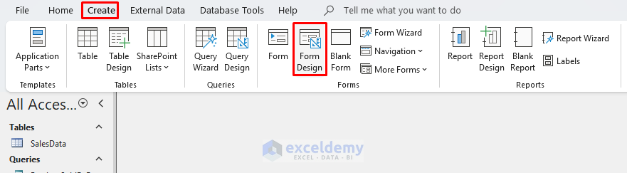
- Go to the Form Design tab >> select Insert Modern Chart >> from Column chart >> select Clustered Column chart.
- Draw a rectangle on the form canvas to insert the chart.
- In the Chart Settings panel on the right >> select the Data tab.
- In Data Source >> select Queries >> select TotalSalesByCategory.
- In Axis (Category) >> select ProductCategory.
- In Value (Y Axis) >> select Sum of SalesAmount.
- In Legend (Series) >> select ProductCategory.
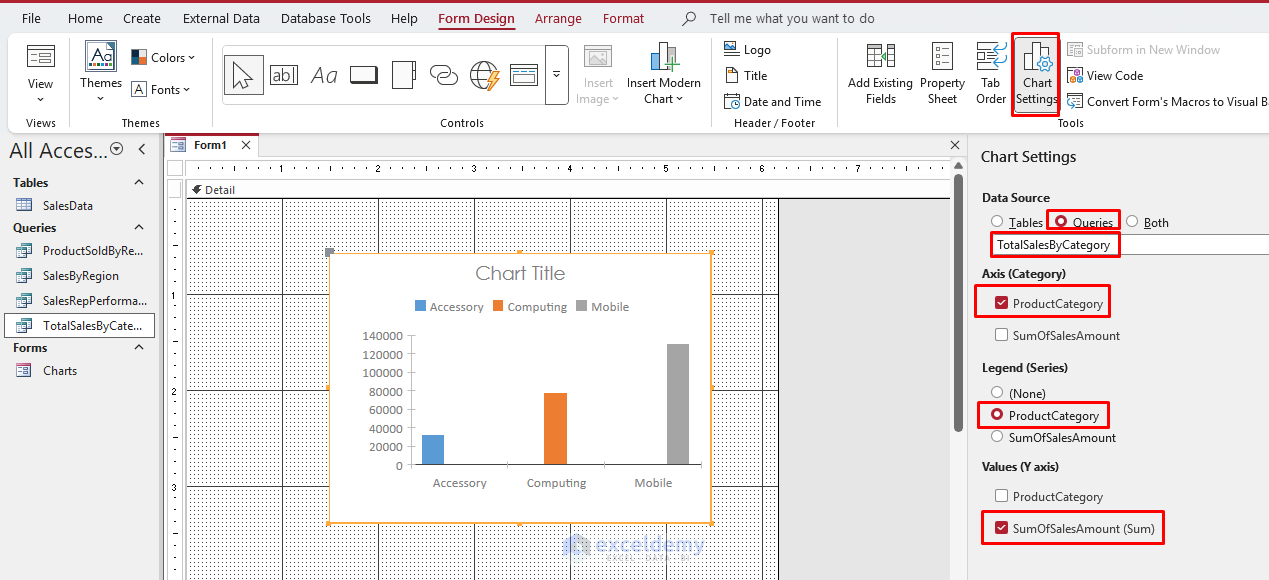
- Open Property Sheet:
- Set Chart Title: Total Sales By Category.
- Save the form as SalesByCategoryChart_Form.
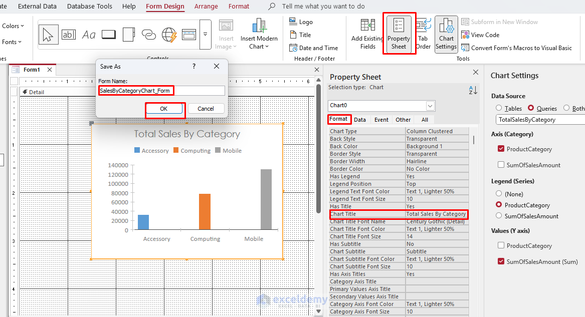
- Click Form View to see the chart.
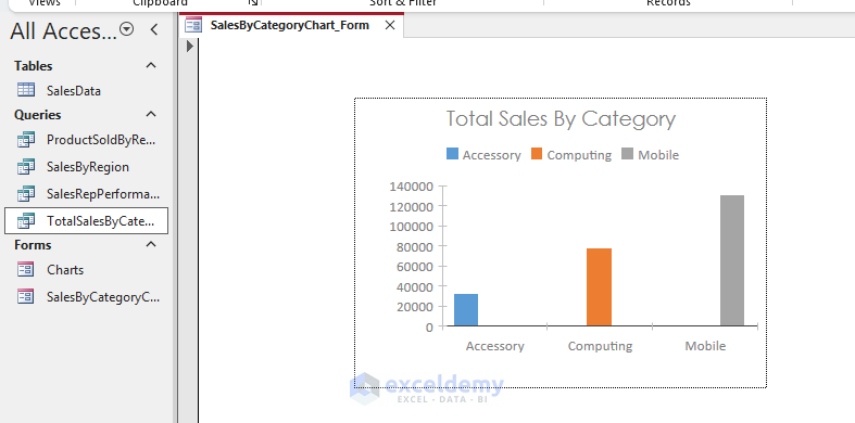
This form now displays total sales by product category in a clustered column chart.
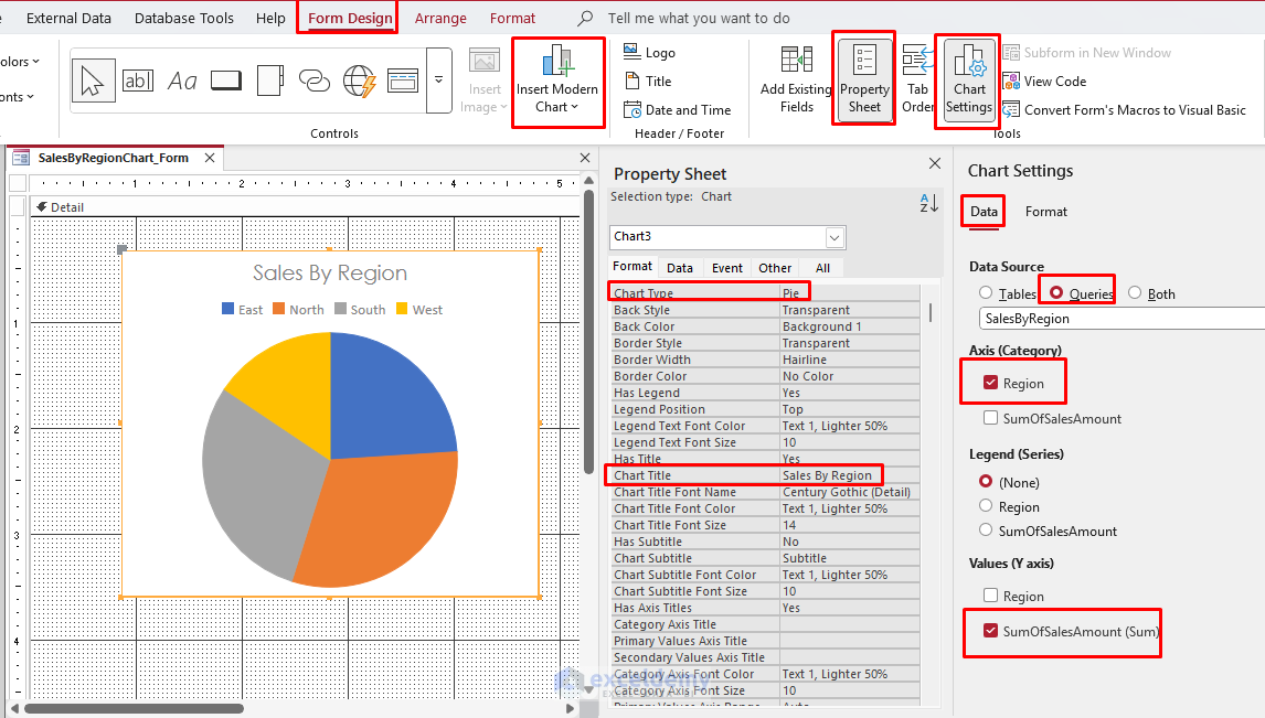
Create a Pie Chart
- Go to the Create tab >> select Form Design.
- Go to the Form Design tab >> select Insert Modern Chart >> select Pie chart.
- Draw a rectangle on the form canvas to insert the chart.
- In the Chart Settings panel on the right >> select the Data tab.
- In Data Source >> select Queries >> select SalesByRegion.
- In Axis (Category) >> select Region.
- In Value (Y Axis) >> select Sum of SalesAmount.
- In Legend (Series) >> select None.
- Open Property Sheet:
- Set Chart Title: Sales By Region.
Format Data Series: SumOfSumOfSalesAmount
- In the Chart Settings panel on the right >> select the Format tab.
- Data Label Display Format: Percentage
- Percentage Decimal Places: 2
- Data Label Position: Best Fit
- Sort Order: Ascending
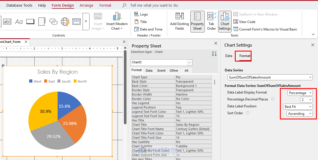
- Click Form View to see the chart.
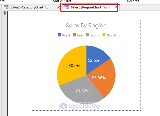
This form now displays the total sales percentage by region in a pie chart.
Create a Bar Chart
- Go to the Create tab >> select Form Design.
- Go to the Form Design tab >> select Insert Modern Chart >> from Column chart >> select Clustered Bar chart.
- Draw a rectangle on the form canvas to insert the chart.
- In the Chart Settings panel on the right >> select the Data tab.
- In Data Source >> select Queries >> select Save as SalesRepPerformance..
- In Axis (Category) >> select SalesPerson.
- In Value (Y Axis) >> select Sum of SalesAmount.
- In Legend (Series) >> select SalesPerson.
- Open Property Sheet:
- Set Chart Title: SalesRep Performance.
- Save the form as SalesRepPerformanceChart.
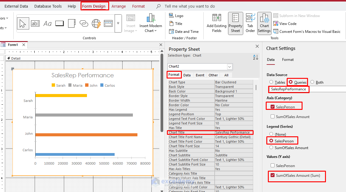
- Click Form View to see the chart.
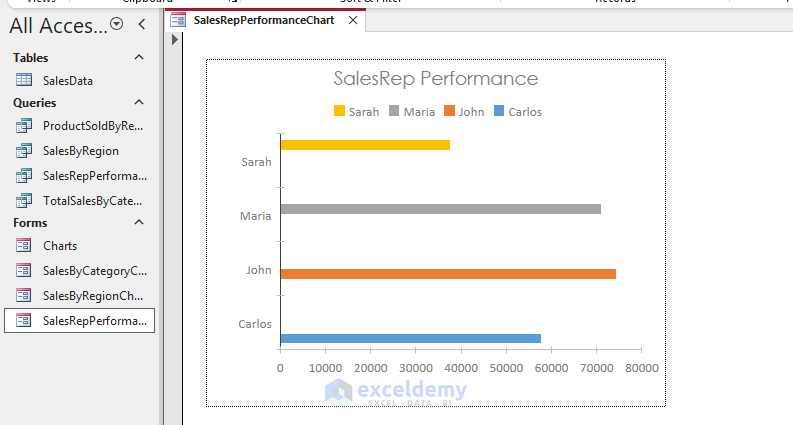
Now you have a clustered bar chart form that shows how salespeople are performing.
Step 4: Use Chart Wizard (Classic) to Visualize Data Effectively
You can also use the Chart Wizard, which is available when building reports.
- Go to the Create tab >> select Form Design.
- In the Form Design tab >> select Chart from Controls.
- Also, enable Use Control Wizards.
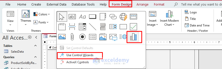
- Draw a chart box on the report.
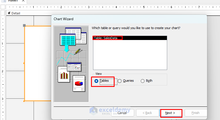
- A wizard will appear:
- Select the SalesData table as the data source.
- Click Next.
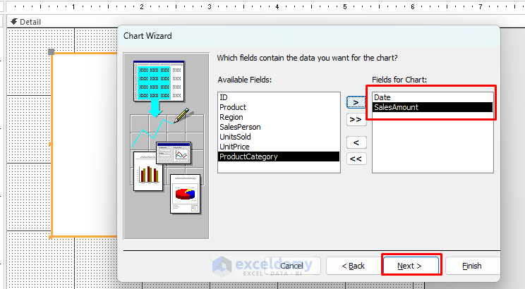
-
- Choose Date (for X-axis) and SalesAmount (for Y-axis).
- Click Next.
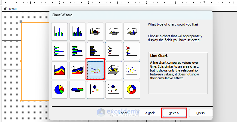
-
- Choose Line Chart when prompted.
- Click Next.
-
- Click on Preview Chart.
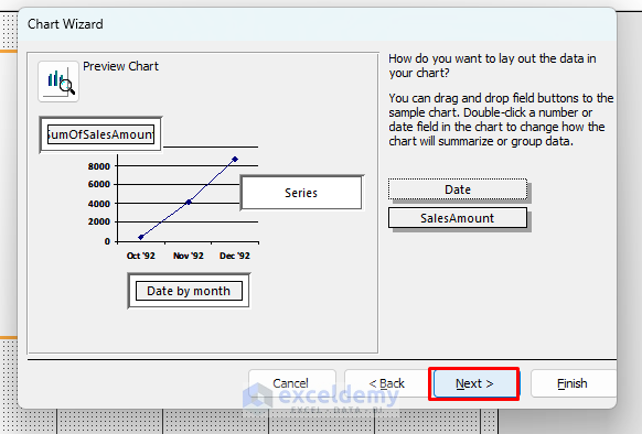
-
- Here is your sample chart.
- Click Finish.
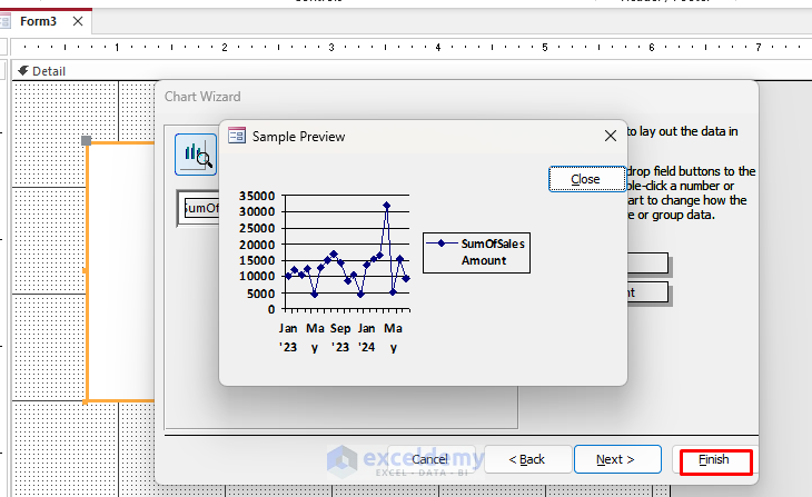
This chart shows how revenue changes over time.
Access Chart Wizard Limitations
Before concluding, it’s important to acknowledge some significant limitations with the Access Chart Wizard:
Warning: The Chart Wizard preview often differs significantly from the final chart that appears in your forms and reports. This inconsistency can lead to frustration and wasted time trying to achieve your desired visualization.
Step 5: Customize Each Chart
Clear visualization makes data easier to interpret:
- Right-click on a chart and select Chart Settings.
- Labels and Titles: Clearly label axes and provide descriptive titles.
- Set appropriate titles like “Total Revenue by Product Category” or “Sales Distribution by Region”.
- Data Label: Add data labels if helpful for interpretation.
- Legend: Include a legend for multi-series charts.
- Simplify: Avoid cluttering the visual with unnecessary data points.
- Color and Contrast: Use color strategically to highlight significant data points or categories.
Step 6: Interactive Dashboards
Create interactive dashboards by combining forms, reports, and charts:
- Use navigation forms to link multiple reports and charts.
- Include interactive controls such as dropdowns, buttons, or sliders to filter visualizations dynamically.
- Test usability and ensure interaction logic aligns with user expectations.
Step 6: Export and Share Visualizations
Access visualizations can be exported easily:
- Go to the External Data tab >> Export to export your visualizations as PDF or Excel.
- Share reports via email directly from Access.
- Integrate visualizations into other Office documents or presentations.
Best Practices for Effective Visualization
- Match Chart Type to Data: Use bar charts for comparison, line charts for trends, and pie charts for proportions.
- Avoid Distortion: Maintain accurate scaling and proportions.
- Regular Updates: Keep data updated to reflect current conditions.
Conclusion
By following these visualization techniques, you can effectively visualize your data. It will help you and your stakeholders gain valuable insights from your data, driving better business decisions. Remember that effective data visualization is about clear communication, not just pretty charts. Focus on answering important business questions, and your Access visualizations will provide tremendous value to your organization.
Get FREE Advanced Excel Exercises with Solutions!
