
Choosing between Power BI and Excel for creating dashboards can significantly impact your organization’s data analysis capabilities.
This tutorial will help you understand the strengths, limitations, and ideal use cases for each platform.
What is an Excel Dashboard?
Excel remains one of the most widely used tools for data analysis and dashboard creation. Excel Dashboards are visual displays created within Microsoft Excel using its built-in charts, PivotTables, slicers, and conditional formatting. You can pull data from tables, external sources, or manual entry, and present key metrics interactively.
Typical Uses:
- Financial reporting.
- Sales performance tracking.
- Budgeting and forecasting.
- Project management.
What is a Power BI Dashboard?
Microsoft Power BI is a dedicated business intelligence platform for data visualization, analysis, and sharing. Power BI dashboards are built using Microsoft Power BI, a cloud-based business analytics tool. It provides advanced analytics capabilities and seamless integration with various data sources.
Typical Uses:
- Company-wide performance dashboards.
- Live operational dashboards.
- Combining data from multiple sources.
- Sharing insights across teams or externally.
Compare Excel and Power BI Dashboards Features
Data Handling Capacity
Excel:
- Limited to approximately 1 million rows per worksheet.
- Performance degrades with large datasets.
- Manual refresh processes for external data connections.
- Best suited for datasets under 100,000 rows.
Power BI:
- Can handle millions of rows efficiently.
- Optimized for big data processing.
- Automatic data refresh capabilities.
- Compressed data storage reduces file sizes significantly.
Data Source Connectivity
Excel:
- Connects to databases, web services, and files.
- Limited real-time data connections.
- Requires manual setup for most connections.
- Best with static or infrequently updated data.

Power BI:
- 100+ native data connectors.
- Real-time streaming data support.
- Cloud and on-premises data integration.
- Automatic data gateway for secure connections.

Visualization Capabilities
Excel:
- Standard chart types (bar, line, pie, scatter).
- Limited customization options.
- Static visualizations are used in most cases.
- Familiar charting interface.

Power BI:
- Extensive library of custom visuals.
- Interactive and dynamic visualizations.
- Cross-filtering between multiple charts.
- Custom visual marketplace with hundreds of options.

Collaboration and Sharing
Excel:
- File-based sharing (email, SharePoint).
- Version control challenges.
- Limited real-time collaboration.
- Requires an Excel license for full functionality.

Power BI:
- Cloud-based sharing and collaboration.
- Centralized report management.
- Real-time updates for all users.
- Web-based access without desktop software.
Cost Analysis
Excel Costs
- Part of the Microsoft Office suite ($8.25-$22/user/month).
- One-time purchase options available.
- No additional licensing for basic dashboard features.
- Hidden costs in maintenance and version control.
Power BI Costs
- Power BI Pro: $10/user/month.
- Power BI Premium: $20/user/month or $5,000/month capacity-based.
- Additional costs for an on-premises data gateway.
- Potential savings through improved efficiency and automation.
When to Choose Power BI
Power BI is the better choice when you need:
- If you are dealing with large, complex, or multiple data sources.
- You need to build interactive dashboards for a wider audience.
- You want to schedule data refreshes and use cloud/mobile sharing.
- You require advanced analytics, like DAX calculations or machine learning integration.
- Your team is moving towards modern BI platforms.
Best for: Business intelligence teams, company-wide reporting, operational monitoring, and data analysts needing powerful modeling and visuals.
When to Choose Excel
Excel dashboards are ideal when you need:
- You’re already comfortable with Excel and need quick analysis.
- Your data fits in a single file (not too large).
- Your dashboard is for personal use or small team sharing.
- Your organization hasn’t adopted Power BI yet.
- You need advanced spreadsheet functions and manual data manipulation.
Best for: Financial analysts, accountants, quick ad-hoc reporting, or when working with small datasets.
Example: Creating a Simple Sales Dashboard
Let’s see the steps for creating a basic sales dashboard in both tools:
In Excel:
- Prepare Data: List sales data in a table (Date, Region, Sales Amount).
- Insert PivotTable: Summarize sales by Region and Month.
- Add Charts: Create column charts for regional sales, line charts for trends.
- Insert Slicers: Enable quick filtering by region or month.

- Format & Arrange: Use conditional formatting for KPIs, and arrange all visuals on a single sheet.

In Power BI:
- Load Data: Import the same sales data.
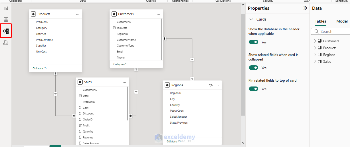
- Model Data: Set relationships if needed, create calculated columns/measures.
- Create Visuals: Drag-and-drop charts, KPIs, and slicers.
- Enhance Interactivity: Use drill-through, tooltips, and bookmarks.
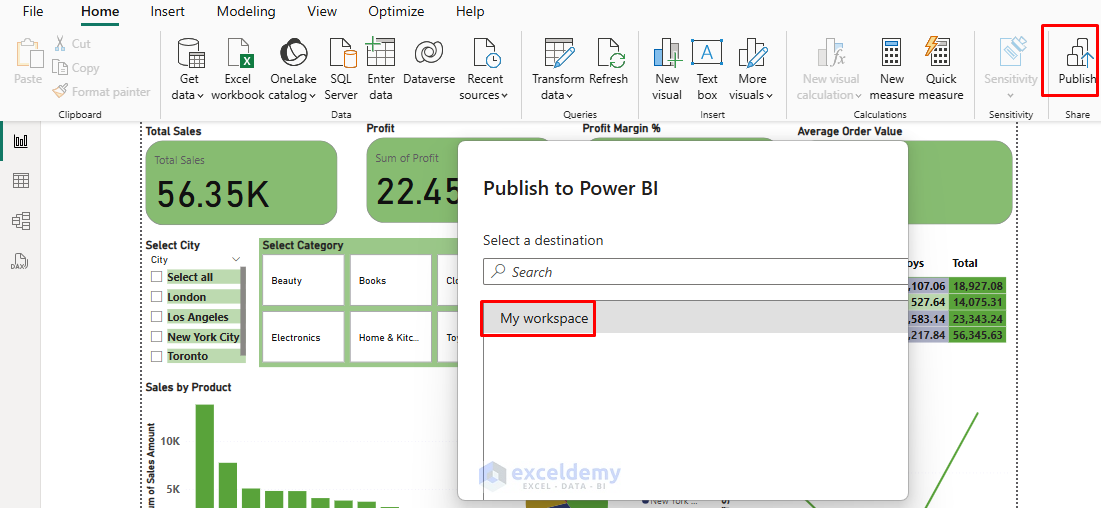
- Publish & Share: Publish to Power BI Service for web/mobile access.

Conclusion
Both Excel and Power BI have their place in modern data analysis. Excel excels at detailed data manipulation, ad-hoc analysis, and situations where simplicity is key. Power BI shines when you need professional dashboards, handle large datasets, or require advanced analytics capabilities. Many organizations use both: Excel for personal or initial analysis, and Power BI for publishing and sharing at scale.
The choice ultimately depends on your specific requirements, budget, and long-term data strategy. Remember that the best dashboard tool is the one that your team will use effectively to make better data-driven decisions.
Get FREE Advanced Excel Exercises with Solutions!
