
Image by Editor
Power BI is a powerful business analytics tool that allows you to import, transform, and visualize data from various sources. Excel is one of the most common data sources used with Power BI.
In this tutorial, we will show how to import and transform Excel Data in Power BI.
Let’s consider a sales performance dataset that tracks monthly sales across different regions, product categories, and sales representatives.
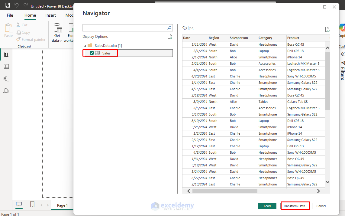
Step 1: Import Excel Data in Power BI
- Launch Power BI Desktop.
- On the Home tab >> from Data group >> select Excel Workbook.
- Browse to locate and select your file (e.g., SalesData.xlsx).

- A Navigator window appears listing the available sheets or tables.
- Select Sales sheet >> click Transform Data to open the Power Query Editor.
Step 2: Explore Power Query Editor
When the Power Query Editor opens, take a moment to explore the data:
- View data preview.
- Check for any errors or inconsistencies.
- Notice how Power BI has automatically detected some data types.
- Identify areas that need cleaning or transformation
- Apply transformations.
- Track each step in the Applied Steps pane.

You now have the Sales table loaded for transformation.
Step 3: Transform the Data
Let’s explore some common data transformations using the sample dataset.
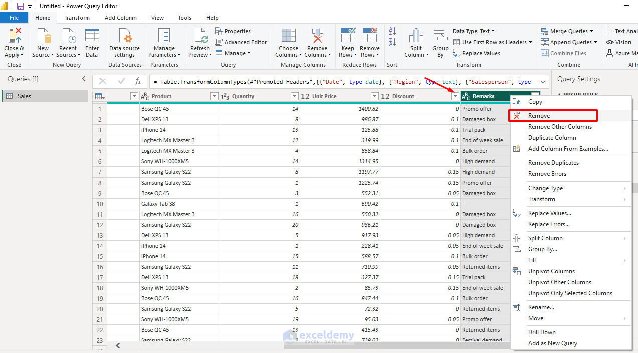
1. Remove Unnecessary Columns
If you decide the Remarks column isn’t needed, you can remove the Remarks column.
- Right-click the column header (e.g., Remarks).
- Select Remove.
2. Rename Columns
If you want, you can rename columns to make it more intuitive.
- Double-click Unit Price and rename it to Price Per Unit.

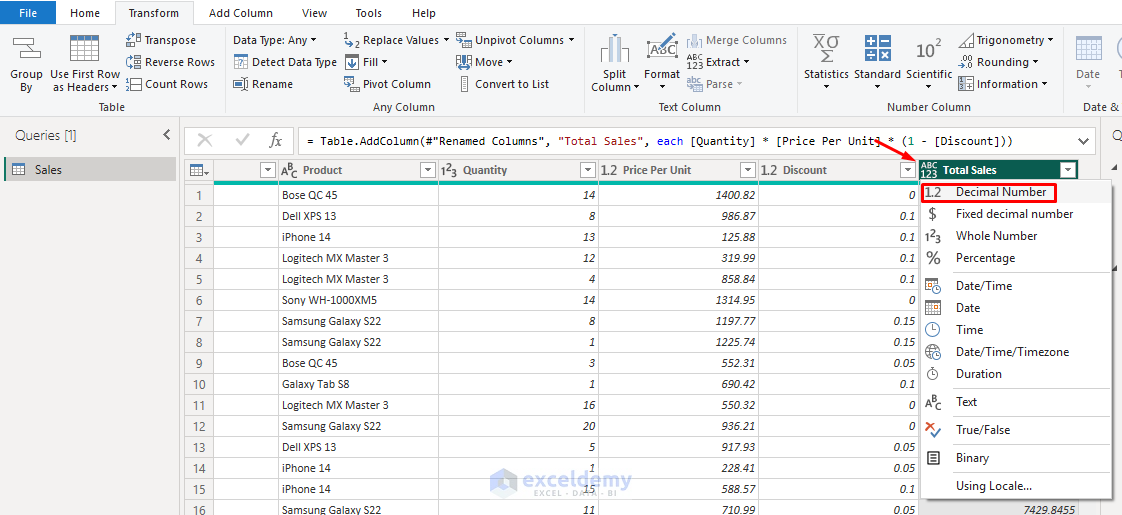
3. Add Calculated Column for Total Sales
Create a column to calculate total revenue after discount:
- Go to the Add Column tab >> select Custom Column.
- Name it Total Sales.
- Enter the following formula:
[Quantity] * [Price Per Unit] * (1 - [Discount])
- Click OK.

Output:

4. Set Correct Data Types
- Click on the Column Header icon >> select the correct Data Type.
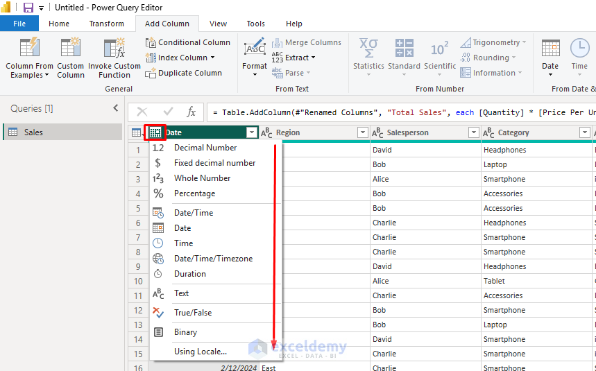
- Date → Date.
- Region, Salesperson, Product → Text.
- Quantity → Whole Number.
- Price Per Unit, Discount, Total Sales → Decimal Number.
5. Sort Data
You can sort data to organize your dataset.
To Sort Total Sales Descending:
- Click on the Total Sales column dropdown icon >> select Sort descending.
- Click OK.

6. Format Numbers
Ensure proper formatting for decimal places.
To Format Total Sales:
- Click on the Total Sales column header icon >> select Fixed Decimal Number.

7. Adding a Month Column
- Select the Date column.
- Go to the Add Column tab >> select Date >> select Month >> select Name of Month.
- You now have a new column showing the month’s name.

8. Cleaning Data Issues
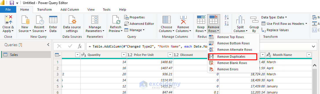
Handling Duplicate Entries
- Go to the Home tab >> select Remove Rows >> select Remove Duplicates.
- Select columns that should make a unique entry (Date, Region, Sales Rep, Product Category).
Replace Values
If you notice inconsistencies like North and Northern:
- Select the Region column.
- Go to the Transform tab >> select Replace Values.
- In the Replace Values dialog box;
- Insert Value To Find: Northern.
- Insert Replace With: \North.
- Click OK.

9. Filter Data
You can use the filter dropdown for columns like Quantity or Product and remove blank or erroneous values. Let’s filter to show only high-value sales.
- Click the filter icon on the Total Sales column.
- Select is greater than or equal to >> insert 3000.
- Click OK.

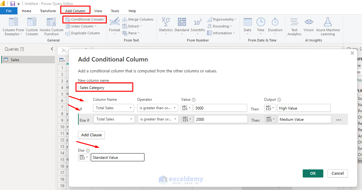
10. Categorize Data
- Go to the Add Column tab >> select Conditional Column.
- Name it Sales Category.
- Set up conditions:
- If Total Sales is greater than or equal to 5000, then High Value.
- If Total Sales is greater than or equal to 2000, then Medium Value.
- Otherwise, Standard Value.
Step 4: Advanced Transformations
Creating a Summary by Region and Product Category
- Go to the Home tab >> select Group By.
- Group by Region and Category.
- Select Advanced.
- Add aggregations:
- Name: Sum of Total Sales; Operation: Sum; Column: Total Sales.
- Name: Average of Units Sold; Operation: Sum; Column: Quantity.
- Name: Count of Sales Rep; Operation: Count Distinct Rows.
- Click OK.

Pivoting Data for Monthly Analysis
Let’s pivot the data to see monthly sales by region:
- First, ensure you have a Month column (created earlier).
- Select Region column.
- Go to the Transform tab >> select Pivot Column.
- Choose Month as Values Column.
- Click OK.

You now have a table with months as rows and regions as columns.

Step 5: Load the Data
Once transformations are complete:
- Go to the Home tab >> select Close & Apply.
- Power BI will load the cleaned data into the data model.

You can now use fields like Region, Product, Total Sales, and Salesperson to create charts and visualizations.

Step 6: Create Basic Visuals
Now that your data is loaded, you can create visualizations:
- Bar Chart: Total Sales by Region.
- Select the Bar Chart from Visualizations.
- Y-axis field: Region.
- X-axis field: Total Sales.

- Pie Chart: Product Category-wise sales distribution.
- Select the Pie Chart from Visualizations.
- From Data;
- Drag Category to Y-axis field.
- Drag Total Sales to the X-axis field.

- Line Chart: Monthly Sales Trends using the Date field.
- Select the Line Chart from Visualizations.
- Y-axis field: Date (Month).
- X-axis field: Total Sales.

- Matrix: Salesperson and Product matrix with Total Sales.
- Select the Matrix Chart from Visualizations.
- Rows: Salesperson.
- Columns: Product.
- Values: Total Sales.

Output:

Step 7: Enable Data Refresh
To keep your Power BI report up to date:
- Save your Excel file in a consistent path.
- Go to the Home tab >> select Refresh in Power BI whenever the Excel file is updated.
- You can also schedule refreshes if using Power BI Service (Pro account required).

Conclusion
Importing and transforming Excel data in Power BI is a critical skill for creating effective reports. By following these steps, you can easily import and transform Excel data using the Power Query editor. It automates data cleaning, calculation, and aggregation tasks before loading data into Power BI for visual storytelling. You will be able to handle most Excel-to-Power BI workflows confidently. This workflow can be adapted to any Excel dataset you work with, allowing you to turn raw data into actionable insights using Power BI’s powerful capabilities.
Get FREE Advanced Excel Exercises with Solutions!
