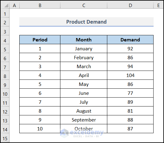
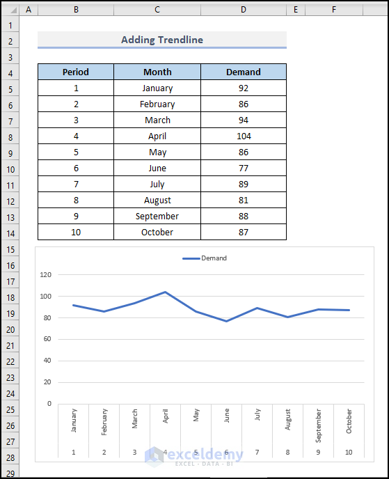
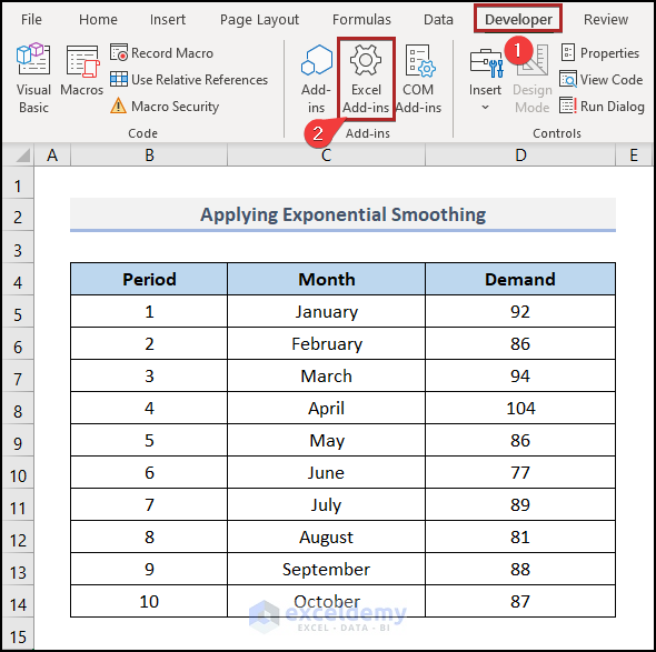
Dataset Overview
To make data trends more visually clear, we’ll demonstrate how to smooth a Product Demand chart in Excel. Our dataset includes columns for Period, Month, and Demand, located in cells B4:D14 consecutively.
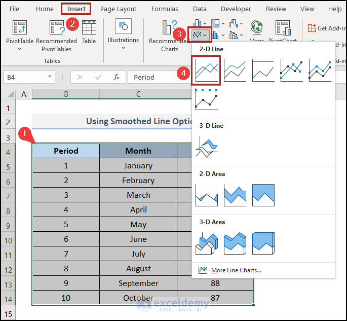
Method 1 – Using Smoothed Line Option
- Highlight cells in the B4:D14 range.
- Go to the Insert tab.
- Click on the Insert Line or Area Chart dropdown in the Charts group.
- Choose 2-D Line from the available options.
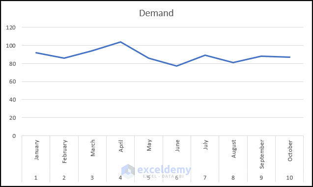
- A Line Chart will appear on the worksheet.
- Right-click anywhere on the series in the chart to open the context menu.
- Select Format Data Series.
- The Format Data Series task pane will appear on the right side of the display.
- Click on the Fill & Line icon (depicted as a spilling color can).
- Choose Line (as shown in the image below).
- Check the box next to Smoothed line.
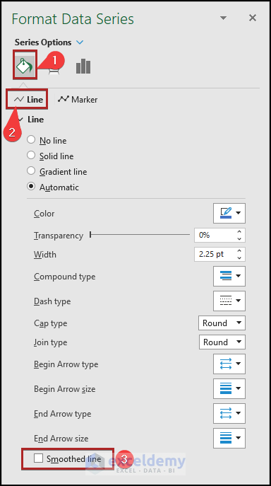
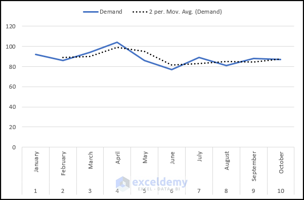
- The chart’s line will now appear smoothed.
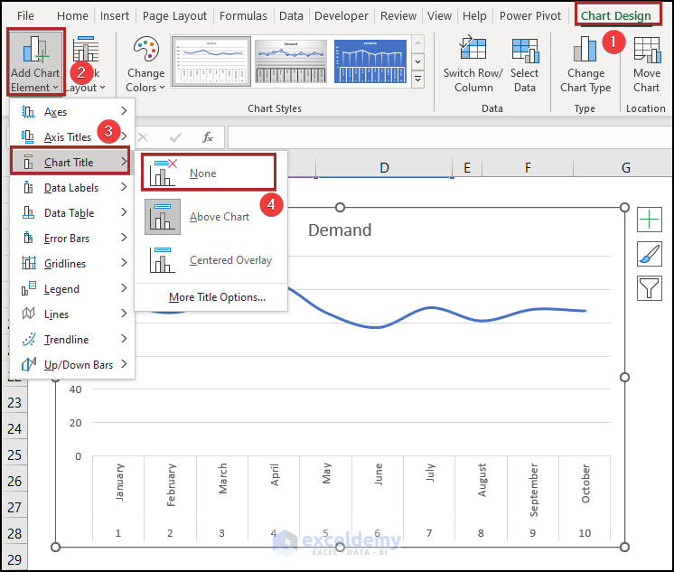
- Move to the Chart Design tab.
- Click on the Add Chart Element dropdown in the Chart Layouts ribbon group.
- Open the sub-menu and select Chart Title.
- Choose None to remove the chart title.
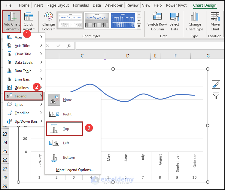
- Click the Add Chart Element dropdown again.
- Select Legend and position it at the top.
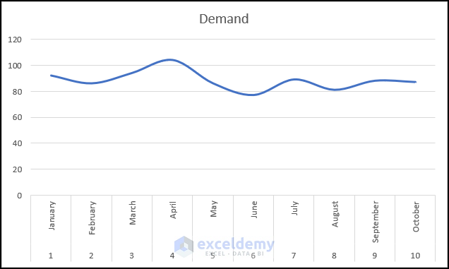
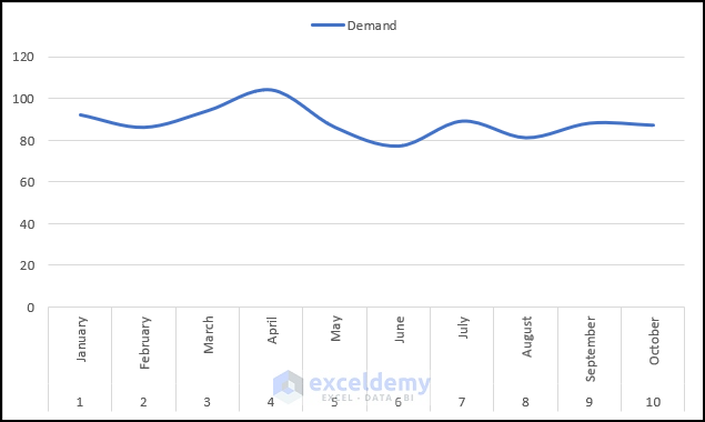
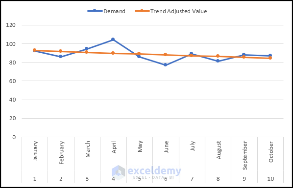
The final output of the chart will resemble the image below:
Method 2 – Adding a Trendline
In this approach, we’ll introduce a new Trendline to our chart. The trendline will represent a smoother version of our data. Follow the steps below to achieve this:
- Insert a chart based on the data table in the B4:D14 range, similar to Method 1.
- Go to the Chart Design tab.
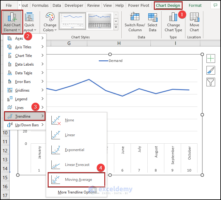
- Click on the Add Chart Element dropdown within the Chart Layouts group.
- Choose Trendline.
- From the available options, select Moving Average
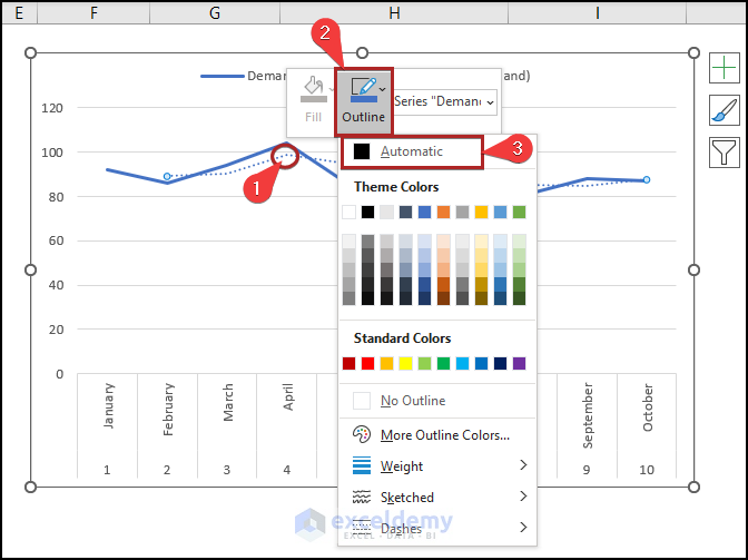
- Right-click on the newly added trendline series.
- In the context menu, click on the Outline dropdown.
- Select Automatic as the theme color.
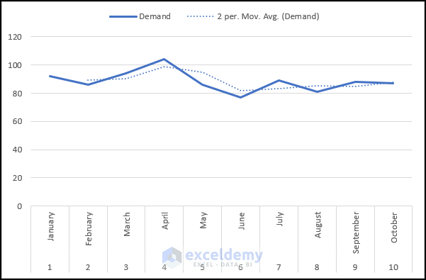
The resulting trendline will appear as shown below:
Method 3 – Applying Exponential Smoothing in Excel
In this section, we’ll demonstrate the quick steps to perform exponential smoothing in Excel on the Windows operating system. You’ll find detailed explanations of the methods and formulas here.
Steps:
- Before proceeding, we need to enable the Data Analysis tool. To do this:
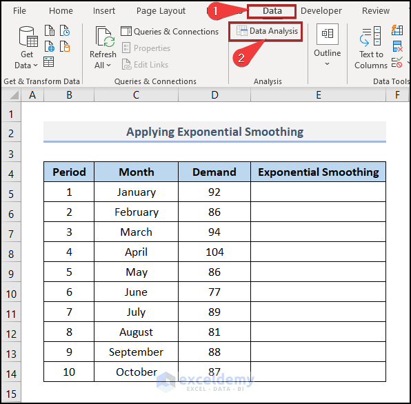
- Go to the Developer tab.
- Select Excel Add-ins in the Add-ins group.
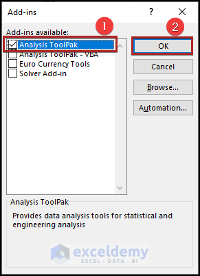
- The Add-ins dialog box will appear.
-
-
- Check the box next to Analysis Toolpak.
- Click OK.
-
-
- Now that we’ve installed this add-in, we can utilize it in Excel.
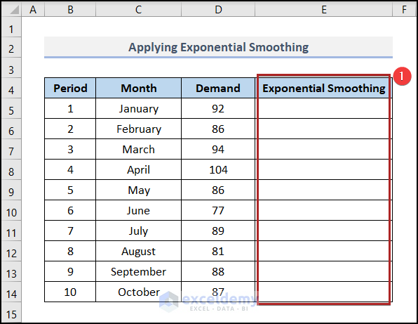
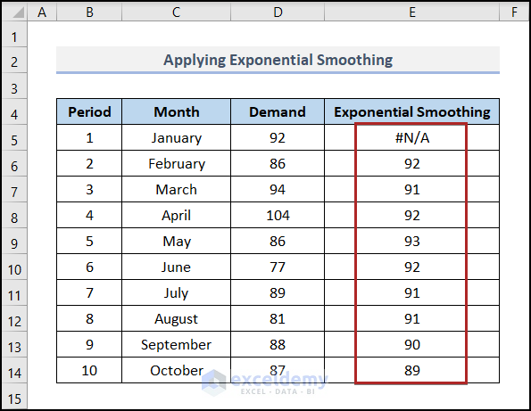
- Add a new column called Exponential Smoothing under Column E.
- Move to the Data tab.
- Select Data Analysis in the Analysis group.
- The Data Analysis toolbox will appear.
- In the toolbox, select Exponential Smoothing from the Analysis Tools section.
- Click OK.

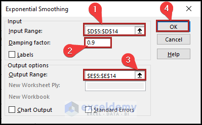
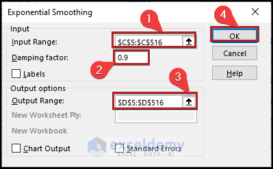
- The Exponential Smoothing dialog box will open.
- Specify the input range by giving the cell reference of D5:D14 in the Input Range box.
- Set the damping factor to 0.9.
- Specify the output range by using E5:E14 as the cell reference in the Output Range box.
- Click OK.
- The result will appear in the newly created Exponential Smoothing column.
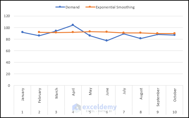
- Insert a chart based on the updated table, similar to Method 1.
Method 4 – Implementing Trend-Adjusted Exponential Smoothing
In this method, we’ll calculate trend-adjusted exponential smoothing to smooth our data. Let’s dive in!
Steps:
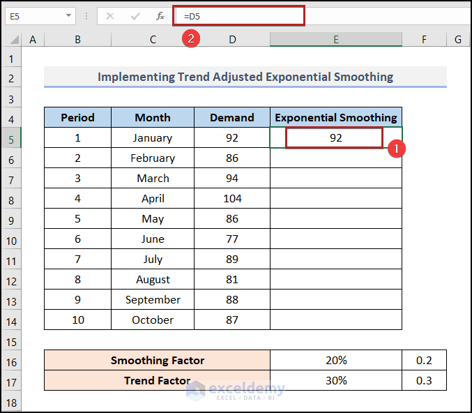
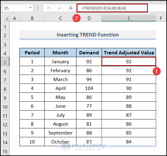
- Select cell E5 and enter the following formula:
=D5
- Press ENTER.
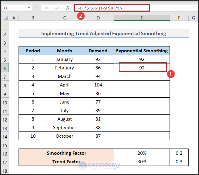
- Go to cell E6 and enter the formula below:
=D5*$F$16+(1-$F$16)*E5
-
- Here, D5 represents the demand for January, E5 represents the exponential smoothing for January, and F16 serves as the smoothing factor (0.2 in this case).
- Press ENTER.
- Position the cursor at the right-bottom corner of cell E6 (it will look like a plus sign, known as the Fill Handle tool).
- Double-click on it.
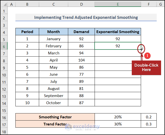
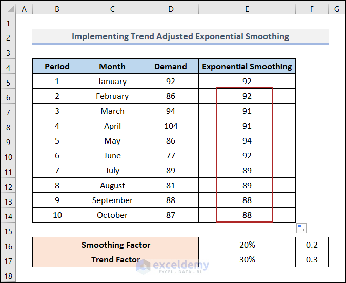
- This will populate the remaining results in cells E7:E14.
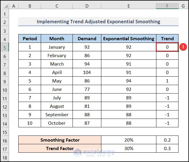
- Add a new column named Trend.
- In cell F6, paste the following formula:
=$F$17*(E6-E5)+(1-$F$17)*F5
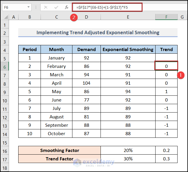
- Write down 0 in cell F5 to fill the entire column.
- To calculate trend-adjusted exponential smoothing, select cell G6 and enter the formula below:
=E6+F6
- Press ENTER.
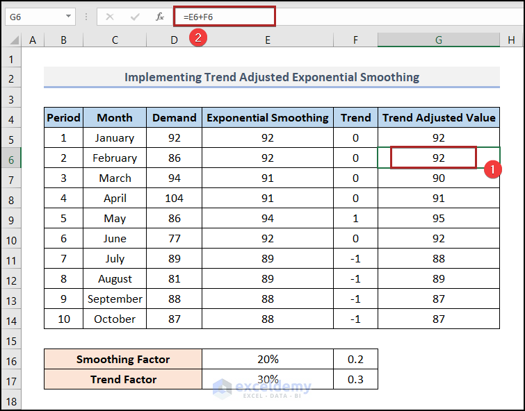
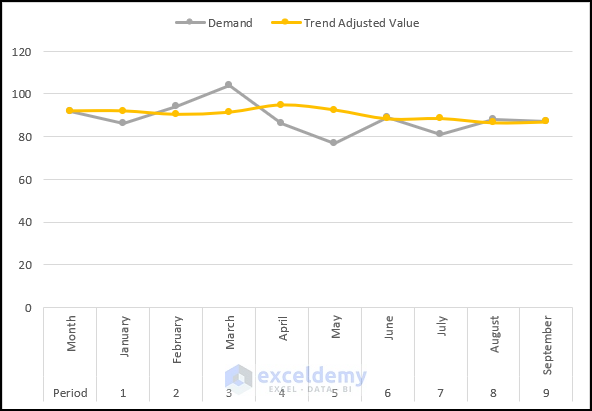
- Create a chart using columns Period, Month, Demand, and Trend-Adjusted Value, similar to what we did in Method 1.
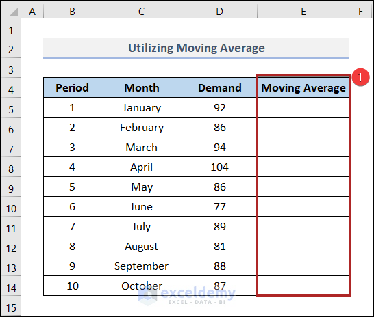
Method 5 – Utilizing Moving Average
The Moving Average is also referred to as the Rolling Average. Let’s use this feature to smooth our data. Follow the steps below:
- Add a new column named Moving Average.
- Go to the Data tab.
- Click on the Data Analysis tool in the Analysis group on the ribbon.
- The Data Analysis toolbox will open.
- From the Analysis Tools list, select Moving Average.
- Click OK.

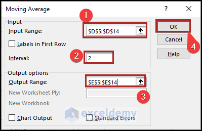
- In the Moving Average dialog box:
- Specify the input range by giving the reference of D5:D14 in the Input Range box.
- Change the Interval to 2.
- In the Output Range box, write down E5:E14.
- Click OK.
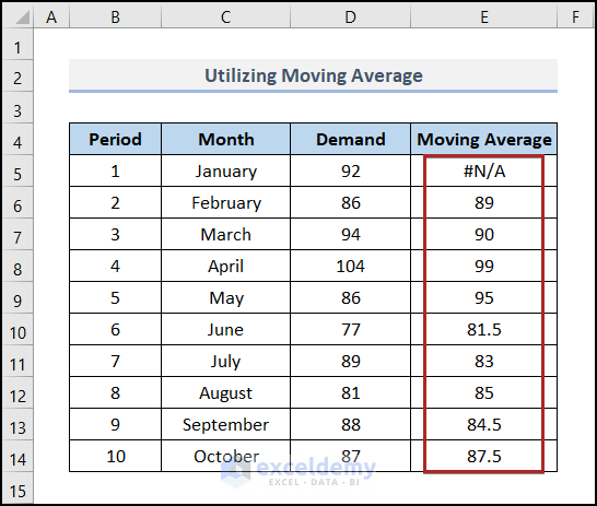
- The moving average result will appear in cells E5:E14.
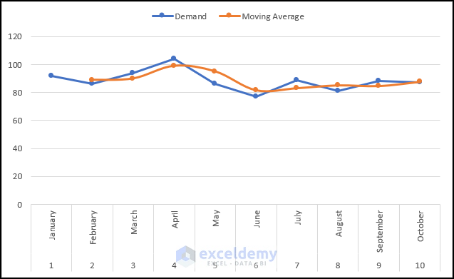
- Create a chart using the data range from B4:E14.
Method 6 – Inserting the TREND Function
- Open your Excel spreadsheet.
- Navigate to cell E5.
- Enter the following formula:
=TREND(D5:D14,B5:B14)
-
- This formula uses the TREND function to predict values based on historical data points. The range D5:D14 represents the known y-values (dependent variable), and B5:B14 represents the known x-values (independent variable).
- Press ENTER to calculate the predicted value.
- To visualize the trend, create a Line Chart using the data from your table, similar to Method 1.
Remember that the TREND function uses the least-squares method to find the best-fitting linear trend for your data points. It’s a powerful tool for predicting values based on existing data.
Read More: Perform Holt-Winters Exponential Smoothing in Excel
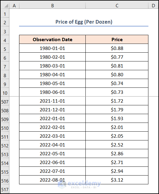
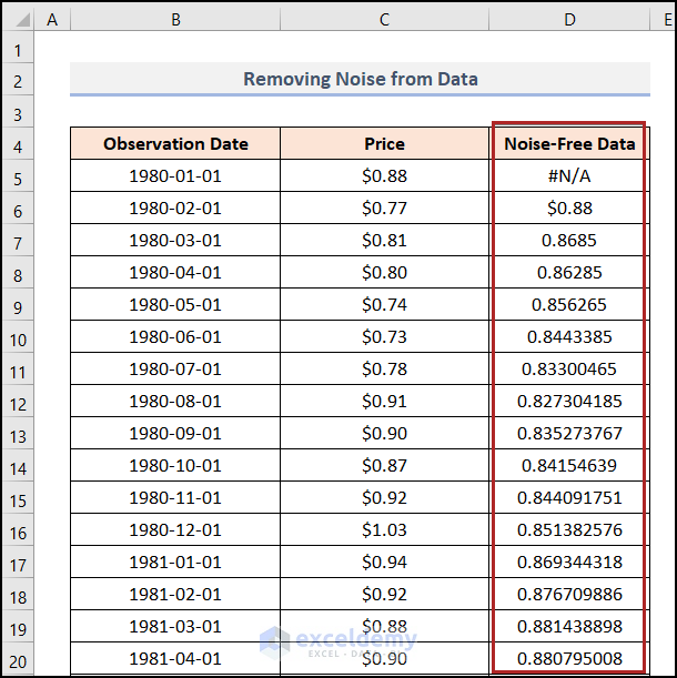
Removing Noise from Data
Let’s talk about how we can remove noise from data in Excel. We’ll use a list of Prices of Eggs (Per Dozen). This dataset contains 512 rows of information. There are prices from 1 Jan 1980 to 1 Aug 2022.
Using Exponential Smoothing
- Go to the Data tab.
- Click Data Analysis.
- Choose Exponential Smoothing under Analysis Tools.
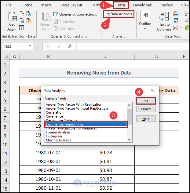
- In the Exponential Smoothing dialog box:
- Assign the input range (C4:C20).
- Set the output range (D4).
- Specify the damping factor (e.g., 0.9).
- Click OK.
- Excel will provide smoothed data in column D, which represents the noise-free data.
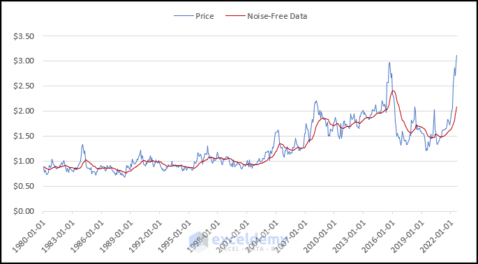
- Create a chart similar to Method 1 to visualize the trend.
Exponential Smoothing is an effective technique for removing noise and improving data clarity.
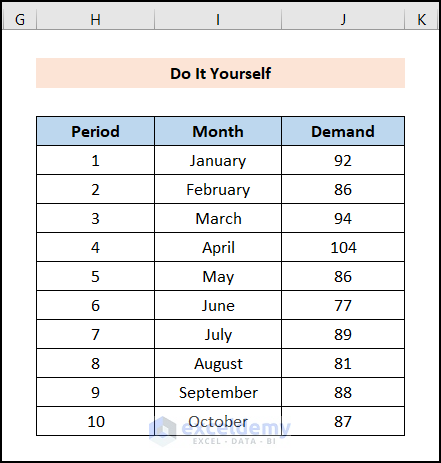
Practice Section
To practice on your own, you’ll find a Practice section on the right side of each sheet. Take some time to work through the exercises there.
Download Practice Workbook
You can download the practice workbook from here:
<< Go Back to Exponential Smoothing in Excel | Solver in Excel | Learn Excel
Get FREE Advanced Excel Exercises with Solutions!

I believe the exponential smoothing in Excel uses the simple (Brown’s) exponential method. There are other methods that can be more appropriate if the data exhibits trend or seasonality.
For the damping parameter (0-1), I suggest you calibrate this value by minimizing the sum of squared errors between the data and the smoothed values, to get the best result.
Hello MOHAMAD,
Thanks for your valuable comment. We always expect such positive feedback from our users.
As you said, here we’ve shown the simple exponential method only. The main reason for this is that we didn’t only want to emphasize exponential smoothing; rather we wanted to cover all conceivable methods of data smoothing. If so happened the article would then be extremely lengthy.
But you can find triple exponential smoothing widely called the Holt-Winters Exponential Smoothing on our website also. This method is very much adaptable for data with seasonal patterns.
Thanks Again.