
Image by Editor
Excel has been the go-to tool for data analysis for decades, but Power BI takes data visualization and business intelligence to the next level with its interactive dashboards and advanced analytical capabilities. Power BI enhances Excel insights by transforming static reports into interactive dashboards.
In this tutorial, we will show how to build a Power BI dashboard from Excel PivotTables and charts.
Step 1: Prepare Your Excel Workbook
Before importing, make sure your Excel file is clean and well-structured. Consider that you have sales data in Excel along with PivotTables and Charts.
Create PivotTable:
- Select the data range.
- Go to the Insert tab >> select PivotTable.
- In the location, select New Worksheet.
- Click OK.

- In the PivotTable Field list;
- Drag the Region to the Rows field.
- Drag Sales to the Values field.

- By following the same procedure, create multiple pivot tables.
- Sales by Category.
- Product Performance.
Create Chart:
- Select the Sales by Region pivot table.
- Go to the PivotTable Analyze tab >> select PivotChart.
- Select Pie chart.

- Sales by Category with chart.

Step 2: Import Excel into Power BI
Import Your Excel File:
- Open Power BI Desktop.
- Go to the Home tab >> from Data >> select Excel Workbook.
- Browse to the Excel file and select it.

- A Navigator window will appear, showing available tables, worksheets, and ranges.
- Select Your Data:
- Choose the worksheets or tables containing your data.
- You can select:
- SalesData.
- PivotTables.
- Charts- shows an empty column.
- Click Load to import the selected data.

Handling PivotTables:
- Important: Power BI doesn’t directly import PivotTable functionality, just the underlying data
- For best results, import the source data that powers your PivotTables rather than the PivotTables themselves.
Step 3: Clean and Transform Data (Power Query)
If you don’t have access to the source data, you need to transform the PivotTable data to make it usable.
Launch the Power Query Editor:
- Go to the Home tab >> select Transform Data.
- Open the Sales by Category table.
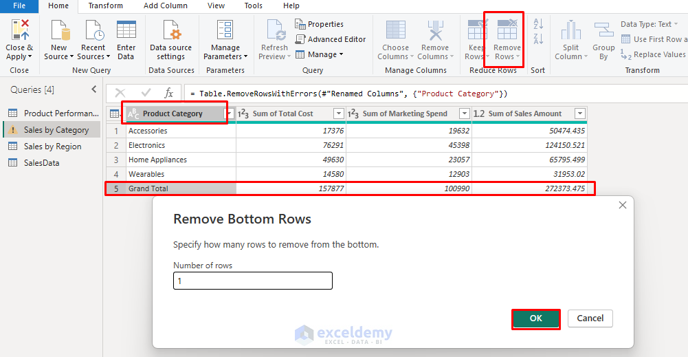
- Rename the column headers.
- Remove the Grand Total row using the Remove Bottom Rows option.
- Click Close & Apply when done.
Step 4: Recreating Your Excel PivotTables in Power BI
Power BI imports the pivot table as a table. You can get the visual, then create it in the report view.
Create a New Visual:
- Go to the Report view.
- Select a visualization type from the Visualizations pane that matches your Excel PivotTable (table, matrix, or chart).
Sales by Region:
- Select Matrix from the Visualization pane.
- Expand the SalesData table.
- Drag the Regions to the Row field.
- Drag the Sales Amount to the Values field.

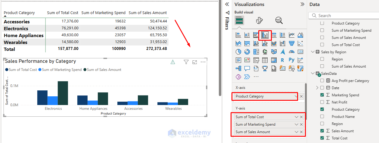
Sales by Category:
- Select Matrix from the Visualization pane.
- Expand the SalesData table.
- Drag Product Category to the Rows field.
- In the Values field;
- Drag the Total Cost.
- Drag the Marketing Spend.
- Drag the Sales Amount.

Apply Formatting:
- Use the Format pane to change colors, fonts, borders, etc.
- Add titles, legends, and labels as needed.
Step 5: Recreating Your Excel Charts in Power BI
Power BI doesn’t import any kind of chart. It shows an empty column instead of a chart. By following the chart settings, you will need to recreate Excel chart visuals using Power BI’s visualizations.

Select an Appropriate Chart Type
- Power BI offers all standard Excel chart types, plus many more.
- From the Visualizations pane, select a chart type (column, line, pie, etc.).
Configure the Chart
- Drag fields to:
- Axis: For category fields (X-axis).
- Values: For numeric data (Y-axis).
- Legend: For series differentiation.
Create PivotTable Charts:
You can manually create the charts by dragging values to the Axis and Values fields. As you have tables similar to PivotTable, you can directly create a chart from these tables.
- Select the Sales by Region table.
- Right-click >> select Copy >> select Copy visual.

- Paste the chart in the report views space.
- Select the table >> select Pie chart from the Visualization pane.
- You will get a similar PivotChart in Power BI.

- Similarly, create a chart for Sales Performance by Category.
Format Your Chart:
- Use the Format pane to adjust colors, titles, labels, and other properties.
- Add data labels, grid lines, and other elements as needed.
Step 6: Add Interactivity with Slicers and Filters
Power BI’s slicers make your dashboard dynamic.
- Go to the Visualizations pane >> select Slicer.
- Add the following fields:
- Region
- Date
- Product Category
- Product Name

These slicers apply filters across all visuals.
Tip: If your report contains visuals from multiple tables, you need to create a relationship between tables to apply filters across all visuals.
- Bookmarks:
- Create different views of your data.
- Show/hide visuals based on user selection.
- Drill-Through Pages
- Create detailed report pages that users can access by right-clicking data points.
- Tooltips
- Create custom tooltips that appear when hovering over data.
- Include additional context or even mini visualizations.
- Buttons and Actions
- Add navigation buttons.
- Create conditional formatting based on data values.
Step 7: Create Your Dashboard Layout
- Use Grid layout for alignment.
- Insert images for logos or graphics.
- Text boxes for instructions or context.
- Place KPIs (cards) on top.
- Total Sales
- Total Cost
- Total Marketing Spend
- Net Profit
- Place Charts are below for details.
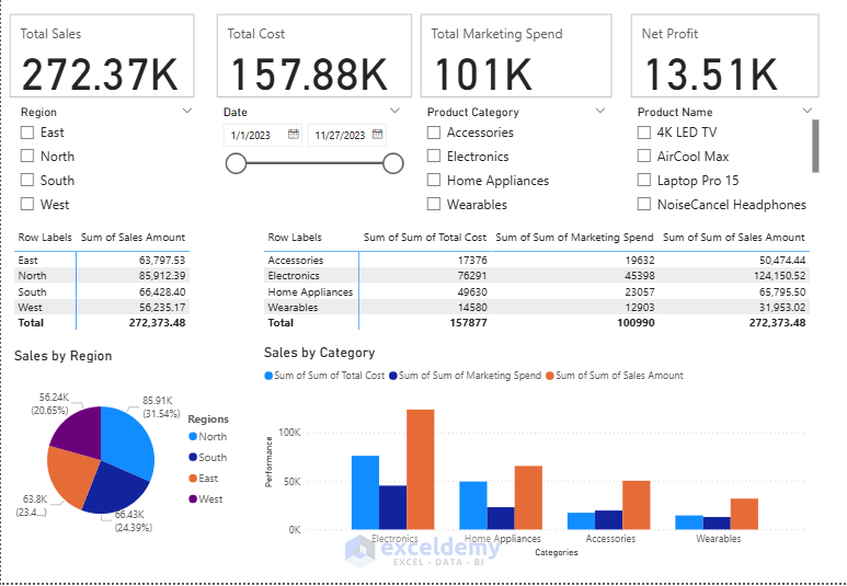
- Use the Format pane for slicers and tables.
- Use Themes for consistency.
- Go to the View tab >> select Themes.
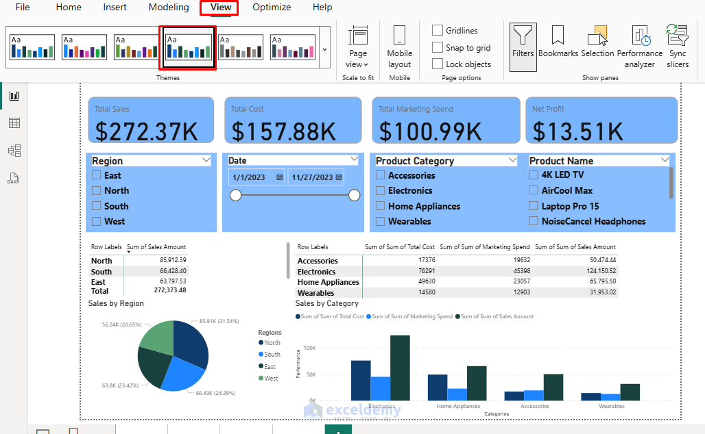
Test Interactivity:
- Select the North region from the slicer.
- The dashboard will only show the value of this region.

Step 8: Refresh and Publish
- Set up refresh if Excel is on OneDrive/SharePoint:
- Go to the Power BI Service >> select Dataset >> select Settings >> select Scheduled Refresh.
- Go to the Home tab >> select Publish to upload to Power BI Service.
Conclusion
By following this tutorial, you will learn how to import your Excel PivotTables, charts data into Power BI, recreate your PivotTables and Charts as interactive visualizations. This will help you to build a comprehensive dashboard that can be shared across your organization. Instead of manually updating charts and slicers, let Power BI automate and elevate your reporting.
Get FREE Advanced Excel Exercises with Solutions!

Please share Sales Dataset.
Hello Usman,
You can download it from here: How to Build a Power BI Dashboard from Excel PivotTables and Charts
Regards
ExcelDemy