
Image by Editor
Microsoft Excel is a powerful tool that is widely used for data collection, processing, and basic analysis. However, when it comes to advanced statistical modeling, machine learning, and custom visualizations, the R programming language stands out. Integrating Excel and R allows analysts and researchers to benefit from Excel’s accessibility and R’s analytical power.
In this tutorial, we will show how to integrate Excel and R to perform advanced statistical analysis and custom visualizations.
Part 1: Set Up the Environment
Install Required Tools:
Create a New R Script:
- Click File tab >> select New File >> select R Script.
- A blank white space will open in the top-left.
- This is where you will copy and paste your code.
- Save this file using:
- Click File >> select Save As… >> name it excel_integration.R

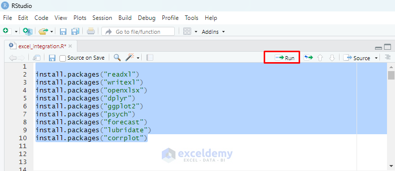
Install Required Packages:
- In the script file, paste the following code.
install.packages("readxl")
install.packages("writexl")
install.packages("openxlsx")
install.packages("dplyr")
install.packages("ggplot2")
install.packages("psych")
install.packages("forecast")
install.packages("lubridate")
install.packages("corrplot")
These packages are used for data import/export, manipulation, statistics, and graphics.
- Now select all the lines >> click Run (top-right of the script window) or press Ctrl + Enter.
- Wait until all packages are installed (you’ll see progress in the Console below).
Load the Libraries:
Below the install lines, paste the following code in the R script.
library(readxl)
library(writexl)
library(openxlsx)
library(dplyr)
library(ggplot2)
library(psych)
library(forecast)
library(lubridate)
library(corrplot)
- Select the block and press Run again.
Part 2: Import Excel Data into R
To import data from an Excel file, save the file, for example, SalesData.xlsx, in a known directory, and copy the file path.
#Load library
library(readxl)

# Load Excel file
file_path <- ""C:\Users\YourName\Documents\R\SalesData.xlsx"
data <- read_excel(file_path)

# View the data
print(data)
This loads the Excel sheet into R and prints it to verify correctness.

Part 3: Exploratory Data Analysis with R
Now that we have our data in R, let’s perform some exploratory analysis that would be tedious or impossible in Excel alone.
Descriptive Statistics
## Generate summary statistics
summary(data)  # Gives basic min, max, mean, quartiles

#Load library
library(psych)

# More detailed stats including skewness and kurtosis
describe(data)

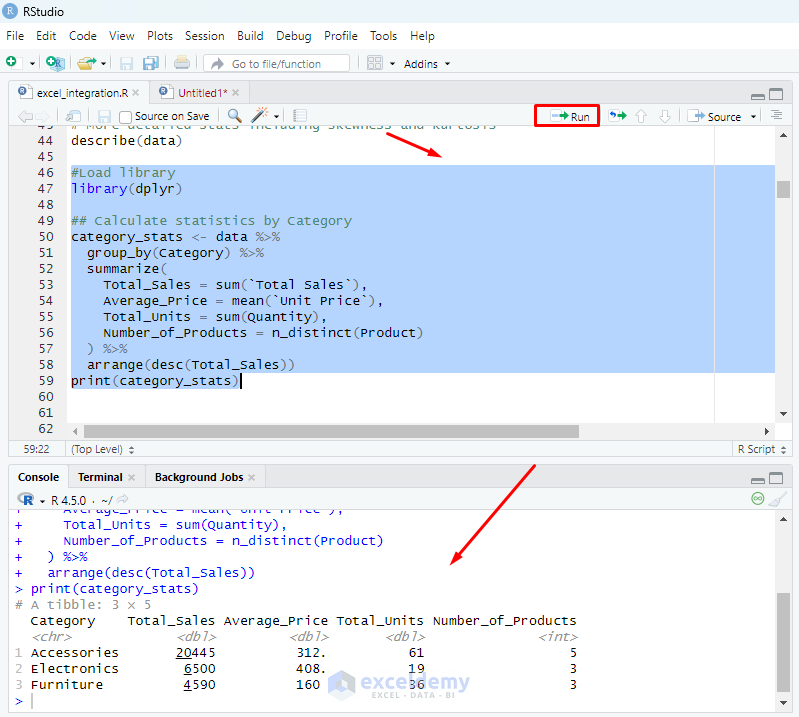
Group by Category and Sales
You can group the sales based on category.
#Load library
library(dplyr)

## Calculate statistics by Category
category_stats <- data %>%
  group_by(Category) %>%
  summarize(
    Total_Sales = sum(`Total Sales`),
    Average_Price = mean(`Unit Price`),
    Total_Units = sum(Quantity),
    Number_of_Products = n_distinct(Product)
  ) %>%
  arrange(desc(Total_Sales))
print(category_stats)
Part 4: Advanced Statistical Analysis
Linear Regression
You can evaluate how price and quantity affect total sales.
#Linear Regression
model <- lm(`Total Sales` ~ `Unit Price` + Quantity, data = data)
summary(model)
- Look for coefficients and p-values to interpret variable significance.
- The R-squared value tells you how well the model fits.

ANOVA – Analysis of Variance
You can test if sales differ across categories.
#ANOVA (Analysis of Variance)
anova_model <- aov(`Total Sales` ~ Category, data = data)
summary(anova_model)
- A significant p-value (< 0.05) indicates that at least one category is different.

Correlation Analysis and Visualization
Correlation analysis helps to identify relationships between numeric variables.
# Load required libraries
library(dplyr)
library(corrplot)

# Select numeric columns
numeric_data <- data %>%
  select(Quantity, `Unit Price`, `Total Sales`)

# Calculate correlation matrix
cor_matrix <- cor(numeric_data)
print(cor_matrix)

# Visualize the correlation matrix
corrplot(cor_matrix, method = "circle")
Explanation:
- It selects only the numeric columns.
- It calculates the pairwise correlations between them.
- Finally, it displays the correlation values and visualizes them using colored circles, where larger and darker circles indicate stronger relationships.

Time-Based Trend Analysis and Visualizations
Time-based trend analysis helps to understand how sales evolve. A time-based trend analysis is performed by aggregating total sales by month and product category. This allows visualization of seasonal patterns and category-specific performance trends.
# Load required libraries
library(lubridate)
library(ggplot2)

#Create a "Month" column to examine trends over time
data$Month <- floor_date(data$Date, "month")

#Summarize sales by month and category:
  monthly_sales <- data %>%
  group_by(Month, Category) %>%
  summarise(
    Monthly_Sales = sum(`Total Sales`),
    Units_Sold = sum(Quantity),
    .groups = "drop"
  ) %>%
  arrange(Month)
print(monthly_sales)

#Plot the monthly trend:
  ggplot(monthly_sales, aes(x = Month, y = Monthly_Sales, fill = Category)) +
  geom_col(position = "dodge") +
  labs(title = "Monthly Sales by Category", x = "Month", y = "Sales ($)") +
  theme_minimal()
The resulting bar chart shows monthly total sales separated by category, revealing fluctuations in sales volume over time and highlighting which categories perform better during different months.

Part 5: Custom Visualizations
Bar Chart for Sales by Category
A bar chart visualizes total sales by each category.
# Bar chart of sales by category
# Bar chart of sales by category
ggplot(category_stats, aes(x = reorder(Category, -Total_Sales), y = Total_Sales, fill = Category)) +
  geom_bar(stat = "identity") +
  geom_text(aes(label = paste0("$", Total_Sales)), vjust = -0.5) +
  theme_minimal() +
  labs(title = "Total Sales by Product Category",
       x = "Category",
       y = "Total Sales ($)") +
  scale_fill_brewer(palette = "Reds") +
  theme(legend.position = "none")

# Save the chart
ggsave("category_sales.png", width = 8, height = 5)

Scatter Plot with Regression Line
Shows the relationship between Price and Sales.
#Scatter Plot with Regression Line
ggplot(data, aes(x = `Unit Price`, y = `Total Sales`)) +
  geom_point(color = "blue") +
  geom_smooth(method = "lm", color = "red") +
  theme_minimal() +
  labs(title = "Price vs Total Sales")

Boxplot for Category Comparison
Compares the distribution of sales by category:
#Boxplot for Category Comparison
ggplot(data, aes(x = Category, y = `Total Sales`, fill = Category)) +
  geom_boxplot() +
  theme_minimal() +
  labs(title = "Sales Distribution by Category")

Part 6: Export Results to Excel
You can export the analysis and visualizations to Excel.
#load required libraries
library(openxlsx)

# Create workbook
wb <- createWorkbook()

addWorksheet(wb, "Summary")
writeData(wb, "Summary", describe(data))
saveWorkbook(wb, "C:\\Users\\hemay\\OneDrive\\Desktop\\Guiding Tech Media\\Images\\Excel and R integration\\summary_report.xlsx", overwrite = TRUE)

#To save a plot:
ggsave("C:\\Users\\hemay\\OneDrive\\Desktop\\Guiding Tech Media\\Images\\Excel and R integration\\price_vs_sales.png", width = 6, height = 4)

#To insert that plot into the Excel workbook:
insertImage(wb, "Summary", "C:\\Users\\hemay\\OneDrive\\Desktop\\Guiding Tech Media\\Images\\Excel and R integration\\price_vs_sales.png", startCol = 2, startRow = 15)
saveWorkbook(wb, "C:\\Users\\hemay\\OneDrive\\Desktop\\Guiding Tech Media\\Images\\Excel and R integration\\final_report.xlsx", overwrite = TRUE)

Conclusion
Integrating Excel and R gives you the best of both worlds: Excel’s familiar interface and R’s powerful analysis capabilities. This workflow supports comprehensive data exploration, modeling, and reporting with minimal effort. If you are familiar with Excel but new to R, this integration opens the door to advanced data science and visualization without leaving the comfort of familiar datasets.
Get FREE Advanced Excel Exercises with Solutions!
