
Excel is a go-to tool for many data analysts because of its simplicity and flexibility. But for large, repetitive, or complex data tasks, Python provides speed, automation, and advanced analytics. By integrating Excel with Python, you can leverage the best of both worlds.
In this tutorial, we will show how to combine Excel with Python for a powerful data science workflow.
Required Tools & Setup
Before combining Excel with Python, set up the environment. This ensures your workflow is smooth and productive from the very first step.
Prerequisites:
- Microsoft Excel: For initial data review and reporting.
- Python 3.x: The engine for your data science workflow.
- Python Libraries:
- pandas for data analysis.
- matplotlib for plotting.
- openpyxl (optional, for writing Excel files).
- numpy (numerics).
- matplotlib/seaborn for visualization.
Install Python Libraries:
pip install pandas matplotlib openpyxl
1. Read Data into Python
You can load your data into Python using pandas, which makes it easy to manipulate and analyze tabular data.
import pandas as pd

# Read data from Excel file
df = pd.read_excel('SalesData.xlsx')

# Preview data
print(df.head()) # Show the first 5 rows of the data
print(df.info()) # Show info about columns, datatypes, and missing values
- pd.read_csv() reads the Excel file into a pandas DataFrame.
- df.head() displays the first five rows, it is great for a quick check.
- df.info() shows the number of rows, columns, and datatypes.
You will see the first few rows of your sales data, along with a summary like:
   TransactionID       Date CustomerID ProductID ProductName     Category  Quantity  UnitPrice Region Channel SalesRep
0         100001 2024-01-02      C-100     P-101      Laptop  Electronics       2.0      800.0   East  Online    Smith
1         100002 2024-01-02      C-101     P-102     Printer  Electronics       1.0      200.0   West  Retail  Johnson
2         100003 2024-01-03      C-102     P-103       Mouse  Electronics       5.0       25.0  North  Online      Lee
3         100004 2024-01-04      C-103     P-104        Desk    Furniture       1.0      150.0  South  Retail    Brown
4         100005 2024-01-05      C-104     P-105     Monitor  Electronics       3.0      175.0    NaN  Online    Davis
<class 'pandas.core.frame.DataFrame'>
RangeIndex: 63 entries, 0 to 62
Data columns (total 11 columns):
 #   Column         Non-Null Count  Dtype
---  ------         --------------  -----
 0   TransactionID  63 non-null     int64
 1   Date           62 non-null     datetime64[ns]
 2   CustomerID     62 non-null     object
 3   ProductID      61 non-null     object
 4   ProductName    63 non-null     object
 5   Category       61 non-null     object
 6   Quantity       61 non-null     float64
 7   UnitPrice      62 non-null     float64
 8   Region         62 non-null     object
 9   Channel        62 non-null     object
 10  SalesRep       62 non-null     object
dtypes: datetime64[ns](1), float64(2), int64(1), object(7)
memory usage: 5.5+ KB
None
2. Data Cleaning & Transformation
Raw data is rarely ready for analysis. In this step, you’ll fix missing values, convert columns to the right types, and add new calculated fields.
Remove Duplicates:
# Remove Duplicates
df = df.drop_duplicates()
- Drops duplicate values.
Check for Missing Values:
# Print count of missing values per column
print(df.isnull().sum())
- It shows how many missing (NaN) values are in each column. If any are found, you can decide to drop or fill them.
#Output:
TransactionID    0
Date             1
CustomerID       1
ProductID        2
ProductName      0
Category         2
Quantity         2
UnitPrice        1
Region           1
Channel          1
SalesRep         1
dtype: int64
Convert Data Types:
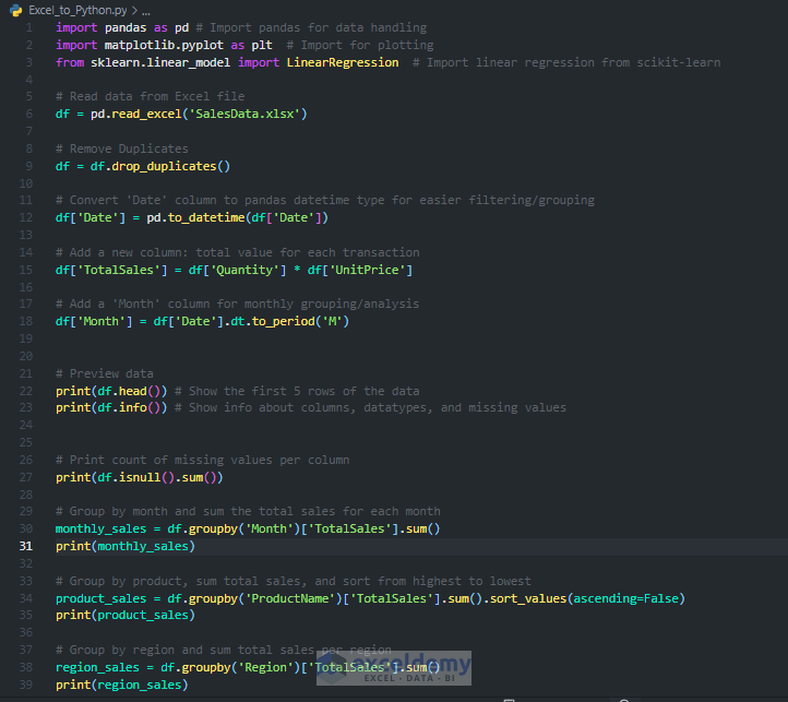
# Convert 'Date' column to pandas datetime type for easier filtering/grouping
df['Date'] = pd.to_datetime(df['Date'])
- It converts the Date column from text to pandas datetime format for easier filtering and grouping.
Create a ‘TotalSales’ Column:
# Add a new column: total value for each transaction
df['TotalSales'] = df['Quantity'] * df['UnitPrice']
- Adds a new column showing the total value for each transaction.
Extract Month for Time Series Analysis:
df['Month'] = df['Date'].dt.to_period('M')
- This creates a Month column to group and analyze sales by month.
- Now use print(df.head()) to preview the cleaned data.
#Ouput:
TransactionID       Date CustomerID ProductID ProductName     Category  ...  UnitPrice  Region Channel SalesRep TotalSales    Month
0         100001 2024-01-02      C-100     P-101      Laptop  Electronics  ...      800.0    East  Online    Smith     1600.0  2024-01
1         100002 2024-01-02      C-101     P-102     Printer  Electronics  ...      200.0    West  Retail  Johnson      200.0  2024-01
2         100003 2024-01-03      C-102     P-103       Mouse  Electronics  ...       25.0   North  Online      Lee      125.0  2024-01
3         100004 2024-01-04      C-103     P-104        Desk    Furniture  ...      150.0   South  Retail    Brown      150.0  2024-01
4         100005 2024-01-05      C-104     P-105     Monitor  Electronics  ...      175.0     NaN  Online    Davis      525.0  2024-01
3. Analyze Your Data
With a clean dataset, you can now generate insights that drive business value. This includes aggregating sales by month, product, and region.
Total Sales by Month:
# Group by month and sum the total sales for each month
monthly_sales = df.groupby('Month')['TotalSales'].sum()
print(monthly_sales)
- Groups the data by Month and sum the TotalSales for each month.
#Output:
Month
2024-01    9075.0
2024-02    9800.0
2024-03    9075.0
Freq: M, Name: TotalSales, dtype: float64
Top-Selling Products:
# Group by product, sum total sales, and sort from highest to lowest
product_sales = df.groupby('ProductName')['TotalSales'].sum().sort_values(ascending=False)
print(product_sales)
- Sums sales per product, then sorts them from most to least popular.
#Output:
ProductName
Laptop     15200.0
Monitor     3850.0
Printer     3200.0
Desk        2550.0
Chair       2325.0
Mouse       1125.0
Name: TotalSales, dtype: float64
Sales by Region:
# Group by region and sum total sales per region
region_sales = df.groupby('Region')['TotalSales'].sum()
print(region_sales)
- Aggregates total sales by each region.
#Output:
Region
East     6075.0
North    5925.0
South    8225.0
West     7500.0
4. Visualize Key Insights
Data is more powerful when visualized. Let’s create quick charts to help you and stakeholders grasp key trends at a glance.
4.1. Monthly Sales Trend
import matplotlib.pyplot as plt  # Import for plotting

# Create a bar chart of sales by month
monthly_sales.plot(
    kind='bar',
    title='Total Sales by Month',
    ylabel='Sales ($)',
    xlabel='Month'
)
plt.tight_layout()           # Avoid label overlap
plt.savefig('monthly_sales.png')  # Save the figure as a PNG file
plt.show()                  # Display the chart
- Plots monthly sales as a bar chart.
- plt.savefig saves the chart for reports
- A bar chart will show the sales change each month.

4.2. Sales by Region
# Pie chart of sales by region
region_sales.plot(
    kind='pie',
    autopct='%1.1f%%',
    title='Sales Distribution by Region'
)
plt.ylabel('')              # Remove default y-label
plt.tight_layout()
plt.savefig('region_sales.png')
plt.show()
- Pie chart of sales by region, great for management or marketing.

5. Advanced Analysis & Modeling
Beyond basic grouping and summaries, Python enables advanced statistical analysis, pivot tables, and even machine learning, all with just a few lines of code. Let’s dig deeper into the data to unlock even more insights.
5.1. Descriptive Statistics
Descriptive statistics give you a quick summary of your dataset, showing means, standard deviations, and quantiles for numeric columns.
# Show summary statistics for numeric columns (mean, std, min, max, quartiles, etc.)
print(df.describe())
- df.describe() quickly summarizes all numeric columns (like Quantity, UnitPrice, TotalSales).
#Output:
       TransactionID   Quantity   UnitPrice   TotalSales
count      61.000000  59.000000   60.000000    59.000000
mean   100030.180328   2.542373  262.083333   478.813559
std        17.497150   1.534905  277.339497   527.085627
min    100001.000000   1.000000   25.000000    75.000000
25%    100015.000000   1.000000   75.000000   162.500000
50%    100030.000000   2.000000  175.000000   300.000000
75%    100045.000000   3.000000  200.000000   525.000000
max    100060.000000   7.000000  800.000000  2400.000000
5.2. Pivot Tables in pandas
Pivot tables are powerful for interactive reporting in Excel, and pandas can do them too.
# Create a pivot table: sum TotalSales for each Region
pivot = df.pivot_table(index='Region', values='TotalSales', aggfunc='sum')
print(pivot)
- pivot_table() summarizes TotalSales for each region, similar to Excel’s Pivot Table.
#Output
        TotalSales
Region
East        6075.0
North       5925.0
South       8225.0
West        7500.0
5.3. Simple Machine Learning Example
Let’s see if we can predict total sales from just the quantity sold using a simple linear regression (machine learning) model.
from sklearn.linear_model import LinearRegression  # Import linear regression from scikit-learn

# Prepare features and target variable
X = df[['Quantity']]        # Feature: Quantity sold
y = df['TotalSales']        # Target: Total sales value

# Create and fit the regression model
model = LinearRegression()
model.fit(X, y)

# Print the regression coefficient (slope)
print('Coefficient:', model.coef_)
# Print the intercept (base value when Quantity=0)
print('Intercept:', model.intercept_)
- Imports LinearRegression from scikit-learn.
- Uses Quantity to predict TotalSales.
- Fits the model and prints the coefficient (how much sales increase per extra unit sold).
#Output:
Coefficient: [-37.65294772]
Intercept: 596.8483500185391
6. Export Cleaned/Analyzed Data Back to Excel
After cleaning, analyzing, and modeling your data, you can export your summary tables and insights to a multi-sheet Excel file. This keeps all your key findings together and ready for review in Excel.
# Export summary and advanced analysis tables to a multi-sheet Excel file

with pd.ExcelWriter('sales_summary.xlsx') as writer:
    # Monthly summary
    monthly_sales.to_frame().to_excel(writer, sheet_name='Monthly Sales')
    # Product summary
    product_sales.to_frame().to_excel(writer, sheet_name='Product Sales')
    # Region summary
    region_sales.to_frame().to_excel(writer, sheet_name='Region Sales')
    # Pivot table (total sales by region)
    pivot.to_excel(writer, sheet_name='Pivot Table')
    # Optionally, you can export descriptive statistics
    df.describe().to_excel(writer, sheet_name='Descriptive Stats')
- Context Manager (with … as writer): Ensures the Excel file is properly saved and closed after writing.
- .to_excel() for Each Table: Saves each DataFrame or summary to its own sheet for easy access.
- Custom Sheet Names: Each sheet is named for clarity, matching your analysis steps.

- Open sales_summary.xlsx in Excel.
- You’ll see separate sheets for Monthly Sales, Product Sales, Region Sales, your Pivot Table, and Descriptive Statistics.

7. Automate & Scale Your Workflow
By using Python, you can automate recurring reports or analyses. Next time you get a new Excel file, just replace the file and re-run your script; all analysis and reports are refreshed instantly.
- Keep all analysis code in one Python file.
- To update your reports, replace the CSV and run:
python Excel_to_Python.py
- For even more power, you can schedule this as a weekly/monthly task.
Conclusion
By combining Excel’s intuitive data entry and reporting with Python’s data science power, you can process and analyze large, messy datasets efficiently. It automates repetitive reporting tasks. Unlocks machine learning and advanced visualization. You don’t need to become a Python expert overnight. Start with one simple task; once that works, add one more step. Before you know it, you’ll be automating complex reports.
Get FREE Advanced Excel Exercises with Solutions!
