
In this tutorial, we will show how to build advanced Excel dashboards using Power Query, Power Pivot, and VBA.
Let’s create a sales dashboard for a fictional retail company that sells products across multiple regions. We’ll work with a dataset containing the following tables.
- Sales – Contains transaction data.
- Products – Product details and categories.
- Customers – Customer information.
- Regions – Geographic information.
Step 1: Use Power Query for Data Import
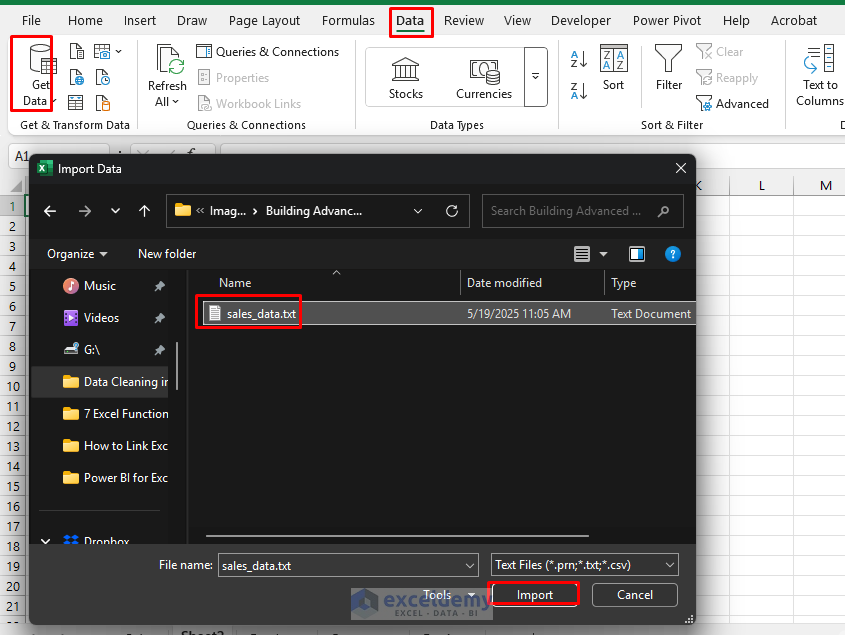
Import Data:
- Go to the Data tab >> select Get Data >> select From File >> select From Text/CSV.
- Navigate to your sales_data.txt file >> click Import.
- When the Power Query Editor opens, review the data and make these transformations:
- Change data types.
- Right-click any column >> select Change Data Type >> select Data Type.
- OrderDate to Date.
- Quantity to Whole Number.
- UnitPrice and Discount to Decimal Number.
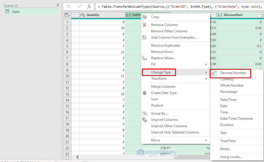
- Remove any duplicate rows using Remove Duplicates.
- Repeat the import process for Products.csv, Customers.csv, and Dates.csv, applying appropriate data type transformations.
Transform Data with Power Query:
Let’s enhance our sales data by performing tasks using Power Query.
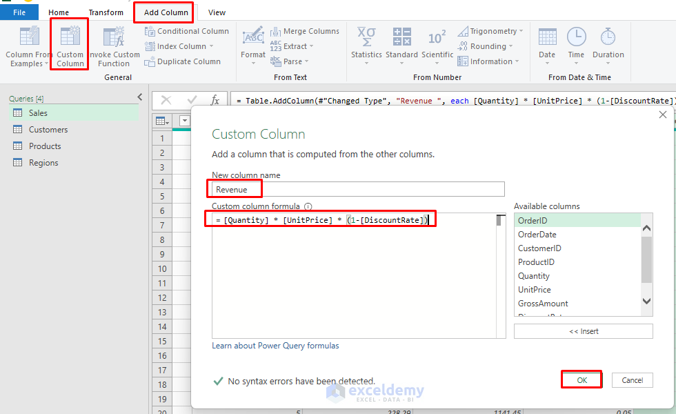
Add Calculated Columns:
- In Power Query Editor, select Sales data.
- Go to the Add Column tab >> select Custom Column.
- Name it: Revenue.
- Insert the following formula.
= [Quantity] * [UnitPrice] * (1-[DiscountRate])
- Click OK.
- Add another custom column.
- Name it: Profit.
- Insert the following formula.
Profit = [Revenue] - ([Quantity] * [UnitCost])
- Click OK.
- We will need to merge with the Products table to get the Cost.
Merge Tables for Additional Insights:
- In Power Query Editor with Sales data open.
- Go to the Home tab >> click Merge Queries from the ribbon.
- Select ProductID from the Sales table.
- Select the Products table and join on ProductID.
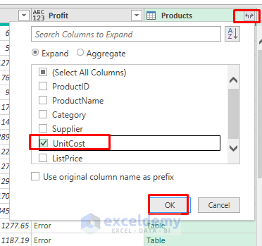
- Click OK.
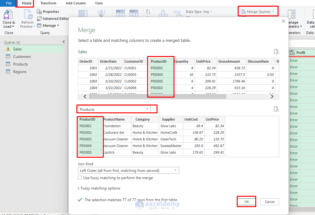
- Click on the Expand Table option >> select only the UnitCost column to bring in.
- Click OK.
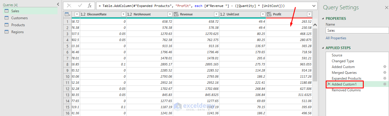
- Now, drag the Profit column under the Expanded Products step.
- You will get the profit amount.
- Once you are done with data transformation.
- Click Close & Load To…
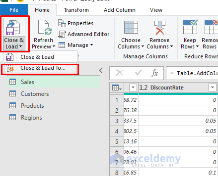
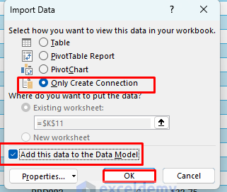
- In the Import Data box;
- Select Only Create Connection.
- Select Add this data to Data Model for all four tables.
- Click OK.
Step 2: Build the Data Model with Power Pivot
Open Power Pivot:
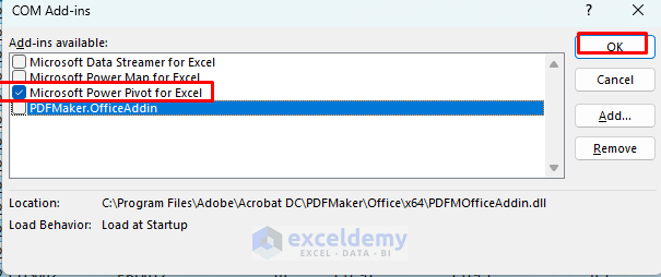
If Power Pivot is not available in the ribbon, then enable it.
- Go to the File tab >> select Options >> select Add-ins.
- In Manage box >> select COM Add-ins >> select Go.
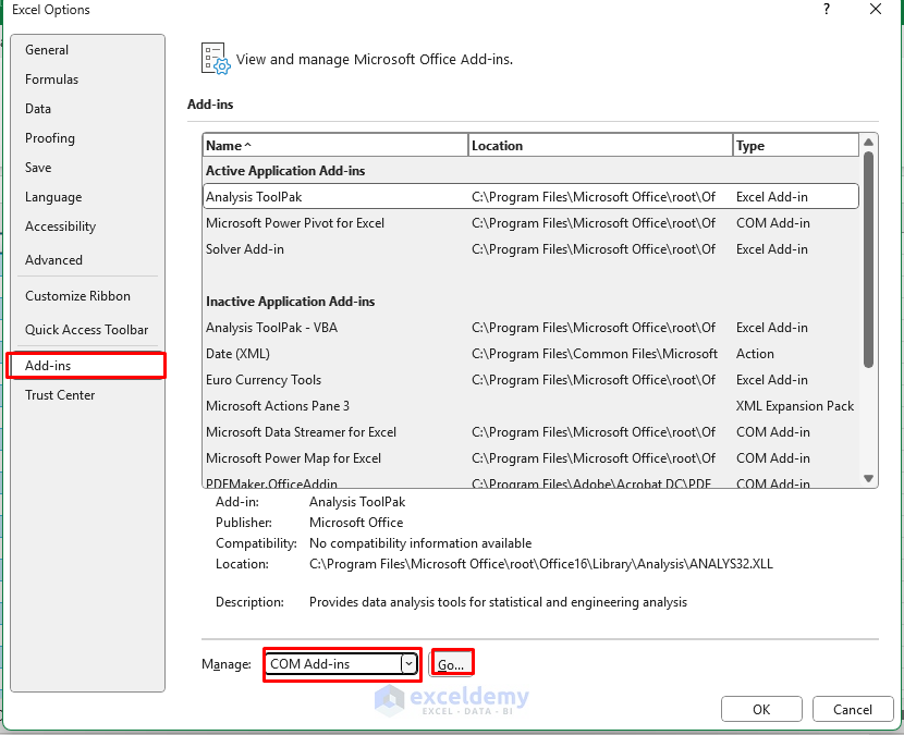
- Select Microsoft Power Pivot for Excel.
- Click OK.
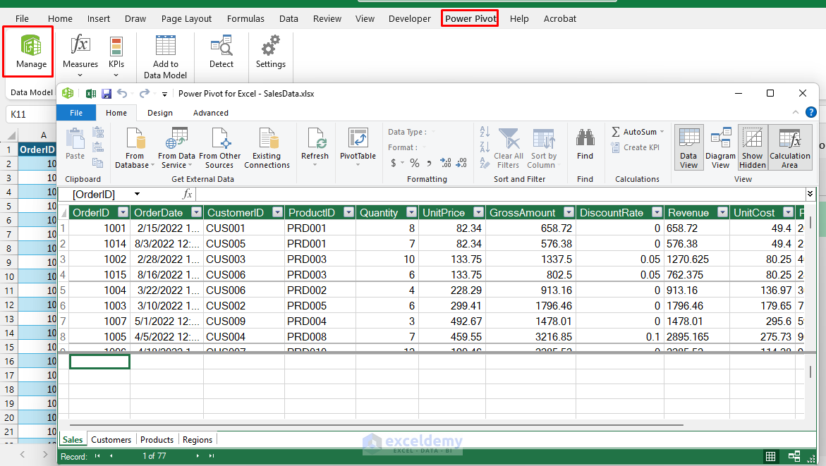
- Go to the Power Pivot tab >> select Manage.
- It will open the imported data from Power Query.
Create Relationships:
- Go to the Home tab >> select Diagram View.
- Drag Sales[ProductID] to Products[ProductID].
- Drag Sales[CustomerID] to Customers[CustomerID].
- Drag Customers[RegionID] to Regions[RegionID].
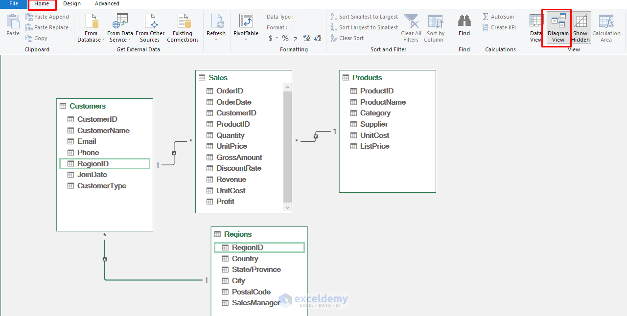
- Or go to the Design tab >> select Create Relationship.
- Then select matching columns.
Create Calculated Measures:
- In Power Pivot, click on the Sales table.
- Go to the Home tab >> select Measures >> click New Measure.
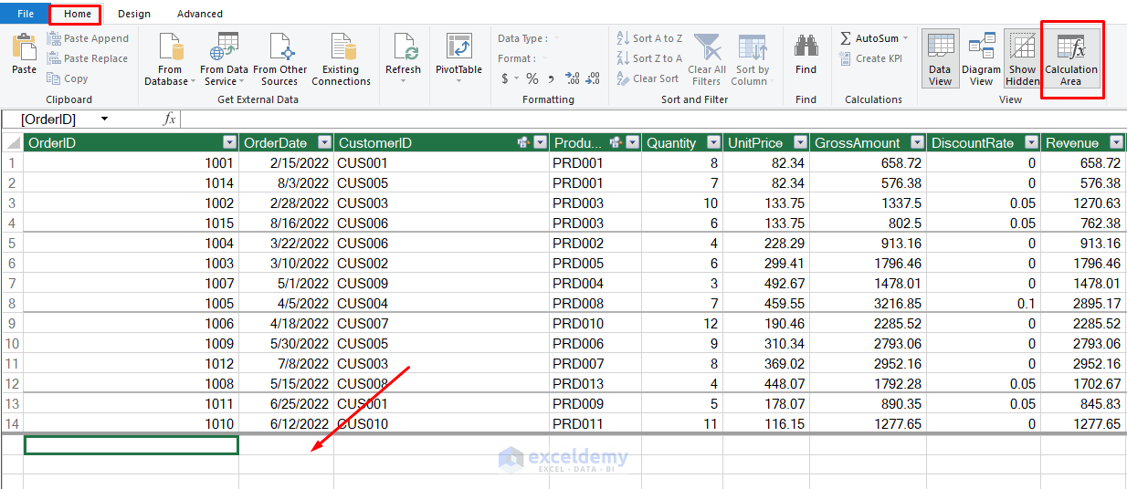
- Or, go to the Home tab >> select Calculation Area.
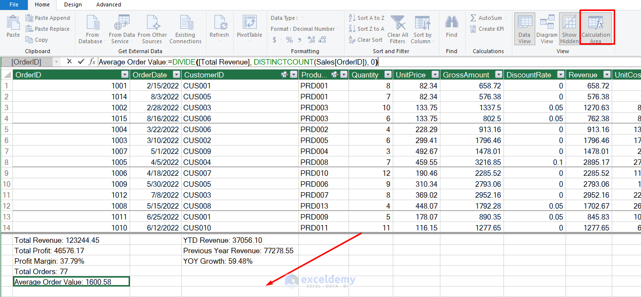
- Insert the calculated measures there:
- Total Revenue:
Total Revenue := SUM(Sales[Revenue])
- Total Profit:
Total Profit := SUM(Sales[Profit])
- Profit Margin:
Profit Margin := DIVIDE([Total Profit], [Total Revenue], 0)
- Total orders:
Total Orders:=COUNTA(Sales[OrderID])
- Average Order Value:
Average Order Value:=DIVIDE([Total Revenue], DISTINCTCOUNT(Sales[OrderID]), 0)
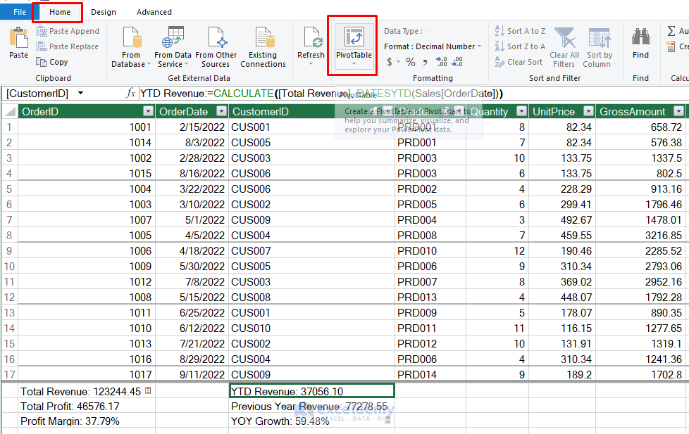
- YTD Revenue:
YTD Revenue:=CALCULATE([Total Revenue], DATESYTD(Sales[OrderDate]))
- Previous Year Revenue:
Previous Year Revenue:=CALCULATE([Total Revenue], SAMEPERIODLASTYEAR(Sales[OrderDate]))
- YOY Growth:
YOY Growth := DIVIDE([Total Revenue] - [Previous Year Revenue], [Previous Year Revenue], 0)
Step 3: Use Pivot Table to Create Dashboard Components
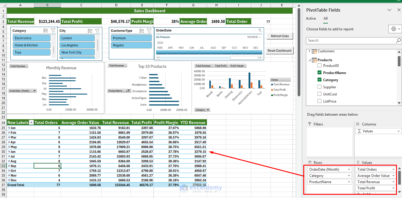
Create PivotTables
- Go to the Insert tab >> select PivotTable >> select From Data Model.
- In Power Pivot, go to the Home tab >> select Pivot Table.
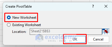
- In the Create PivotTable box;
- Select New Worksheet.
- Click OK.
- Create separate PivotTables for Total Revenue, Total Profit, Profit Margin, and Growth.
- Place these in cells that align with your dashboard structure.
- Format as currency or percentage as appropriate.
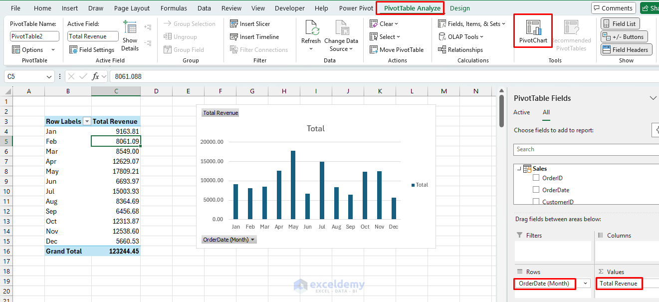
Charts and Visualizations
Revenue Trend Chart:
- Create a PivotTable from the Data Model.
- Rows: Sales[OrderDate[Month]]
- Values: Total Revenue
- Go to the PivotTable Analyze tab >> select Clustered Column Chart.
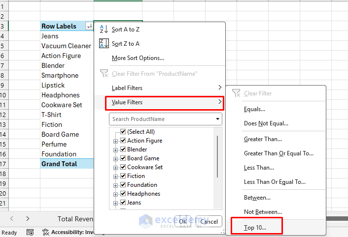
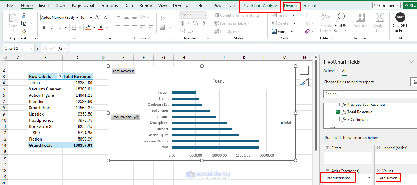
Top Products Chart:
- Create a PivotTable from the Data Model.
- Rows: Products[ProductName]
- Values: Total Revenue
- Sort by Total Revenue descending, filter to top 10.
- Go to the PivotTable Analyze tab >> select Clustered Bar Chart.
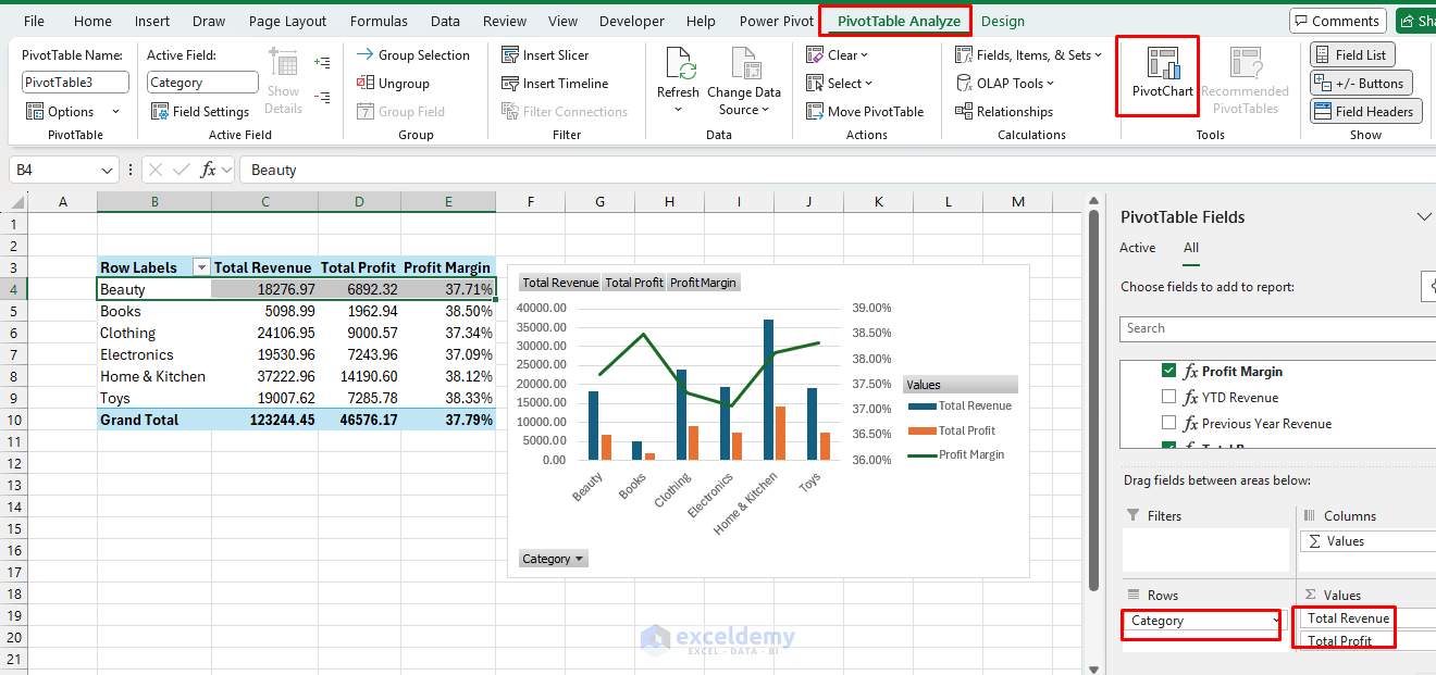
Category Performance:
- Create a PivotTable from the Data Model.
- Rows: Products[Category]
- Values: Total Revenue, Total Profit, Profit Margin.
- Go to the PivotTable Analyze tab >> select Combo >> select Clustered Column – Line on Secondary Axis.
Step 4: Insert Interactive Elements
Insert Slicers and Timeline:
Create Product and Region Slicers:
- Go to the PivotAnalyze tab >> select Insert Slicer.
- Select Products[Category] and Customers[Region].
- Click OK.
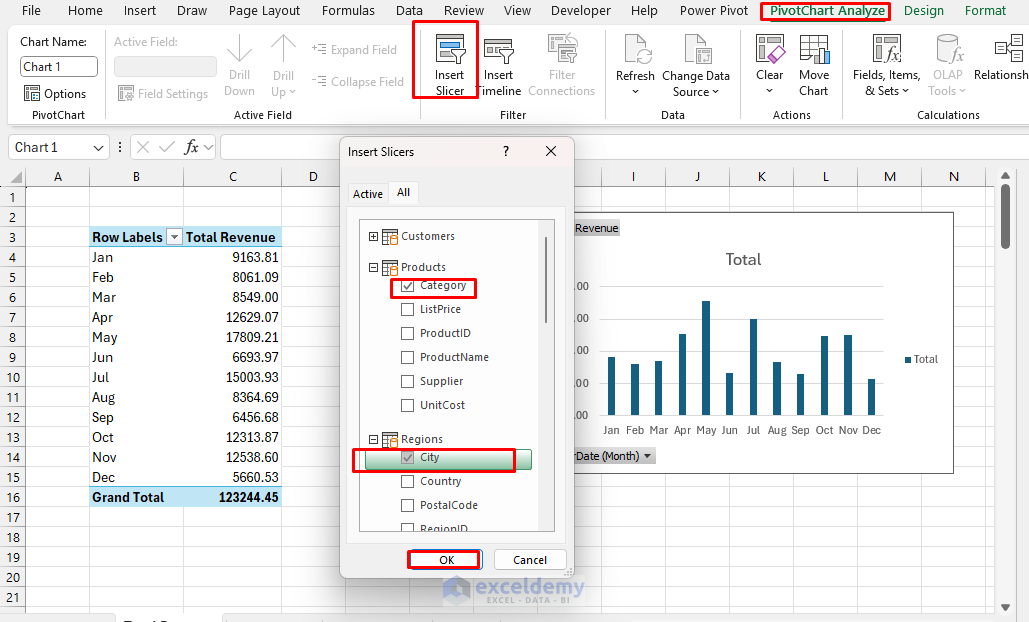
- Format them to match your dashboard design.
Add a Timeline for Date Filtering:
- Go to the PivotAnalyze tab >> select Insert Slicer.
- Select Sales[OrderDate].
- Click OK.
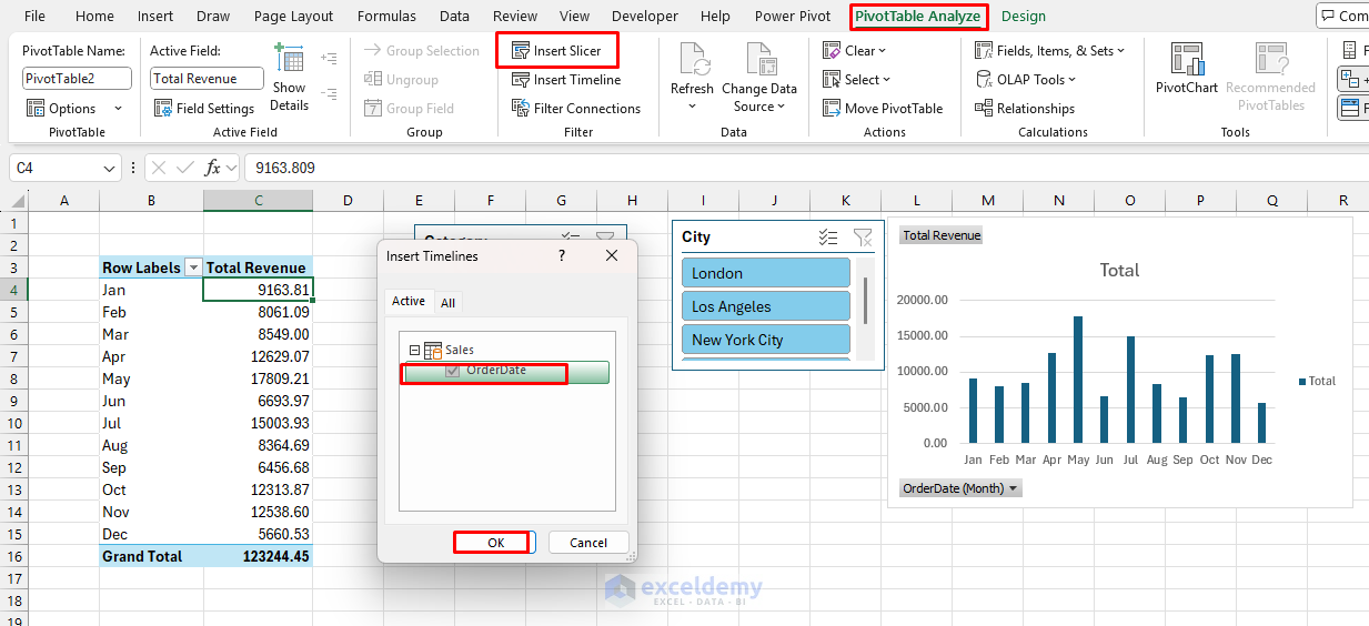
- Position above your charts.
- Format to match your dashboard style.
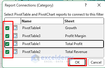
Connect All Slicers to PivotTables:
- Right-click each slicer >> select Report Connections.
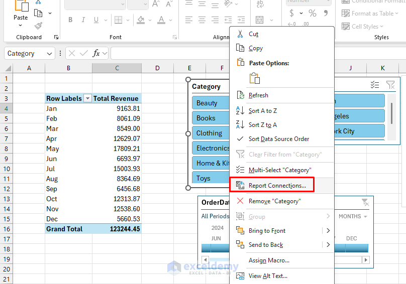
- Check all PivotTables to ensure filters apply globally.
- Click OK.
Step 5: Automate and Enhance Interactivity with VBA
We’ll use VBA to make the dashboard dynamic and easier to navigate.
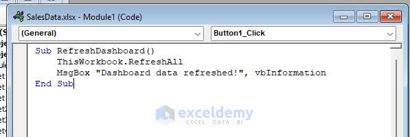
Example 1: Refresh Data Button
- Go to the Developer tab >> select Insert >> select Button.
- Rename the button to Refresh Data.
- Right-click button >> select Assign Macro >> select New.
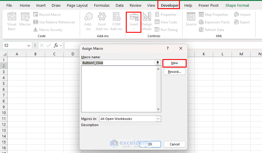
- Copy-paste the following code.
VBA Code:
Sub RefreshDashboard()
    ThisWorkbook.RefreshAll
    MsgBox "Dashboard data refreshed!", vbInformation
End Sub
Example 2: Dashboard Reset Button
- Go to the Developer tab >> select Insert >> select Button.
- Rename the button to Reset Dashboard.
- Right-click button >> select Assign Macro >> select New.
- Copy-paste the following code.
VBA Code:
Sub ResetDashboardFilter()
    Dim ws As Worksheet
    Dim slicer As slicerCache
    Dim pivotTable As pivotTable

    ' Clear all slicer caches
    For Each slicer In ActiveWorkbook.SlicerCaches
        slicer.ClearAllFilters
    Next slicer

    ' Reset any timelines (already using SlicerCaches)
    For Each slicer In ActiveWorkbook.SlicerCaches
        If slicer.SourceType = xlTimeline Then
            slicer.ClearAllFilters
        End If
    Next slicer

    ' Refresh pivot tables
    For Each ws In ActiveWorkbook.Worksheets
        For Each pivotTable In ws.PivotTables
            pivotTable.RefreshTable
        Next pivotTable
    Next ws

    MsgBox "Dashboard filters have been reset!", vbInformation, "Reset Filters"
End Sub
Step 6: Create the Dashboard Layout
Create a new worksheet named Dashboard.
- Set Up the Dashboard Structure:
- Dashboard title and date filter.
- KPI section (Revenue, Profit, Margin, Growth).
- Charts (Sales Trend, Top Products, Regional Performance).
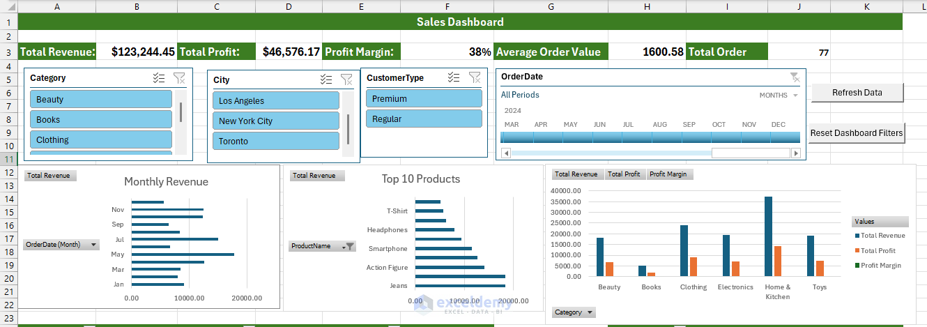
- You can create a summary table for the Data tables and a detailed analysis.
- Apply consistent formatting:
- Use a consistent color scheme throughout.
- Align all elements properly.
- Add borders to separate dashboard sections.
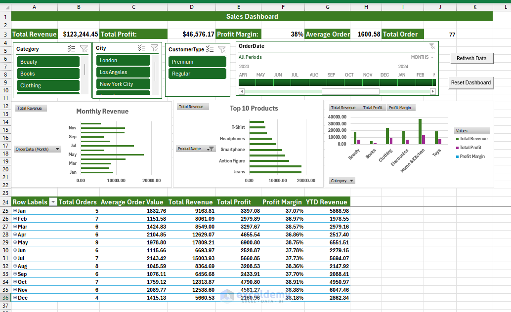
- Add Conditional Formatting to Data Tables:
- Use data bars and color scales to highlight important values.
- Add KPI icons to show performance against targets.
- Create an Instruction Sheet:
- Create a new worksheet named Instructions.
- Add text explaining how to use the dashboard.
- Include information on data refresh, interactivity, and available features.
Step 7: Test and Troubleshoot
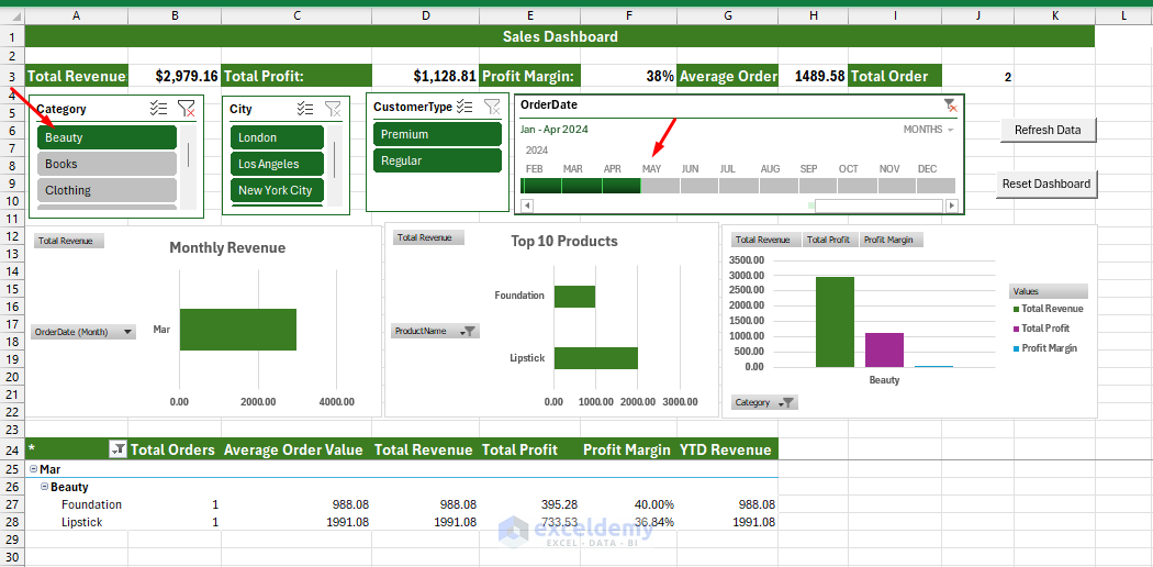
Test All Interactive Elements:
- Ensure slicers filter all relevant visualizations.
- Verify that buttons execute macros correctly.
- Check the timeline controls to ensure data ranges are properly.
- Select Beauty from the Category slicer.
- Select Jan-April 2024 from Timeline.
- This will update the entire dashboard based on the filter selection.
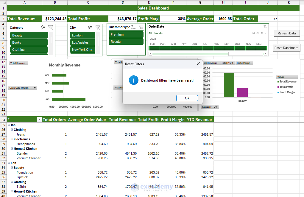
Test Reset Data Filter:
- Click on the Reset Dashboard.
- A message will pop up, “Dashboard filters have been reset”.
- Click OK.
- All filters will be removed, and you will get a fresh dashboard.
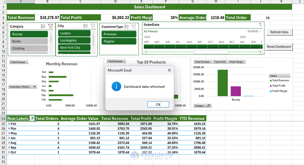
Test Data Refresh:
- Modify the source data.
- Click Refresh Data.
- Ensure all calculations update correctly.
- Check for any broken connections or formulas.
Download Practice Workbook
Conclusion
Following all the steps, you can build an advanced Excel dashboard that will work as a powerful business intelligence tool. This dashboard leverages the power of Power Query for data preparation, Power Pivot for modeling and analysis, and VBA for enhanced interactivity. This dashboard provides a user-friendly interface for analyzing sales performance across products, regions, and time periods. Experiment with the dashboard and add more advanced functionalities.
Get FREE Advanced Excel Exercises with Solutions!

Dear Shamima Sultana,
I recently read your article on building advanced Excel dashboards using Power Query, Power Pivot, and VBA. I found it very insightful and would love to explore the concepts more deeply.
Would it be possible for you to share the sample dataset used in the tutorial (Sales, Products, Customers, and Regions)? I would like to follow along and practice building a similar dashboard for learning purposes.
Thank you in advance for your time and generosity.
Best regards,
Diva Aliyah
[email protected]
Hello Diva,
Thank you for your thoughtful comment and your interest in the advanced Excel dashboard tutorial. I’m glad you found it insightful!
To make your learning experience easier, I’ve attached a downloadable file with the sample dataset (Sales, Products, Customers, and Regions) as well as the complete dashboard solution. You can use this file to follow along step by step and practice building your own dashboard.
If you have any questions or need further assistance, please feel free to reach out. Happy learning!
Regards
ExcelDemy
Good morning Shamima Sultana, I really appreciate your tutorials, unfortunately there is never a file with the solution available to download for practice. Many websites of your colleagues include the file for those like me who would like to try the features of the tutorials. Thank you and good work.
Hello Flavio,
Good morning! Thank you so much for your kind words and for sharing your feedback!
I understand how useful it is to have a practice file to follow along. I’m happy to let you know that I’ve now attached a downloadable file containing both the sample dataset and the dashboard solution. You can use this file to practice and explore all the features demonstrated in the tutorial.
Thank you again for your support and encouragement. If you have any further questions or need more resources, feel free to let me know!
Regards
ExcelDemy
Thanks for this great tutorial. I am running into a blocker. When i try to connect my slicers to my pivot table containing the ‘YOY Growth’ figure, I get the error: ‘Calculation error in measure ‘sales_data'[Previous Year Revenue]: Function ‘SAMEPERIODLASTYEAR’ only works with contiguous date selections.
Hello Fiona,
Thanks for your feedback and for trying out the tutorial! This error usually occurs when the slicer is filtering a non-contiguous date range (for example, selecting individual months or years instead of a continuous period). The SAMEPERIODLASTYEAR() function in Power Pivot requires a continuous, properly related Date table.
Please check the following points:
1. Make sure you are using a dedicated Calendar/Date table (not the date column directly from the sales table).
2. Ensure the Date table is marked as a Date Table in Power Pivot.
3. Confirm that the slicer is connected to the Date table, not the fact table.
4. When using the slicer, select a continuous range (e.g., a full year or consecutive months).
Once these conditions are met, the YOY Growth measure should work correctly with the slicer. Let us know if the issue persists!
Regards,
ExcelDemy