
Image by Editor
A well-formatted professional document speaks before the reader even dives into the content. Creating professional-looking documents in Microsoft Word doesn’t require advanced design skills; you just need to know a few strategic layout techniques.
Whether you’re preparing a business report, resume, or proposal, these five layout tricks will instantly make your Microsoft Documents look professional.
1. Use Consistent Margins and Spacing
Proper margins and spaces create a clean, readable layout. It also prevents visual clutter. Professional documents maintain visual harmony through consistent spacing.
Steps to implement:
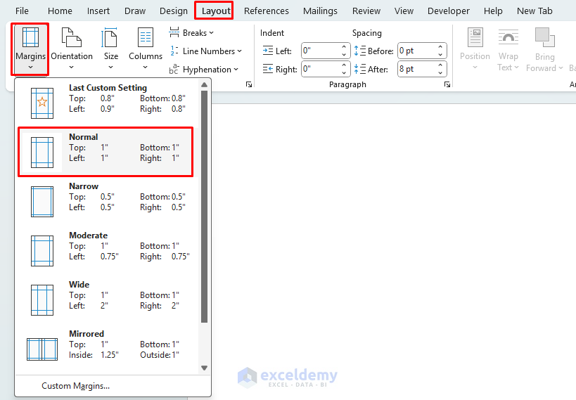
Set Margins:
- Set standard margins (1-inch on all sides is the professional default).
- Go to the Layout tab >> select Margins >> select Normal (1 inch on all sides) or customize as needed.
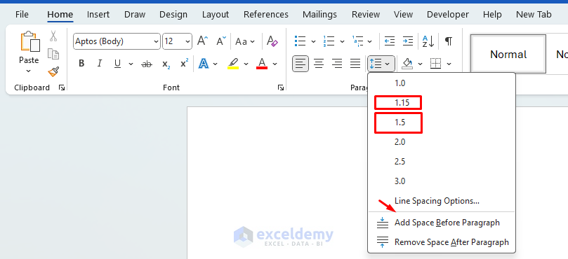
Use Proper Spacing:
- Go to the Home tab >> click Line and Paragraph Spacing >> select 1.15 or 1.5 for better readability.
- Go to the Home tab >> click Line and Paragraph Spacing >> select Line Spacing Options.
- Use consistent paragraph spacing of 8pt before and 8pt after paragraphs.

- Use Ctrl + Enter to insert clean page breaks instead of multiple Enter.
- Add spacing between sections, and use consistent indentation.
Pro tip: For a clean, balanced look, avoid using the Enter key multiple times to create space. Instead, use proper paragraph spacing settings to maintain consistency throughout your document.
2. Master Section Breaks and Headers/Footers
Professional documents often require different formatting in various sections. Section breaks let us apply different formatting (e.g., headers, orientation) to different parts of the document.It will give you precise control over your document structure.
Steps to implement:
Insert Section Breaks:
- Place your cursor where the new section should begin.
- Go to Layout tab >> from Breaks >> select Section Breaks >> select Next Page.

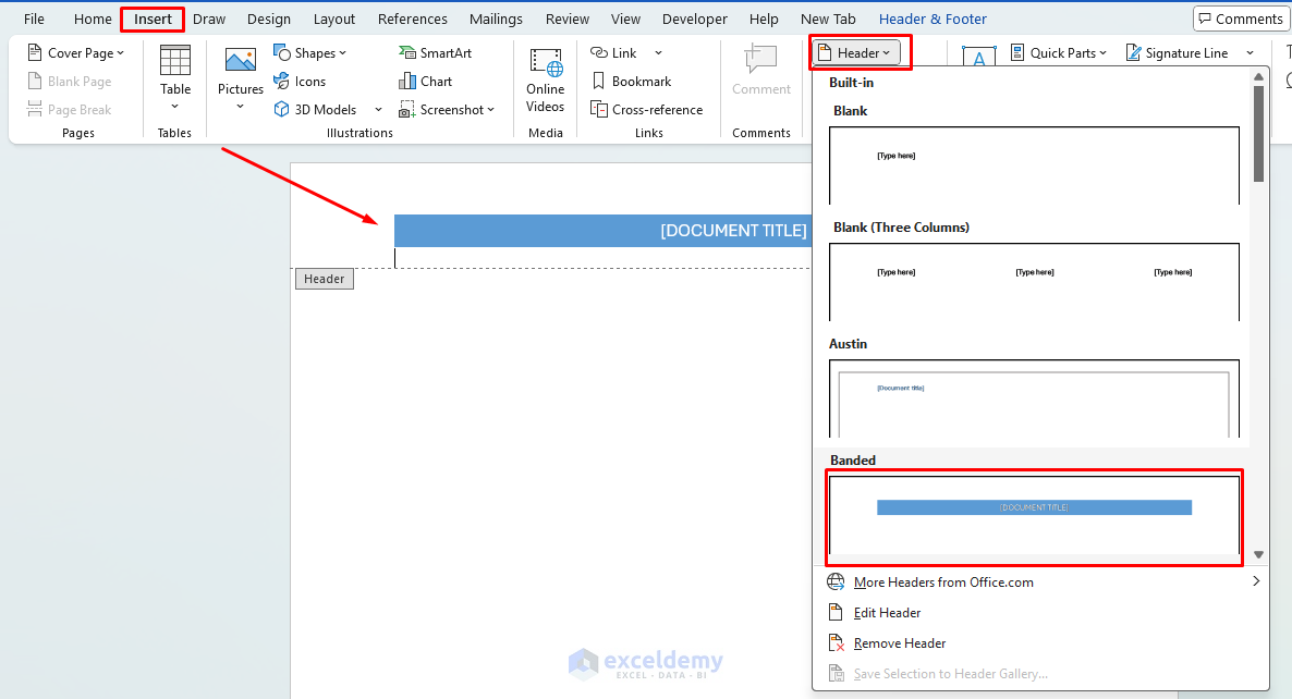
Insert Header/Footer:
- Now you can create professional headers and footers with page numbers, document title, and date.
- Go to the Insert tab >> select Header or Footer and choose a built-in template or create your own.
- Use different headers/footers for different sections by breaking the link between sections.
- For longer documents, include section numbers in headers.
- Add subtle divider lines in headers/footers using the border tool.
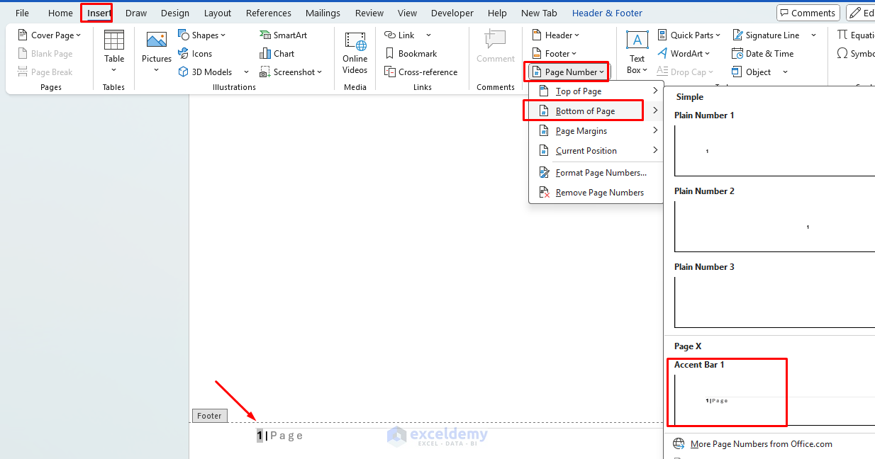
Insert Page Number:
- Go to the Insert tab >> select Page Number, and format as needed.
- Check the Different First Page if you want to skip the header/footer on the cover page.
Pro tip: Create a customized footer with your name or company information, page numbers, and date to instantly make any document look more polished and professional. Press Ctrl + Shift + 8 to show non-printing characters and avoid extra blank lines.
3. Implement a Consistent, Limited Typography System
Professional documents rely on purposeful, minimal font choices to ensure readability and consistency.
Steps to implement:
Consistent Typography:
- Limit Font Usage:
- Choose a maximum of 2–3 fonts for your entire document.
- Example: Calibri (sans-serif) for headings, Georgia (serif) for body text.
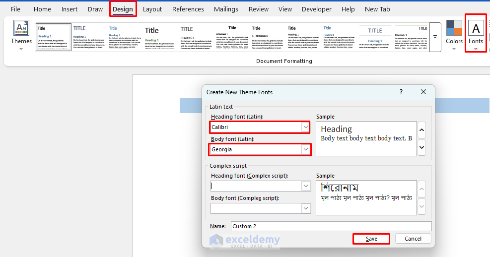
- Set Default Fonts:
- Go to the Design tab >> select Fonts >> select Customize Fonts.
- Choose your desired Heading and Body fonts.
- Save the custom font set for future use.
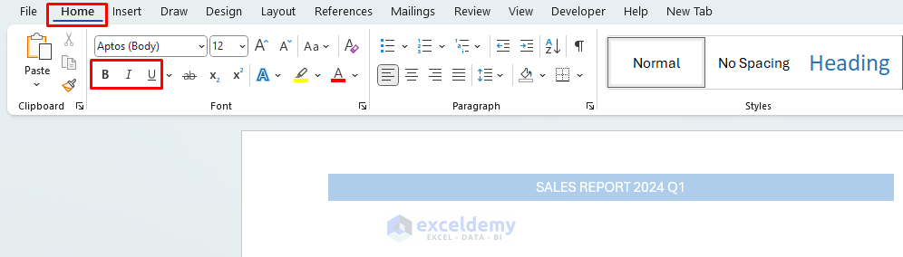
Use Emphasis Carefully:
- Apply bold or italics only for highlighting important information.
- Avoid underlining unless required for links or specific formatting rules.
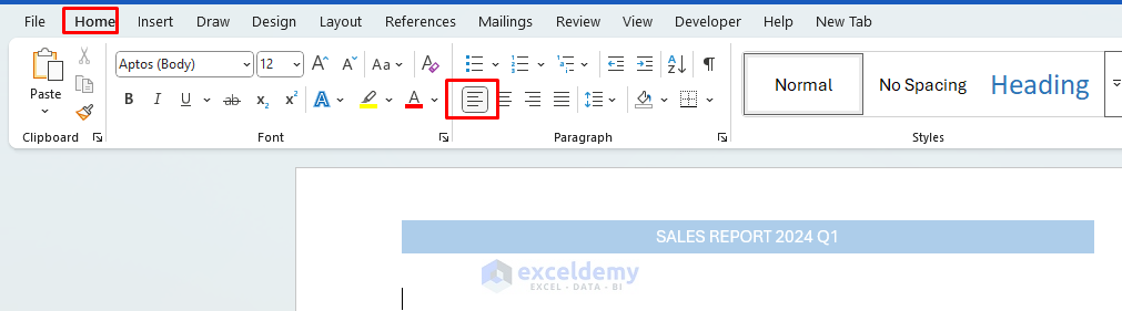
Align Text Consistently:
- Ensure all body text is left-aligned (not justified).
- Avoid center alignment for long paragraphs or entire sections.
Pro tip: Save your typography choices as a custom theme (Design >> Themes > >Save Current Theme) to reuse across all your documents for consistent branding.
4. Create and Use Custom Styles
Styles are the secret weapon of professional Word users. Built-in styles ensure consistency, improve navigation, and save formatting time. It makes document-wide formatting changes effortless.
Steps to implement:
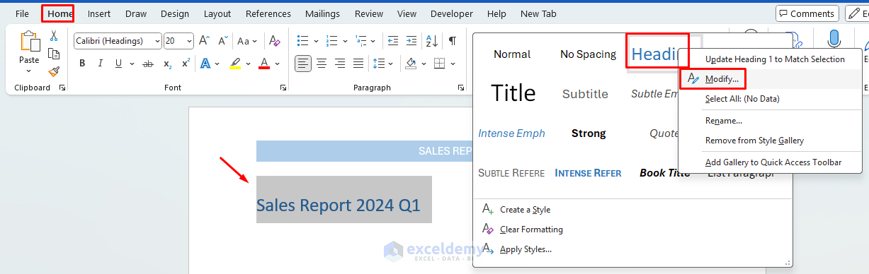
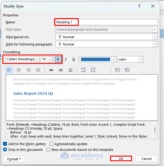
Define Heading Styles:
- Go to Home tab >> right-click on Heading 1, Heading 2, etc. >> select Modify.
- Set sizes like:
- Heading 1: 16 pt, bold.
- Heading 2: 14 pt, bold.
- Heading 3: 12 pt, italic or regular.
- Modify styles to update all instances throughout your document at once.
- Create a style set for your organization or personal brand.
Create Custom Styles:
- Format any paragraph as desired.
- Right-click the formatted text > select Styles >> select Create a Style >> name your style.

- Select Modify to format the new style.

- It will appear in the Styles Gallery for easy reuse.
Use the Style Inspector:
- Use the Style Inspector to troubleshoot inconsistencies.
- Go to Home tab >> from Styles Pane >> click the Style Inspector icon.
- Useful for identifying and fixing formatting inconsistencies.

Pro tip: Create a table of contents automatically from your heading styles by going to References > Table of Contents. This not only looks professional but also makes navigation easier in longer documents.
5. Use Tables, Columns, and Grids for Alignment
Proper alignment and column layouts create a professional visual flow. These techniques enhance readability, especially in documents with structured content like contact info, comparison sections, or multi-part layouts.
Steps to implement:
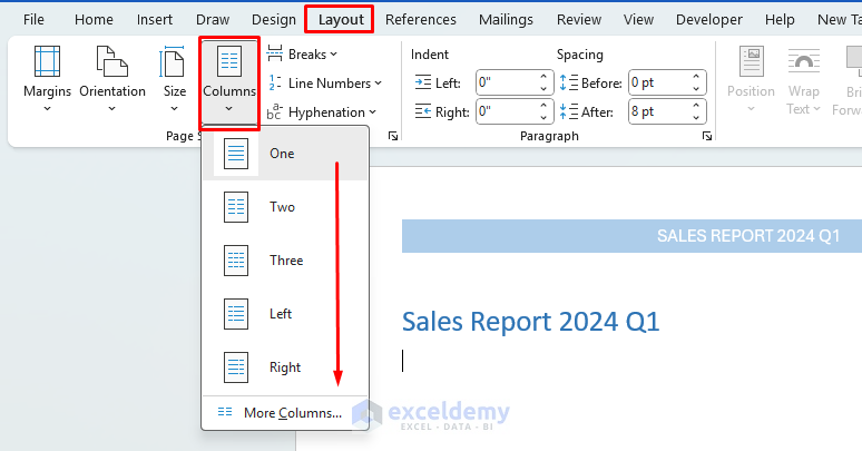
Insert Columns:
- Useful for text-heavy sections (e.g., newsletters, summaries).
- Go to the Layout tab >> from Columns >> select column type.
- It creates visual harmony by aligning images with text margins.
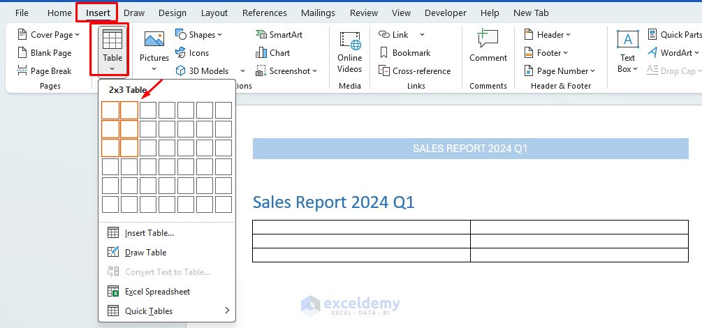
Insert Table:
- Align numbers in tables and lists using tab stops rather than spaces. Invisible borders create perfectly aligned layouts.
- Go to the Insert tab >> select Table.
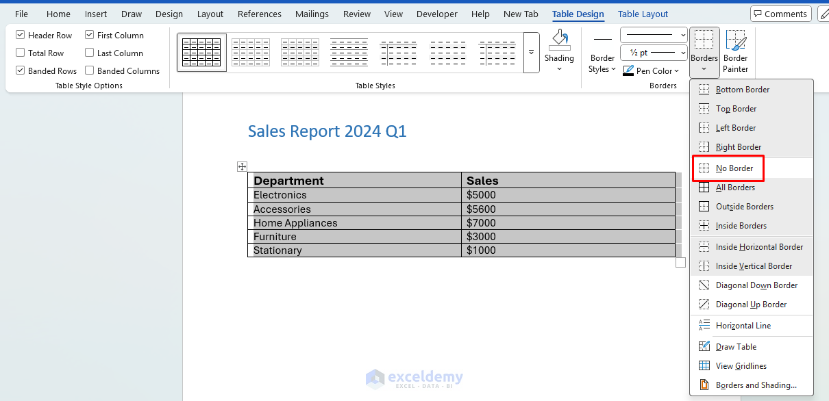
- Then format and remove borders, go to the Table Tools >> select Design >> select No Borders.
- Great for aligning logos, signatures, and comparison blocks.

Align with Tab Stops and Ruler:
- Use tab stops and a ruler to align columns of text.
- Go to the View tab >> select Ruler to align text columns precisely.
- Avoid using spaces for alignment, tabs are more accurate and responsive.
Enable Gridlines for Visual Precision:
- Go to View tab >> select Gridlines to guide alignment while editing (they won’t print).

Pro tip: For multi-column text, try using section breaks instead of text boxes, as section breaks maintain better flow with page numbers and other document elements. Tables without borders can create professional layouts like two-column resumes or side-by-side comparisons.
Conclusion
Professional documents are about more than just content. By implementing these five layout tricks, you can transform your ordinary Word documents into polished, professional publications that enhance the credibility of the document. These tricks will make your Microsoft Word documents visually appealing, easy to read, and presentation-ready.
Get FREE Advanced Excel Exercises with Solutions!
