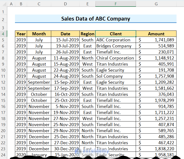
Look at the following dataset; we have the company’s sales data.
Method 1 – Getting Sum of Amount by a Specific Criterion, i.e., Year, Month, Region, or Client at Once
Create a Pivot Table first, drag the Amount field to the Values area and other attributes to the Rows area.
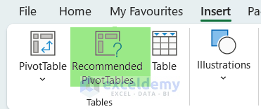
Excel has an feature which is Recommended PivotTables just beside the PivotTable button. You can use this feature also.
- After clicking the Recommended PivotTable button, Excel will show some sample Pivot Tables like the following image.
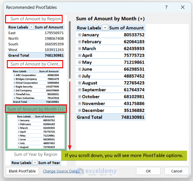
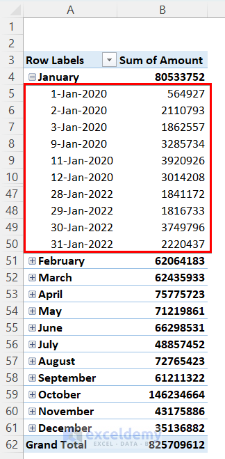
- We can say that the total order amounts for January, July, and December are $80533752, $48857452, and $35136882.
- A similar approach goes for the sum of the amount by region, client, etc.
- Click on any of the right-side Pivot Table previews and press OK; a new sheet will be opened to the left of the current sheet.
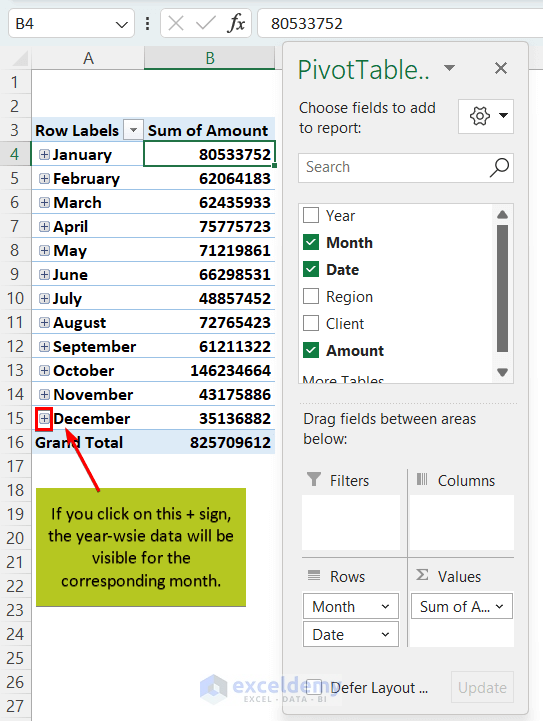
- Click on the + signs in each month-row, we get year-wise (same month, different years) amounts too.
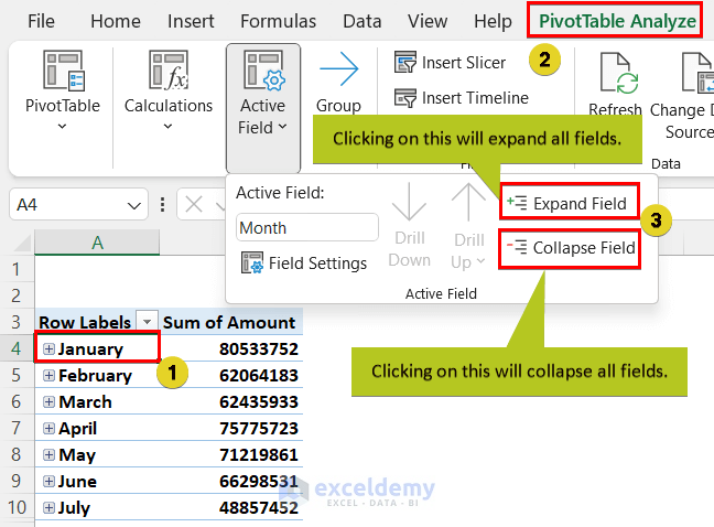
You can expand or collapse data fields with the following workaround.
- Click any cell in the Row Labels column ⇒ Go to the PivotTable Analyze tab ⇒ click the Expand Field or Collapse Field buttons.
Method 2 – Use of Value Field Settings & Sort: Find Maximum Value and Corresponding Data
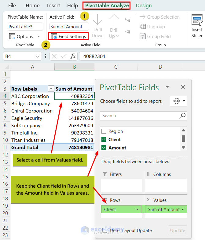
- Work with two variables: Client and Amount.
- To get the answer, place the Client field in the Rows area and the Amount field in the Values area. Excel chooses the Sum operation for Values in a Pivot Table by default, change these settings to see the maximum amount of order.
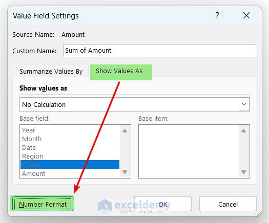
- Select a cell from the Values field (i.e., Sum of Amount column here) ⇒ go to the PivotTable Analyze tab ⇒ click on the Field Settings option. You will find this command in the Active Field group.
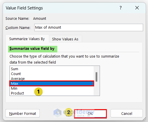
- From the Value Field Settings window, choose the Max option from the Summarize value field by section ⇒ Press OK.
- Utilize Show Values As to format amounts in the desired way.
- The Pivot Table looks like the following image.
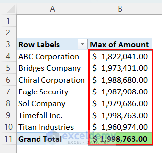
So, the highest amount of orders is $1,998,763, but who is the highest-order placer? It is not clear from the current Pivot Table. To find this,
- Click on any cell in the Amount column and right-click on your mouse.
- Choose Sort from the context menu and select Sort Largest to Smallest.
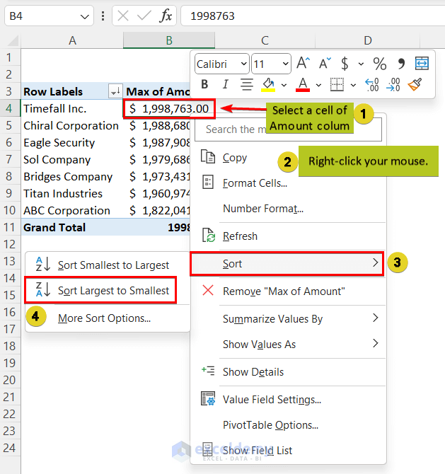
- The Pivot Table will look like this.
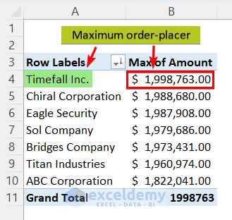
So, the maximum order is placed by Timefall Inc. (which is $1,998,763.00).
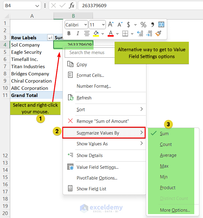
A straightforward way to get to the Value Field Settings option is following this workaround.
- Select a cell in the Values area ⇒ Right-click ⇒ Choose Summarize Values By option from the context menu ⇒ Select any suitable operation from the list.
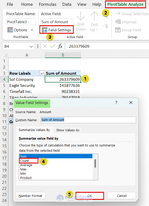
Method 3 – Use of Count Operation: Find How Many Times Each Client Placed an Order
- Select the Client and Amount fields, and from Value Field Settings, select the Count option.
- See the following image.
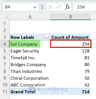
- The Sol company placed orders 254 times, which is the highest.
Method 4 – Add and Use Slicers in Pivot Table
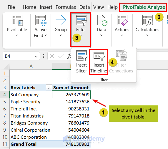
- After creating the Pivot Table, click a Pivot Table cell ⇒ Go to the PivotTable Analyze tab ⇒ Click Insert Slicer from the Filter group ⇒ Select filtering options from the pop-up window. Each selection will create a separate slicer.
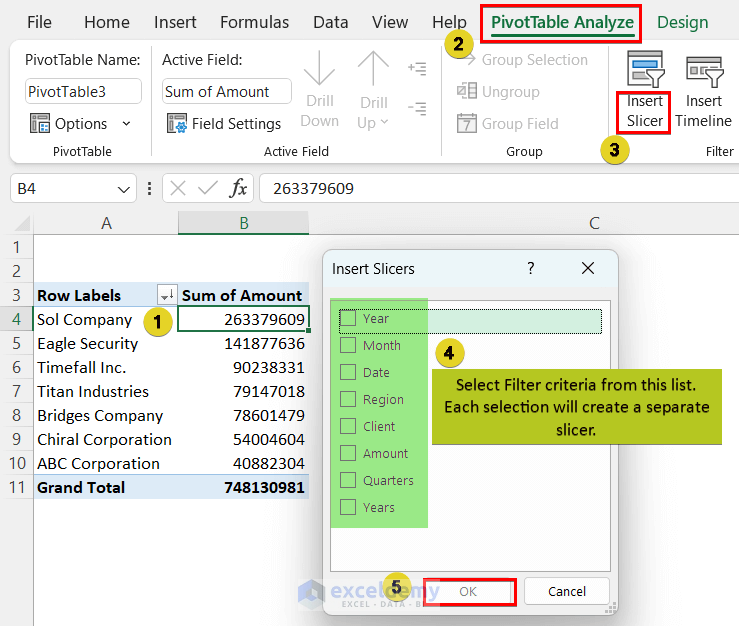
- We selected Year, Month, and Client. Here are our slicers.
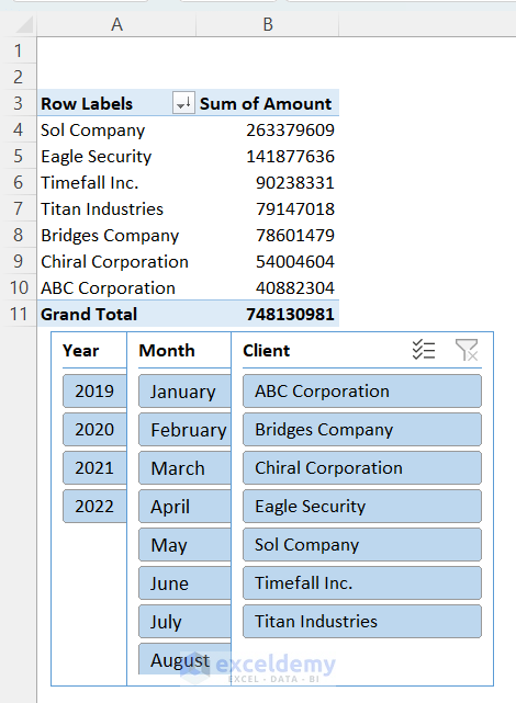
How to Use Pivot Table Slicer:
- Go to Year Slicer first. Select 2022, you will see that Month and Client Slicers will be edited according to this. Select a Month, e.g., July.
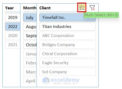
- The Clients who haven’t placed any order in July 2022 will be greyed out in the Client slicer.
- Select a Client and see the corresponding data.
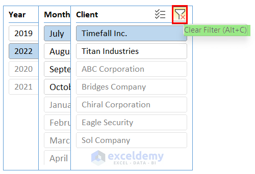
- To apply multiple criteria, click the Multi-Select icon or press ALT+S ⇒ Choose any number of criteria you want.
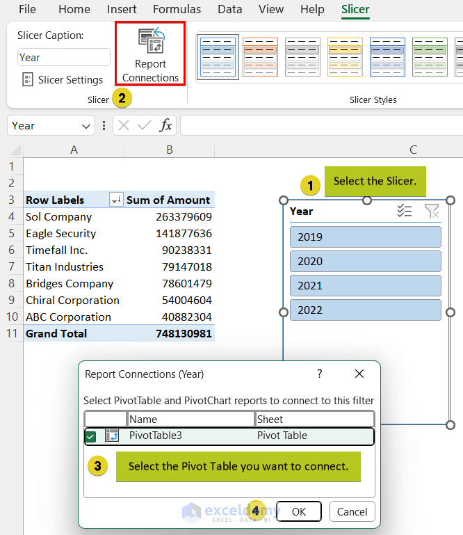
- If you have multiple Pivot Tables and want to connect the Slicer Filter to a specific one, click the Slicer ⇒ Go to the Slicer tab ⇒ Click on Report Connections and select your desired Pivot Table from the pop-up ⇒ Press OK.
How to Clear Filter and Remove Slicer:
To clear the filter created with Slicer, click the cross icon or press ALT+C.
- To remove a Slicer, select it and press DELETE.
Method 5 – Add and Use a Timeline Slicer in Excel Pivot Table
How to Add a Timeline in Excel Pivot Table:
- Add a Timeline to your Pivot Table worksheet, select a cell in a Pivot Table and choose Insert ⇒ Filter ⇒ Timeline.
- Also get this feature from the PivotTable Analyze tab’s Filter group.
- Mark the Date box and press OK.
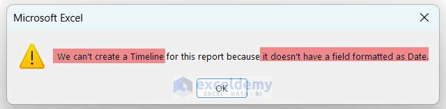
Excel will display an error if your Pivot Table doesn’t have a field formatted as a date.
- You will have a timeline slicer like the following image.
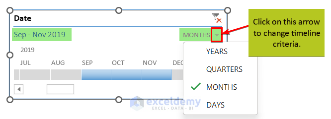
- Change the date range from month criteria to other date criteria, click the arrow sign at the top-right corner of the timeline.
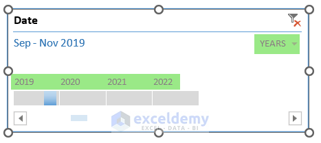
- If you select Year criteria, the timeline will look as follows.
How to Use Timeline Slicer in Excel Pivot Table:
- Select the 2022 part from the timeline bar ⇒ Select MONTHS.
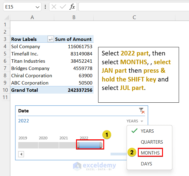
- Select the JAN part from the timeline, press the SHIFT key, hold it, and select the JUL part.
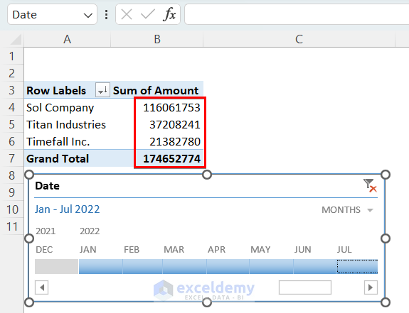
- You will get the total order placed by a company from January to July of 2022.
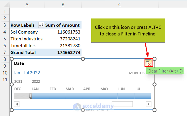
- To clear this filter, click on the cross icon or press ALT+C.
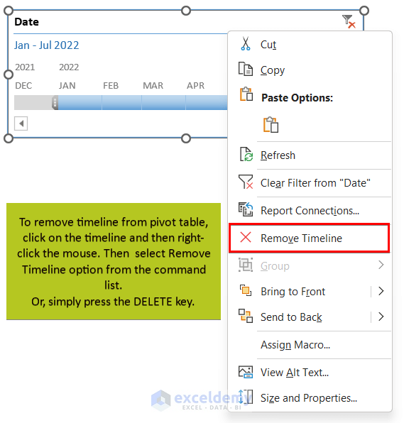
- To remove the Pivot Table timeline, follow this workaround.
- Click on the timeline and right-click the mouse ⇒ select the Remove Timeline option from the command list.
- Or press DELETE.
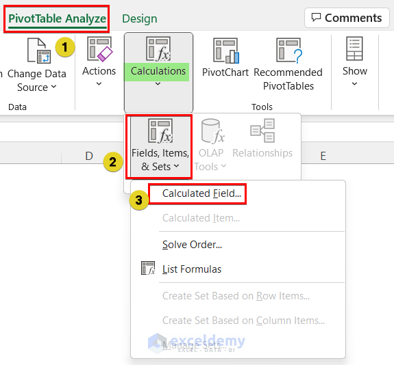
Method 6 – Use of Calculated Field: Applying Formula in Excel Pivot table
- If want to offer a 10% discount to the clients you need to know the discounted amounts. To do this task, use the Calculated Field option.
- Click on any cell of the table ⇒ go to the PivotTable Analyze tab ⇒ From the Calculations group, select the Calculated Field option of Fields, Items & Sets drop-down.
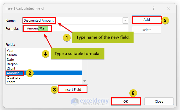
- In the appeared pop-up, type a name for the new field ⇒ From the Fields menu, select the field name for the newly added field ⇒ Press Insert Field ⇒ In the Formula box, type a suitable formula ⇒ Press Add ⇒ press OK.
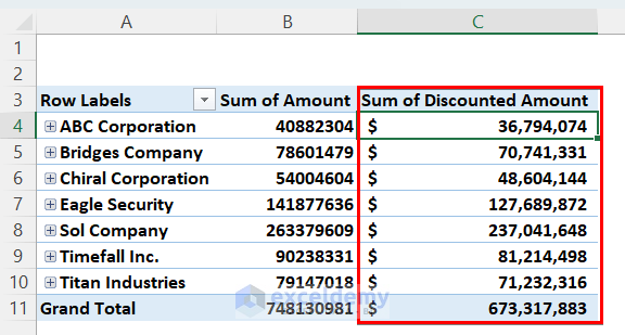
- You will see that a new column with desired output appears.
Method 7 – Use of Calculated Item Command
A command named Calculated Item is below the Calculated Field command in the list.
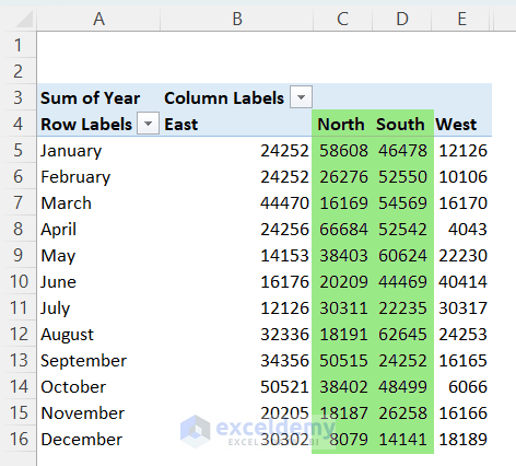
Under the Column Labels, we have listed East, North, South, and West regions (colored in green). These are called Items. Using the Calculated Item command, we can perform various calculations between the associated values of the corresponding Items.
- If I want to know the difference in sales between North and South regions, you have to select a cell inside the Pivot Table and select the Calculated Item option from the Fields, Items, and Sets drop-down of the PivotTable Analyze tab.
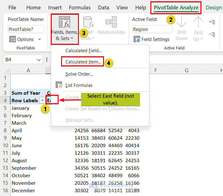
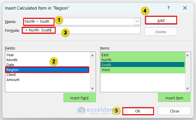
- The following window will pop up. Give a name (North ~ South) ⇒ Select a suitable field (Region here) ⇒ Create a formula in the following manner.
- Select an item (North) ⇒ double click on it or press the Insert Item button ⇒ Type a minus (-) sign ⇒ Select Item (South) and press the Insert Item button or double click on the Item name ⇒ Then press Add and OK.
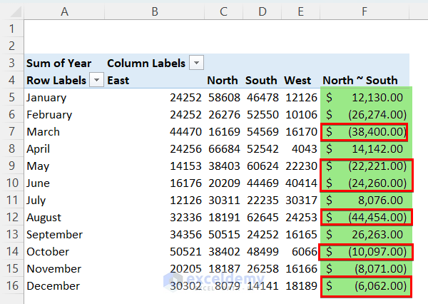
- The following image shows that you have the difference between the two regions.
- After applying the accounting format, the result looks like this.
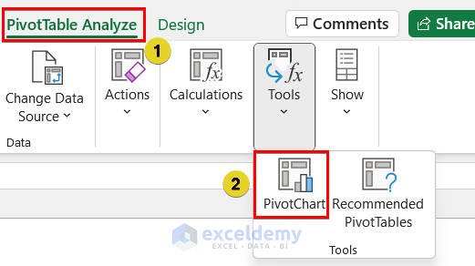
Method 8 – Insert a Pivot Chart to Visualize Data
- To insert a PivotChart, click any cell in the table ⇒ From the PivotTable Analyze tab, click on PivotChart.
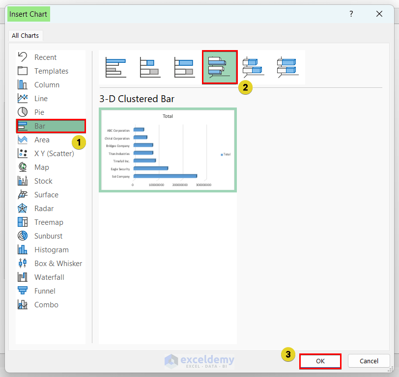
- Select a suitable Chart type from the pop-up window ⇒ Press OK.
- We have selected 3D Clustered Bar from the Bar section.
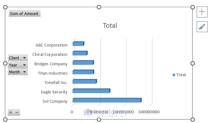
- The graph looks like the following image.
Quickest Way to Insert a PivotChart:
Select any pivot table cell ⇒ Press ALT+F1
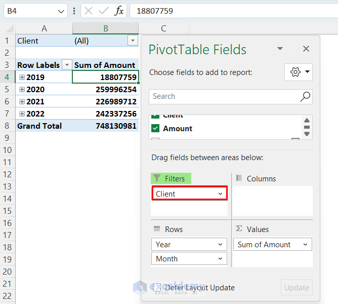
Method 9 – Generate Multiple Pivot Tables in Different Sheets for Each Row Label
- Drag the Client field in the Filters area of the PivotTable Fields pop-up.
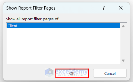
- Click a cell inside the table and go to the PivotTable Analyze tab ⇒ From the Options drop-down, select Show Report Filter Pages.
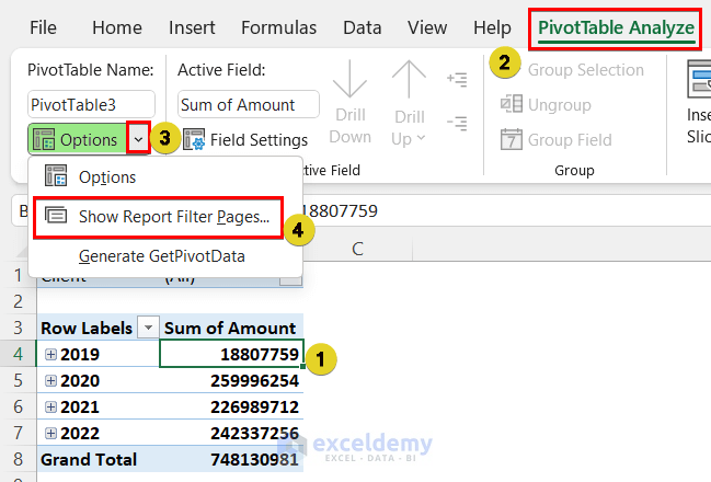
- Click OK on the pop-up.
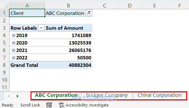
- You will see that sheets are generated by Excel for each client, with a separate Pivot Table for each of them.
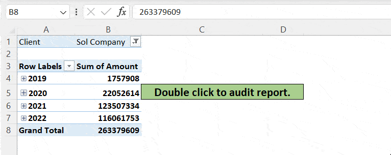
Method 10 – Audit Data in Pivot Table
- Double-click on the value you want to cross-check. A new sheet will be generated automatically.
- In this sheet, you can see the details of the data.
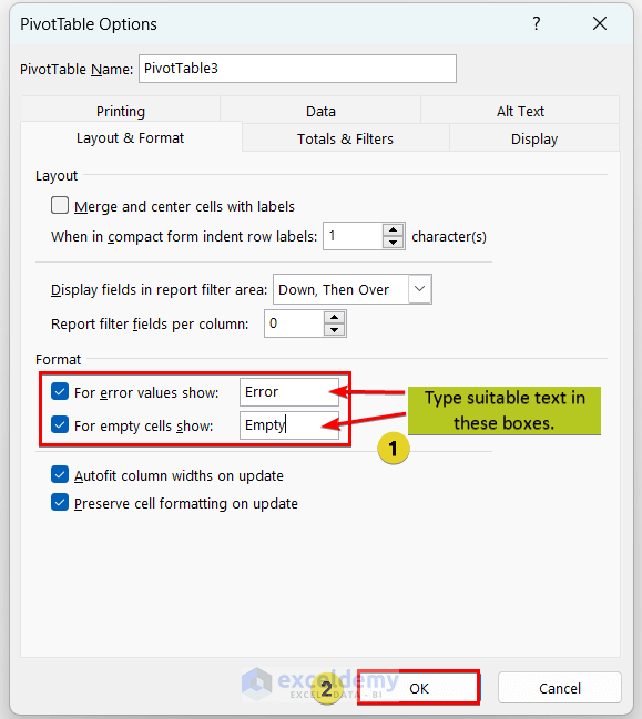
Method 11 – Format Pivot Table for Error or Empty Values
- Click any cell in the table and right-click on your mouse ⇒ Click PivotTable Options.
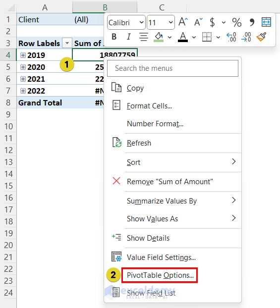
- In the pop-up, mark For error values show and For empty values show boxes, and type suitable text in the boxes. Press OK.
Method 12 – Get Amount in % of Grand Total, Row Total and Column Total
- Select any cell in the Pivot Table ⇒ go to PivotTable Analyze tab ⇒ Click on Field Settings ⇒ Go to Show Values As section in the appeared pop-up ⇒ select a suitable option and press OK.
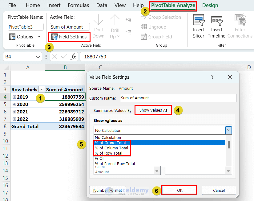
- If you scroll down the options in this list, you will also see more commands like Difference from, Running Total, etc.
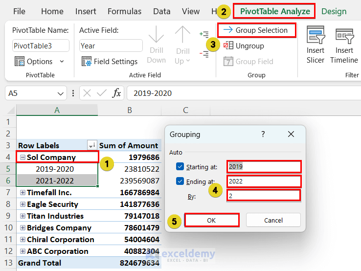
Method 13 – Group Data by Date in Excel Pivot Table
- Go to the PivotTable Analyze tab and select the Group Selection command.
- In the Grouping pop-up, set the Starting and Ending date/year/month ⇒ Set the interval and press OK.
Quick Notes
- Refresh Pivot Table After Change in Source Data: To reflect the change in source data to a Pivot Table, click the Refresh button located in the Data tab, or the PivotTable Analyze tab.
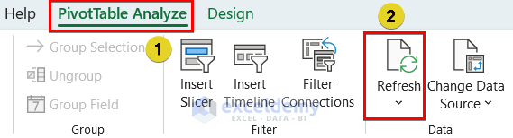
Refresh Keyboard Shortcut:
One Pivot Table: ALT+F5
All Pivot Tables: CTRL+ALT+F5
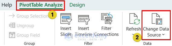
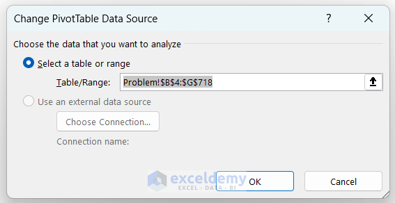
- Change Source Data Range: To change the source range of the Pivot Table, select any cell of the Pivot Table, and select the Change Data Source option.
Select source data again from the following pop-up.
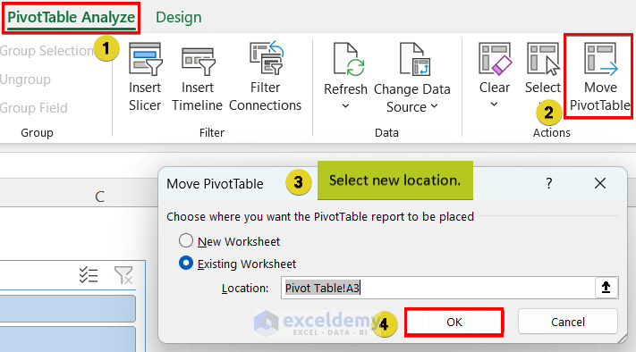
- Change Pivot Table Location: Use the Move PivotTable button.
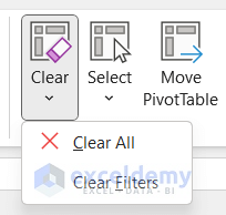
- Clearing Pivot Table Data: Use the Clear All button from the PivotTable Analyze tab.
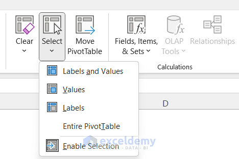
- Select from Pivot Table: Use the following options from the PivotTable Analyze tab.
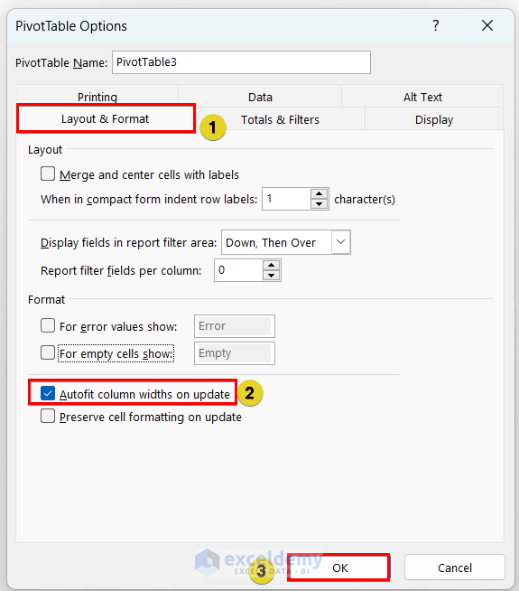
- Keeping Column Width Updated with Refresh: Go to PivotTable Options from the context menu after right-clicking your mouse, and mark the Autofit column widths on update checkbox ⇒ Press OK.
Download Practice Workbook
To understand better, we would recommend downloading the following Excel workbook that has source data for practice and a Pivot Table already created. Practice with it while reading this article!
<< Go Back to What is Pivot Table in Excel | Pivot Table in Excel | Learn Excel
Get FREE Advanced Excel Exercises with Solutions!

