Introduction to Skewness and Kurtosis
Skewness
Skewness is a measure of the level of asymmetry in the distribution of a dataset. When a dataset is not distributed symmetrically, skewness is observed in the normal curve. An asymmetric normal curve can be positively or negatively skewed.
Kurtosis
Kurtosis is the measure of tailedness in a normal distribution curve. It can help us find the outliers in a dataset. Based on the shape of the peak and tail, it can be platykurtic, mesokurtic, or leptokurtic.
How to Create a Graph of Skewness and Kurtosis in Excel: 4 Easy Steps
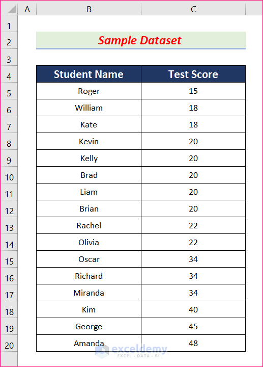
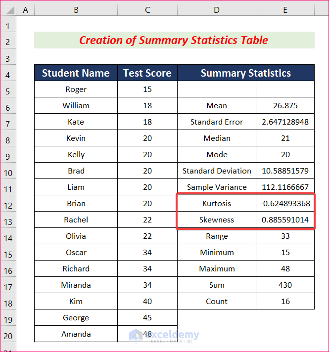
We will use the following dataset for this purpose, which contains a Student Name column and a Test Score column.
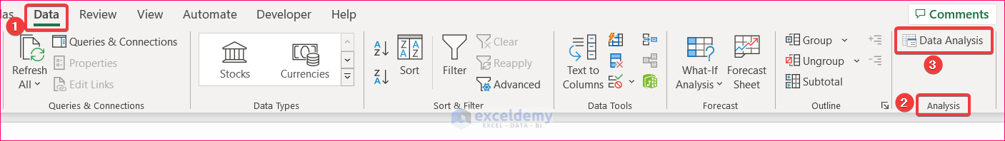
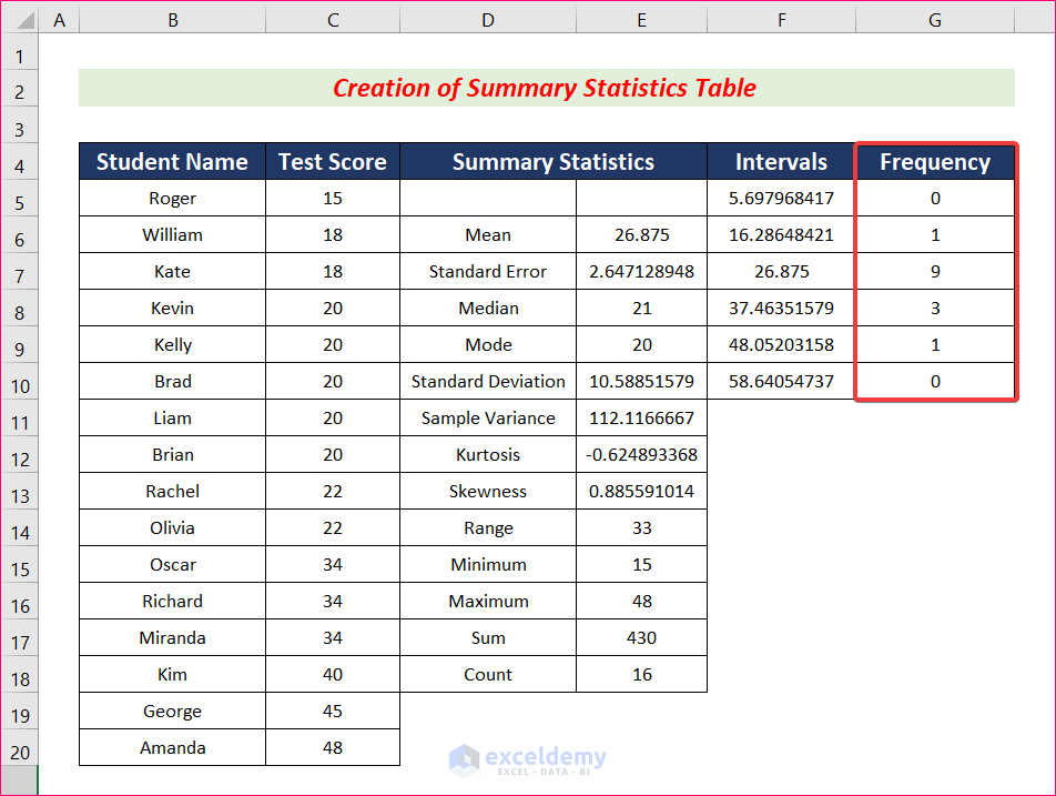
Step 1 – Create a Summary Statistics Table
- Go to Data and select Data Analysis.
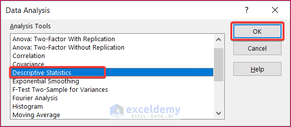
- The Data Analysis pop-up box will appear. Select Descriptive Statistics.
- Click OK to open the Descriptive Statistics dialog box.
- Select the Input range (Test Score) from cells C5 through C20.
- Select the Columns and the Output Range.
- In the Output Range, select the cell where you want your Summary Statistics table to appear.
- Check the box Summary Statistics and click OK.
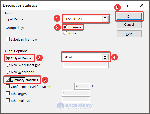
- The Summary Statistics table will appear in your desired cell, including the skewness and kurtosis values.
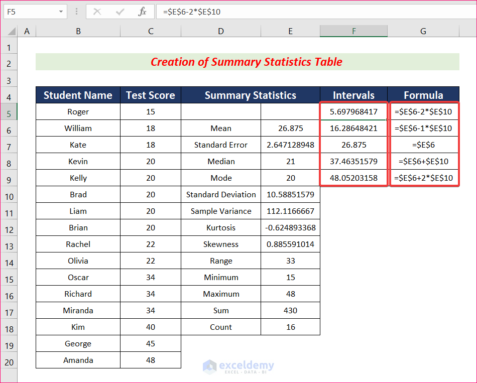
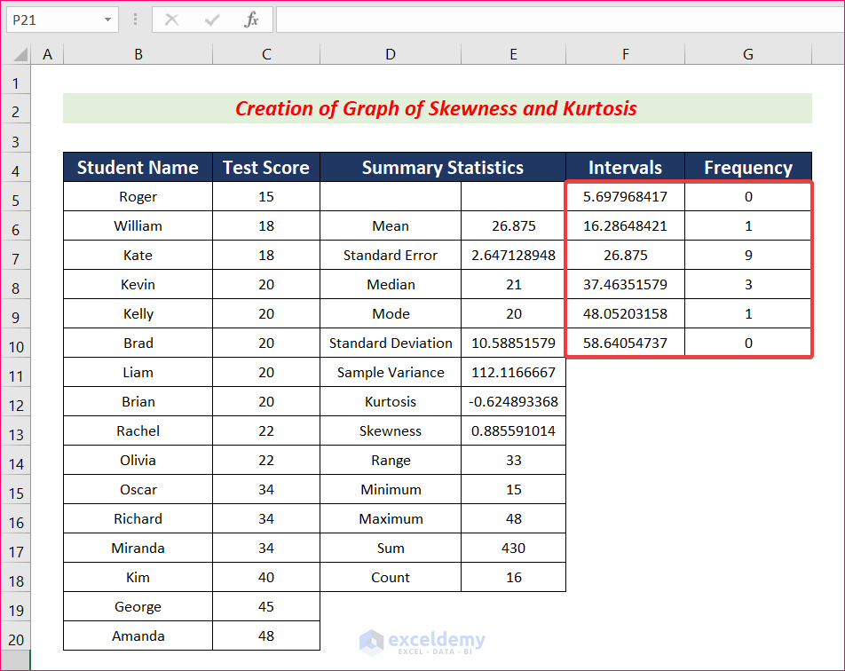
Step 2 – Calculate Bin Intervals
- Insert a column named Intervals.
- Select cell F5 and use the following formula.
=$E$6-2*$E$10- Use similar formulas to cells F6 to F9 and determine Bin Intervals. All the formulas are given in the Formula column. They’re created by modifying the constant that’s multiplying E10 from -2 to 2.
Read More: How to Calculate Skewness in Excel
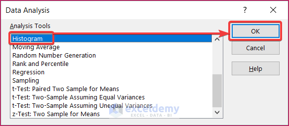
Step 3 – Determine the Frequency
- Go to Data and select Data Analysis.
- Select Histogram and click OK. A new dialog box will pop up.
- Select cells C5 through C20 as the Input Range.
- Choose cells F5 to F9 as the Bin Range.
- Select Output Range to show Frequency in a specific cell and click OK.
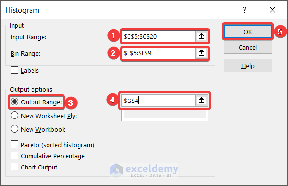
- You will get the Frequency for the Bin Intervals.
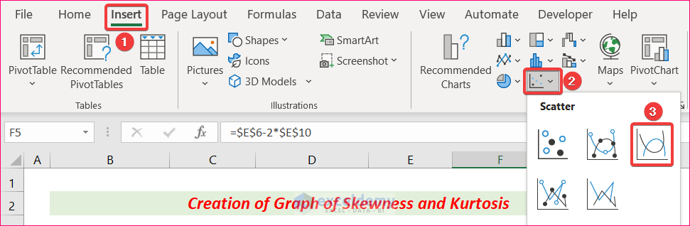
Step 4 – Plot a Graph of Skewness and Kurtosis
- Select the data in Bin Intervals and Frequency.
- Go to Insert and choose Scatter, then select Scatter with Smooth Lines.
- You will get your graph of skewness and kurtosis.
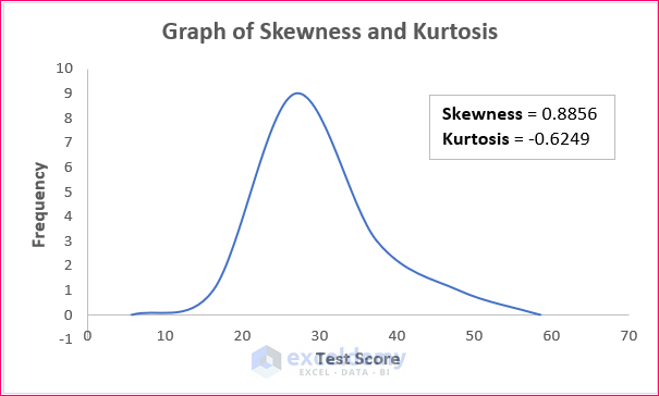
- If you want to format the chart title, axis title, gridlines others, you can do this by using the Chart Design feature.
Read More: How to Calculate Coefficient of Skewness in Excel
Download the Practice Workbook
Related Articles
<< Go Back to Excel for Statistics | Learn Excel
Get FREE Advanced Excel Exercises with Solutions!

Super !
Mi-a fost de mare folos. Prezentarea pe pași a fost clara.
Dear Radu Pescaru,
Sunteți foarte bineveniți.
Regards
ExcelDemy
how did you identify the “-2” there are also examples that shows “-3” instead? how can i identify it?
Hello Fin,
The “-2” or “-3” are the different adjustments for kurtosis calculations. In this article, “-2” is used in the context of excess kurtosis, which helps measure how heavy or light-tailed the distribution is compared to a normal distribution.
Normally, kurtosis is 3 for a normal distribution. Some methods subtract 3 from kurtosis (excess kurtosis), while in other cases, adjustments like “-2” are made based on specific analysis needs. It’s essential to know which method or software you’re using.
Regards
ExcelDemy