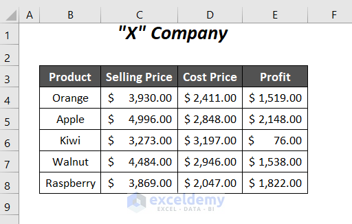
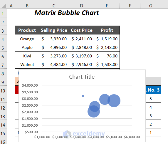
In the dataset below, we have records of the selling prices, cost prices, and profits of a company’s products.
Method 1 – Creating a Matrix Bubble Chart
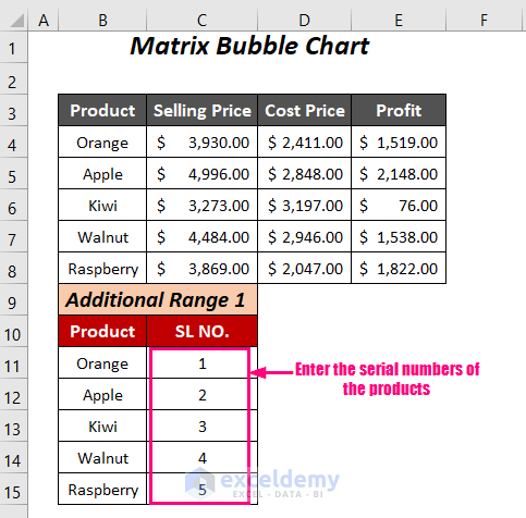
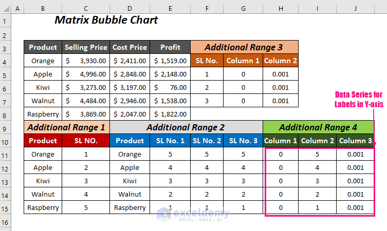
Step 1- Creating Additional New Data Ranges
For Additional Range 1;
- Add two columns: one containing the product names and the other containing the serial numbers of the products.
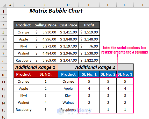
For Additional Range 2;
- Enter the product names in the first column.
- Add 3 extra columns (as we have 3 sets of values in the Selling Price, Cost Price, and Profit columns). Arrange the serial numbers in these columns in reverse order.
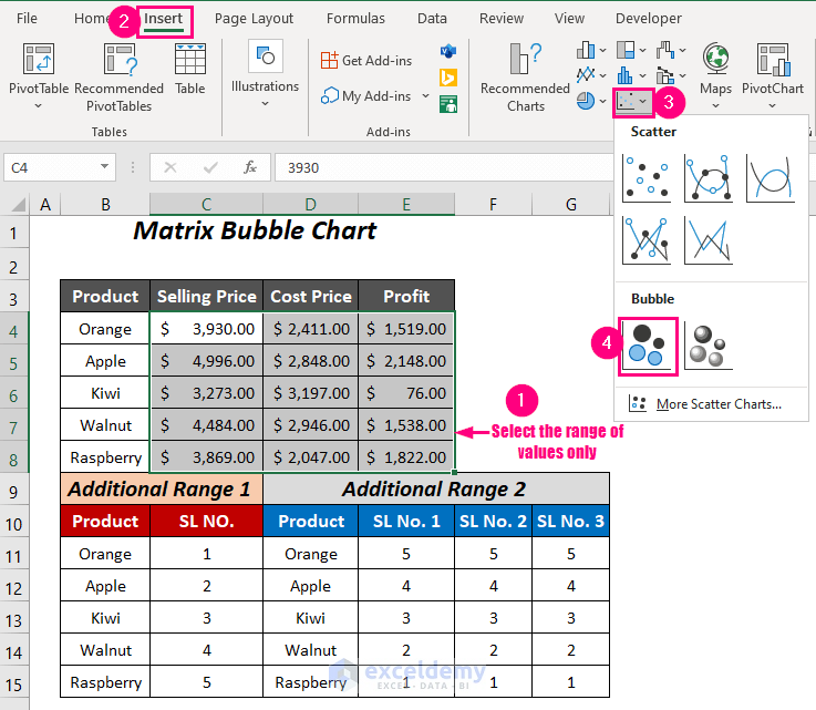
Step 2 – Inserting a Bubble Chart to Create a Matrix Chart
- Select the range of values (C4:E8).
- Go to the Insert Tab >> Charts Group >> Insert Scatter (X, Y) or Bubble Chart Dropdown >> Bubble Option.
The following Bubble chart will be created.
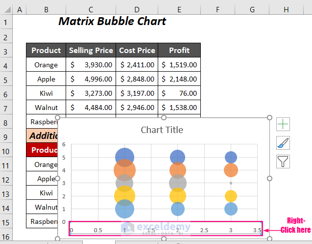
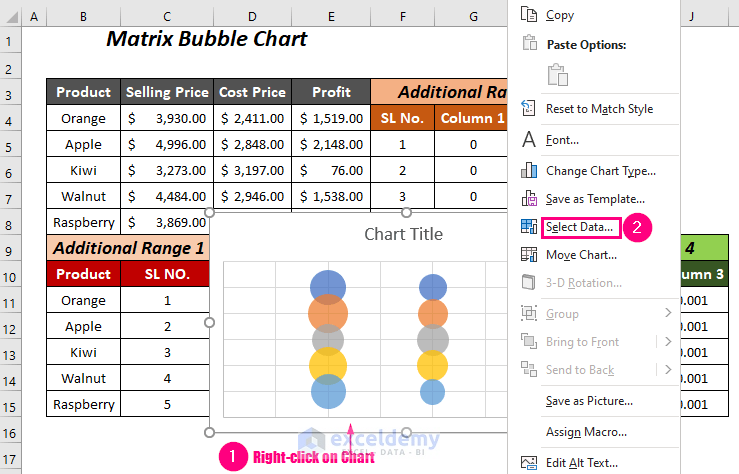
- To rearrange the bubbles, select the chart and right-click on it.
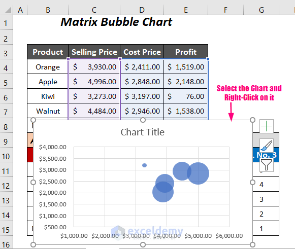
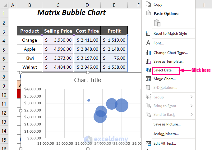
- Choose the option Select Data from various options.
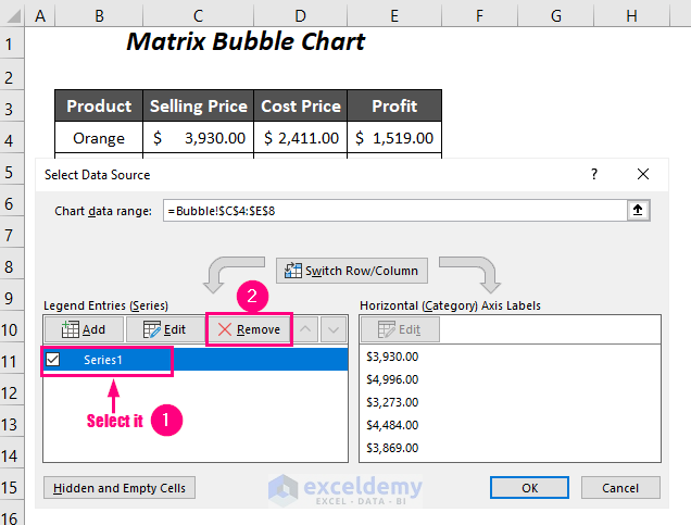
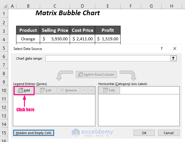
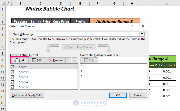
The Select Data Source dialog box will open up.
- Select the already created series Series1 and click on Remove.
- Click on Add to include a new series.
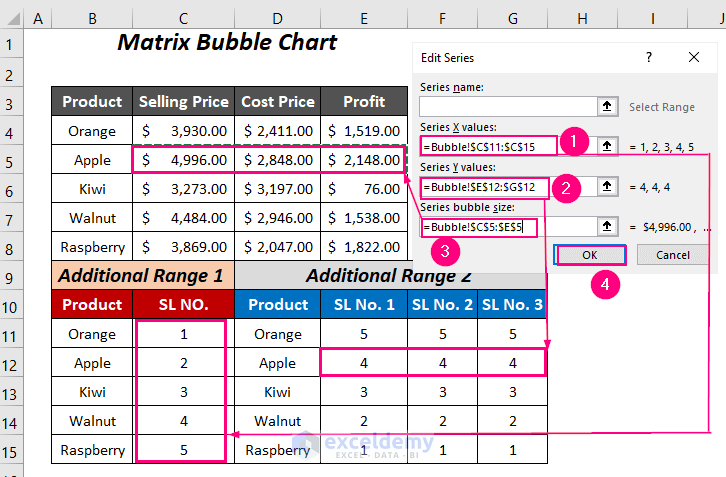
- The Edit Series wizard will pop up.
For Series X values, select the serial numbers of the Additional Range 1 of the Bubble sheet, and for Series Y values, select the serial numbers in the three columns of Product Orange of the Additional Range 2.
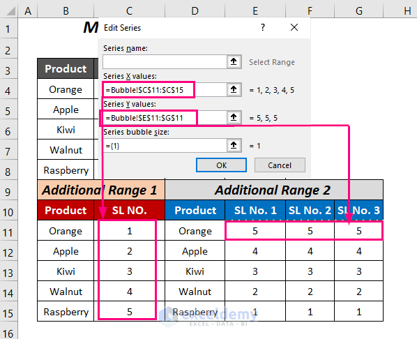
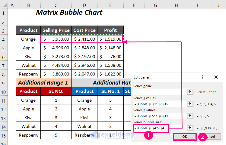
- The Series bubble size will be the selling price, cost price, and profit of the product Orange.
- Press OK.
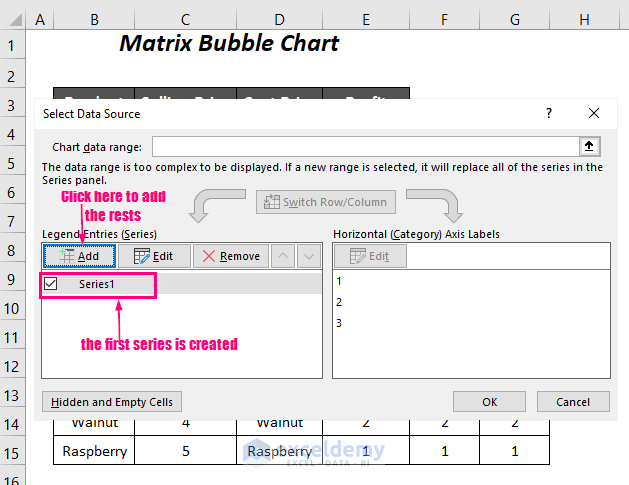
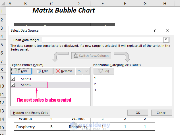
We have added a new series, Series 1.
- Click Add to enter another series.
- For Series X values, select the serial numbers of Additional Range 1, and for Series Y values, select the serial numbers in the three columns of Product Apple of Additional Range 2.
- The Series bubble size will be the selling price, cost price, and profit of the product Apple.
- Press OK.
The new series Series2 will appear.
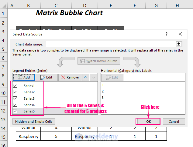
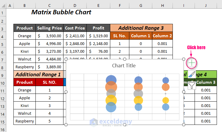
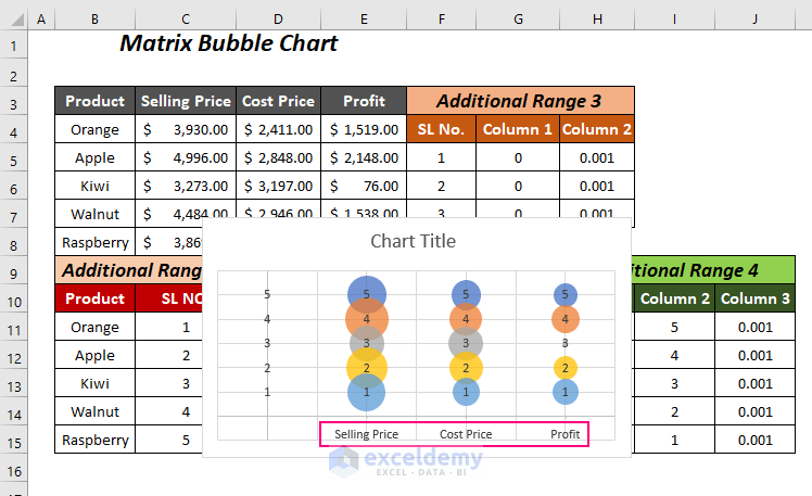
Complete all of the 5 series for the 5 products and press OK.
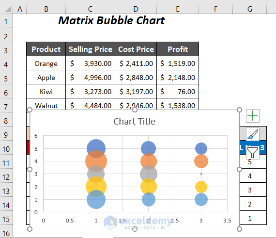
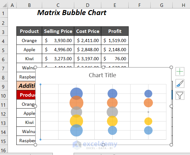
Then you will get the following Bubble chart.
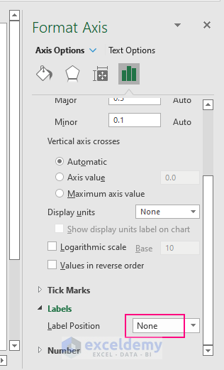
Step 3 – Removing Default Labels of Two Axes
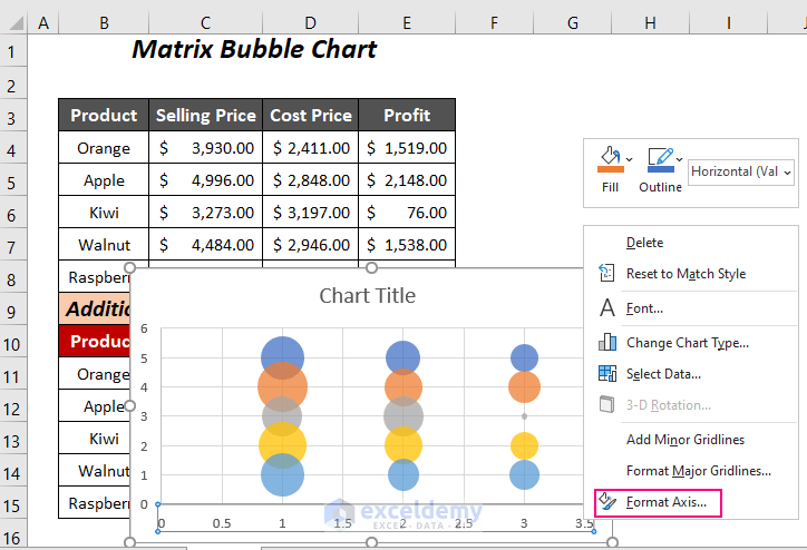
- Select the labels on the X-axis and then right-click on them.
- Choose the option Format Axis.
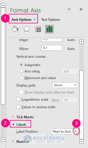
The Format Axis pane will appear on the right side.
- Go to the Axis Options tab >> expand the Labels option >> click on the dropdown symbol of the Label Position box.
- Choose None.
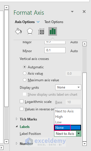
The Label Position will be changed to None.
We have removed the labels of the X-axis. You can follow this process for the Y-axis.
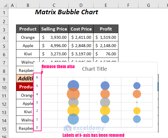
We have discarded all of the default labels from the chart.
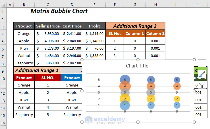
Step 4 – Adding Two Extra Ranges for New Labels of Axes
- We have entered a 3-row and 3-column data range for the X-axis label. Where the first column contains serial numbers, the second column contains 0, and the last column is for the bubble width (0.001 or whatever you want).
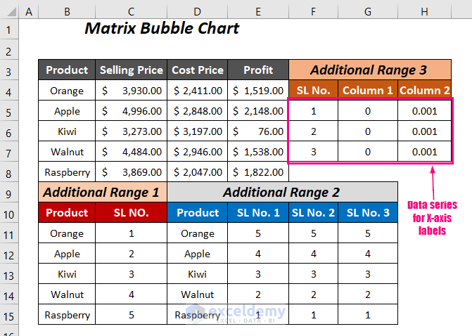
- Create the Additional Range 4 for the labels of the Y-axis. The first column contains 0, the second column contains the serial numbers in reverse order, and the last column is for the bubble widths, which is 0.001.
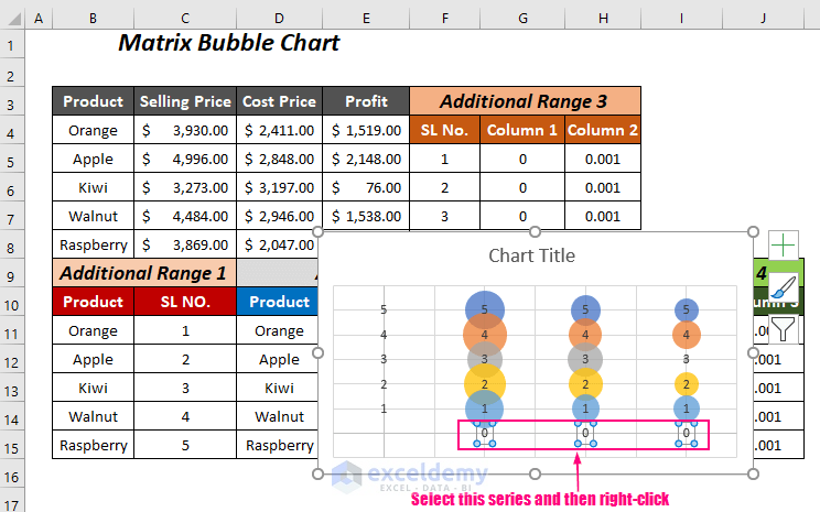
Step 5- Adding a New Series for Labels to Create a Matrix Chart
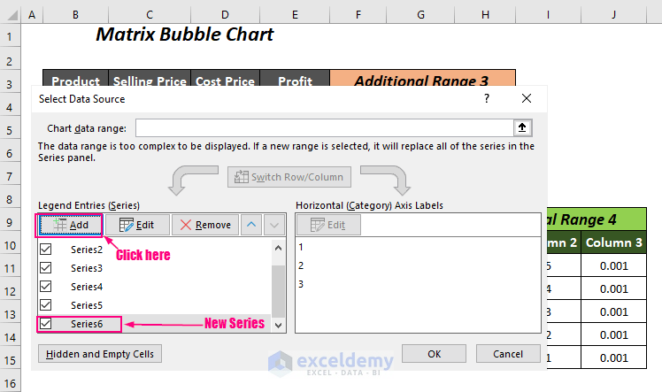
- To add the new 2 series to the chart Right-click on the chart and then choose the Select Data option.
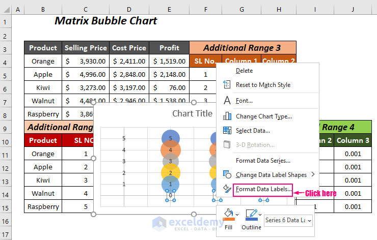
- Click on Add in the Select Data Source dialog box.
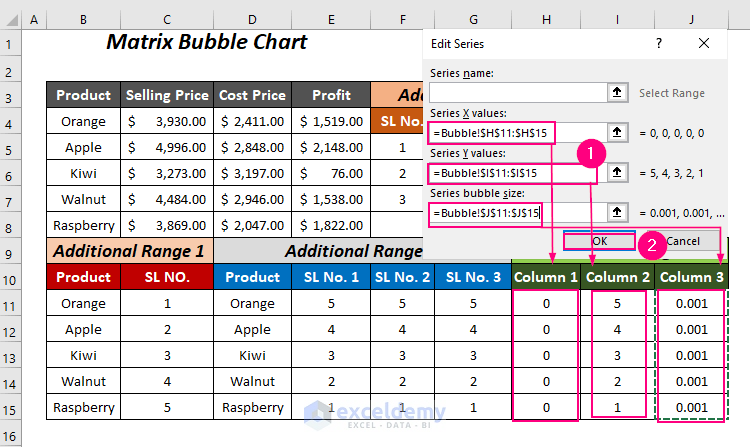
The Edit Series wizard will pop up.
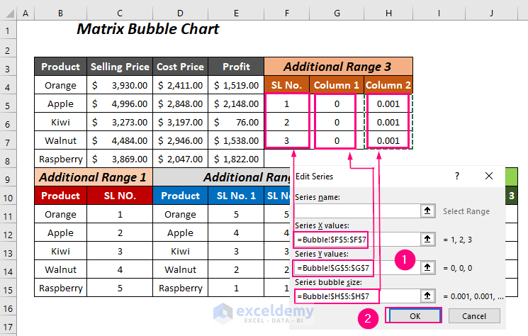
- For Series X values, select the first column of the Additional Range 3, and for Series Y values, select the second column and choose the third column for the Series bubble size.
- Press OK.
We have created the new series Series6, and now press Add to enter another series.
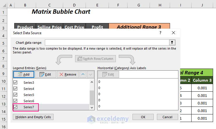
- In the Edit Series dialog box, for Series X values, select the first column of the Additional Range 4, and for Series Y values, select the second column and choose the third column for the Series bubble size.
- Press OK.
We have added Series7 for Y-axis labels.
Step 6 – Adding New Labels
- Click on the chart and select the Chart Elements symbol.
- Check the Data Labels option.
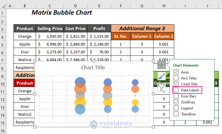
All of the data labels will be visible on the chart.
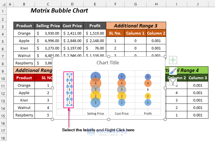
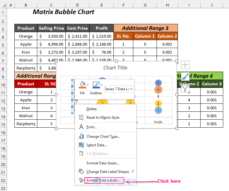
- Select the labels of the X-axis and Right-click.
- Click on the Format Data Labels option.
The Format Data Labels pane will be visible on the right side.
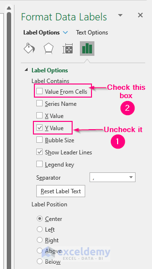
- Go to the Label Options Tab >> expand the Label Options Option >> check the Value From Cells Option.
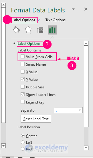
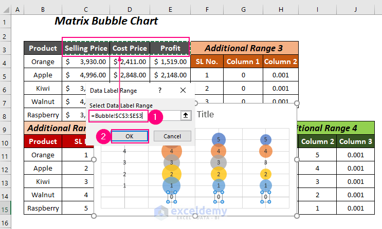
The Data Label Range dialog box will open up.
- Select the column headers of the values in the Select Data Label Range box and press OK.
You will return to the Format Data Labels part again.
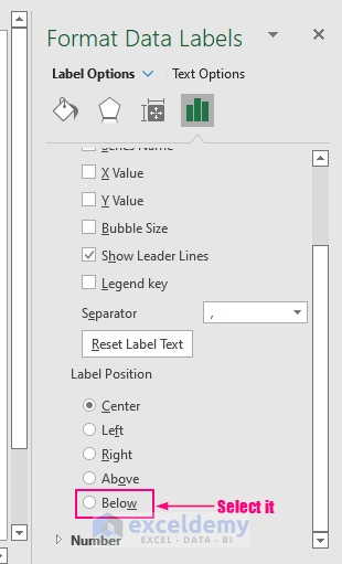
- Uncheck the Y Value from the Label Options and scroll down to the downside to see all of the options of the Label Position.
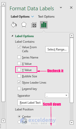
- Select the Below option.
We will be able to add our desired X-axis labels.
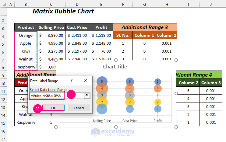
- Select the Y-axis labels and then Right-click.
- Click on the Format Data Labels option.
The Format Data Labels pane will be visible on the right side.
- Uncheck the Y Value option and click the Value From Cells option among various Label Options.
The Data Label Range dialog box will open up.
- Select the product names in the Select Data Label Range box and press OK.
You will be taken to the Format Data Labels part again.
- Click on the Left option under the Label Position.
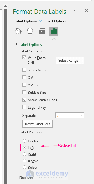
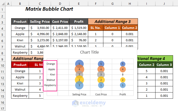
We will have the names of the products on the Y-axis labels.
Step 7 – Adding Labels for Bubbles
- Select the bubbles with the number 5 and then Right-click.
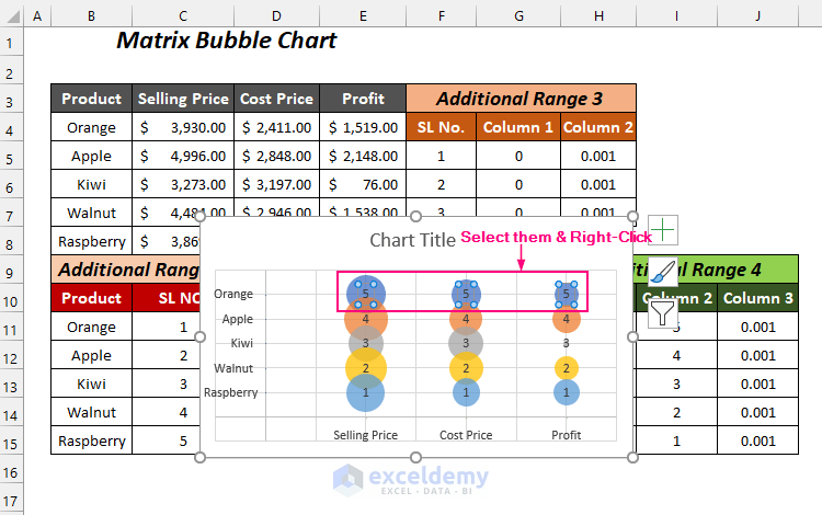
- Choose the Format Data Labels option.
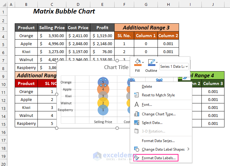
The Format Data Labels pane will open up in the right portion.
- Check the Bubble Size option and uncheck the Y Value option.
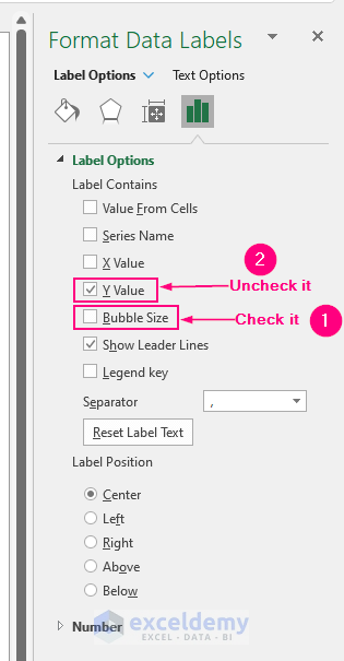
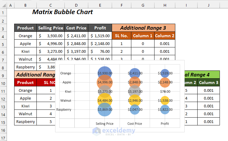
The labels of the bubbles will be converted into the values of the Selling Prices, Cost Prices, and Profits.
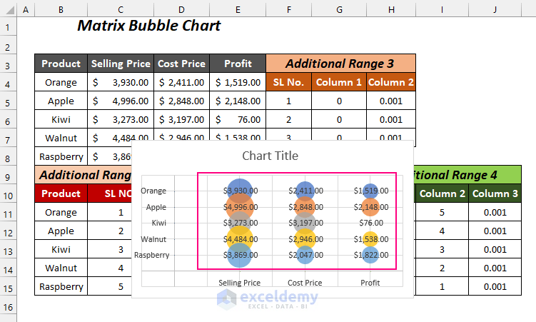
- You can remove the chart title by clicking on the Chart Elements symbol and then unchecking the Chart Title option.
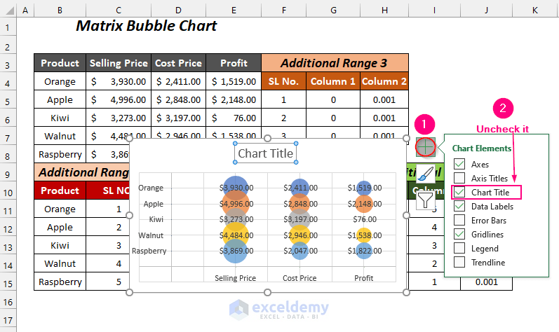
The final outlook of the chart is shown in the following figure.
Method 2 – Creating a 4-Quadrant Matrix Chart
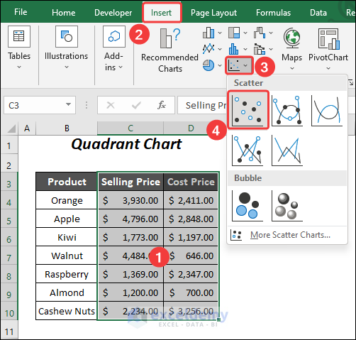
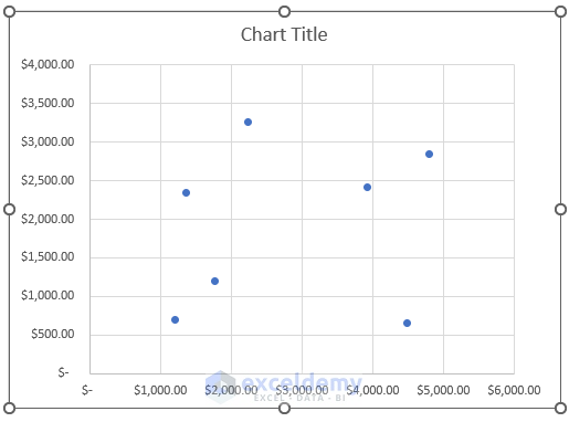
Step 1 – Inserting a Scatter Graph to Create a Matrix Chart
- Select the range of values (C4:D8) and go to the Insert Tab >> Charts Group >> Insert Scatter (X, Y) or Bubble Chart Dropdown >> Scatter Option.
The following graph will appear.
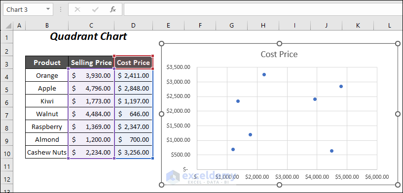
We have to set the upper and lower bound limits of the X-axis and Y-axis.
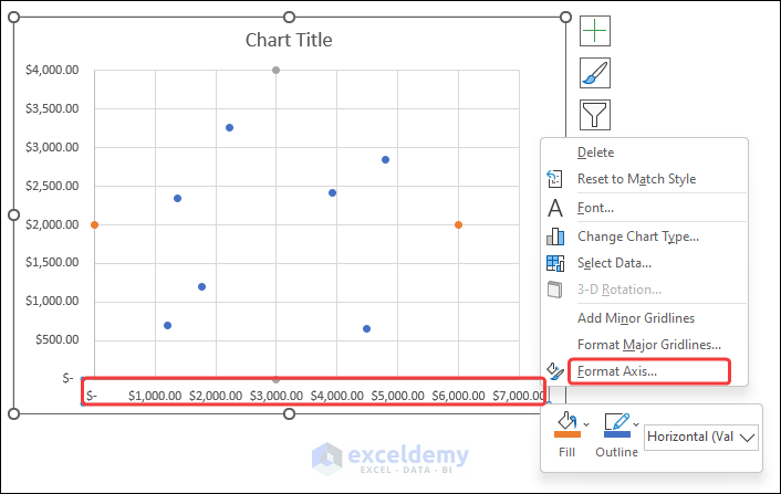
- Select the Y-axis label and Right-click.
- Choose the Format Axis option.
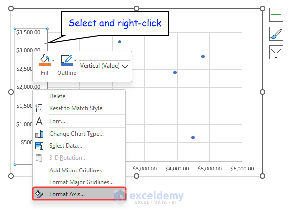
You will get the Format Axis pane on the right side.
- Go to the Axis Options Tab >> expand the Axis Options Option >> set the limit of the Minimum bound as 0.0 and the Maximum bound as 4000.0.\
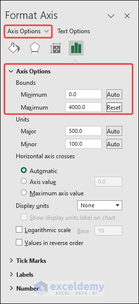
We will have the modified X-axis labels with new limits and we don’t need to modify the Y-axis labels as the upper limit of this axis is here 4000 which is close to the maximum Cost Price of $3,197.00.
Step 2: Creating Additional Data Range
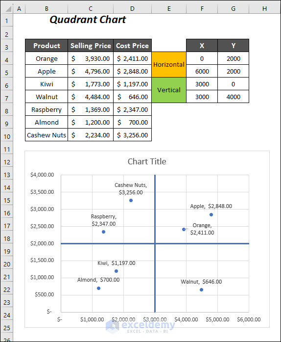
- Create the following data table format with two portions for the Horizontal and the Vertical and two columns for the coordinates X and Y.
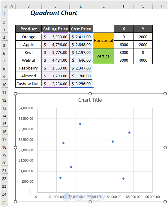
- For the Horizontal part, add the following values in the X and Y coordinates.
X → 0 (minimum bound of X-axis) and 6000 (maximum bound of X-axis)
Y → 2000 (average of the minimum and maximum values of the Y-axis → (0+4000)/2 → 2000)
- For the Vertical part, add the following values in the X and Y coordinates.
X → 3000 (average of the minimum and maximum values of the X-axis → (0+6000)/2 → 3000)
Y → 0 (minimum bound of Y-axis) and 4000 (maximum bound of Y-axis)

Step 3 – Adding Four Points in Graph to Create Quadrant Lines
- Select the graph, Right-click, and choose the Select Data option.
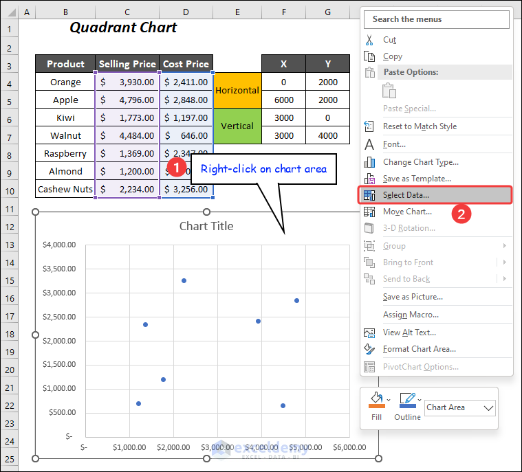
The Select Data Source wizard will open up.
- Click on Add.
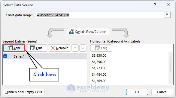
The Edit Series dialog box will appear.
- For Series X values, select the X coordinates of the horizontal part of the Quadrant sheet, and then for Series Y values, select the Y coordinates of the horizontal part.
- Press OK.
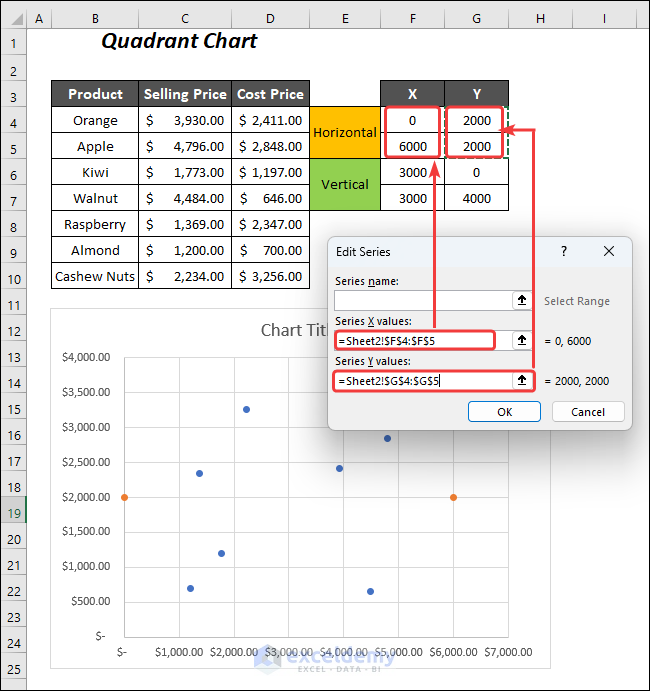
The new series Series2 will be added.
- To insert a new series for the vertical line, click on Add again.
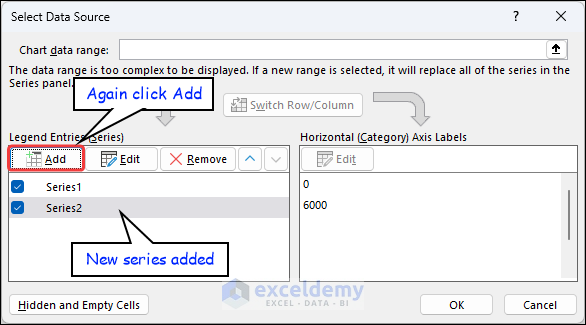
- In the Edit Series dialog box, for Series X values, select the X coordinates of the vertical part of the Quadrant sheet, and for Series Y values, select the Y coordinates of the vertical part.
- Press OK.
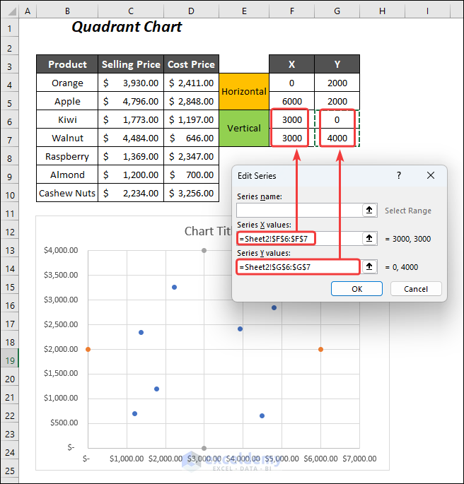
We have added the final series Series3.
- Press OK.
If the maximum bound of data in your chart changes, you can change the bounds by right-clicking > Format Axis option > change the maximum bound according to your need like we did for the Y axis. You can skip this step if you don’t need to change the scale.
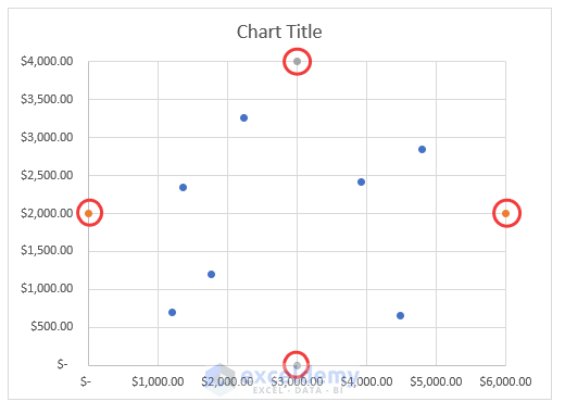
We will have 2 Orange points indicating the horizontal part and 2 Ash points indicating the vertical part.
Step 4 – Inserting Quadrant Lines to Create a Matrix Chart
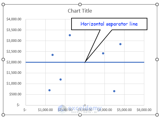
- Select the 2 Orange points and then Right-click.
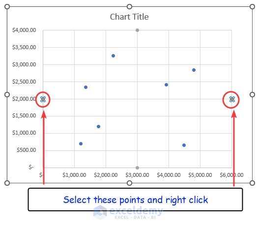
- Choose the Format Data Series option.
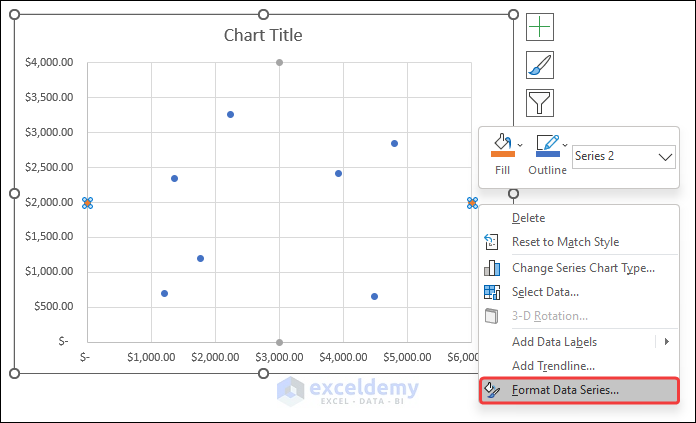
You will have the Format Data Series pane on the right portion.
- Go to the Fill & Line Tab >> expand the Line Option >> click on the Solid line option >> choose your desired color.
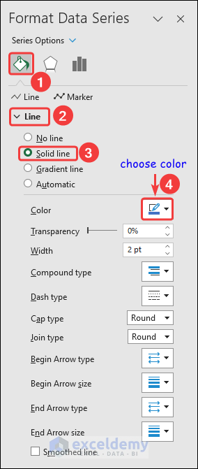
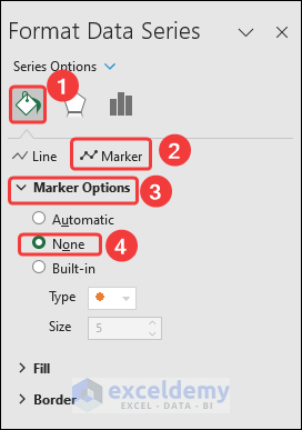
- To hide the points, go to the Fill & Line Tab >> expand the Marker Options Option >> click the None option.
The horizontal line will appear in the chart.
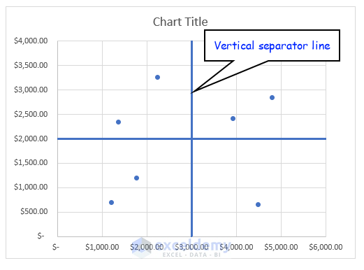
Create the vertical separator line using the 2 ash points.
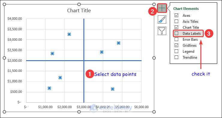
Step 5 – Inserting Data Labels
To indicate the data points with the name of the products we have to add the data label first.
- Select the data points and then click on the Chart Elements symbol.
- Check the Data Labels option.
The values of the points will appear beside them and we have to convert them to the name of the products.
- Right-click after selecting these data points.
- Click on the Format Data Labels option.
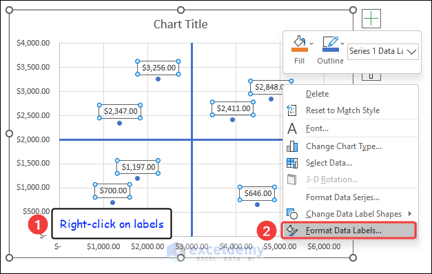
You will have the Format Data Labels pane on the right side.
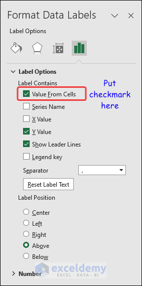
- Check the Value From Cells option from the Label Options.
The Data Label Range dialog box will open up.
- Select the name of the products in the Select Data Label Range box and press OK.
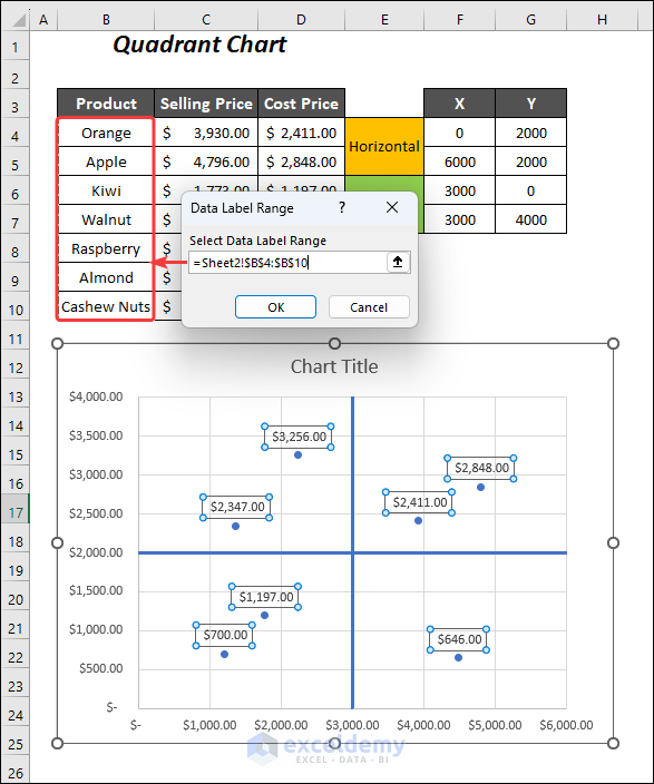
The outlook of the Quadrant Matrix Chart will look like the following.
<< Go Back to Excel Charts | Learn Excel
Get FREE Advanced Excel Exercises with Solutions!
