Method 1 – Combining Functions to Make a Control Chart
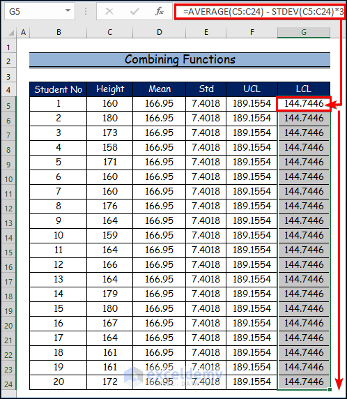
In this method, we’ll create a dataset to construct a control chart in Excel using multiple functions. Specifically, we’ll use the AVERAGE function to calculate the mean and the STDEV function to determine the standard deviation. From there, we’ll evaluate the Upper Control Limit (UCL) and the Lower Control Limit (LCL).
Steps:
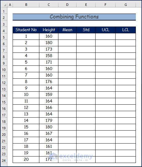
- Prepare the Data:
- Begin with your base dataset.
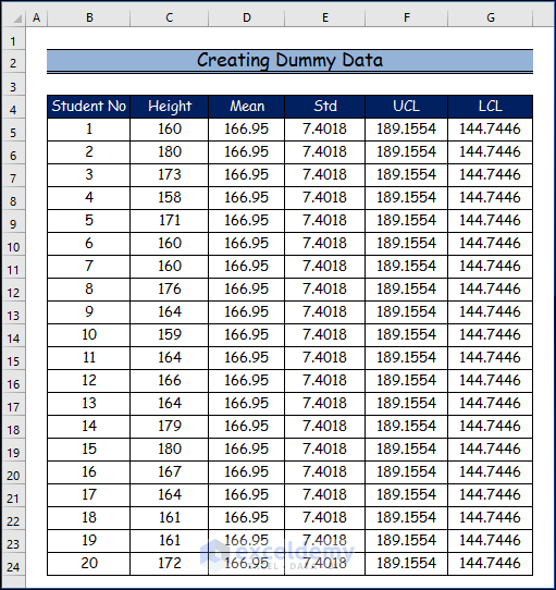
- Create a dummy dataset if needed.
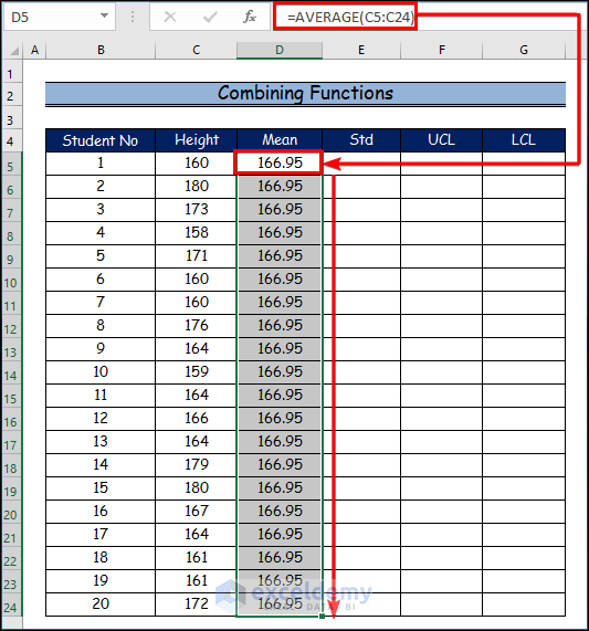
- Calculate the Mean:
- Use the following formula to find the mean:
=AVERAGE(C5:C24)-
- Drag the Fill Handle down from cell C5 to C24 to calculate the mean for all 20 students in the dataset.
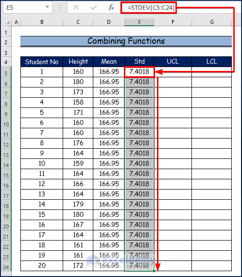
- Evaluate the Standard Deviation:
- Use the following formula to find the standard deviation:
=STDEV(C5:C24)-
- Similarly, drag the Fill Handle from cell C5 to C24 to determine the standard deviation for all 20 students.
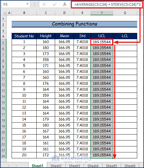
- Determine the Upper Control Limit (UCL):
- Use the following formula:
=AVERAGE(C5:C24) + STDEV(C5:C24)*3-
- Drag the Fill Handle from cell C5 to C24 to find the UCL for each student.
- Establish the Lower Control Limit (LCL):
- Use the following formula:
=AVERAGE(C5:C24) - STDEV(C5:C24)*3-
- Similarly, drag the Fill Handle from cell C5 to C24 to determine the LCL for each student.
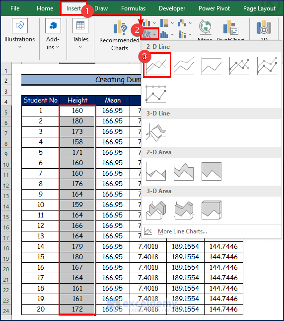
- Create the Control Chart:
- Select the Height column from your data.
- Go to the Insert tab.
- Choose the Insert Line or Area Chart command.
- Click on the Line option.
-
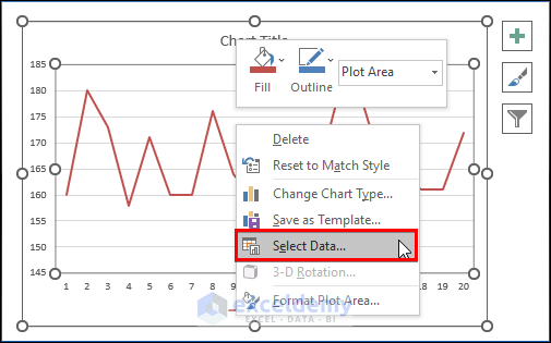
- Right-click on the line graph.
- Select Select Data from the context menu.
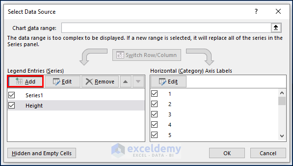
-
- Click Add in the Select Data Source dialog box.
-
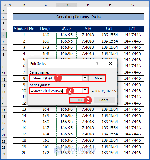
- Set Mean as the Series Name in the Edit Series dialog.
- Enter the relevant data into the Series values text box.
- Configure the Control Chart Limits:
- Click OK after setting up the Mean series.
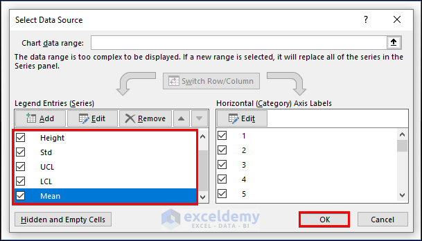
- Repeat the same procedure for the Upper Control Limit (UCL) and Lower Control Limit (LCL) series.
- Once done, you’ll have all three series configured.
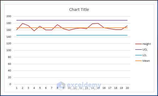
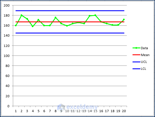
- View the Final Control Chart:
- The control chart will now display the Mean, UCL, and LCL for the selected variables.
- Analyze the chart to identify any trends, outliers, or deviations from the expected process.
Remember to save your Excel file to preserve your control chart and data. Additionally, consider creating a dynamic control chart using named ranges and formulas if you need to update it regularly.
As for precautions and frequency of performing GST reconciliation, here are some recommendations:
- Precautions:
- Ensure that your data is accurate and complete before reconciliation.
- Validate the data sources (purchase book and GSTR-2A) to avoid discrepancies.
- Double-check formulas and calculations to prevent errors.
- Keep backups of your data to avoid accidental loss.
- Frequency:
- Perform GST reconciliation regularly, ideally on a monthly basis.
- Reconcile before filing GST returns to ensure accuracy.
- Address any discrepancies promptly to maintain compliance.
Method 2 – VBA Code to Create a Control Chart in Excel
Visual Basic for Applications (VBA) is a programming language that can be utilized for various tasks within Excel. In this method, we’ll generate a VBA code snippet that simplifies the process of creating a control chart.
Here are the steps:
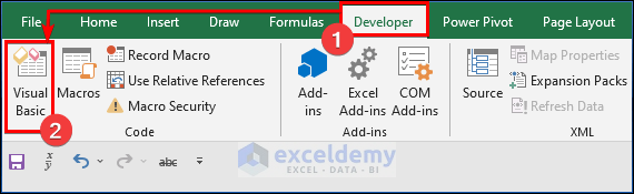
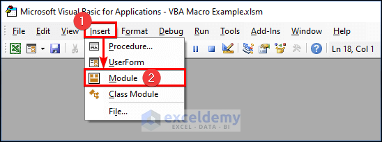
- Open the VBA Editor:
- Press Alt = F11 to launch the VBA editor.
- Insert the VBA Code:
- Within the VBA editor, locate the Developer tab.
- Click on the Visual Basic command.
- In the module, paste the following VBA code:
Sub DummyData()
'Populate header
Worksheets(1).Cells(1, 1) = "Student No"
Worksheets(1).Cells(1, 2) = "Height"
'Apply RND function to create random dummy data
For i = 2 To 21
Worksheets(1).Cells(i, 1) = i - 1
Worksheets(1).Cells(i, 2) = Int((180 - 158 + 1) * Rnd + 158)
Next i
End Sub
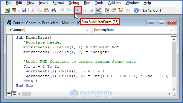
- Run the Program:
- To execute the program, click the Run button or press F5.
This VBA code will populate a worksheet with dummy data for student numbers and heights, which you can then use to create your control chart. Remember to adjust the code according to your specific requirements.
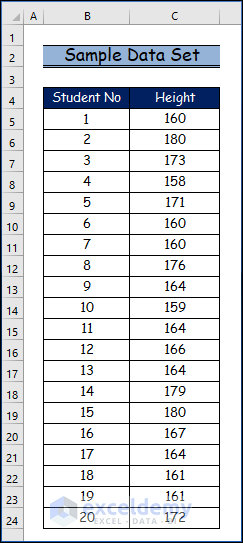
- Generating Random Dummy Data:
Before delving into the programming aspect, we’ll create random dummy data using the Excel RND function. This data will represent the heights of 20 high school students and will fall between 158 and 180. Run the following code to obtain these random numbers.
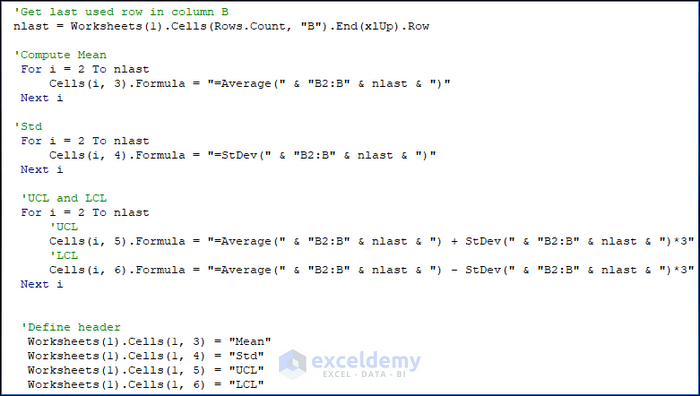
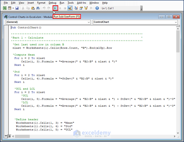
- Computing Mean, LCL, and UCL: With the sample data in place, we’ll compute the mean, lower control limit (LCL), and upper control limit (UCL) for our control chart. These values will be used to draw the central line, lower line, and upper line, respectively. We’ll use formulas to calculate these statistics so that they automatically adjust when we modify the sample data. Here’s the code snippet to achieve this:
'Get last used row in column B
nlast = Worksheets(1).Cells(Rows.Count, "B").End(xlUp).Row
'Compute Mean
For i = 2 To nlast
Cells(i, 3).Formula = "=Average(" & "B2:B" & nlast & ")"
Next i
'Std
For i = 2 To nlast
Cells(i, 4).Formula = "=StDev(" & "B2:B" & nlast & ")"
Next i
'UCL and LCL
For i = 2 To nlast
'UCL
Cells(i, 5).Formula = "=Average(" & "B2:B" & nlast & ") + StDev(" & "B2:B" & nlast & ")*3"
'LCL
Cells(i, 6).Formula = "=Average(" & "B2:B" & nlast & ") - StDev(" & "B2:B" & nlast & ")*3"
Next i
'Define header
Worksheets(1).Cells(1, 3) = "Mean"
Worksheets(1).Cells(1, 4) = "Std"
Worksheets(1).Cells(1, 5) = "UCL"
Worksheets(1).Cells(1, 6) = "LCL"
-
- Here’s our dummy data:
- Here is what the data looks like, and the data may vary from time to time when running the above code.
- Here’s our dummy data:
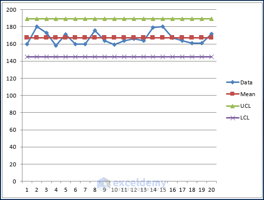
- Visualizing the Control Chart: Now that we have all the necessary data, let’s proceed to the crucial step of drawing the control chart using VBA programming. To begin, declare a ChartObject object (which acts as a container for chart elements). You can name it myChtobj or any other suitable name. Below, I’ll outline the methods we’ll use for the myChtobj object.
VBA Code Statement Explanation
- Chartobjects.Add(Left, Top, Width, Height):
- This statement creates a blank, embedded chart on a worksheet or a chart sheet.
- Arguments
- Left: The distance between the left edge of the sheet and the right edge of the chart (in points).
- Top: The distance between the top of the sheet and the top of the chart (in points).
- Width: The width of the chart (in points).
- Height: The height of the chart (in points).
- Chartobjects(Index):
- Refers to a single embedded chart or a collection of all the embedded charts.
- Argument
- Index: The name or number of the chart. You can use an array to specify more than one chart.
- Chartobjects(Index).HasTitle = True:
- Adds a title to the embedded chart.
- Chartobjects(Index).ChartTitle.Text = “Height of 20 students”:
- Sets or changes the title of the embedded chart.
- Chartobjects(Index).SeriesCollection.Add source:=Worksheets(“Sheet1”).Range(“B2:B21”):
- Adds a new series (data range) to the embedded chart.
- The specified data range is from cells B2 to B21 on the “Sheet1” worksheet.
- Chartobjects(Index). ChartType = xlLineMarkers:
- Specifies the chart type.
- Option xlLineMarkers represents a line chart with data markers, which is suitable for control charts.
- Creating Chart Elements:
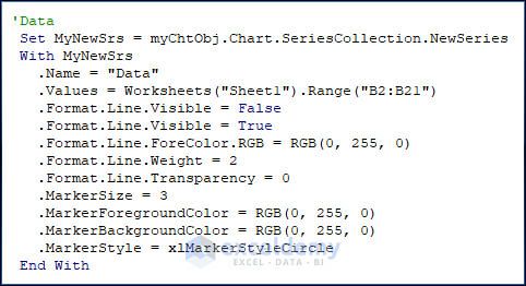
- To create chart elements such as the series graph, central lines, UCL (Upper Control Limit), and LCL (Lower Control Limit) lines, place them into the chart container.
- You can use the Chart.SeriesCollection.NewSeries method to add new series to the chart.
- VBA Code:
- Copy and paste the following VBA code into a Module.
- To run the program, click the “Run” button or press F5.
Sub ControlChart()
'''''''''''''''''''''''''''''''''''''''''''''''''''''''''''''''''''''''''''''
'Part 1 - Calculate '
'''''''''''''''''''''''''''''''''''''''''''''''''''''''''''''''''''''''''''''
'Get last used row in column B
nlast = Worksheets(1).Cells(Rows.Count, "B").End(xlUp).Row
'Compute Mean
For i = 2 To nlast
Cells(i, 3).Formula = "=Average(" & "B2:B" & nlast & ")"
Next i
'Std
For i = 2 To nlast
Cells(i, 4).Formula = "=StDev(" & "B2:B" & nlast & ")"
Next i
'UCL and LCL
For i = 2 To nlast
'UCL
Cells(i, 5).Formula = "=Average(" & "B2:B" & nlast & ") + StDev(" & "B2:B" & nlast & ")*3"
'LCL
Cells(i, 6).Formula = "=Average(" & "B2:B" & nlast & ") - StDev(" & "B2:B" & nlast & ")*3"
Next i
'Define header
Worksheets(1).Cells(1, 3) = "Mean"
Worksheets(1).Cells(1, 4) = "Std"
Worksheets(1).Cells(1, 5) = "UCL"
Worksheets(1).Cells(1, 6) = "LCL"
'''''''''''''''''''''''''''''''''''''''''''''''''''''''''''''''''''''''''''''
'Part 2 - Chart '
'''''''''''''''''''''''''''''''''''''''''''''''''''''''''''''''''''''''''''''
'Define Object
Dim myChtObj As ChartObject
Set myChtObj = ActiveSheet.ChartObjects.Add(Left:=400, Width:=400, Top:=25, Height:=300)
myChtObj.Chart.ChartType = xlLineMarkers
'Data
Set MyNewSrs = myChtObj.Chart.SeriesCollection.NewSeries
With MyNewSrs
.Name = "Data"
.Values = Worksheets("Sheet1").Range("B2:B21")
.Format.Line.Visible = False
.Format.Line.Visible = True
.Format.Line.ForeColor.RGB = RGB(0, 255, 0)
.Format.Line.Weight = 2
.Format.Line.Transparency = 0
.MarkerSize = 3
.MarkerForegroundColor = RGB(0, 255, 0)
.MarkerBackgroundColor = RGB(0, 255, 0)
.MarkerStyle = xlMarkerStyleCircle
End With
'Central line
Set MyNewSrs = myChtObj.Chart.SeriesCollection.NewSeries
With MyNewSrs
.Name = "Mean"
.Values = Worksheets("Sheet1").Range("C2:C21")
.Format.Line.Visible = False
.Format.Line.Visible = True
.Format.Line.ForeColor.RGB = RGB(255, 0, 0)
.MarkerStyle = xlNone
End With
'Upper line
Set MyNewSrs = myChtObj.Chart.SeriesCollection.NewSeries
With MyNewSrs
.Name = "UCL"
.Values = Worksheets("Sheet1").Range("E2:E21")
.Format.Line.Visible = False
.Format.Line.Visible = True
.Format.Line.ForeColor.RGB = RGB(0, 0, 255)
.MarkerStyle = xlNone
End With
'Lower line
Set MyNewSrs = myChtObj.Chart.SeriesCollection.NewSeries
With MyNewSrs
.Name = "LCL"
.Values = Worksheets("Sheet1").Range("F2:F21")
.Format.Line.Visible = False
.Format.Line.Visible = True
.Format.Line.ForeColor.RGB = RGB(0, 0<span style="color: #ff0000;">, 255)</span>
.MarkerStyle = xlNone
End With
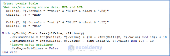
'Ajust y-axis Scale
'Get max/min among source data, UCL and LCL
Cells(2, 7).Formula = "=max(" & "B2:B" & nlast & ",E2)"
Cells(1, 7) = "Max"
Cells(2, 8).Formula = "=min(" & "B2:B" & nlast & ",F2)"
Cells(1, 8) = "Min"
With myChtObj.Chart.Axes(xlValue, xlPrimary)
.MaximumScale = Int(Cells(2, 7).Value) + (10 - (Int(Cells(2, 7).Value) Mod 10)) + 10
.MinimumScale = Int(Cells(2, 8).Value) - (Int(Cells(2, 8).Value) Mod 10) - 10
'Remove major gridlines
.HasMajorGridlines = False
End With
'Get current width of plot area
pwidth = myChtObj.Chart.PlotArea.Width
'Remove legend
myChtObj.Chart.Legend.Delete
'Set the width of plot area equal to width of orignal one
myChtObj.Chart.PlotArea.Width = pwidth
'Set marker value label for the last marker
Count = nlast - 1
With myChtObj.Chart.SeriesCollection(2).Points(Count)
.HasDataLabel = Ture
.DataLabel.Characters.Text = Worksheets(1).Cells(1, 3)
.DataLabel.Position = xlLabelPositionRight
.DataLabel.Font.Size = 12
.DataLabel.Font.Bold = True
.DataLabel.Font.Color = RGB(255, 0, 0)
End With
For i = 3 To 4
With myChtObj.Chart.SeriesCollection(i).Points(Count)
.HasDataLabel = Ture
.DataLabel.Characters.Text = Worksheets(1).Cells(1, i + 2)
.DataLabel.Position = xlLabelPositionRight
.DataLabel.Font.Size = 12
.DataLabel.Font.Bold = True
.DataLabel.Font.Color = RGB(0, 0, 255)
End With
Next i
End Sub
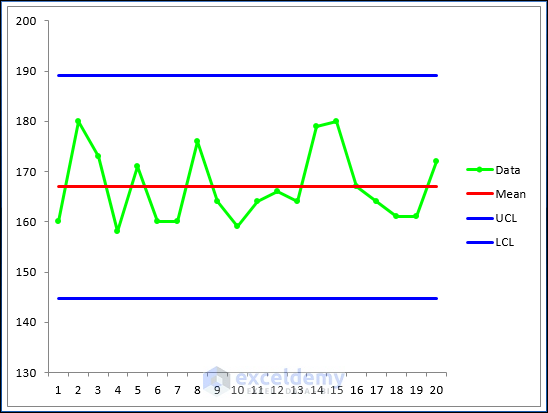
- Improving the Graph:
- By repeating the process and adding new series using the above approach, you can create a graph.
- However, the initial graph may not look visually appealing.
- To enhance it:
- Remove data markers from the central line, upper line, and lower line.
- Change the foreground color of the series.
- Set the value of MarkerStyle to x1None to remove markers.
'Data
Set MyNewSrs = myChtObj.Chart.SeriesCollection.NewSeries
With MyNewSrs
.Name = "Data"
.Values = Worksheets("Sheet1").Range("B2:B21")
.Format.Line.Visible = False
.Format.Line.Visible = True
.Format.Line.ForeColor.RGB = RGB(0, 255, 0)
.Format.Line.Weight = 1
.Format.Line.Transparency = 0
.MarkerSize = 3
.MarkerForegroundColor = RGB(0, 255, 0)
.MarkerBackgroundColor = RGB(0, 255, 0)
.MarkerStyle = xlMarkerStyleCircle
End With
-
-
- After formatting, you’ll achieve a better-looking graph.
-
- Adjusting the Y-Axis Scale:
- Use the MOD function to automate the computation of the maximum and minimum values for the y-axis scale (see details below in red).
- Consider both source data, UCL, and LCL when determining the scale.
'Ajust y-axis Scale
'Get max/min among source data, UCL and LCL
Cells(2, 7).Formula = "=max(" & "B2:B" & nlast & ",E2)"
Cells(1, 7) = "Max"
Cells(2, 8).Formula = "=min(" & "B2:B" & nlast & ",F2)"
Cells(1, 8) = "Min"
With myChtObj.Chart.Axes(xlValue, xlPrimary)
.MaximumScale = Int(Cells(2, 7).Value) + (10 - (Int(Cells(2, 7).Value) Mod 10))
.MinimumScale = Int(Cells(2, 8).Value) - (Int(Cells(2, 8).Value) Mod 10)
'Remove major gridlines
.HasMajorGridlines = False
End With
- Legend and Text:
- Delete the legend if desired.
- Insert text next to the lines for clarity.
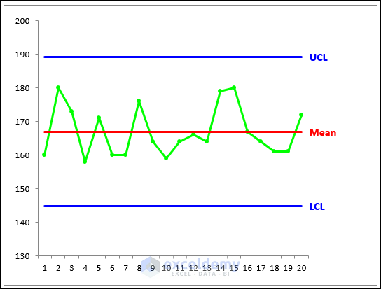
- Plot Area Width:
- After removing the legend, retrieve the current width of the plot area.
- Resize the plot area’s width as needed.
'Get current width of plot area
pwidth = myChtObj.Chart.PlotArea.Width
'Remove legend
myChtObj.Chart.Legend.Delete
'Set the width of plot area equal to width of orignal one
myChtObj.Chart.PlotArea.Width = pwidth
Special Considerations
Before creating control charts, it’s essential to examine the data. The data should ideally follow a normal distribution. If it doesn’t, the chart might produce an unexpectedly high number of false alarms.
Download Practice Workbook
You can download the practice workbook from here:
Related Articles
<< Go Back to Excel Control Chart | Excel Charts | Learn Excel
Get FREE Advanced Excel Exercises with Solutions!

Hi
Very interesting, however, control charts are meant for daily data input…the chart should update automatically….can you present one with daily input and automatic chart update?
I use control charts daily and have problems with this, also Mean Std UCL LCL must be in one cell and not in every entry..
Hi Sew. Thanks for your suggestions. I will write another post later when I am free.
obviously like your web site however you need to check the spelling on several of your posts.
A number of them are rife with spelling problems and I in finding it very
bothersome to inform the reality on the other hand I’ll
surely come back again.
Thanks a lot for your feedback. I will make plans to correct them. Best regards