PivotTable – Basic Things
A PivotTable is a powerful data analysis tool in Microsoft Excel. It allows users to quickly summarize, organize, and gain insights from large datasets. By transforming raw data into a more meaningful and compact format, PivotTables enable efficient analysis without the need for complex formulas or manual data manipulation. They are especially useful when dealing with extensive datasets, providing a user-friendly way to extract valuable information and identify trends, patterns, and outliers. If you’ve mastered the basics of PivotTables, exploring advanced techniques can further enhance your data analysis capabilities.
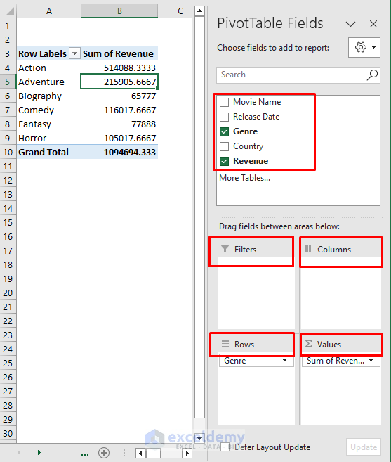
Basic Components of a PivotTable
- Data Source: The data source serves as the foundation for creating a PivotTable. It originates from the original dataset and should be well-organized, complete with column headers. These headers play a crucial role in defining the fields within the PivotTable.
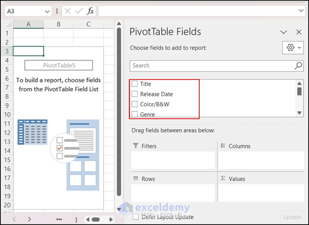
- Field List: When you create a PivotTable, the Field List appears on the right side of your screen. It includes all the available fields from your dataset. You can easily drag and drop these fields into the desired areas within the PivotTable.
- To access or hide the Field List, navigate to the “PivotTable Analyze” tab and select or deselect the corresponding option.
- Rows and Columns: In a PivotTable, you can arrange fields from the data source into the “Rows” and “Columns” areas. These selections determine how the data is organized and displayed in the final table.
- Values: The “Values” area contains numerical data that you want to summarize or analyze. You can apply various summary functions (such as sum, count, average, minimum, maximum, etc.) to perform calculations on this data.
- Filters: The “Filters” area allows you to add fields that act as filters. By selecting or deselecting filter options, you can dynamically update the results displayed in the PivotTable.
How to Create a Pivot Table in Excel
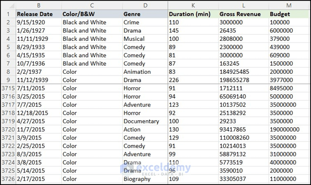
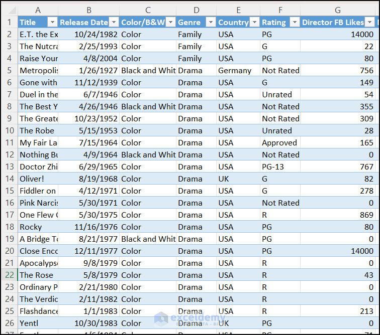
The below large dataset will be used to create a PivotTable.
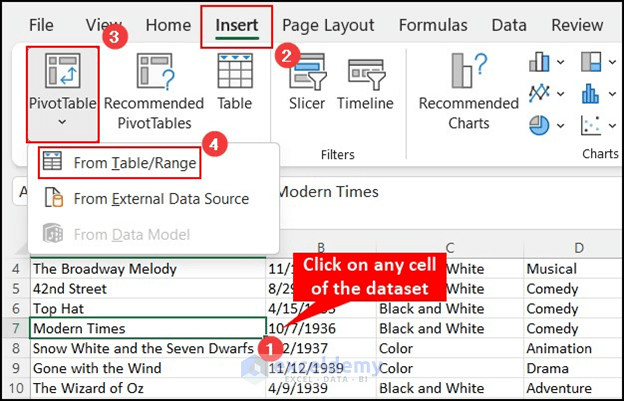
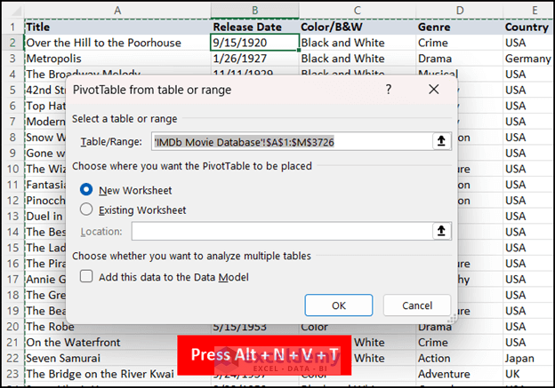
- Select Table/Range Option:
- Open your Excel workbook containing the dataset you want to analyze.
- Click on any cell within the dataset to ensure it’s selected.
- Navigate to the Insert tab in the Excel ribbon.
- Choose PivotTable and click on From Table/Range.
-
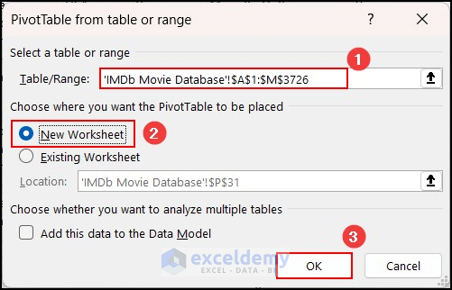
- The PivotTable from table or range dialog box will appear.
- The Table/Range field will automatically be set based on the cell you clicked earlier.
- If you want the PivotTable to appear in a new worksheet, select that option and click OK.
- Choose Fields for the PivotTable:
- You need to select the fields (columns) from your dataset to include in the PivotTable.
- The Field List will appear on the right side of your screen.
- You can drag and drop fields into the following areas:
- Rows: Determines how data is organized vertically.
- Columns: Determines how data is organized horizontally.
- Values: Contains the numerical data you want to summarize (e.g., sum, average, count, etc.).
- Filters: Allows you to add fields that act as filters for your PivotTable.
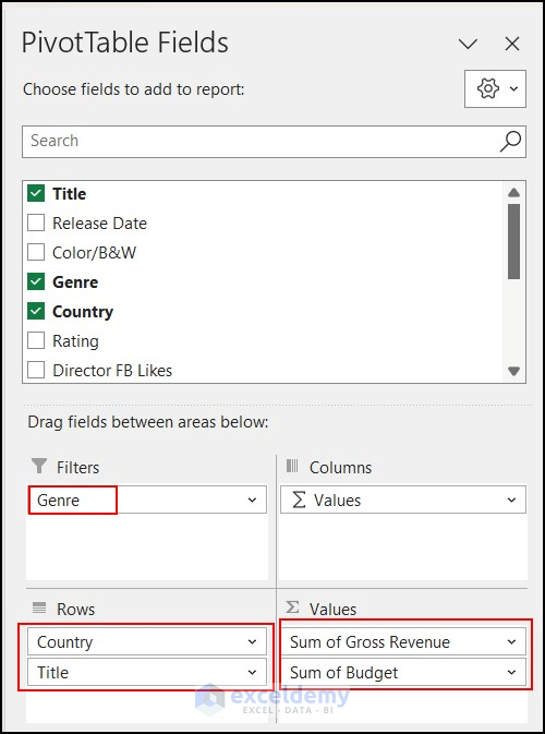
- Example Selection:
- Let’s say you’ve chosen the following fields:
- Rows: Country and Title
- Values: Gross Revenue and Budget
- Filters: Genre
- Let’s say you’ve chosen the following fields:
-
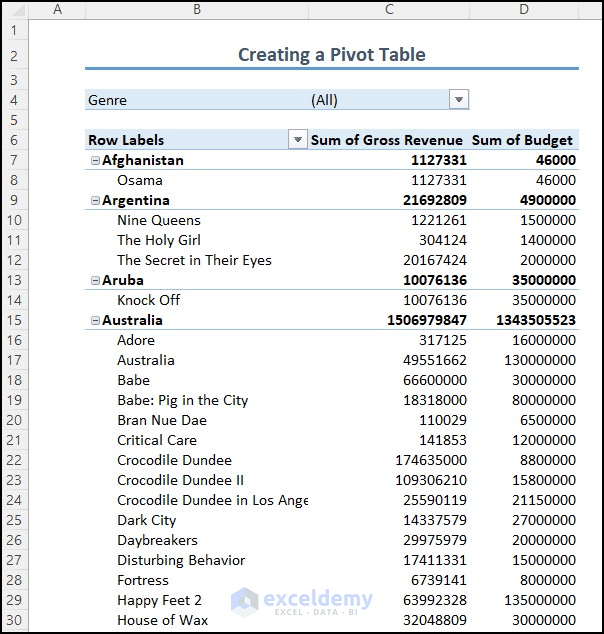
- By arranging these fields, you’ve successfully created a PivotTable that summarizes and analyzes your data.
- Apply Keyboard Shortcut:
- Alternatively, you can create a PivotTable using a keyboard shortcut:
- Press Alt + N + V + T.
- The PivotTable from table or range dialog box will appear.
- Follow the same steps as described earlier.
- Alternatively, you can create a PivotTable using a keyboard shortcut:
Remember, PivotTables are incredibly versatile and can help you gain valuable insights from your data.
Benefits of Using Advanced Techniques in Excel Pivot Table
Using advanced techniques in Excel Pivot Tables can significantly enhance your data analysis capabilities, making your work more efficient and insightful. Let’s explore the advantages:
- Complex Data Analysis:
- Advanced techniques allow you to perform more complex tasks, such as creating calculated fields, calculated items, and custom formulas. These functionalities enable you to extract deeper insights from your data beyond basic summary functions (e.g., sum, average, count).
- Sophisticated Data Models:
- With advanced Pivot Table techniques, you can build sophisticated data models. This includes combining multiple data sources, using Power Query for data shaping and transformation, and establishing relationships between tables.
- Dynamic Reports:
- Advanced features enable you to create dynamic reports that automatically update when the source data changes. This ensures your analysis remains up-to-date without manual adjustments.
- Interactive Filtering:
- Slicers and timelines are powerful filtering tools within Pivot Tables. They provide an interactive way to filter data, allowing you to explore different aspects of your dataset effortlessly.
- Visual Representation:
- PivotTables can be used to create charts and graphs. Visualizing your data in this way helps present complex information more intuitively to stakeholders.
- Data Exploration:
- Advanced techniques allow you to explore data at different levels. You can drill down into specific details to gain deeper insights, which is valuable for thorough analysis.
- Time-Based Analysis:
- PivotTables can automatically group date and time data into intervals (e.g., months, quarters, years). This simplifies time-based analysis and provides a clearer view of trends over time.
- Efficiency and Data-Driven Decisions:
- As you become proficient with advanced Pivot Table techniques, you’ll save time and effort during data analysis. This efficiency allows you to focus on interpreting results and making informed decisions based on data.
25 Tips & Techniques when using Advanced Pivot Tables
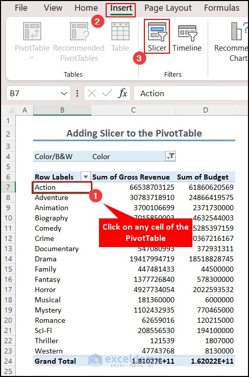
1. Use Slicers for Effortless Data Filtering
- Scenario: You have a PivotTable, and you want to filter data quickly with a single click.
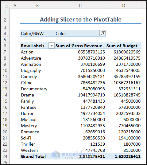
- Solution:
- Click on any cell within your PivotTable.
- Navigate to the Insert tab.
- Select Slicer.
-
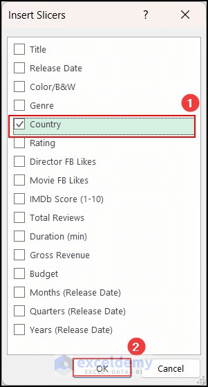
- In the Insert Slicers dialog box, choose the field (e.g., Country) by which you want to filter your PivotTable.
- Click OK.
-
- A slicer will appear next to your PivotTable. You can now select different countries to filter the data.
- The best part? You can select multiple countries simultaneously as filters.

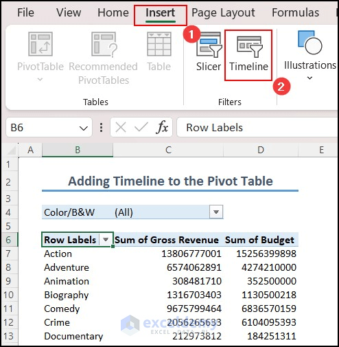
2. Enhance Data Visualization with Timelines
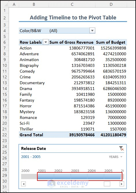
- Scenario: You’re working with a dataset containing movie release dates spanning from 1920 to 2015. You want to filter data based on release years.
- Solution:
- Select any cell within your PivotTable.
- Go to the Insert tab.
- Choose Timeline.
-
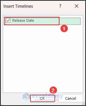
- In the Insert Timelines dialog box, you’ll see the available time-related field (e.g., Release Date).
- Click OK.
-
- A timeline will be added to your PivotTable.
- From the dropdown, select the desired time interval (e.g., YEARS).
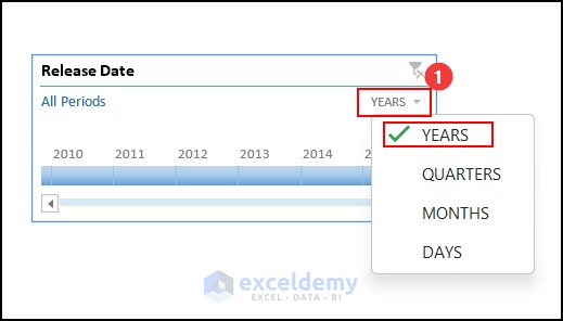
-
- You can easily filter data by selecting specific years from the timeline.
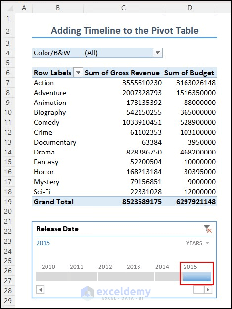
-
- Bonus: You can even select multiple years, and the PivotTable values will adjust accordingly.
3. Customize Number Format in a PivotTable
Did you know that you can tailor the number format within a PivotTable? It’s a handy feature! Here’s how you can do it:
- Right-click on any cell in the column for which you want to change the number format.
- From the context menu, select Number Format.
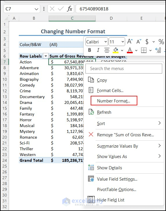
- The Format Cells dialog box will appear.
- Choose an appropriate category (e.g., Accounting) and set the desired number of decimal places (e.g., 0).
- Click OK.
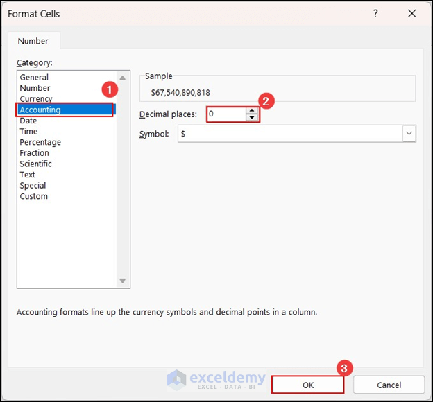
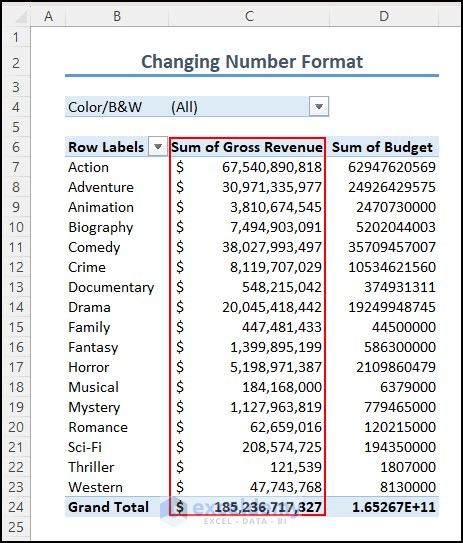
You’ll see that the number format has been updated.
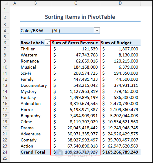
4. Sort Items Using the Context Menu
Sorting items in a PivotTable is essential for better analysis. Follow these steps:
- Right-click on any cell in the column you want to sort.
- Select Sort and then choose More Sort Options.
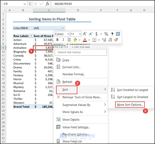
- In the Sort By Value dialog box, specify your sorting preferences (e.g., Smallest to Largest and Top to Bottom).
- Click OK.
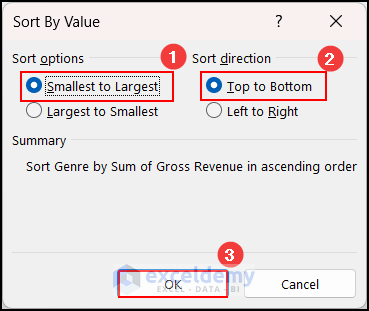
Your table will now be sorted based on the sum of the Gross Revenue column.
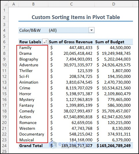
5. Custom Sort Items
Sometimes, you may want to sort PivotTable items according to your own order. Here’s how:
- Create a custom sort order by listing the items in a separate column within the same worksheet.
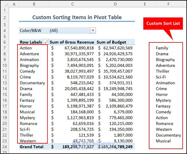
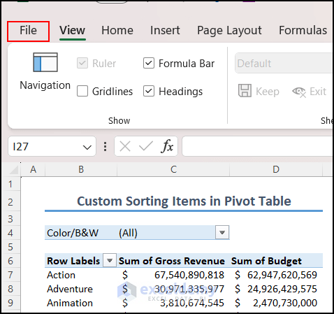
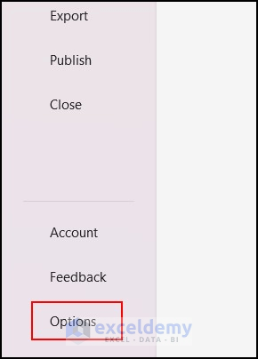
- Click on the File tab.
- Go to Options.
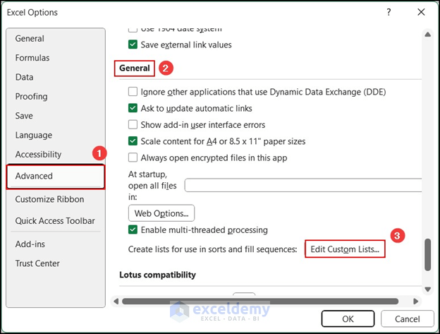
- In the Excel Options dialog box, select Advanced and click on Edit Custom Lists.
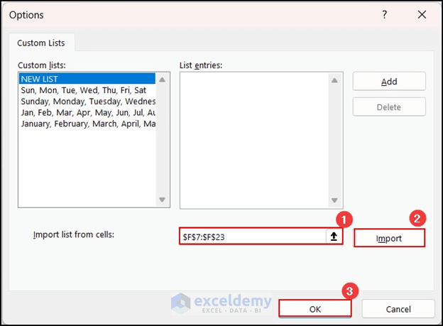
- Specify the cell reference of your custom sort list (or manually enter the items).
- Press Import and then click OK.
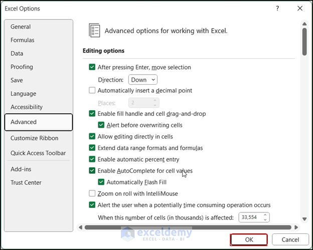
- Press OK when the Excel Options dialog box appears.
- Refresh the PivotTable by right-clicking on any cell in the column you want to sort.
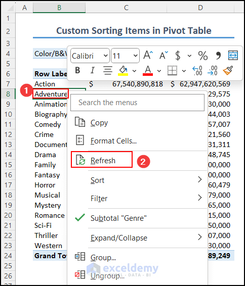
The items in the Row Labels column will be custom-sorted according to your preference.
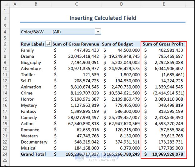
6. Create or Remove a Calculated Field in a PivotTable
Creating a calculated field is an advanced feature in Excel’s PivotTable. It’s a clever technique that allows you to compute various parameters without writing complex formulas. Here’s how you can create or remove a calculated field:
6.1 Create a Calculated Field:
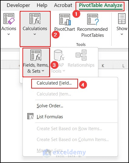
- Click on any cell within the PivotTable.
- Go to the PivotTable Analyze tab.
- Under Calculations, select Fields, Items, & Cells, and then choose Calculated Field.
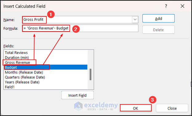
- The Insert Calculated Field dialog box will appear.
- Provide a relevant name for your calculated field (e.g., Gross Profit).
- From the available fields, select the ones you want to use in your formula and click Insert Field. For example, you can calculate Gross Profit by subtracting the Budget from the Gross Revenue.
- Review your formula and click OK.
- A new column will be added to your existing PivotTable with the calculated values.
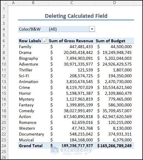
6.2 Remove a Calculated Field
- To remove a calculated field, follow the same steps as when creating one.
- Open the Insert Calculated Field dialog box.
- Click the dropdown menu and choose the field you want to delete.
- Press Delete and then click OK.
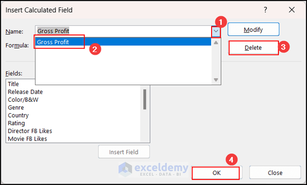
Now you can manage your calculated fields efficiently!
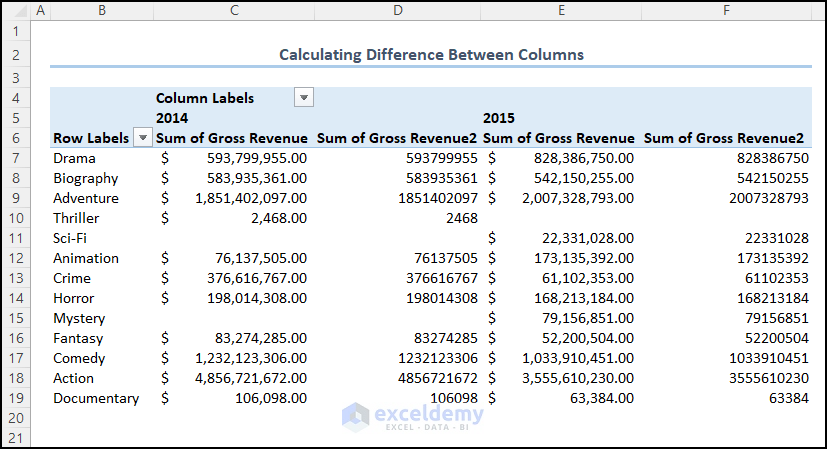
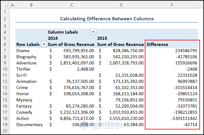
7. Calculate the Difference Between Two Columns
You can easily compute the difference between two columns in a PivotTable without writing any formulas. Follow these quick steps:
- In your dataset, you have Gross Revenue for the years “2014” and “2015.” Let’s calculate the difference in Gross Revenue between these two years.
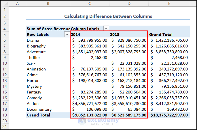
- Click on any cell within the PivotTable.
- Go to the Design tab.
- Under Grand Totals, select Off for both Rows and Columns. We don’t need grand totals for this calculation.
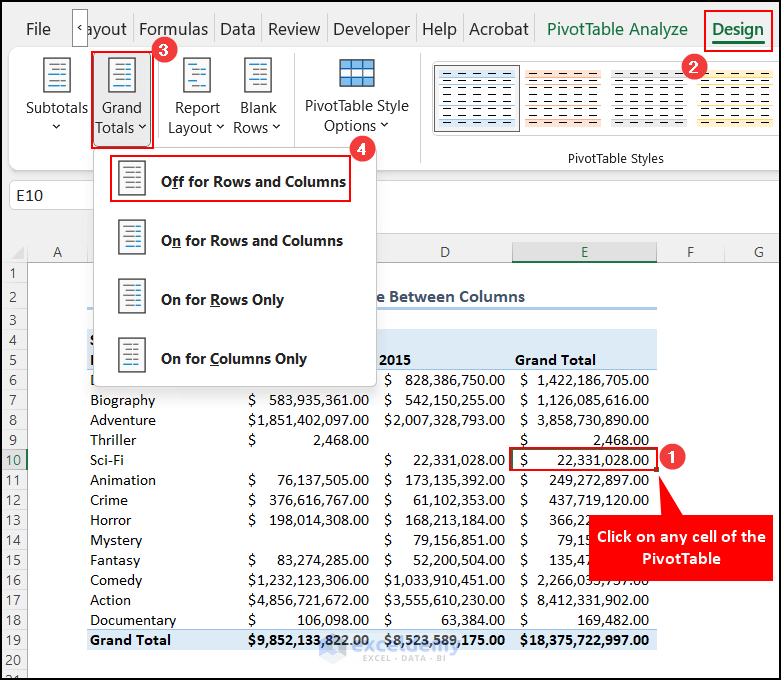
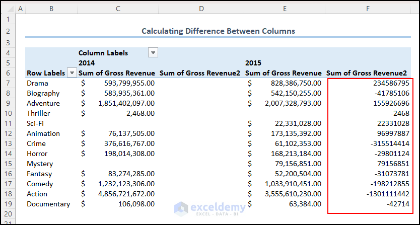
- Add the Gross Revenue to the Values area a second time. We’ll use this duplicate field to show the difference.
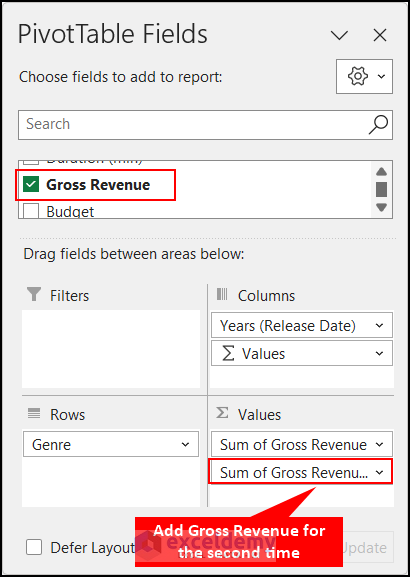
- You’ll see that Gross Revenue has been added a second time.
- Right-click on any cell in the newly added Sum of Gross Revenue2 column.
- Select Show Value As and then choose Difference From…”
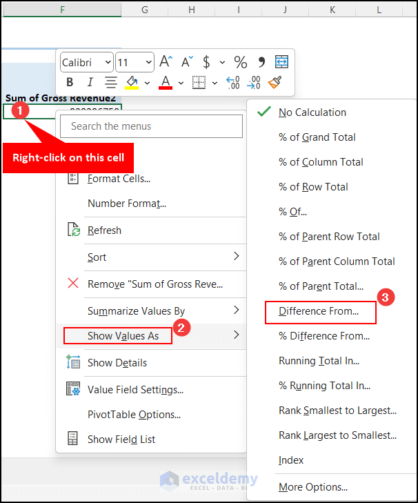
- The Show Values As dialog box will appear. Set Years (Release Date) as the Base Field.
- In the Base Item dropdown, select previous because we want to calculate the difference from the previous column.
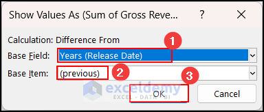
- The difference will now be calculated.
- Edit the name of the column to Difference and hide any unnecessary columns.
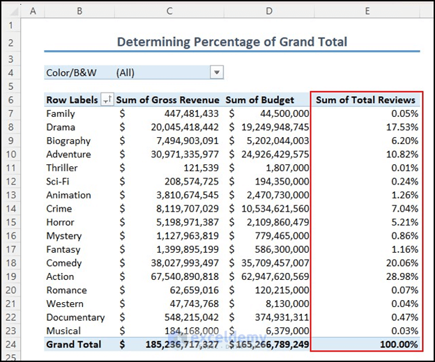
8. Show Percentage of Grand Total
Now let’s determine the Total Reviews as a percentage of the grand total. Follow these steps:
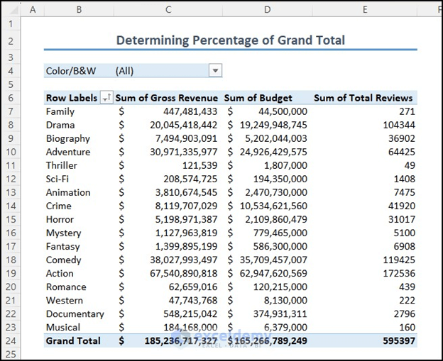
- Right-click on any cell in the column you want to display as a Percentage of the Grand Total.
- Click on Show Values As and then choose % of Grand Total.
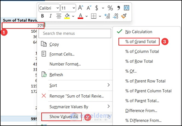
You’ll see that the Sum of Total Reviews is now shown as a percentage of the overall grand total.
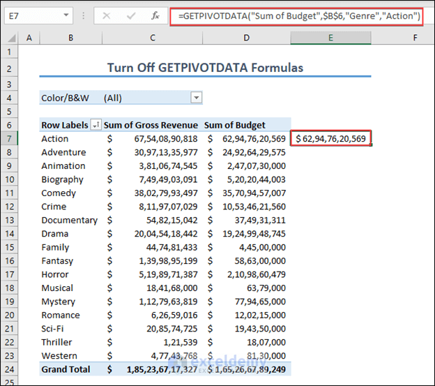
9. Disabling the GETPIVOTDATA Formula
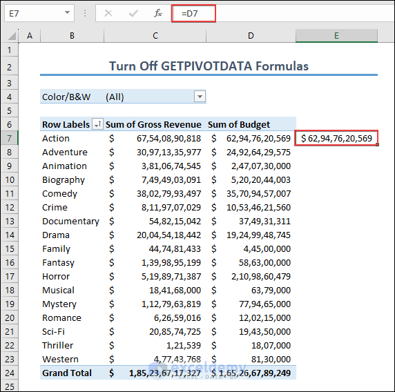
The GETPIVOTDATA function retrieves data from a pivot table by referencing specific values within that table. Unlike regular cell references, it directly extracts data from the source data. Suppose you want to reference a cell value from a PivotTable. For example, you want to display the value of cell D7 in cell E7 by simply writing the formula “=D7.” However, after doing this, the GETPIVOTDATA formula still appears in cell E7. The formula looks like this:
=GETPIVOTDATA("Sum of Budget",$B$6,"Genre","Action")Keeping the GETPIVOTDATA formula can be problematic, especially when creating dynamic dashboards. If it remains active, the data won’t update correctly. Here are some difficulties users face when using GETPIVOTDATA:
- Not Ideal for Dynamic Analysis:
- When users frequently change data criteria, GETPIVOTDATA becomes cumbersome. Each time the criteria change, the function must be manually updated.
- Layout and Structure Changes:
- If you modify the layout or structure of the PivotTable (e.g., changing the layout), GETPIVOTDATA formulas may break, causing errors in the worksheet.
- Issues with Calculated Fields and Items:
- GETPIVOTDATA may not work well with calculated fields and items in the PivotTable, leading to incorrect results or errors.
- Hard-Coded References:
- GETPIVOTDATA often uses hard-coded cell references in the formula. This can be problematic when you want to use cell references or other dynamic formulas.
To avoid these problems, you can turn off the GETPIVOTDATA formula:
- Click on any cell in the column for which you want to disable GETPIVOTDATA.
- Go to the PivotTable Analyze tab.
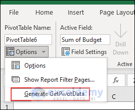
- Under Options, click on Generate GetPivotData.
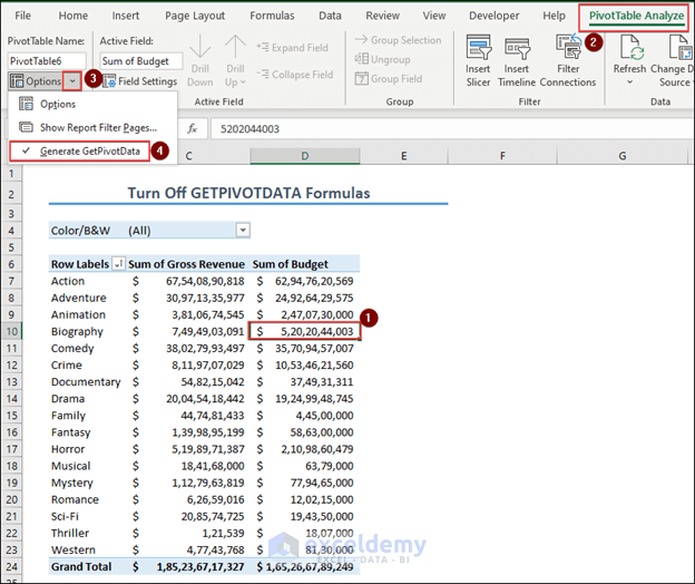
- The checkmark should disappear next to the Generate GetPivotData option.
- If you enter the formula “=D7” in cell E7, it will display only the value of cell D7. This is because you’ve turned off the GETPIVOTDATA option.
Remember that you can always turn it back on by clicking the Generate GetPivotData option again.
10. Grouping and Ungrouping Items Under a Field
Grouping items in a PivotTable allows you to organize and summarize data effectively. Here’s how you can group and ungroup items:
- Grouping Items:
- Select the items you want to group together.
- Right-click on the selection.
- From the context menu, choose the Group option.
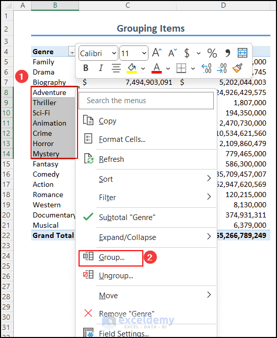
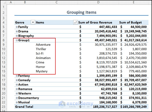
- The selected items will now be grouped under a default name (e.g., Group1). You can edit this group name according to your preference.
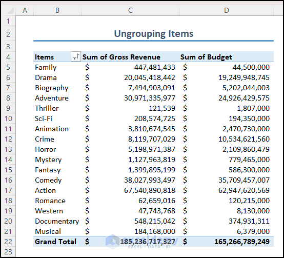
- Ungrouping Items:
- To ungroup the items, right-click on the group name (e.g., Group1).
- Select the Ungroup option.
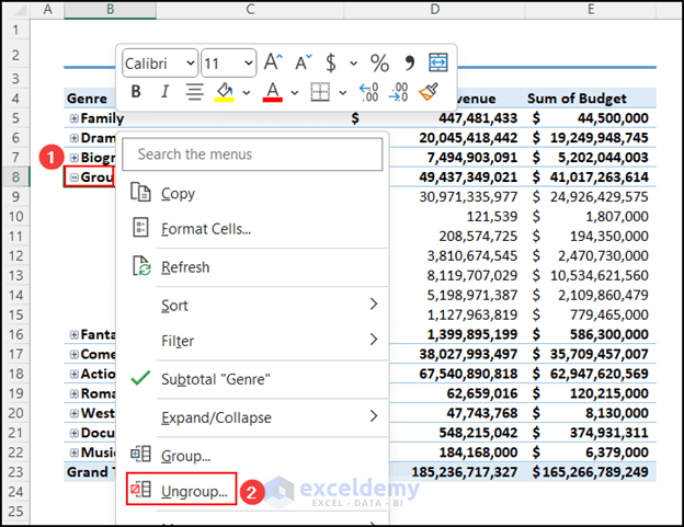
- The items will be ungrouped.
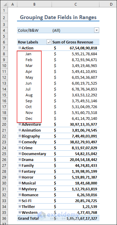
11. Grouping a Date Field
Grouping date fields is useful for analyzing time-based data. Let’s say you have a column called Released Date represented by quarters, but you want to group it by months. Follow these steps:
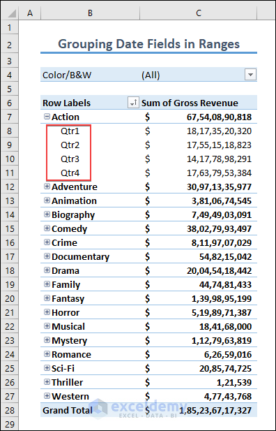
- Right-click on any cell within the Quarters column.
- Select the Group option from the context menu.
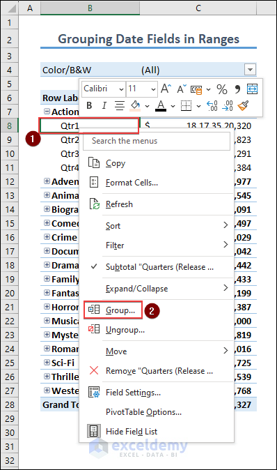
- The Grouping dialog box will open.
- The starting and ending dates will be set automatically based on your dataset, but you can adjust them if needed.
- In the By box, choose your preferred grouping (e.g., Months).
- Click OK.
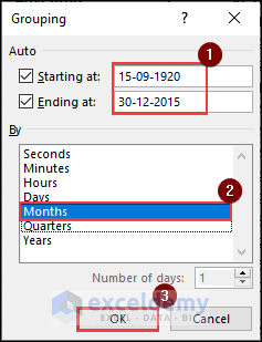
- The dates will now be successfully grouped into Months.
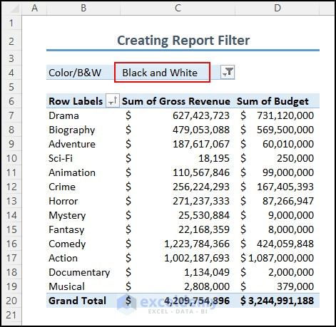
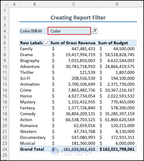
12. Creating a Report Filter
A report filter allows you to filter data in your PivotTable based on specific criteria. Here’s how you can create one:
- Click on any cell within the PivotTable.
- The PivotTable Fields pane will appear.
- Drag and drop the field that you want to use as a filter into the Filters area.
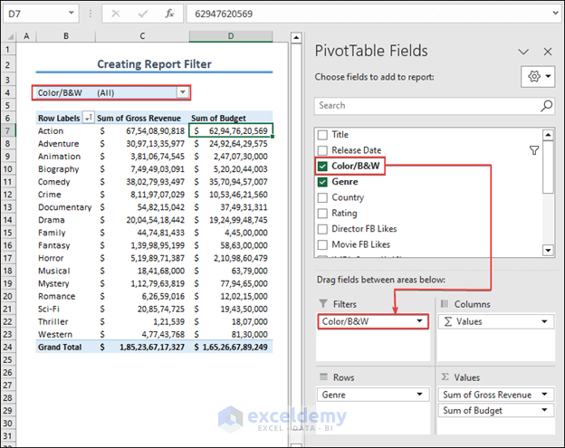
- A filter option will appear just above the table.
- Click on the drop-down arrow.
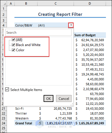
- Select the option you want to see in the PivotTable (e.g., Black and White) and press OK.
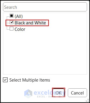
- Only the values corresponding to your chosen filter will be displayed.
- You can further refine the filter by selecting other options (e.g., Color).
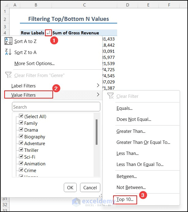
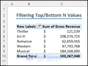
13. Filter Top/Bottom N Values
Suppose you want to filter the top or bottom items based on the sum of gross revenue in your PivotTable.
Follow these steps:
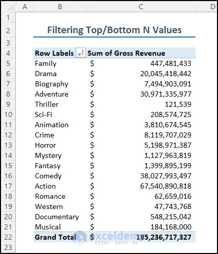
- Click on the drop-down arrow next to the Row Labels.
- Select Value Filters and then choose the Top 10 option.
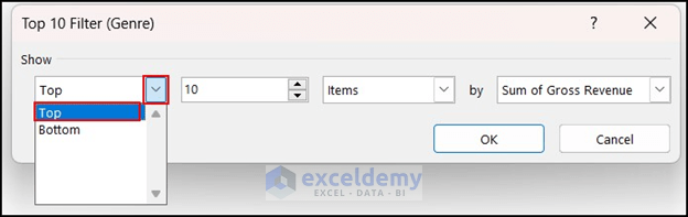
- The Top 10 Filter dialog box will appear.
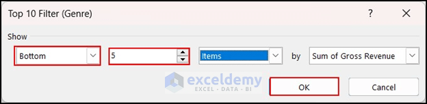
- From the drop-down, choose Top to show the top values.
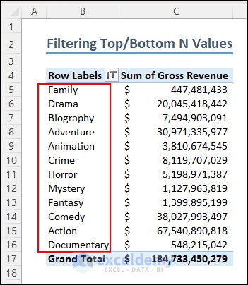
- Select the number of items you want to see. For example, if you want to see the top 12 values, select 12.
- Under By, choose Sum of Gross Revenue and press OK.
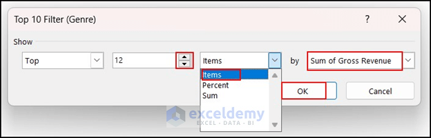
- As a result, you’ll see the top 12 sum of gross revenue values along with their corresponding genres.
- If you want to show bottom values instead, select Bottom from the dropdown. For example, you can choose the bottom 5 items by sum of gross revenue.
- Press OK.
14. Refresh Data
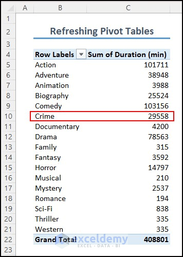
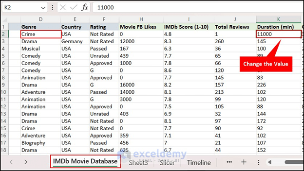
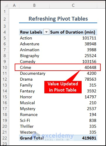
When you update or add any value, the source data of the PivotTable changes. To reflect these changes, you need to refresh the table. Let’s say the sum of duration for the genre Crime in your PivotTable is currently 29558. If you make changes to any value under this genre, the PivotTable needs to be updated.
14.1 From the PivotTable Analyze Tab
- Change the value from 110 to 11000 (or any other value) to visualize the change.
- Click on the PivotTable Analyze tab.
- Select the Refresh command and click on the Refresh option.
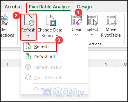
- The sum of duration for the Crime genre will be updated to the new value (e.g., 40448).
14.2 From PivotTable Options
- Select any cell within the PivotTable.
- Click on the PivotTable Analyze tab.
- Choose the PivotTable dropdown and then click on Options.
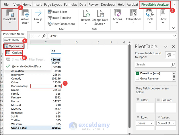
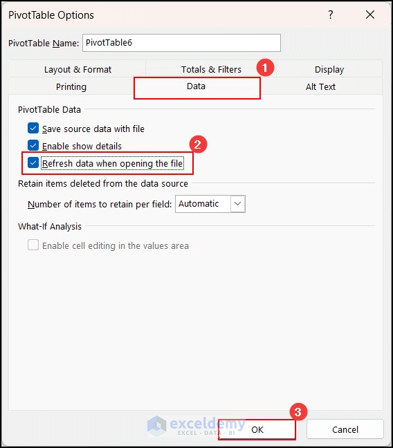
- In the PivotTable Options dialog box, go to the Data section.
- Check the Refresh data when opening the file option.
- Click OK.
- The values will automatically refresh every time you open the file.
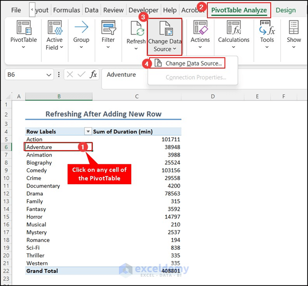
14.3 Refresh Pivot Table When New Column/Row is Added
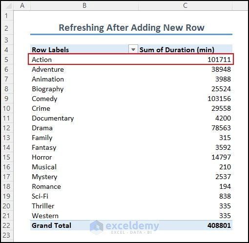
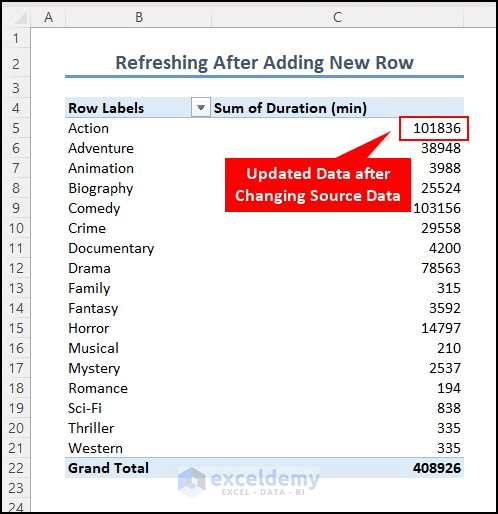
In your dataset, you can see that the sum of duration for the Action movie is 101711. If you insert new data into the source data of the Action movie, the PivotTable should be updated accordingly.
Follow these steps:
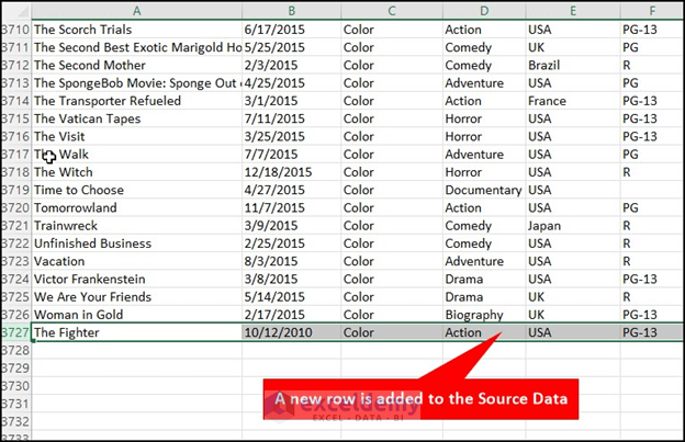
- Insert a new row or column of information into the data source of the PivotTable.
- Right-click on any cell within the PivotTable.
- From the context menu, click on Refresh.
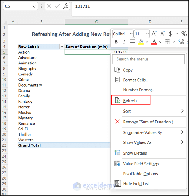
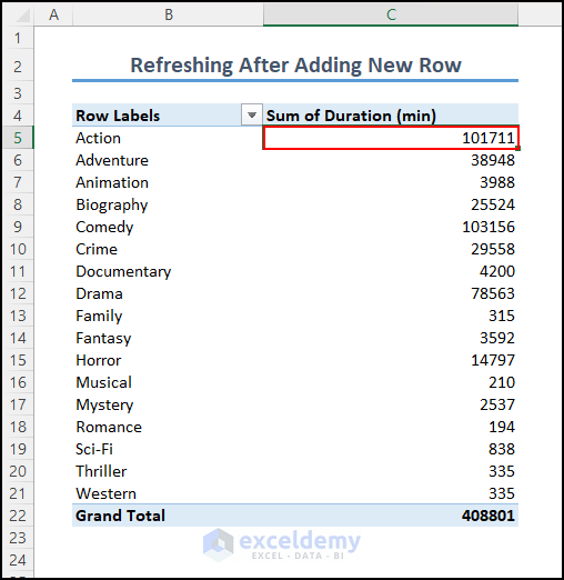
- However, you’ll notice that the PivotTable doesn’t update after clicking Refresh. The Action movie still shows a duration of 101711 minutes.
To resolve this issue, follow these additional steps:
- Click on any cell within the PivotTable.
- Select the PivotTable Analyze tab.
- Choose Change Data Source and then select Change Data Source again.
- The Move PivotTable dialog box will appear.
- This time, select the entire table, including the newly added row, in the Table/Range box.
- Click OK.
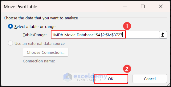
- As a result, you’ll see that the data is now updated in the PivotTable.
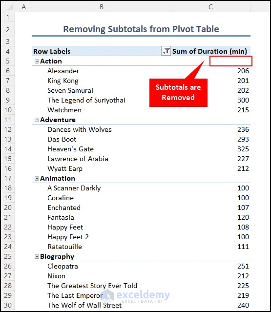
15. Hide/Unhide Subtotals
In a PivotTable, subtotals are typically shown. However, there are situations where you might need to hide these subtotals. Follow these steps:
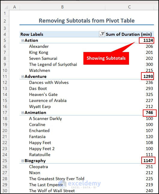
- Click on any cell within the Sum of Duration column.
- Select the Design tab.
- Click on Subtotals and choose the option Do not Show Subtotals.
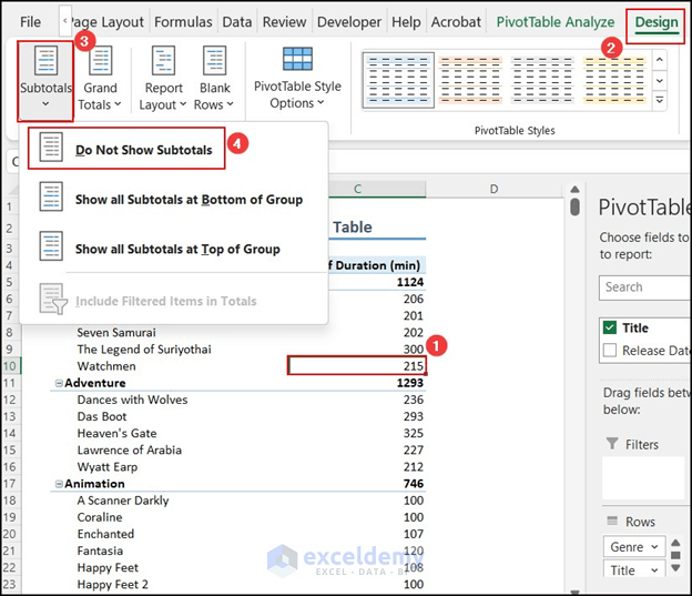
- As a result, the subtotals will be hidden.
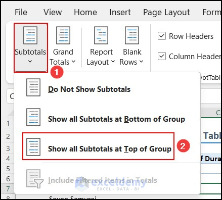
- If you want to Unhide them, select the option Show all Subtotals at Top of Group under Subtotals.
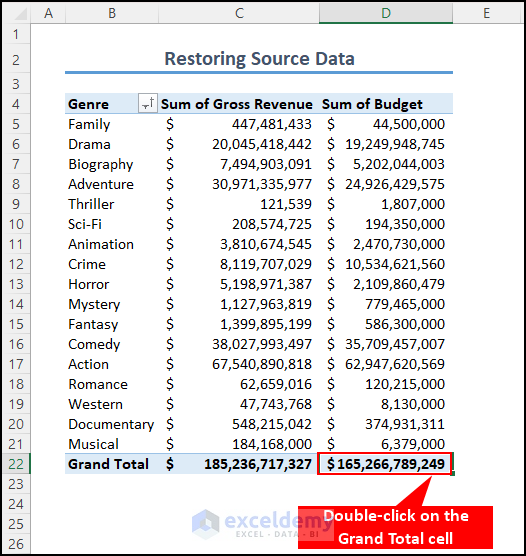
16. Delete Source Data and Restore It with a Double-click
Sometimes, to reduce file size, you may need to delete the source data of a PivotTable. Fortunately, deleting the source data won’t affect the table itself. Here’s how to do it:
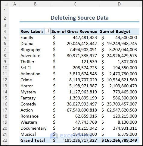
- Right-click on the sheet where the source data is stored.
- Select the Delete option to remove it.
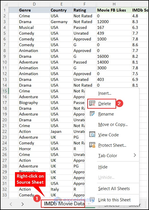
- If you want to restore the source data, right-click on any cell within the PivotTable.
- Choose Show Details.
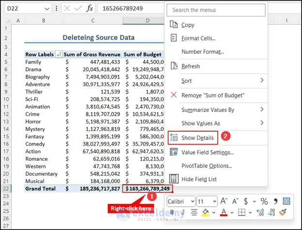
- The data will be restored in a table form.
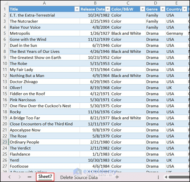
- Alternatively, you can double-click on the output of the Grand Total cell to restore the source data.
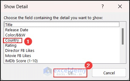
17. Drill Down Pivot Table
Drilling down in a PivotTable is a useful feature to show detailed information from a summarized table. Follow these steps:
- Initially, double-click on the item you want to drill down into.
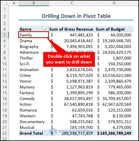
- The Show Detail dialog box will appear.
- Choose the field that contains the detail you want to see. For example, if you want to see details by country, select Country.
- Press OK.
- The items will now have a plus (+) sign next to them.
- Double-click on any item to drill down further.
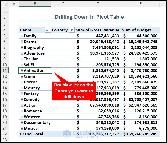
- It will show the names of countries that have released movies in the Animation genre, along with their corresponding values.

18. Create Different Styles in Pivot Table
- Click on any cell within the PivotTable.
- Select the Design tab.
- Click on the drop-down icon for PivotTable Styles.
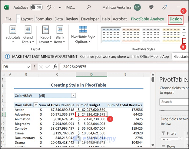
- Choose New PivotTable Style…
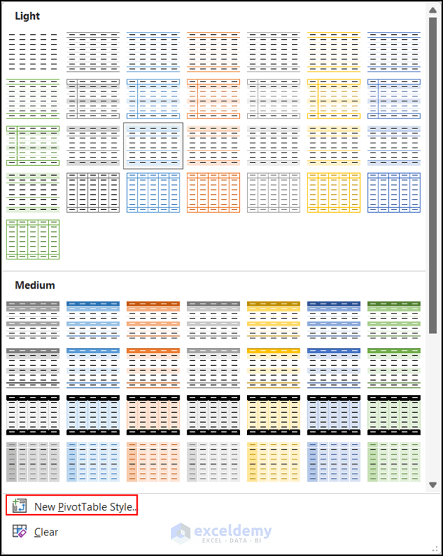
- The New PivotTable Style dialog box will appear.
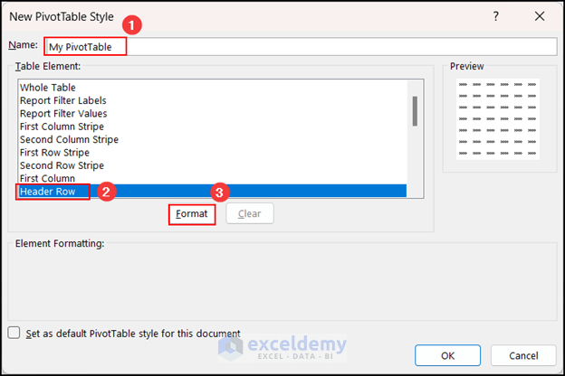
- Give your custom PivotTable style a name.
- Select the element you want to format from the Table Element options. For example, I’ve chosen the Header Row.
- Click on Format.
- Customize the cell formatting according to your preference. In my case, I’ve changed the Fill color.
- Check the Sample and press OK.
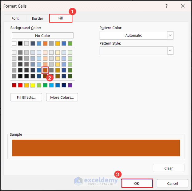
- After reviewing the Preview, click OK.
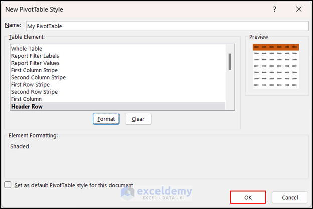
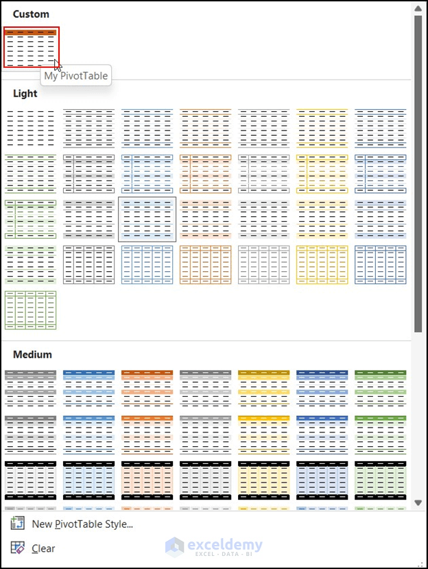
- You’ll now see your created PivotTable style listed in the PivotTable Styles command as Custom.
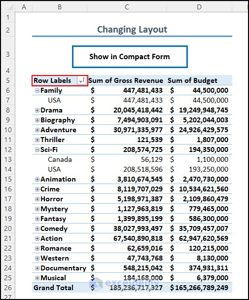
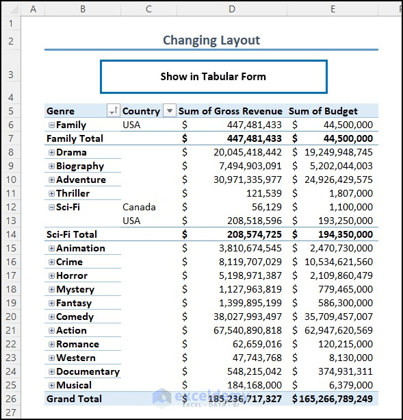
19. Change Layout of Pivot Table
- Click on any cell within the PivotTable.
- Select the Design tab.
- Click on Report Layout and choose the layout you want to display. I’ve selected Show in Compact Form.
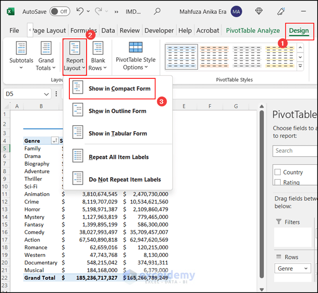
- The PivotTable will now appear in the Compact Form layout.
- If you choose Show in Tabular Form, it will look different.
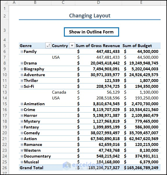
- Similarly, selecting Show in Outline Form will produce a different output.
- Choose a layout that best suits your table.
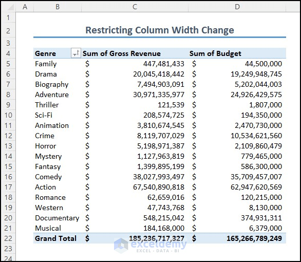
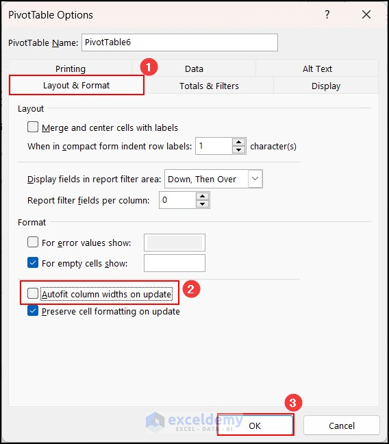
20. Restrict Column Width Change after Refresh
In a PivotTable, adjusting column widths according to your needs is common. However, after refreshing the table, the column widths automatically adjust to autofit the content. Unfortunately, this can sometimes affect the overall appearance of your table. To prevent this:
- In the following image, I’ve increased the column width to improve readability.
- If I click on the Refresh button, the columns will autofit again.
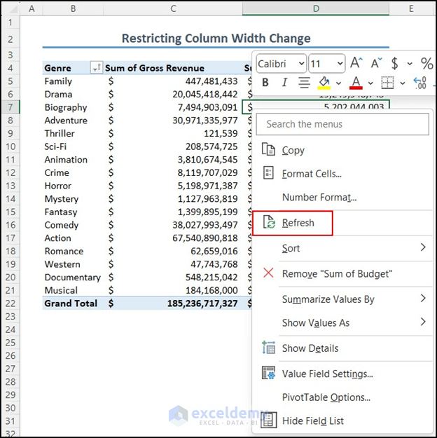
- To restrict column width changes after refresh, right-click on any cell within the PivotTable.
- Click on PivotTable Options.

- In the PivotTable Options dialog box, select the Layout & Format option.
- Uncheck the box that says Autofit column widths on update.
- Click OK.
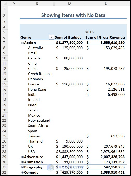
21. Display Items with No Data
In a PivotTable, some items may have no data associated with them. By default, the PivotTable hides the field names for these data-less items. However, you can display them using the following steps:

- In your dataset, there are hidden items that lack data.
- Right-click on any cell within the PivotTable.
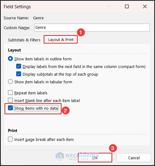
- Click on Field Settings.
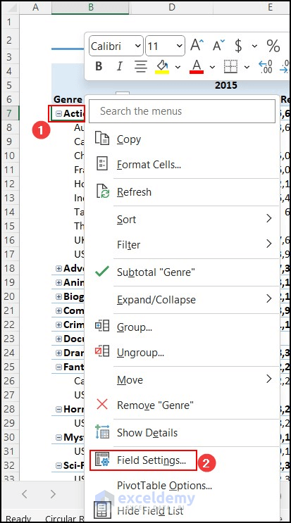
- The Field Settings dialog box will open.
- Select the Layout & Print option and then click on Show items with no data.
- Press OK.
- As a result, the items that previously had no data will now be displayed.
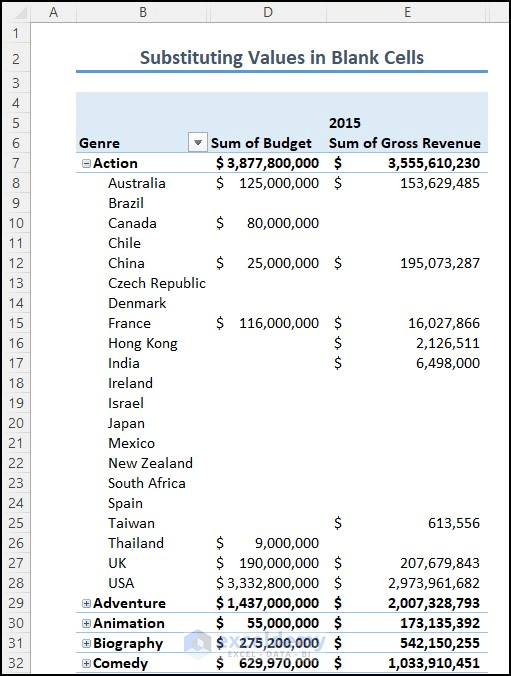
22. Substitute Blank Cells in Pivot Table
In a PivotTable, you can replace any blank cell with a value. If you want to provide additional information about these blank cells, follow this technique:
- Consider the dataset where there are many blank cells. For example, a country didn’t release any movies under the Action genre.
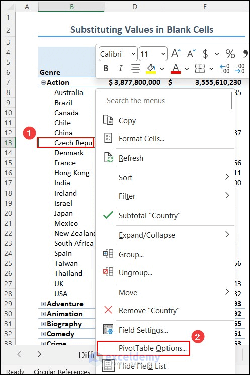
- Click on any cell within the PivotTable.
- Select PivotTable Options from the context menu.
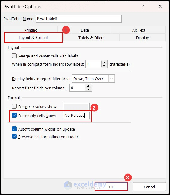
- In the PivotTable Options dialog box, click on Layout & Format.
- Write the text you want to substitute for the blank values in the For empty cells show box (e.g., No Release).
- Press OK.
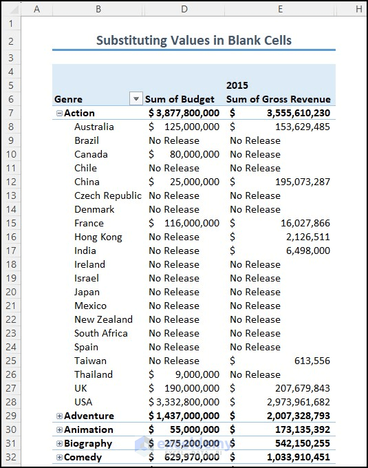
- The blank cells will now be substituted with the specified values.
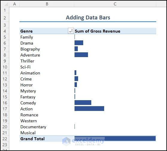
23. Attach Data Bars in Pivot Table
You can enhance your PivotTable by adding data bars. These bars provide a visual representation of data and make the table more attractive and easier to understand. Follow these steps:
- Click on any cell within the PivotTable.
- Then, select the Home tab.
- Go to Conditional Formatting and click on Data Bars, then choose More Rules…
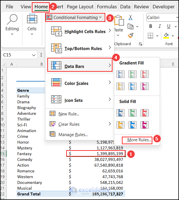
- The New Formatting Rule dialog box will appear.
- Select All cells showing ‘Sum of Gross Revenue’ values.
- Click on the Show Bar Only option if you want to display only the bars.
- Choose a color and check the preview.
- Press OK.
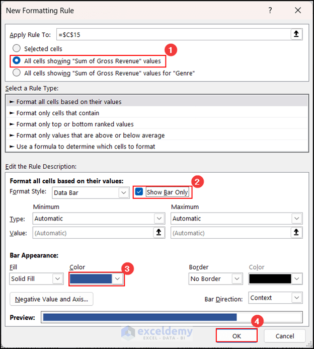
- As a result, data bars will be added to the selected cells.
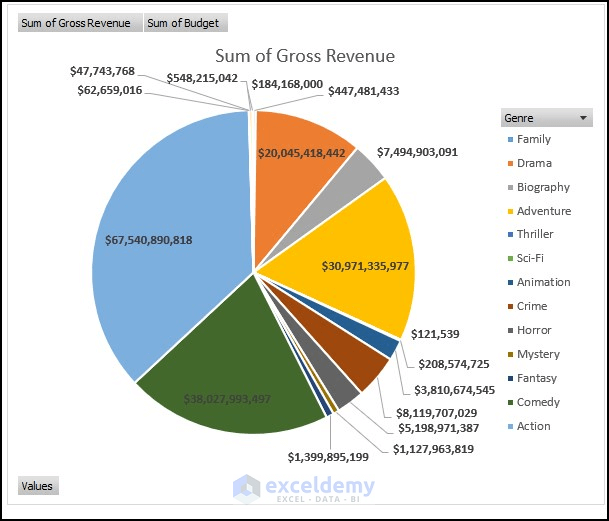
24. Create a Pivot Chart
Adding a Pivot Chart to your PivotTable can enhance the readability of your worksheet. Follow these steps to create a Pivot Chart from a Pivot Table:
- Click on any cell within the PivotTable.
- Go to the Insert tab.
- Click on PivotChart and select the desired chart type.
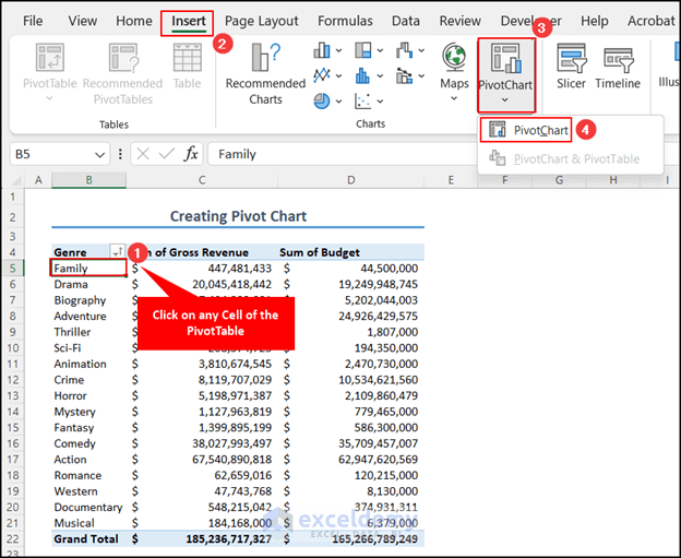
- The Insert Chart dialog box will appear.
- Choose the chart type you want (for example, Pie chart).
- Click OK to insert the Pivot Chart.
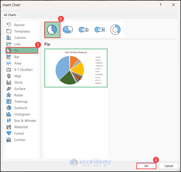
- A Pivot Chart is inserted.
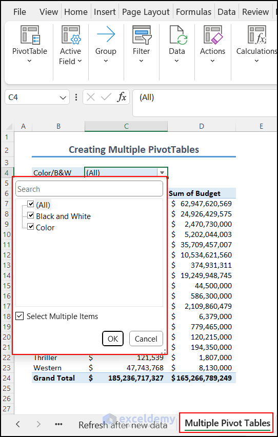
25. Create Multiple Pivot Tables
Suppose you have a dataset with two types of movies: Black and White and Color. You want to create separate PivotTables for each movie type. Here’s how you can do it:
- Click on any cell within the PivotTable.
- Go to the PivotTable Analyze tab.
- Click on Show and then select Field List.
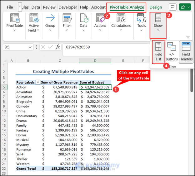
- The PivotTable Fields pane will open.
- Drag the field (e.g., Color/B&W) to the Filters area.
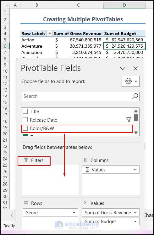
- This will insert a filter option into the existing PivotTable.

- The existing PivotTable is in a sheet named Multiple Pivot Tables.
- Now create two separate PivotTables based on the filter options:
-
- Click on any cell within the PivotTable.
- Go to PivotTable Analyze, select PivotTable and click on Options.
- Click on Show Report Filter Pages…
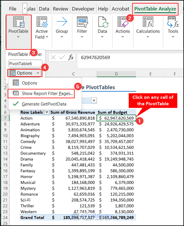
-
- Select the filter item from the Show Report Filter Pages dialog box.
- Press OK.

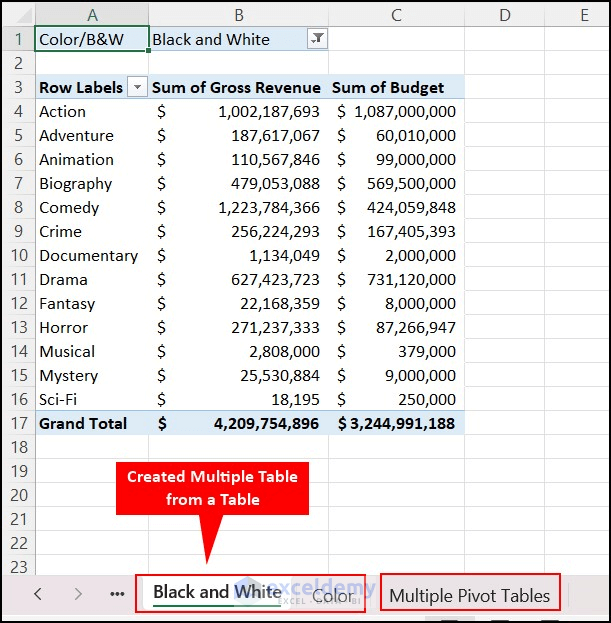
- You can see another two PivotTables have been inserted based on the filter options. The name of the worksheets is based on the filter options.
Apply Keyboard Shortcuts to Enhance Productivity with Pivot Table
Using keyboard shortcuts in Excel is always helpful. Here are some PivotTable-related keyboard shortcuts that can save you time and effort:
| Keyboard Shortcut | What it Does |
|---|---|
| Alt + N + V | Inserts a PivotTable |
| Alt + N + V + T + Enter | Opens PivotTable from table or range dialog box |
| Alt + D + P | Opens the Old PivotTable Wizard |
| Alt + Shift + Right Arrow Key | Groups the selected items of PivotTable |
| Alt + Shift + Left Arrow Key | Ungroups the selected items of PivotTable |
| Ctrl + Minus (-) | Hides items from the PivotTable |
| Alt + J + T + L | Hides the Field List |
| Ctrl + Shift + = | Creates a Calculated Field |
| Ctrl + A | Selects the entire PivotTable |
| F11 | Inserts Pivot Chart to New Worksheet |
| Alt + F1 | Inserts Pivot Chart to Current Worksheet |
| Space bar | Toggles checkboxes in Fields List |
Things to Remember
- Select the Appropriate Data Range: When creating a PivotTable, make sure to choose the relevant data range. Avoid including unnecessary rows or columns.
- Regularly Refresh Your PivotTable: If your data source changes or updates frequently, remember to refresh your PivotTable to reflect the latest data.
- Use Clear and Descriptive Field Names: When working with a large dataset, use field names that are easy to understand and describe the data accurately.
- Choose the Right Summary Function: Depending on the type of data you want to analyze (e.g., numeric values, counts, averages), select the appropriate summary function for your PivotTable.
Frequently Asked Questions
1. What’s the differences between a pivot table and a pivot chart?
- A Pivot Table is a data analysis tool that summarizes and aggregates data based on specific criteria (rows, columns, values).
- A Pivot Chart is a graphical representation of the data within a Pivot Table. It helps visualize trends and patterns by converting data into different types of graphs (e.g., bar charts, line charts, pie charts).
2. Are there any limitations to advanced pivot tables?
While advanced Pivot Tables are powerful, they may face limitations:
- Handling very large datasets could impact performance.
- Complex calculations might slow down processing.
- Customizations may be less flexible compared to specialized data analysis tools. Remember these tips and insights to make the most of your PivotTable experience!
Download Practice Workbook
You can download the practice workbook from here:
Get FREE Advanced Excel Exercises with Solutions!
