Step 1: Prepare a Dataset
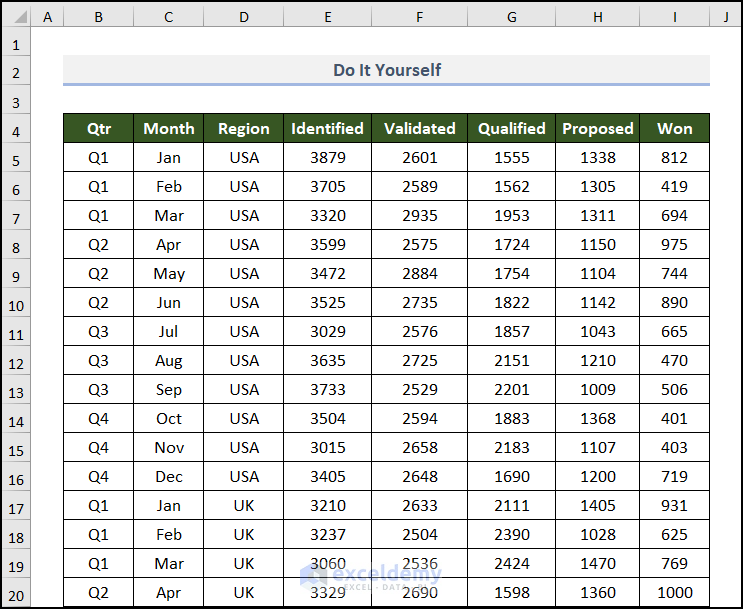
We must create or import a dataset that includes the necessary data for creating a sales pipeline. Here, we will use a report from ABC Organization: Deals of 2021. This dataset contains the Qtr (a quarter of the year), Month names, Region, and different status types in columns B to I.
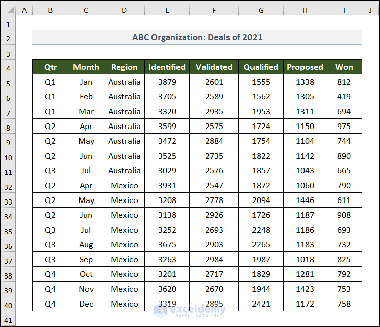
Note: This is a basic dataset with dummy data to keep things simple. In a practical scenario, you may encounter a much larger and more complex dataset.
This dataset is large in the vertical direction. To accommodate the largest part of the table in the image, we used freeze panes in the worksheet.
Step 2: Create a PivotTable
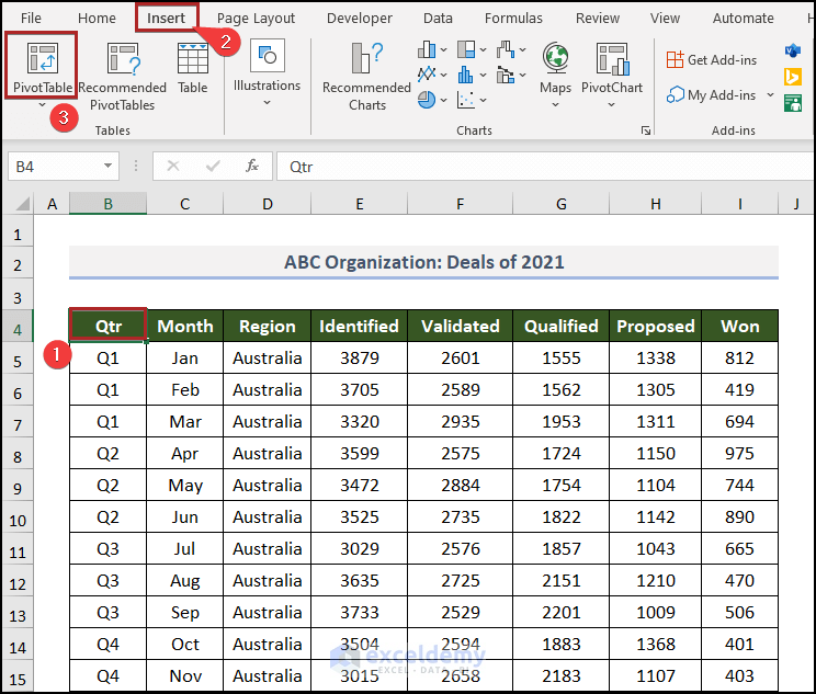
- Select any cell inside the dataset. In this case, we chose cell B4.
- Go to the Insert tab.
- Click on PivotTable on the Tables group of commands.
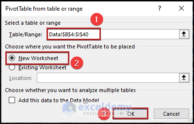
The PivotTable from the table or range dialog box appears.
Here, you can see the whole dataset is selected automatically. But double-check manually to avoid any unwanted mistakes.
- Select New Worksheet in the Choose where you want the PivotTable to be placed section.
- Click OK.
You can see this PivotTable in the new worksheet.
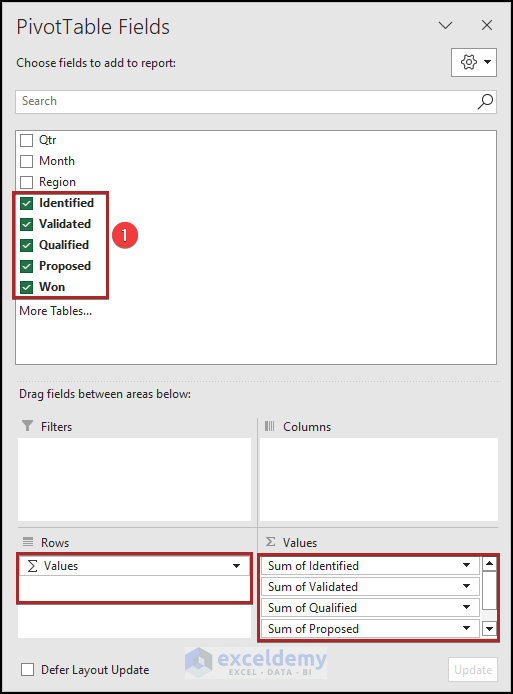
- Click on any cell inside the PivotTable area to find the PivotTable Fields task pane on the right side of the display.
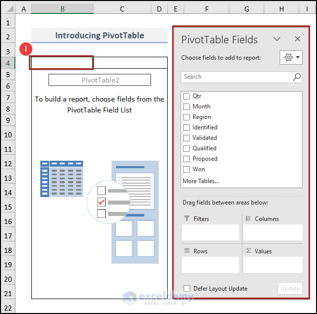
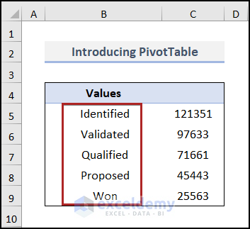
- Check the Identified, Validated, Qualified, Proposed, and Won boxes. Excel will automatically place these fields into the Values area.
Here is the PivotTable in our worksheet.
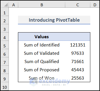
We want to see the field names, such as Identified and Validated. Not at all like the Sum of Identified. To do this, we should replace them.
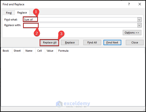
- Click CTRL + H to bring up the Find and Replace wizard.
- In the Find what box, enter Sum of.
- Keep the Replace with box blank.
- Click on the Replace All button.
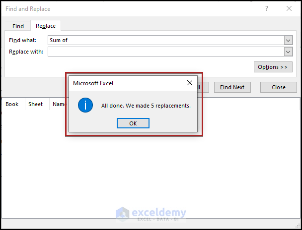
You will get a MsgBox with the message All done. We made 5 replacements.
The PivotTable looks like the one below.
Step 3: Copy Values from PivotTable
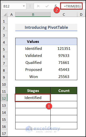
- Create a new table in the B11:C16 range with two columns, Stages and Count.
- Go to cell B12 and enter the following formula:
=TRIM(B5)Here, B5 represents the first text string in the PivotTable. The TRIM function removes the extra spaces from the text string in cell B5.
- Press ENTER.
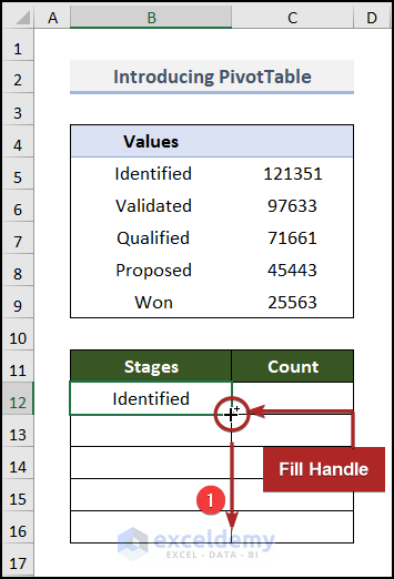
- When you bring the cursor to the bottom right corner of cell B12, it will look like a plus (+) sign. It’s the Fill Handle tool.
- Drag this tool up to cell B16.
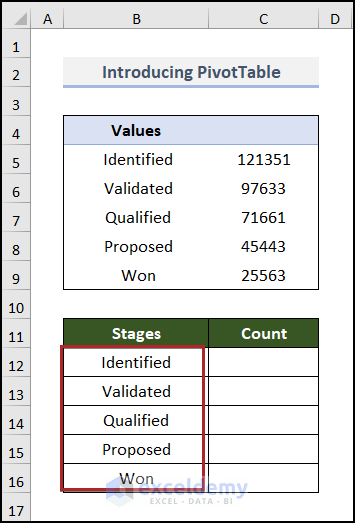
Excel copies the formula to the lower cells, and as a result, here are the results.
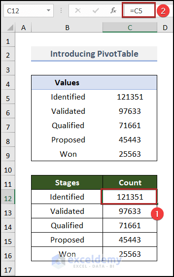
- Go to cell C12 and insert the following formula:
=C5This formula fetches the value from cell C5 to cell C12.
- Press ENTER.
Step 4: Insert a Funnel Chart
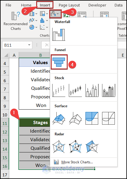
- Select cells in the B11:C16 range.
- Go to the Insert tab.
- Click on the Insert Waterfall, Funnel, Stock, Surface or Radar Chart drop-down icon on the Charts group.
- Choose the Funnel chart from the drop-down list.
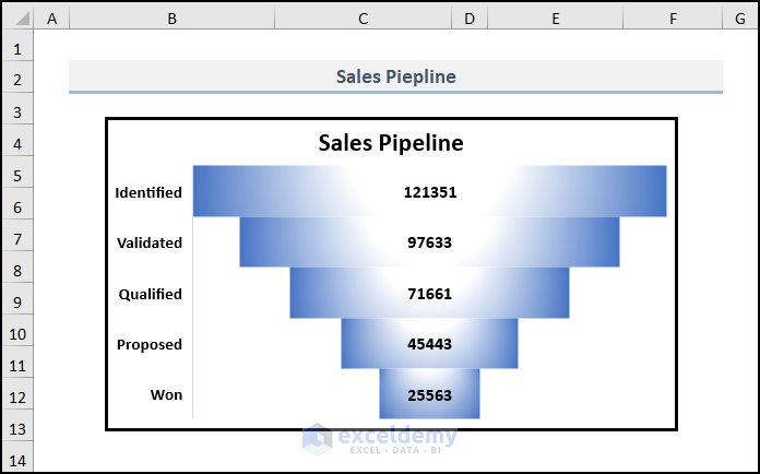
Here is the result.
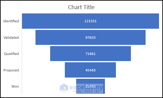
- Create a chart title and make the axis labels bold and a bit bigger.
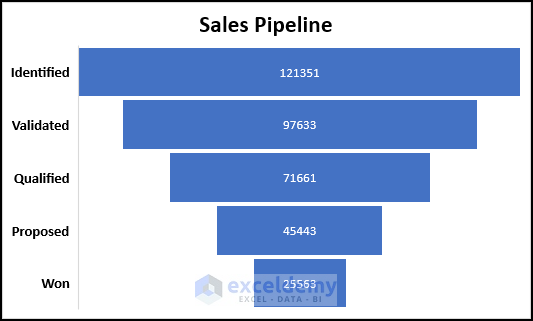
- Select the chart and press CTRL+X on your keyboard to cut it and paste it into a new worksheet named Pipeline using the CTRL+V shortcut.
- Right-click anywhere on the bar of the chart.
- From the context menu, select the Format Data Series option.
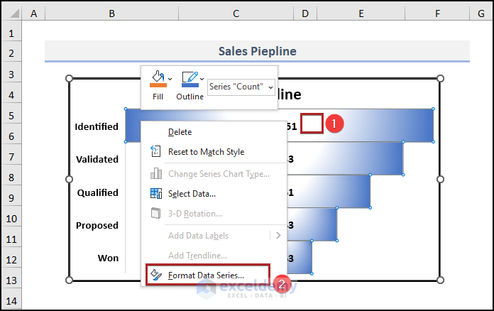
A Format Data Series task pane will be exhibited on the right side of the display.
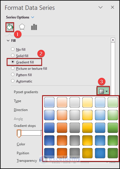
- Click on the Fill & Line icon.
- Select Gradient fill under the Fill section.
- Click on the Preset gradients drop-down icon. From the available options, you can choose whatever style you like.
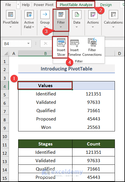
Insert some slicers to get more control over the chart and to make it dynamic.
- Go back to the PivotTable worksheet.
- Click anywhere inside the PivotTable.
- Go to the PivotTable Analyze tab and click on the Filter group of commands.
- Select the Insert Slicer command.
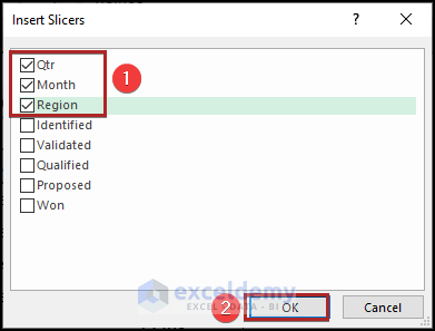
The Insert Slicers dialog box will pop up.
- Check the boxes of Qtr, Month, and Region and click OK.
As a result, we can see three different slicers in the spreadsheet.
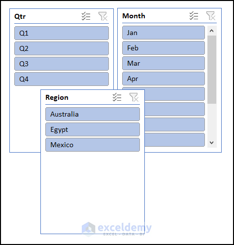
- Select them all and cut them from this sheet.
- Paste them into the Pipeline worksheet.
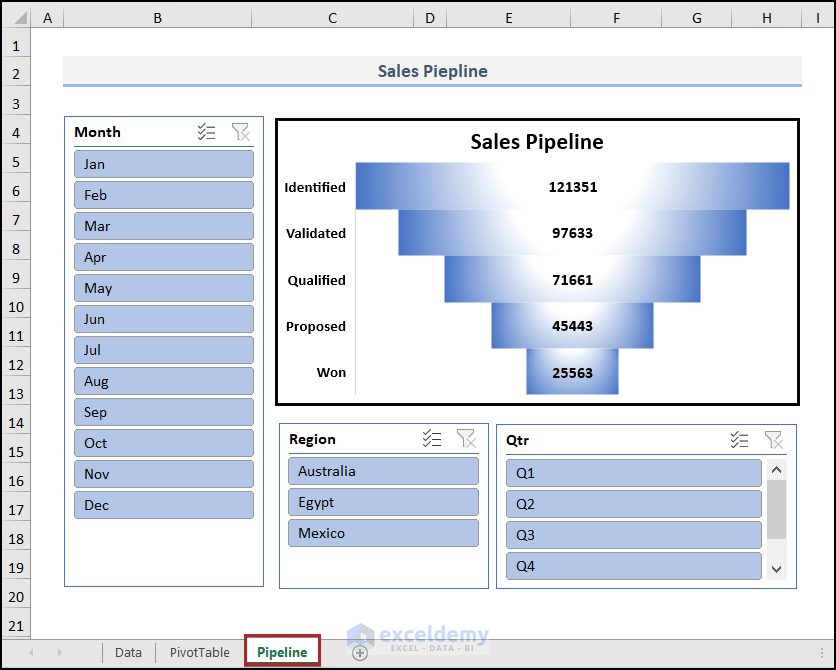
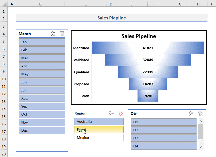
- See the steps in real-time in the animated GIF below to feel the dynamism of this chart.
Practice Section
We have provided a Practice worksheet like the one below for your convenience.
Download the Practice Workbook
You may download the following Excel workbook to practice.
Get FREE Advanced Excel Exercises with Solutions!
