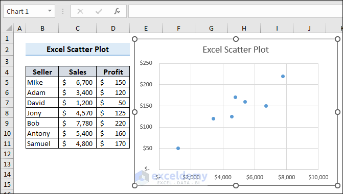
We’ll use the following sales information dataset when creating a scatter plot and describing what you can do with it.
Download the Practice Workbook
How to Make a Scatter Chart in Excel
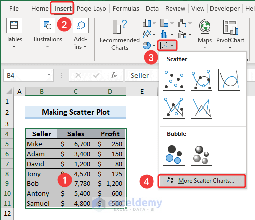
- Select your data range.
- Go to the Insert tab.
- Click the drop-down for Insert Scatter (X, Y or Bubble Chart icon under Charts group.
- Choose Scatter.
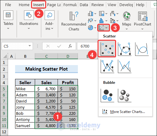
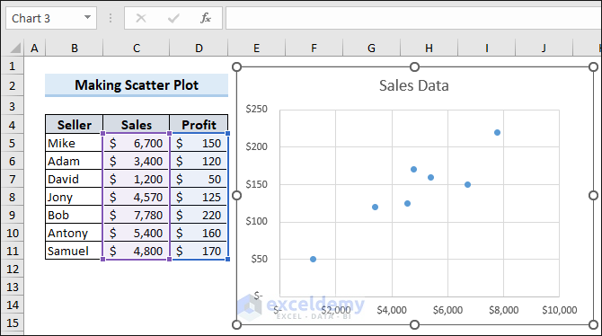
- This command will insert a scatter chart based on the selected data range.
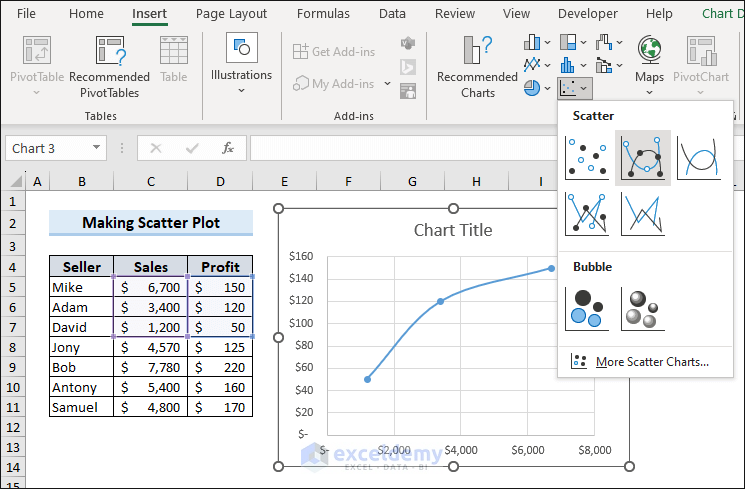
Types of Scatter Charts in Excel
There are a few types of scatter charts available in Excel:
- Scatter with smooth lines and markers
- Scatter with smooth lines
- Scatter with straight lines and markers
- Scatter with straight lines
When you have a few points of data in Excel, then a scatter chart with lines is the most user-friendly option.
For each type of scatter plot, there are two presentation styles available. To unlock the styles:
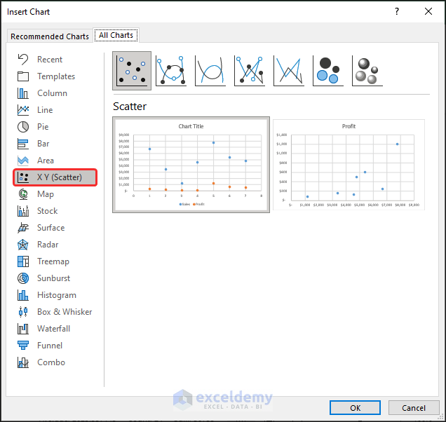
- Go to the Insert tab.
- Click the drop-down for Insert Scatter (X, Y or Bubble Chart icon under Charts group.
- Select More Scatter Charts.
- The Insert Chart dialog box will appear. In the X Y (Scatter) tab, you will find two presentation styles for each chart type. You can choose your preferred one from here.
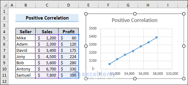
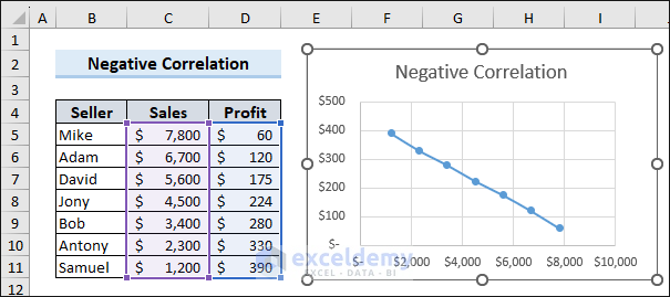
Correlation in an Excel Scatter Chart
- Positive Correlation: Positive correlation means a proportional relationship between the variables. So, if one of the variables increases here, the other also does.
- Negative Correlation: If one variable increases, the other one decreases.
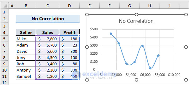
- No Correlation: The variables are just scattered through the chart area.
How to Edit a Scatter Chart in Excel
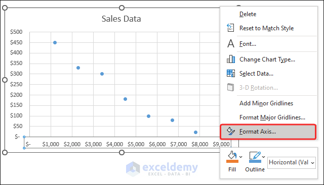
Case 1 – Change Axis Scale
- Right-click on the Axis title.
- Select the Format Axis option.
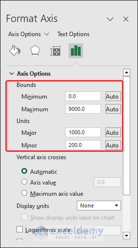
- On the right corner of the worksheet window, the Format Axis pane will appear.
- Under the Axis options, you can change the axis scale by changing the Bounds and Units values.
Case 2 – Add Labels to a Scatter Chart/Plot
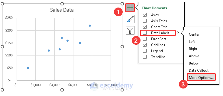
- Click on the chart area.
- Click the Chart Elements button on the top-right.
- Click the right arrow of the Data labels option and select More options.
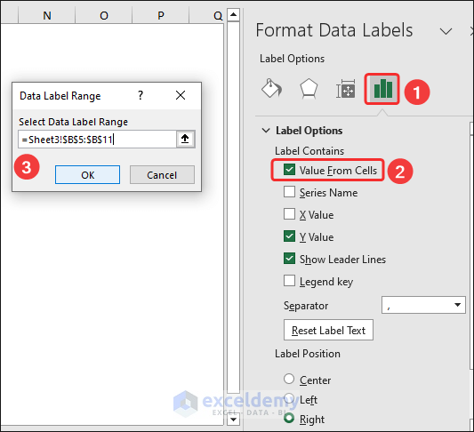
- The Format Data Labels pane will appear on the right side of the worksheet window.
- Under the Label Options, put a checkmark on the Value From Cells option in the Label Contains group.
- In the Data Label dialog box, assign the range of labels in the Select Data Label Range field.
- Click OK.
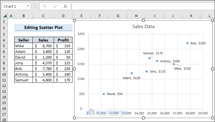
- This will insert labels to your data in the scatter plot.
- You can also replace the position of the labels if they appear so close to one another. Hover over a label, click and hold, then drag it to move it elsewhere.
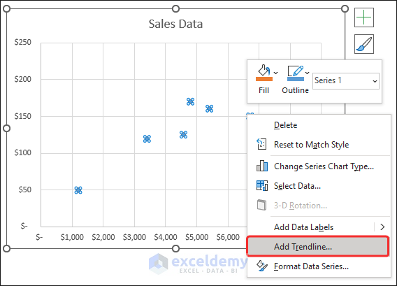
Case 3 – Add a Trendline to a Scatter Plot
- Right-click on any of the dots.
- Select the Add Trendline option from the menu.
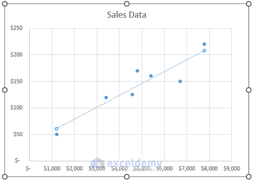
- Excel will insert a trendline for your scattered data.
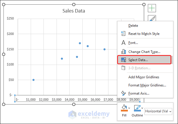
How to Switch Axes in an Excel Scatter Plot
- Right-click on any axis and click on Select Data from the options.
- The Select Data Source dialog box will appear. Click on Edit under Legend Entries (Series).
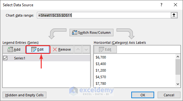
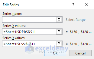
- The Edit Series dialog box will appear.
- Exchange the values in the Series X values and Series Y values fields.
- Click OK.
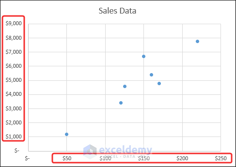
- Excel will switch the X and Y axes in the scatter plot.
Frequently Asked Questions
1. What data is suitable for creating a scatter plot in Excel?
Scatter plots are ideal for visualizing numerical data sets with two variables. The variables should be continuous and measured on a scale.
2. Can I create a scatter plot with more than two variables in Excel?
An Excel scatter plot typically shows the relationship between two variables. However, you can use additional visual elements like color or size to represent a third variable. This technique, known as bubble charts, allows for the inclusion of an extra dimension of data in the scatter plot.
3. Can I analyze data using regression analysis with scatter plots in Excel?
Yes, Excel provides regression analysis tools that can be applied to scatter plots. Regression analysis allows you to estimate and model the relationship between variables, including determining the equation of the best-fit line. This feature enables you to make predictions and draw conclusions based on the scatter plot data.
Scatter Chart in Excel: Knowledge Hub
<< Go Back To Excel Charts | Learn Excel
Get FREE Advanced Excel Exercises with Solutions!
