Sparklines are tiny mini-charts that are contained wholly within worksheet cells. Sparklines were introduced in 2010 and later versions of Excel. Sparklines allow for visualization of data and one can use sparklines to showcase trends or patterns. They are also very striking when used in dashboard creation and purposes. At times, you may find it more convenient to use sparklines in replacement of an actual chart especially if one has limited space available in one’s worksheet for visualization.
If one understands how to use charts and graphs in Excel, then one should easily be able to understand sparklines. There are a few different types of sparklines that you can utilize in your worksheets namely:
- Line sparklines
- Column sparklines
- Win/Loss sparklines
Line sparklines are similar to a line chart and one can show the trends in monthly sales data, for example using line sparklines – the principles governing line chart creation are similar for line sparklines. Column sparklines are similar to a column chart and are useful for comparative analysis between data points. Win/Loss sparklines show each data point or classify each data point as either a win or loss. So for this type of sparkline, the contrast is stark between the win and loss points.
Sparklines are usually positioned in most spreadsheets near or right next to their data sources, as an additional visual explanation. Additionally one can create a single sparkline based on a column or row or multiple sparklines depending on one’s requirements.
So, let’s get started with a few simple examples in order to illustrate how to use sparklines.
Introduction
Snails are a popular delicacy in countries such as Nigeria and France. In Nigeria, snails are served as part of stews, soups, and as snacks at parties. Snails have a high protein content, combined with a relatively low fat and cholesterol content. They are therefore regarded as a tasty yet still healthy source of nutrition.
The largest snail species in the world is found in West Africa. The giant African land snail can grow up to 30 cm in length. Snail farming ventures are being undertaken by many enterprising small business owners in Nigeria since snails can grow in much smaller farms than poultry or traditional livestock and thus space is not an issue. Additionally, snails are hermaphrodites and mate throughout the year. They can lay up to 100 eggs at a time and breed very quickly. The frequency of egg-laying is dependent mainly on climate and the duration of the rainy seasons.
The snail’s shell is secreted by the snail itself, is made up mostly of calcium carbonate, and is a vital source of protection for the snail, therefore, snail farmers must ensure that there is an adequate source of calcium. Snails often burrow into and consume soil fragments so if there is enough calcium in the soil, the farmer has sourced for the snail farm, then the snail will develop a hard adequate shell. The farmer could also supplement the food source with additional calcium if the soil itself does not contain enough calcium. The shell of a snail also houses the visceral mass of the snail.
With the right combination of feeding and breeding techniques, snail farming can yield a reasonable return on investment for the small business owner. Feeding is another important element of running a snail farm. Snails are vegetarian and can consume fruits such as mangoes, bananas, and pears as well as vegetables such as cabbage and lettuce.
Some snail farmers opt for reasonably cheap market and household waste such as fruit and vegetable peels. Other farmers buy specially formulated feeds. Small business owners usually obtain starter wild snail cultures from their natural habitats such as from forests or bush. Additionally, they may also choose to buy snails from another breeding farm.
In our source example, we have some data from a hypothetical small business owner who started a snail farming venture.
Using Win/Loss Sparklines
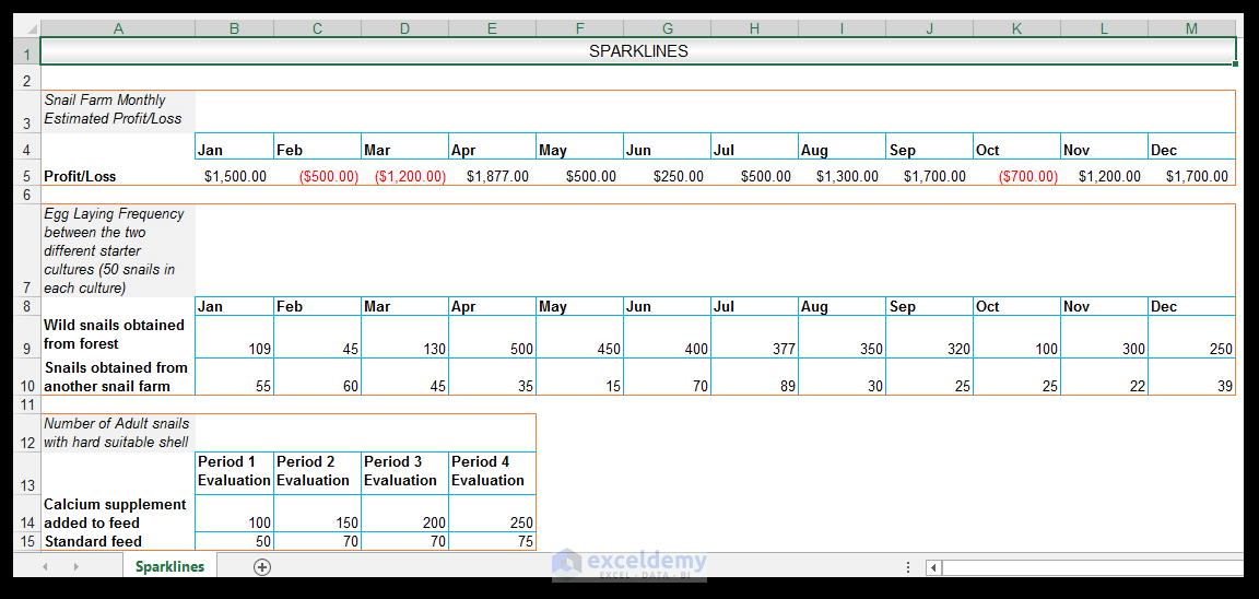
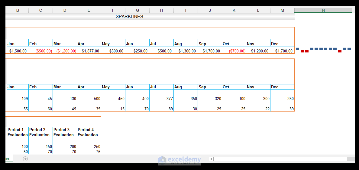
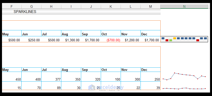
The small business owner has been running the snail farm for five years. He has the data for the previous year’s monthly profit/loss farm statistics. This type of data can be adequately visualized and summarized using the Win/Loss sparklines, where a monthly profit is designated as a win, and a monthly loss is designated as a loss. It can be an oversimplification at times, so if more detailed visualization is needed, then Win/Loss sparklines should be avoided.
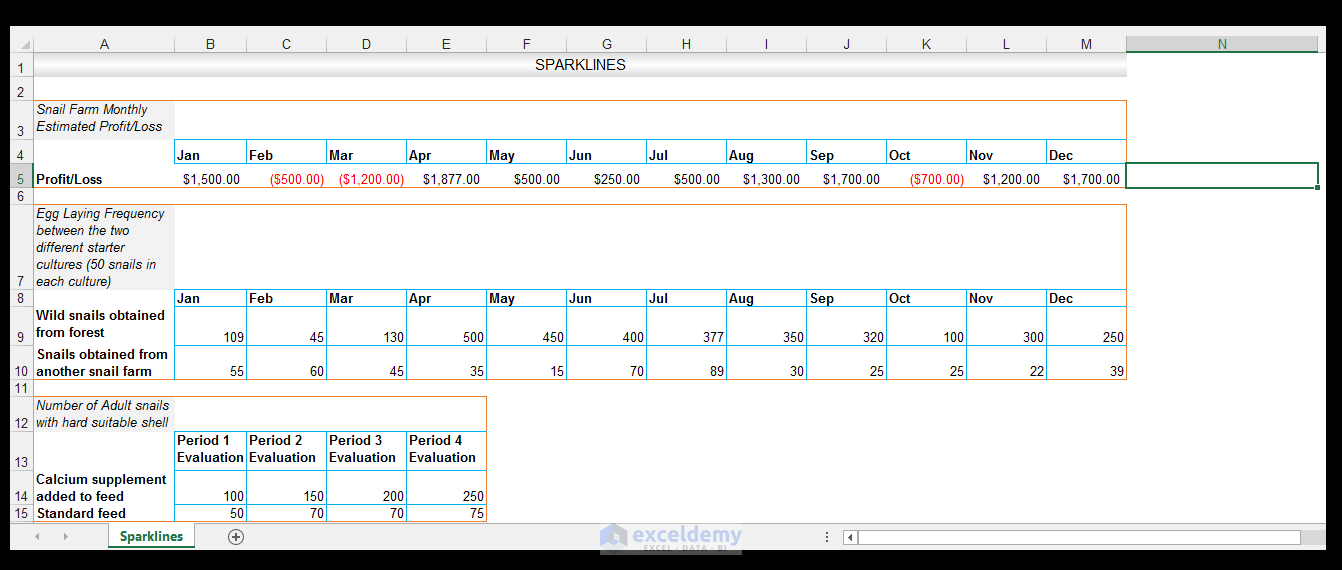
1) So, in order to create this Win/Loss Sparkline, select cell N5, which is right next to the source data.
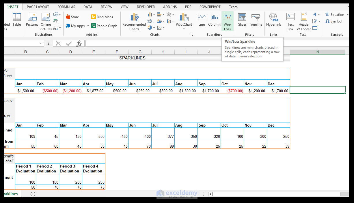
2) Now go to Insert>Sparklines and select Win/Loss.
3) The Create Sparklines Dialog box will appear and one will be prompted to select the Data Range of Interest. You can also change the Location Range but in this case, we will leave the Location Range as is (Excel usually automatically detects the location range based on the originally selected cell). We then select the B5: M5 range as the Data Range, as shown below.
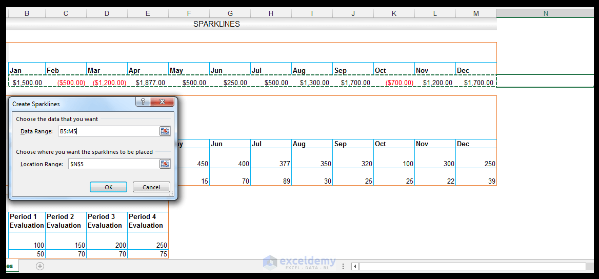
4) Click Ok.
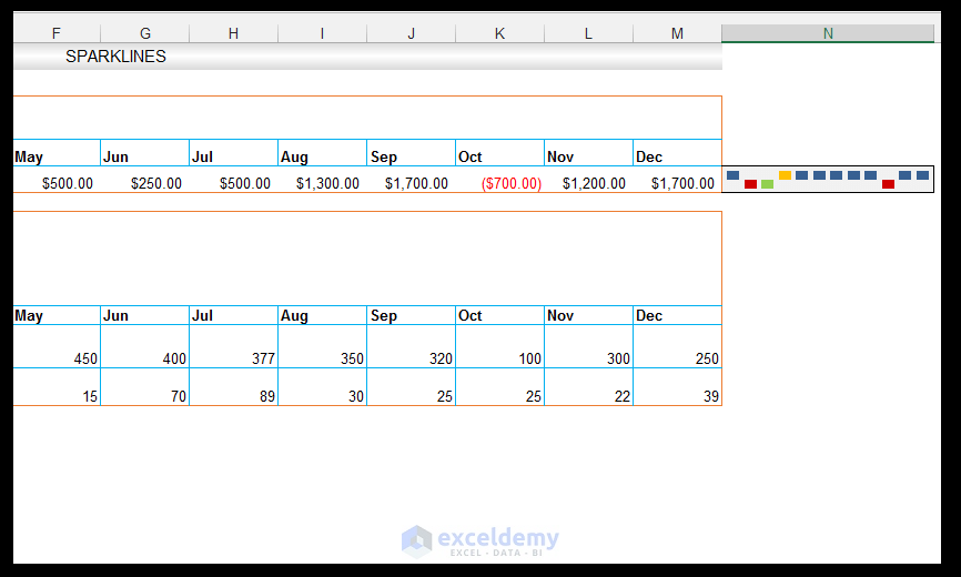
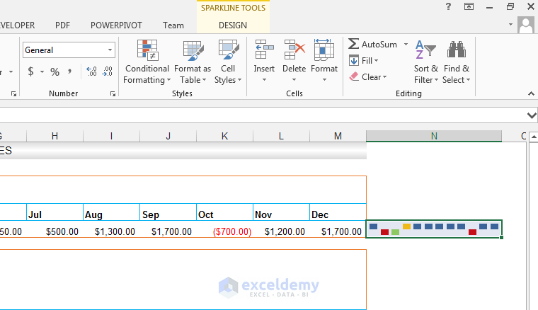
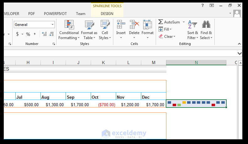
5) The Win/Loss sparklines modeling the monthly data are now shown in cell N5.
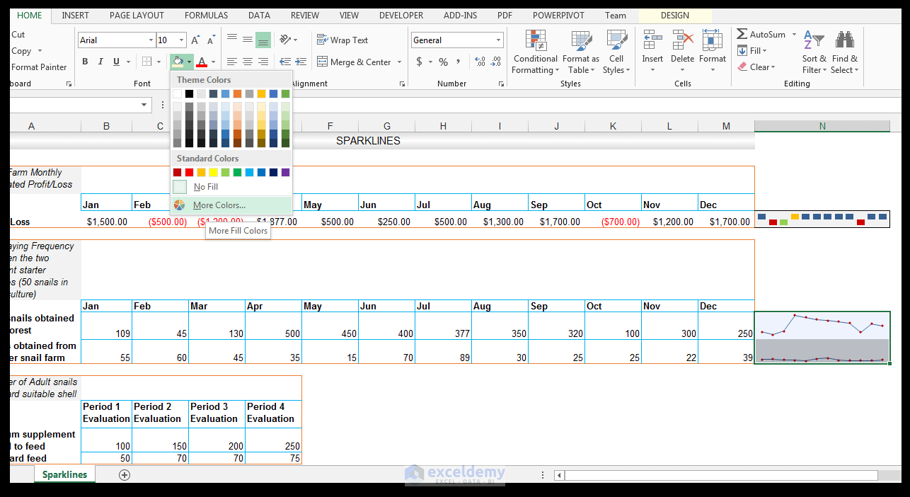
6) We can highlight additional information using the Context-Sensitive Sparkline Tools Menu. With cell N5 selected in order to activate the Context-Sensitive Sparkline Tools Design Menu, Go to Design>Show and check High Point and Low Point in order for the highest profit and the lowest loss to be highlighted.
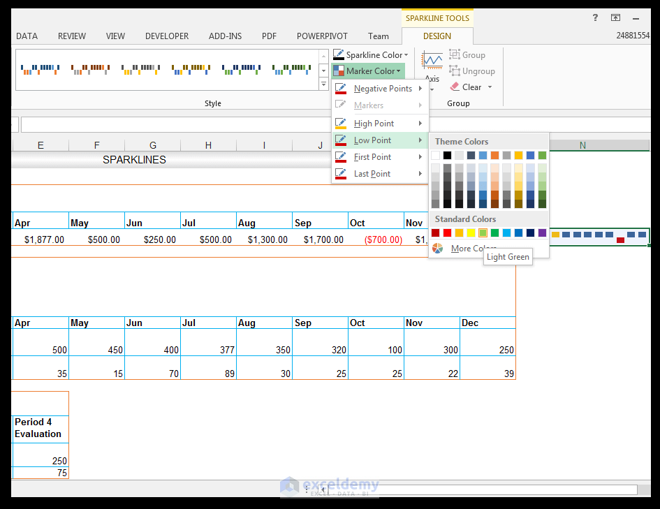
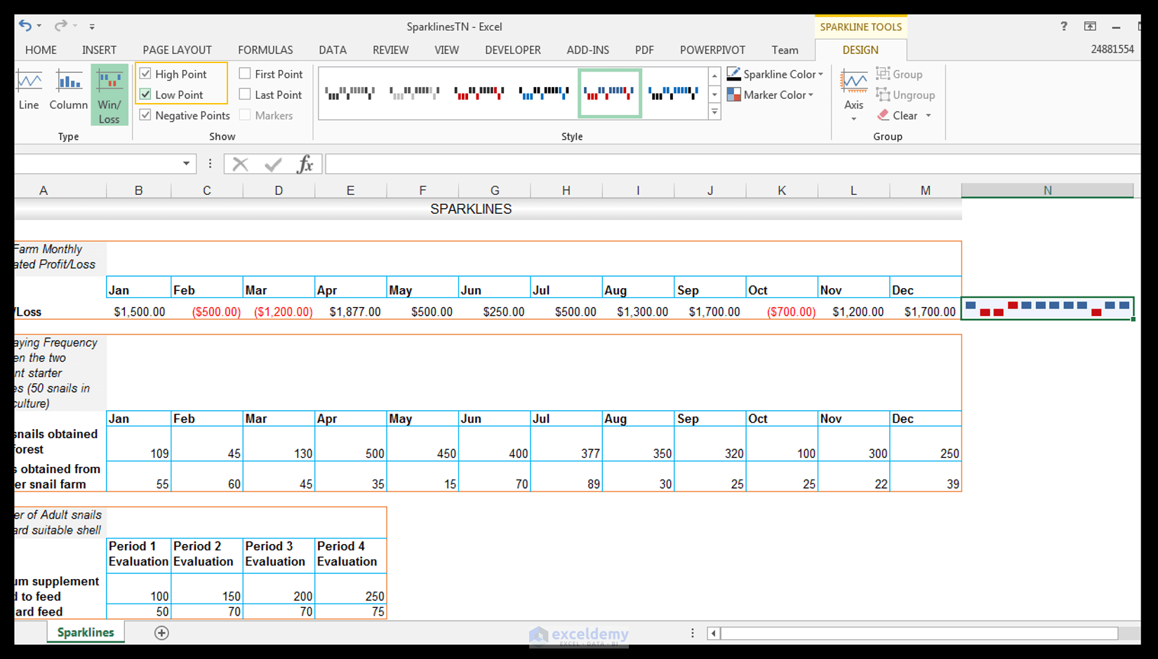 7) We want to change the colors of the High Point and the Low Point since it can be a bit confusing to have the same colors that are being used for the rest of the points. In order to do this, with cell N5 still selected, we go to Sparkline Tools>Design>Style and click on the drop-down next to Marker Color. Go to High Point and select orange (or any other color that is not the red and blue color currently being used).
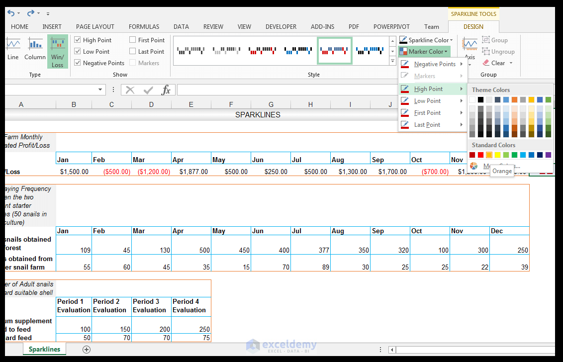
8) The highest point or profit amount, in this case, is now formatted with orange color as shown below.
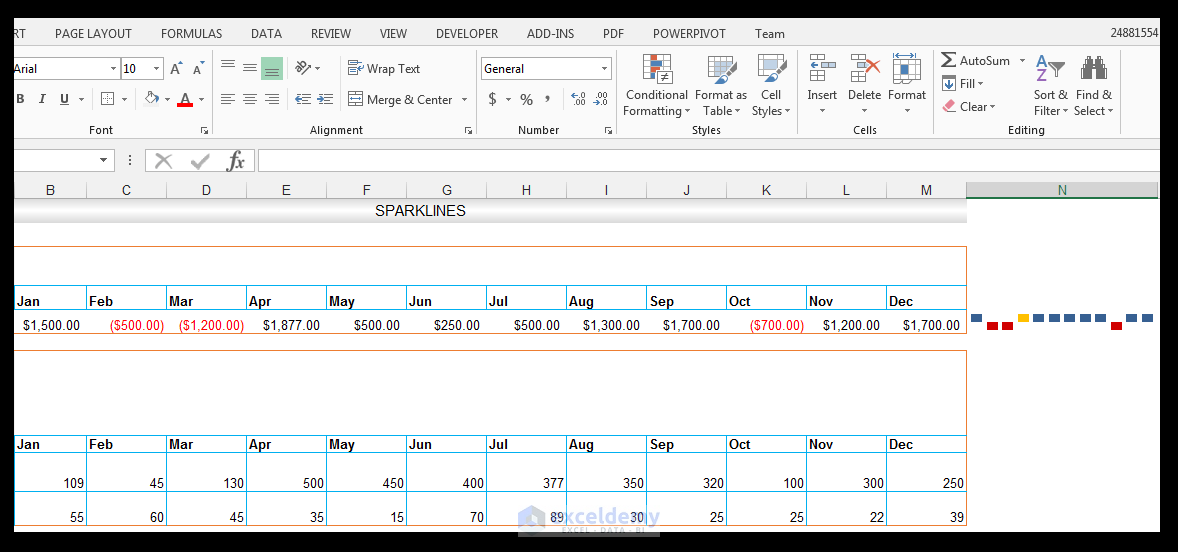
9) Making sure cell N5 is still selected, go to Sparkline Tools>Design>Style and click on the drop-down arrow next to Marker color, and for the Low Point, choose light green as shown below.
10) One can still format cell N5 using standard formatting, in order to make the created Win/Loss Sparkline stand out visually.
11) With cell N5 selected, go to Home>Font>Fill and fill the cell with a light grey filling, in this case, White Background 1, Darker 5%.
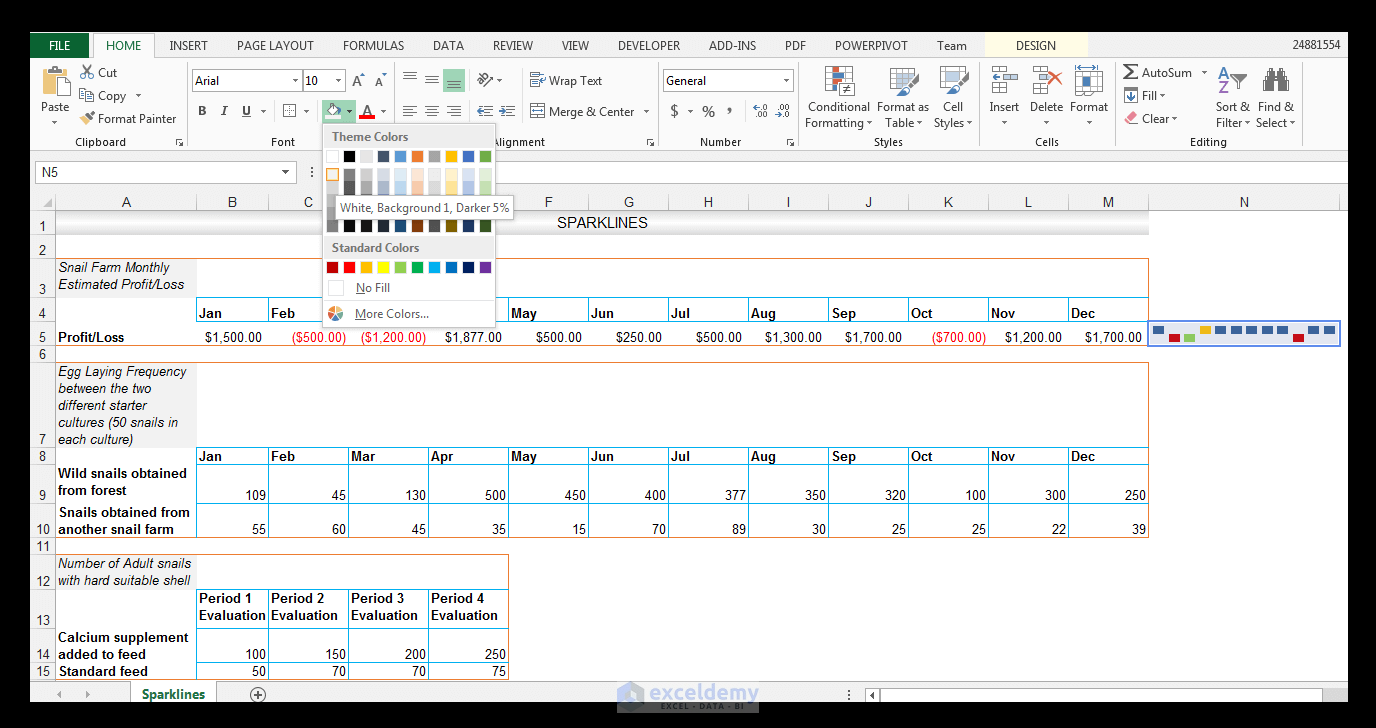 12) With the cell still selected, go to Home>Font> and give the cell a Top Border, a Bottom Border, and a Right Border.
13) The final result is shown below.
Using Line Sparklines
The advantage of running a snail farm is that the area as mentioned, needed for farming is much smaller than the area needed for traditional livestock farming. Also one can test different feeds or different breeding stock quite easily by segmenting the space needed. In this case, in addition to the standard snails the farmer has used over the years for sale and breeding, the farmer has decided to test two different starter breeding cultures. Each culture was kept in a separate enclosure on the farm. The first culture under evaluation was 50 wild snails obtained from the forest. Some in the snail farming community believe that wild snails are more resilient then snails obtained from other farms and are less stressed. Simultaneously, the farmer tested another culture he obtained from another snail breeding farm. He measured the total amount of eggs obtained monthly from the two cultures.
1) Since he wants to showcase the monthly egg laying frequency of each starter culture visually, he has decided to use Line sparklines.
2) So in order to do this, select the range N9: N10 and go to Insert>Sparklines and Choose Line.
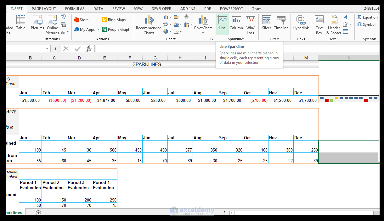
3) Using the Create Sparklines dialog box, select the Data Range of interest, which in this case is range B9: M10 as shown below.
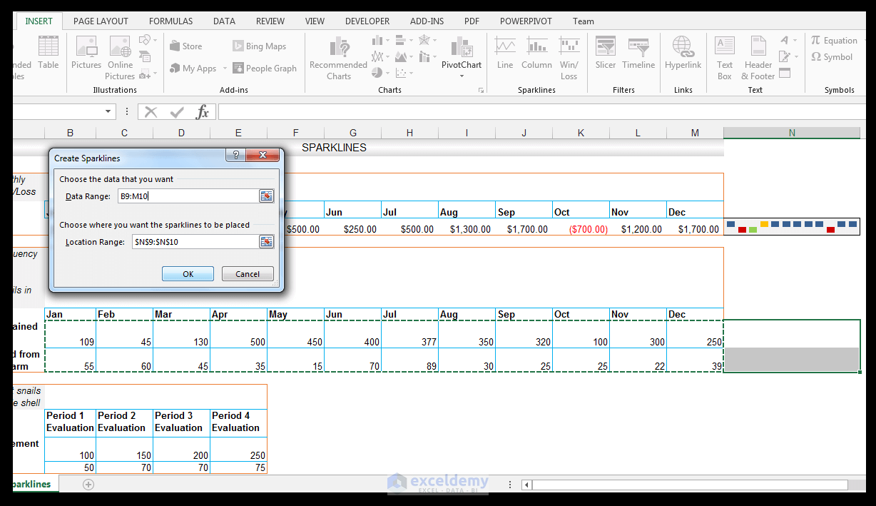
4) Click Ok.
5) The sparklines are created and automatically grouped, which means one can apply certain settings to the sparkline group as a whole.
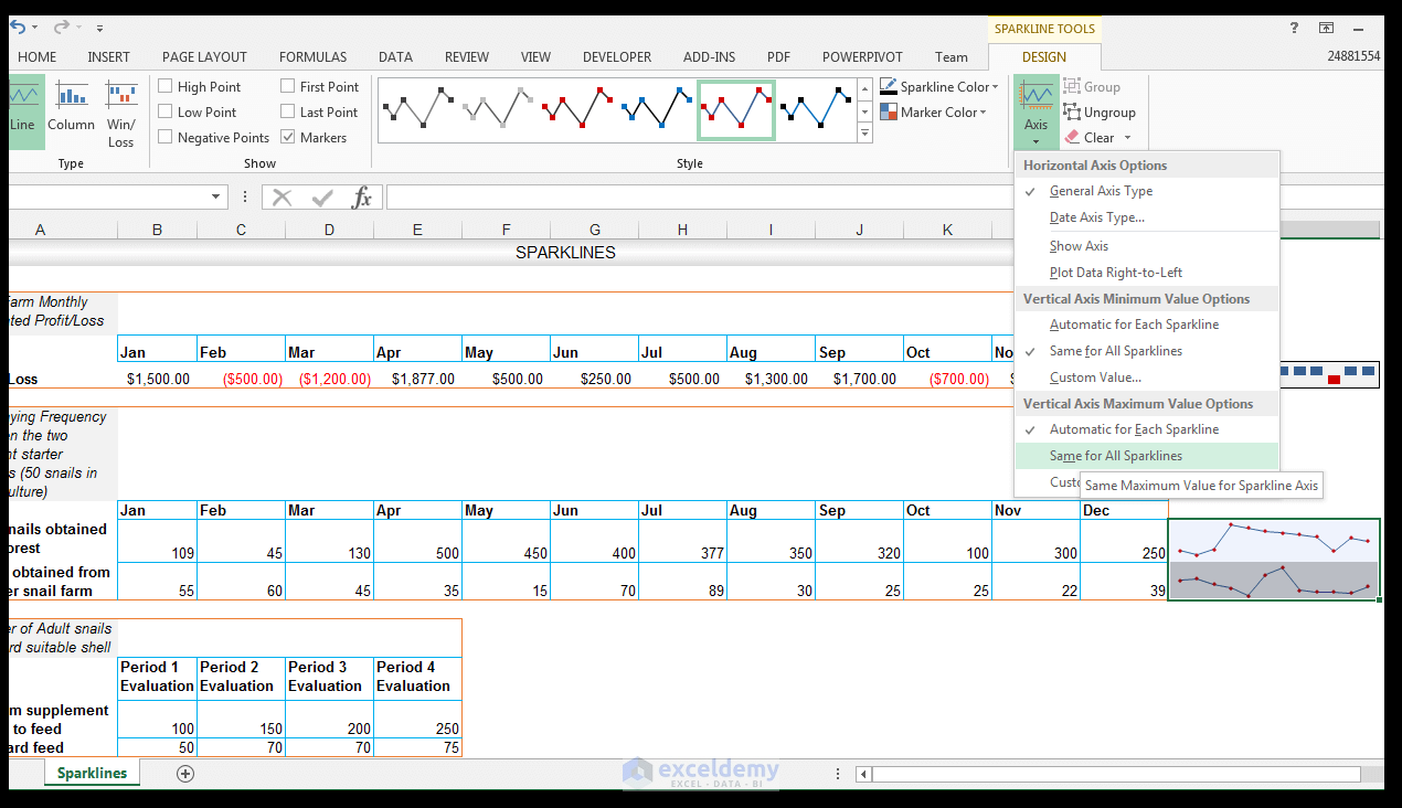
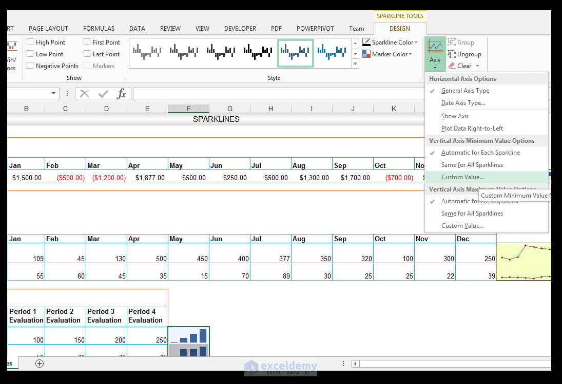
6) With the cells that make up the group selected, go to Sparkline Tools>Design>Show and check Markers in order for the lines to show the markers or each point in other words that make up the line sparkline.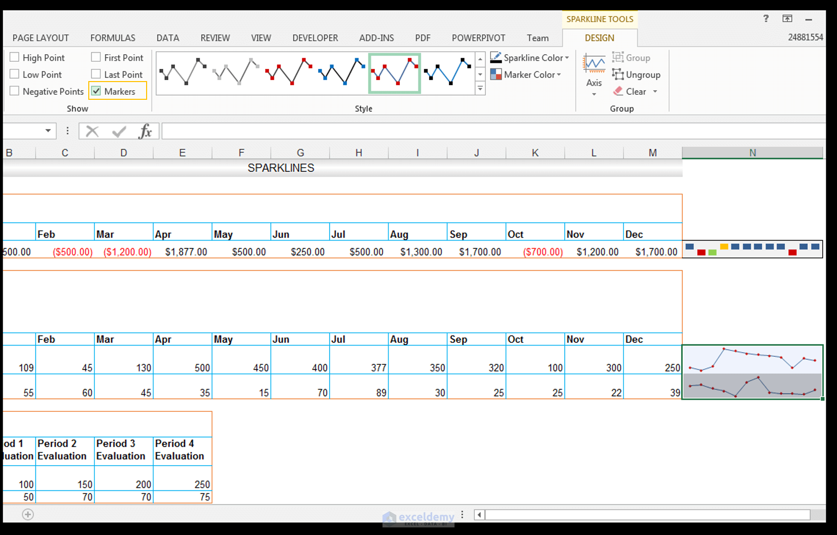 7) With the cells that make up the group still selected, go to Sparkline Tools>Design>Group and click on the drop-down arrow under Axis, and for the Vertical Axis Minimum Value Options, change this from Automatic for all Sparklines to Same for All Sparklines.
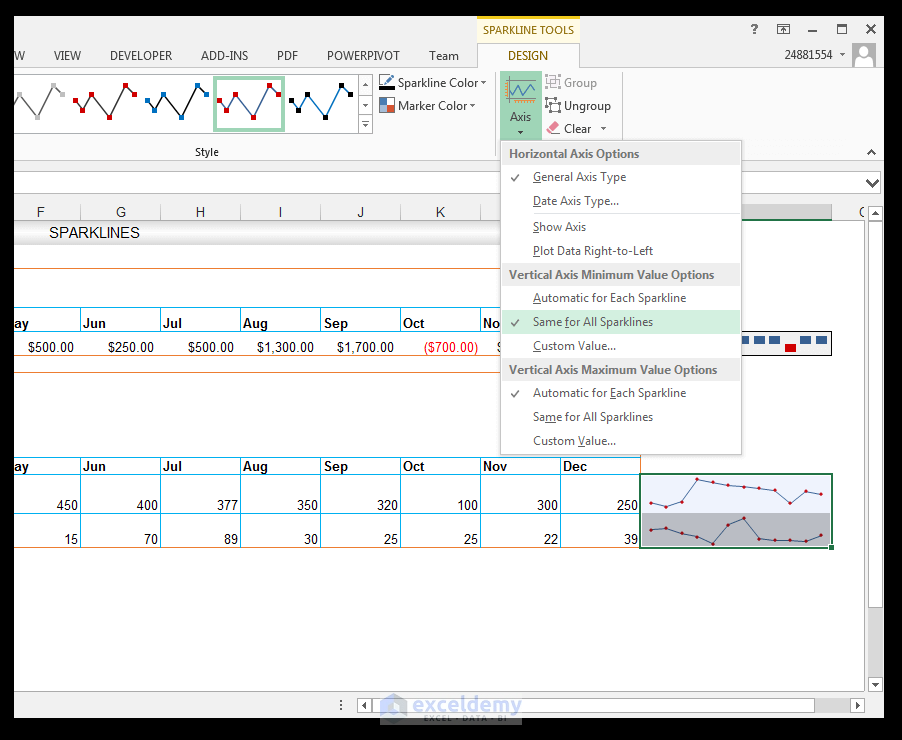
8) With the cells that make up the group still selected, go to Sparkline Tools>Design>Group and click on the drop-down arrow under Axis, and for the Vertical Axis Maximum Value Options, change this from Automatic for all Sparklines to Same for All Sparklines.
9) The effect of changing these settings for the group means that the group of sparklines now uses the same maximum derived from the data which in this case is 500, and the minimum will be set at 15 since this is the minimum derived from the data. We can see the effect of changing these settings is most pronounced on the second line sparkline, which denotes the egg-laying frequency of the snails derived from another snail farm. So, in this case, we can see the egg laying frequency over the months for each culture, as well as see the higher frequency for the wild snail culture since we have used the same axis.
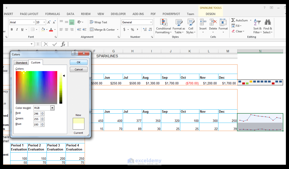
10) Now select the sparklines and go to Home>Font and select the Fill option, then select More Colors as shown.
11) Select the Custom tab, and set the RGB to R 246, G 255, B 193 and click Ok.
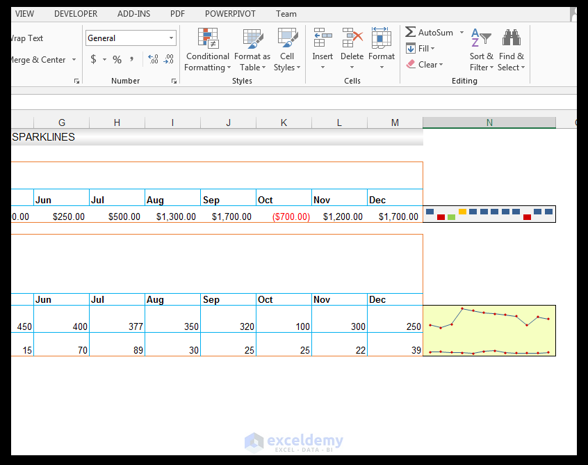
12) Then give the group a bottom border, a top border, and a right border as shown below.
Using Column Sparklines
The development lifecycle of a snail takes place over three main phases. Initially, the snail spends the first month of its life as a hatchling. The hatchling phase is characterized by a very thin shell membrane and rapid growth. The shell is able to develop progressively based on the calcium intake of the snail. The juvenile phase starts from the end of the first or second month of hatching and lasts until the snail reaches sexual maturity, which is usually 14 to 20 months later. The shell at the end of this phase should be well developed and hard. The onset of the adult phase of the snail starts as soon as the snail reaches sexual maturity.
Read More: 3D Referencing & External Reference in Excel
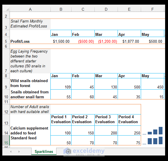
The farmer has two other separate sections of the snail farm divided, in order to test two different feeding regimes. In one section, the starter culture had an additional calcium supplement added to the feed, in another section (the same starter culture though) was fed using the standard feed. The number of adults that had hard shells subsequent to hatchling and juvenile phase, was then measured periodically in order to see whether or not the calcium supplements made a difference or not. In other words, shell hardness was used as an indication of the calcium the snails obtained.
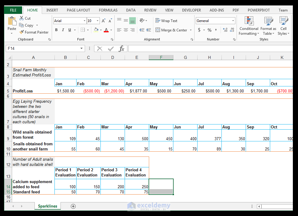
1) The farmer now wants to see this output graphically using a column sparkline.
2) So, select cells F14: F15 as shown below.
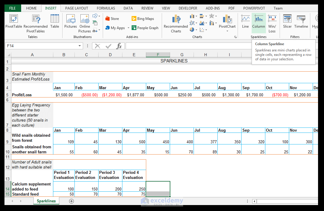
3) Now go to Insert>Sparklines>Column Sparkline.
4) For the data range, select the range B14: E15 as shown below.
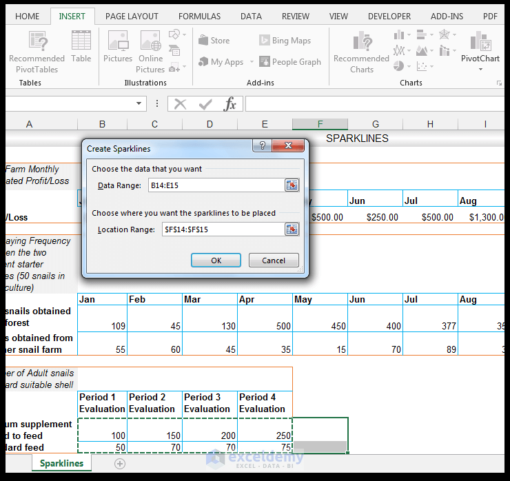
5) Click Ok.
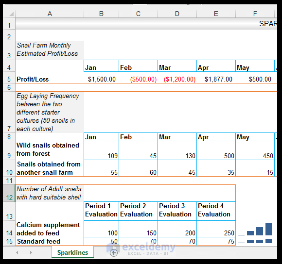
6) The second sparkline in cell F15 is not displaying well using the current row height. So select cell F15, and go to Home>Cells, and click on the drop-down arrow under Format, and under Cell Size choose Row Height. Set the row height to 25.5 as shown below. One can increase or decrease the size of a cell or cells containing sparklines in order to view the sparklines better.
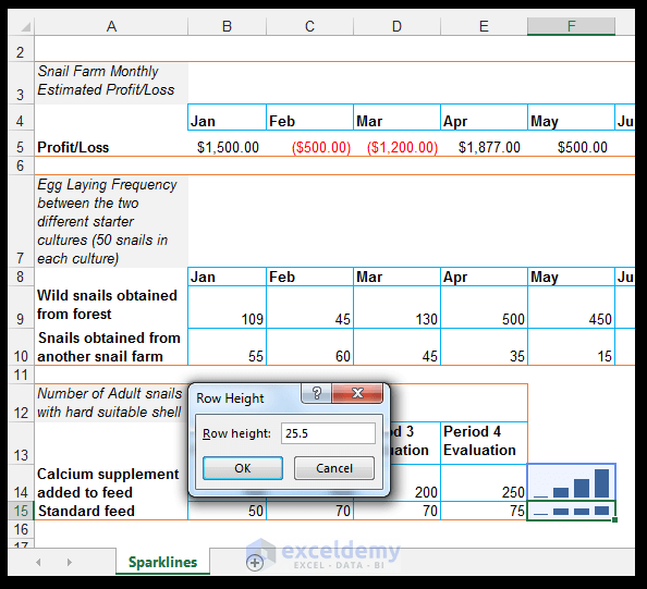
7) Some additional axis customization is needed. So select cells F14: F15, go to Sparkline Tools>Design>Group, and click on the drop-down arrow under the axis, for the Vertical Axis Minimum Value Options, under Vertical Axis Minimum Value Options choose Custom Value this time as shown below.
8) Set 0.0 as the minimum value for the vertical axis and click Ok.
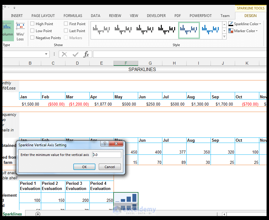
9) With the sparklines still selected, go to Sparkline Tools>Design>Group and click on the drop-down arrow under the axis, for the Vertical Axis Maximum Value Options, choose Custom Value this time as shown below.
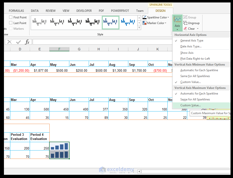
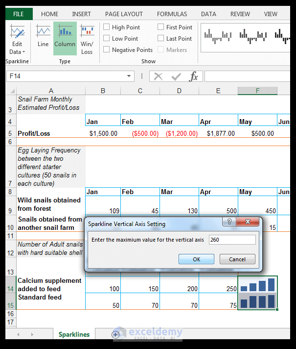
10) Enter the maximum value as 260 as shown below.
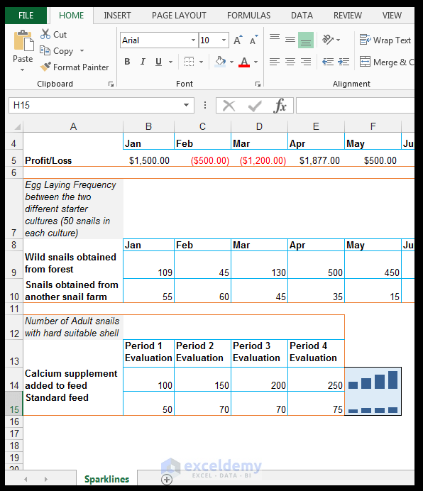
11) With both cells selected, go to Home>Font and Fill with a light blue fill, in this case, Blue, Accent 1, Lighter 80%. Set a top, bottom, and right border as shown below.
Clearing or Deleting Sparklines
1) If you want to clear or delete the sparklines you just created, you cannot just select the cell containing the sparklines and press delete. Instead, select the cell(s) containing the sparklines as shown below.
2) Go Sparkline Tools>Design>Group and select Clear>Clear Selected Sparklines as shown below.
And there you have it.
Download Working Files
Conclusion
Sparklines are useful for visualization and data analysis purposes in one’s worksheets or dashboards. They usually are located alongside the source data and can be used for visual explanatory and enhancement purposes. They are customizable and can be formatted according to one’s specific needs or to highlight certain points of interest.
Please feel free to comment and tell us if you often use sparklines in your worksheets or dashboards.
Review Section: Test your Understanding
1) What are sparklines?
2) When would one use Win/Loss sparklines?
3) Setup a sample dataset with hypothetical monthly sales data, from different regions and choose the appropriate Sparklines to model the data.
4) Format the sparklines you created in the previous question for visual enhancement.
Get FREE Advanced Excel Exercises with Solutions!
