Control charts are widely used to monitor process stability and control. In this article, I will show you how to make a Control Chart with Excel VBA and manually use the functions.
The process data are always plotted in order with three lines added:
- A central line for the Average (Mean)
- An upper line for the Upper Control Limit (UCL)
- And a lower line for the Lower Control Limit (LCL)
If a process is stable and in control, the process data will fall within control limits. Otherwise, the data will fall outside of control limits. By comparing process data against these lines, we can draw conclusions about whether the process variation is in control or out of control.
How to Make a Control Chart in Excel (2 Easy Ways)
In the following two methods, we will discuss two ways to make a control chart in Excel by manually utilizing the AVERAGE and STDEV functions tabs and by applying VBA code. We will demonstrate to you how to make a control chart in Excel by creating sample dummy data.
Based on the above description, we can see that a control chart can be developed by following the following four steps:
- Draw a series graph.
- Add a central line, which is a reference line to indicate the process location.
- Add the other reference lines – upper and lower lines – to show process dispersion.
- Customize the chart to make it more beautiful.
1. Combining Functions to Make a Control Chart
In this method, we will create a dataset to make a control chart in Excel using multiple functions. We will use the AVERAGE function to calculate the mean, and the STDEV function to calculate the Standard Deviation. From that, we will evaluate the Upper Control Limit (UCL) and the Lower Control Limit (LCL)
Steps:
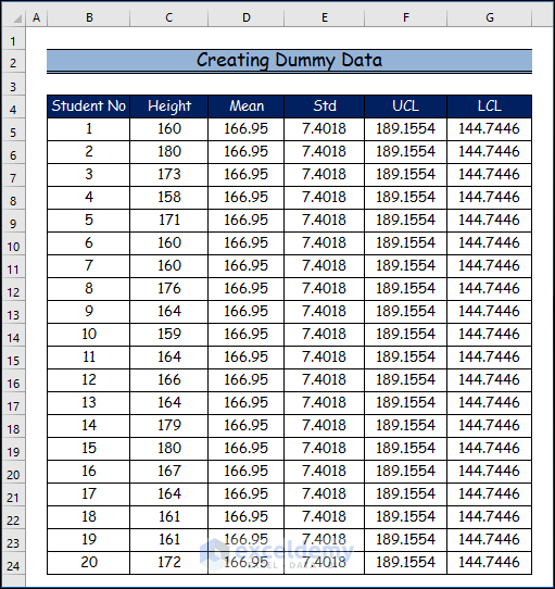
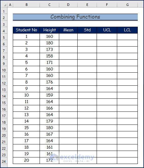
- Here is the base date set.
- Then, we will create the dummy data set.
- Firstly, calculate the mean by using the below formula.
- Then, use the Fill Handle tool and drag it down from the C5 cell to the C24 cell to determine the mean for all the 20 students in the data set.
=AVERAGE(C5:C24)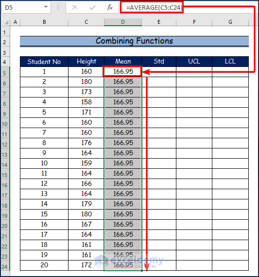
- Secondly, evaluate the standard deviation by using the below formula.
- Similarly, to find the standard deviation for all 20 students in the data set, use the Fill Handle tool and drag it from the C5 cell to the C24 cell.
=STDEV(C5:C24)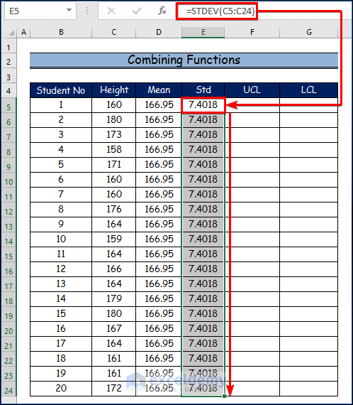
- Thirdly, determine the upper control limit by utilizing the below formula.
- Similarly, to find the upper control limit for all 20 students in the data set, utilize the Fill Handle tool and drag it from the C5 cell to the C24 cell.
=AVERAGE(C5:C24) + STDEV(C5:C24)*3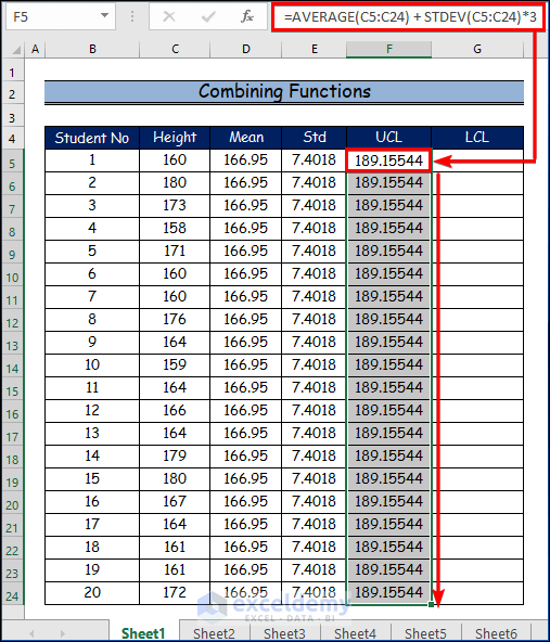
- Finally, use the formula below to establish the lower control limit.
- Similarly, use the Fill Handle tool and drag it from the C5 cell to the C24 cell to determine the lower control limit for each of the 20 students in the data set.
=AVERAGE(C5:C24) - STDEV(C5:C24)*3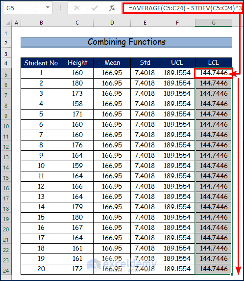
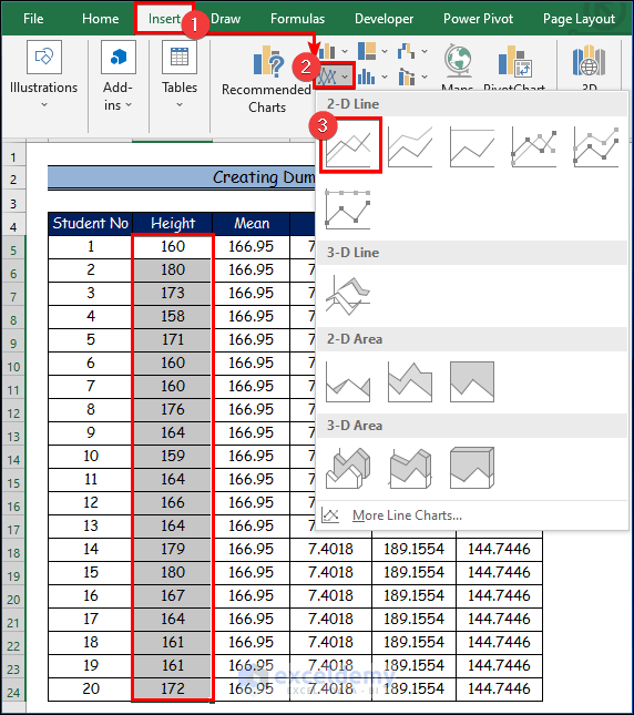
- Here, select the Height column from the data set.
- Firstly, go to the Insert tab.
- Secondly, choose the Insert Line or Area Chart command.
- Thirdly, click on the Line option.
- Then, right-click on the Line graph here.
- Besides, click on the Select Data option from the context menu.
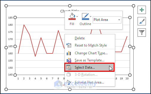
- Then, click on the Add option from the Select Data Source dialog box.
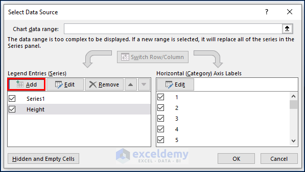
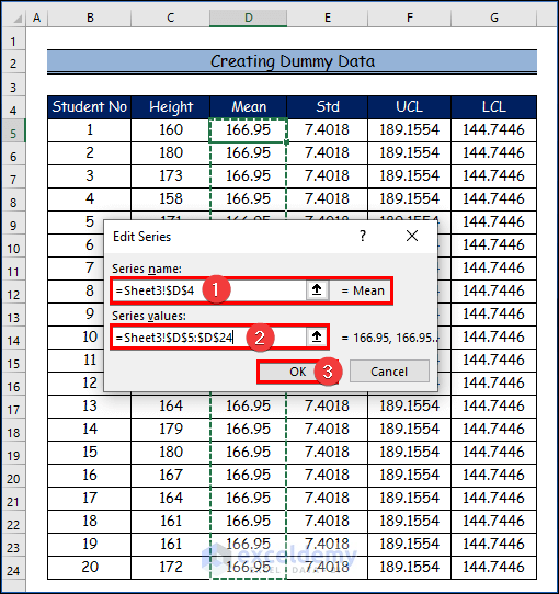
- After that, select Mean as the Series Name in the Edit Series dialog,
- And then type the relevant data into the Series values text box.
- Besides, click OK.
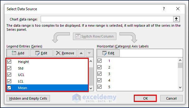
- Similarly, repeat the above procedure for the Upper Control Limit (UCL) and Lower Control Limit (LCL).
- Finally, click OK.
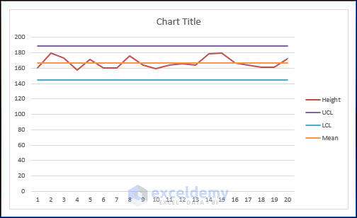
- As a result, you will see the final output of the control chart for all the selected variables.
2. Applying VBA Code to Make a Control Chart
VBA is a programming language that may be used for a variety of tasks, and different types of users can use it for those tasks. Using the Alt + F11 keyboard shortcut, you can launch the VBA editor. In the last section, we will generate a VBA code that makes it very easy to make a control chart in Excel.
Steps:
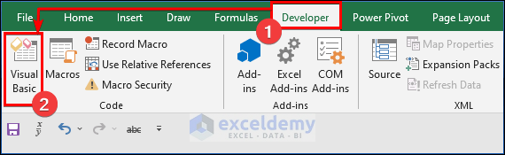
- Firstly, select the Developer tab.
- Then, click on the Visual Basic command.
- Here, the Visual Basic Application window will open.
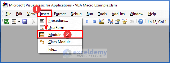
- Next, select the Insert tab.
- Then, click on the Module option to create a new Module to write a VBA code.
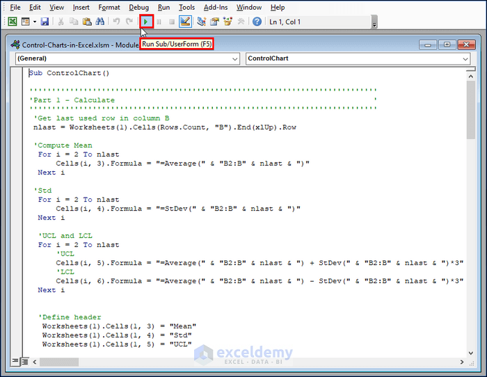
- Then, paste the following VBA code into the Module.
- Therefore, to run the program, click the “Run” button or press F5.
Sub DummyData()
'Populate header
Worksheets(1).Cells(1, 1) = "Student No"
Worksheets(1).Cells(1, 2) = "Height"
'Apply RND function to create random dummy data
For i = 2 To 21
Worksheets(1).Cells(i, 1) = i - 1
Worksheets(1).Cells(i, 2) = Int((180 - 158 + 1) * Rnd + 158)
Next i
End Sub
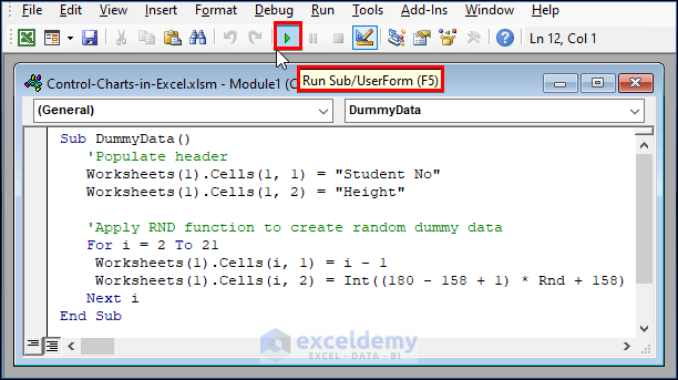
- Before diving into the programming world, let’s use the Excel RND function to create random dummy data which will be used later to plot the control chart. Suppose that the random number represents 20 high school students’ height and will fall between 158 and 180. By running the following code, we can get 20 random numbers.
- With the sample data that we just created, we can use the below code to compute the mean, LCL, and UCL of the sample data, which will be used to draw the central line, lower line, and upper line, respectively. We use a formula to compute statistics so that the mean, standard deviation, LCL, and UCL values can change automatically once we run DummyData to change sample data.
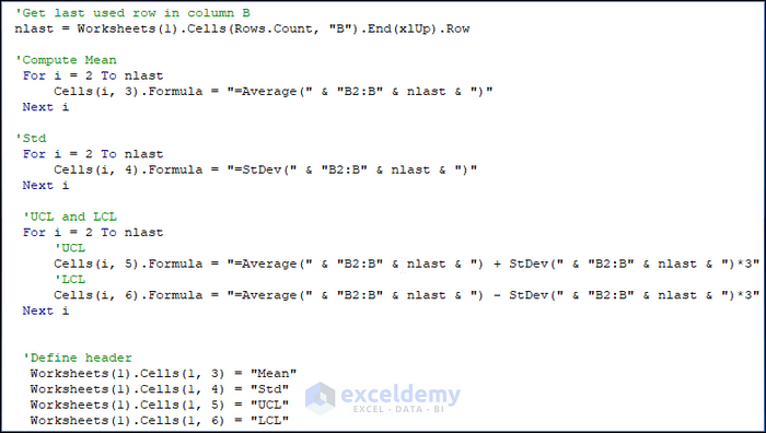
'Get last used row in column B
nlast = Worksheets(1).Cells(Rows.Count, "B").End(xlUp).Row
'Compute Mean
For i = 2 To nlast
Cells(i, 3).Formula = "=Average(" & "B2:B" & nlast & ")"
Next i
'Std
For i = 2 To nlast
Cells(i, 4).Formula = "=StDev(" & "B2:B" & nlast & ")"
Next i
'UCL and LCL
For i = 2 To nlast
'UCL
Cells(i, 5).Formula = "=Average(" & "B2:B" & nlast & ") + StDev(" & "B2:B" & nlast & ")*3"
'LCL
Cells(i, 6).Formula = "=Average(" & "B2:B" & nlast & ") - StDev(" & "B2:B" & nlast & ")*3"
Next i
'Define header
Worksheets(1).Cells(1, 3) = "Mean"
Worksheets(1).Cells(1, 4) = "Std"
Worksheets(1).Cells(1, 5) = "UCL"
Worksheets(1).Cells(1, 6) = "LCL"
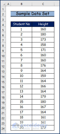
- Here’s our dummy data
- Here is what the data looks like, and the data may vary from time to time when running the above code.
- So far, we have all the data essential for control charts, so let’s move on to the most important part – how to draw control charts using VBA programming.
- First of all, we need to declare a ChartObject object. The ChartObject object acts as a container for all the elements of a chart. Let’s call it myChtobj but you can use any name. Here, we display the methods (together with examples) that we will use for the myChtobj object.
VBA Code Statement Explanation
- chartobjects.Add(Left, Top, Width, Height): This statement creates a blank, embedded chart on a worksheet or a chart sheet.
Arguments
Left: The distance between the left edge of the sheet and the right edge of the chart in points.
Top: The distance between the top of the sheet and the top of the chart in points.
Width: The width of the chart in points.
Height: The height of the chart in points
- Chartobjects(Index): This statement refers to a single embedded chart or a collection of all the embedded charts.
Argument
Index: The name or number of the chart. This argument can be an array, to specify more than one chart
- Chartobjects(Index).HasTitle = True: This statement adds a title to the embedded chart.
- Chartobjects(Index).ChartTitle.Text = “Height of 20 students”: This statement represents the set or change title of the embedded chart.
- Chartobjects(Index).SeriesCollection.Add source:=Worksheets(“Sheet1”).Range(“B2:B21”): This statement adds a new series to the embedded chart.
- Chartobjects(Index). ChartType = xlLineMarkers: This statement specifies the chart type. Option – xlLineMarkers – represents a line with data markers and is suitable for control charts.
- Now let’s try to create elements such as the series graph, central lines, UCL, and LCL lines and put them into the chart container. Chart.SeriesCollection.NewSeries method is available for use. The following shows how to plot a series graph.
- Then, paste the following VBA code into the Module.
- Therefore, to run the program, click the “Run” button or press F5.
Sub ControlChart()
'''''''''''''''''''''''''''''''''''''''''''''''''''''''''''''''''''''''''''''
'Part 1 - Calculate                                                         '
'''''''''''''''''''''''''''''''''''''''''''''''''''''''''''''''''''''''''''''
 'Get last used row in column B
 nlast = Worksheets(1).Cells(Rows.Count, "B").End(xlUp).Row
 'Compute Mean
  For i = 2 To nlast
      Cells(i, 3).Formula = "=Average(" & "B2:B" & nlast & ")"
  Next i
 'Std
  For i = 2 To nlast
      Cells(i, 4).Formula = "=StDev(" & "B2:B" & nlast & ")"
  Next i
  'UCL and LCL
  For i = 2 To nlast
      'UCL
      Cells(i, 5).Formula = "=Average(" & "B2:B" & nlast & ") + StDev(" & "B2:B" & nlast & ")*3"
      'LCL
      Cells(i, 6).Formula = "=Average(" & "B2:B" & nlast & ") - StDev(" & "B2:B" & nlast & ")*3"
  Next i
  'Define header
   Worksheets(1).Cells(1, 3) = "Mean"
   Worksheets(1).Cells(1, 4) = "Std"
   Worksheets(1).Cells(1, 5) = "UCL"
   Worksheets(1).Cells(1, 6) = "LCL"
'''''''''''''''''''''''''''''''''''''''''''''''''''''''''''''''''''''''''''''
'Part 2 - Chart                                                         '
'''''''''''''''''''''''''''''''''''''''''''''''''''''''''''''''''''''''''''''
'Define Object
 Dim myChtObj As ChartObject
 Set myChtObj = ActiveSheet.ChartObjects.Add(Left:=400, Width:=400, Top:=25, Height:=300)
 myChtObj.Chart.ChartType = xlLineMarkers
'Data
 Set MyNewSrs = myChtObj.Chart.SeriesCollection.NewSeries
 With MyNewSrs
   .Name = "Data"
   .Values = Worksheets("Sheet1").Range("B2:B21")
   .Format.Line.Visible = False
   .Format.Line.Visible = True
   .Format.Line.ForeColor.RGB = RGB(0, 255, 0)
   .Format.Line.Weight = 2
   .Format.Line.Transparency = 0
   .MarkerSize = 3
   .MarkerForegroundColor = RGB(0, 255, 0)
   .MarkerBackgroundColor = RGB(0, 255, 0)
   .MarkerStyle = xlMarkerStyleCircle
 End With
'Central line
 Set MyNewSrs = myChtObj.Chart.SeriesCollection.NewSeries
 With MyNewSrs
   .Name = "Mean"
   .Values = Worksheets("Sheet1").Range("C2:C21")
   .Format.Line.Visible = False
   .Format.Line.Visible = True
   .Format.Line.ForeColor.RGB = RGB(255, 0, 0)
   .MarkerStyle = xlNone
 End With
'Upper line
 Set MyNewSrs = myChtObj.Chart.SeriesCollection.NewSeries
 With MyNewSrs
   .Name = "UCL"
   .Values = Worksheets("Sheet1").Range("E2:E21")
   .Format.Line.Visible = False
   .Format.Line.Visible = True
   .Format.Line.ForeColor.RGB = RGB(0, 0, 255)
   .MarkerStyle = xlNone
 End With
 'Lower line
 Set MyNewSrs = myChtObj.Chart.SeriesCollection.NewSeries
 With MyNewSrs
   .Name = "LCL"
   .Values = Worksheets("Sheet1").Range("F2:F21")
   .Format.Line.Visible = False
   .Format.Line.Visible = True
   .Format.Line.ForeColor.RGB = RGB(0, 0, 255)
   .MarkerStyle = xlNone
 End With
'Ajust y-axis Scale
'Get max/min among source data, UCL and LCL
  Cells(2, 7).Formula = "=max(" & "B2:B" & nlast & ",E2)"
  Cells(1, 7) = "Max"
  Cells(2, 8).Formula = "=min(" & "B2:B" & nlast & ",F2)"
  Cells(1, 8) = "Min"
With myChtObj.Chart.Axes(xlValue, xlPrimary)
    .MaximumScale = Int(Cells(2, 7).Value) + (10 - (Int(Cells(2, 7).Value) Mod 10)) + 10
    .MinimumScale = Int(Cells(2, 8).Value) - (Int(Cells(2, 8).Value) Mod 10) - 10
    'Remove major gridlines
    .HasMajorGridlines = False
End With
'Get current width of plot area
 pwidth = myChtObj.Chart.PlotArea.Width
 'Remove legend
 myChtObj.Chart.Legend.Delete
'Set the width of plot area equal to width of orignal one
 myChtObj.Chart.PlotArea.Width = pwidth
'Set marker value label for the last marker
 Count = nlast - 1
 With myChtObj.Chart.SeriesCollection(2).Points(Count)
   .HasDataLabel = Ture
   .DataLabel.Characters.Text = Worksheets(1).Cells(1, 3)
   .DataLabel.Position = xlLabelPositionRight
   .DataLabel.Font.Size = 12
   .DataLabel.Font.Bold = True
   .DataLabel.Font.Color = RGB(255, 0, 0)
 End With
 For i = 3 To 4
    With myChtObj.Chart.SeriesCollection(i).Points(Count)
      .HasDataLabel = Ture
      .DataLabel.Characters.Text = Worksheets(1).Cells(1, i + 2)
      .DataLabel.Position = xlLabelPositionRight
      .DataLabel.Font.Size = 12
      .DataLabel.Font.Bold = True
      .DataLabel.Font.Color = RGB(0, 0, 255)
    End With
 Next i
End Sub
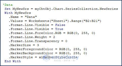
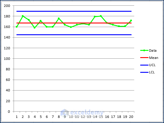
- By repeating and adding new series using the above approach, we can get a graph like the below.
- However, it looks ugly. First of all, we need to remove data markers from the central line, upper line, and lower line and change the foreground color of the series. Here are some methods to change series and marker properties. In order to remove markers, we can just set the value of MarkerStyle as xlNone.
'Data
Set MyNewSrs = myChtObj.Chart.SeriesCollection.NewSeries
With MyNewSrs
.Name = "Data"
.Values = Worksheets("Sheet1").Range("B2:B21")
.Format.Line.Visible = False
.Format.Line.Visible = True
.Format.Line.ForeColor.RGB = RGB(0, 255, 0)
.Format.Line.Weight = 1
.Format.Line.Transparency = 0
.MarkerSize = 3
.MarkerForegroundColor = RGB(0, 255, 0)
.MarkerBackgroundColor = RGB(0, 255, 0)
.MarkerStyle = xlMarkerStyleCircle
End With
- After formatting, we can get the following graph.
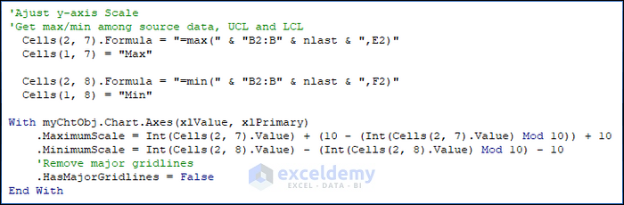
- Obviously, it is still not beautiful. We need to change the legend, axis, and chart itself. There is a little trick when it comes to determining the y-axis scale. The MOD function can be applied to automate the computation of max value and min value (see below in red for details).
- Please note that we need to take both source data, UCL and LCL into consideration when trying to compute maximum scale and minimum scale.
'Ajust y-axis Scale
'Get max/min among source data, UCL and LCL
Cells(2, 7).Formula = "=max(" & "B2:B" & nlast & ",E2)"
Cells(1, 7) = "Max"
Cells(2, 8).Formula = "=min(" & "B2:B" & nlast & ",F2)"
Cells(1, 8) = "Min"
With myChtObj.Chart.Axes(xlValue, xlPrimary)
.MaximumScale = Int(Cells(2, 7).Value) + (10 - (Int(Cells(2, 7).Value) Mod 10))
.MinimumScale = Int(Cells(2, 8).Value) - (Int(Cells(2, 8).Value) Mod 10)
'Remove major gridlines
.HasMajorGridlines = False
End With
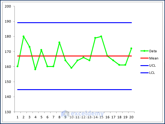
- Here, you will see the image which looks better. But I still want to delete the legend and insert text next to the lines.
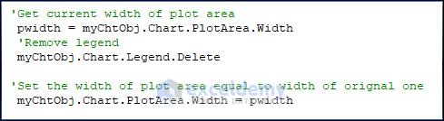
- Then, I also present the output above. It looks much better. However, the plot area will become wider than before without a legend. Therefore, we need to retrieve the current width of the plot area before removing the legend and then re-size the plot area’s width as before. This can be done with the following code.
'Get current width of plot area
pwidth = myChtObj.Chart.PlotArea.Width
'Remove legend
myChtObj.Chart.Legend.Delete
'Set the width of plot area equal to width of orignal one
myChtObj.Chart.PlotArea.Width = pwidth
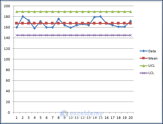
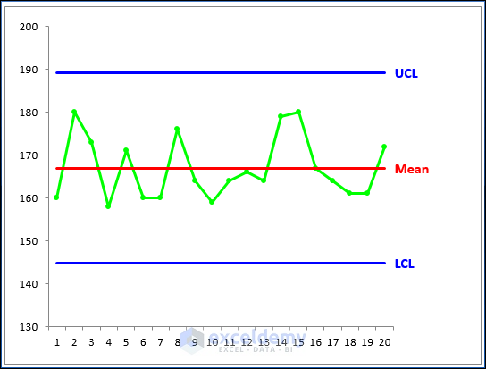
- But what about inserting text that is near the line? We can use the data value label of the last marker point to display the text that we’d like to show. Here is the code showing you how to change the properties of the marker point. Finally, the completed graph is something similar to the one below. It’s awesome, right?
Special Notes to Remember
Please note that we need to do an examination before we start plotting data because the data should be normally distributed when using control charts. Otherwise, the chart may signal an unexpectedly high rate of false alarms.
Download Practice Workbook
You may download the following Excel workbook for a better understanding and to practice yourself.
Conclusion
In this article, I’ve covered 2 handy approaches to make a control chart in Excel. I sincerely hope you enjoyed and learned a lot from this article. Additionally, if you want to read more articles on Excel, you may visit our website, Exceldemy. If you have any questions, comments, or recommendations, kindly leave them in the comment section below.
Related Articles
<< Go Back to Excel Control Chart | Excel Charts | Learn Excel
Get FREE Advanced Excel Exercises with Solutions!

Hi
Very interesting, however, control charts are meant for daily data input…the chart should update automatically….can you present one with daily input and automatic chart update?
I use control charts daily and have problems with this, also Mean Std UCL LCL must be in one cell and not in every entry..
Hi Sew. Thanks for your suggestions. I will write another post later when I am free.
obviously like your web site however you need to check the spelling on several of your posts.
A number of them are rife with spelling problems and I in finding it very
bothersome to inform the reality on the other hand I’ll
surely come back again.
Thanks a lot for your feedback. I will make plans to correct them. Best regards