In this article, we will learn about Pie Chart in Excel. We will explore different components of a Pie Chart and various methods to edit a Pie Chart in Excel.
Pie Chart is one of the most popular charts used in Excel to represent data visually. You may guess some fundamental ideas about Pie Charts from the name. This circular diagram has distinct portions like a pie. The size of each part shows how much or what percentage of the total there is in each category.

Download Practice Workbook
How to Create Various Pie Charts in Excel
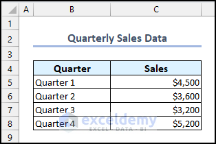
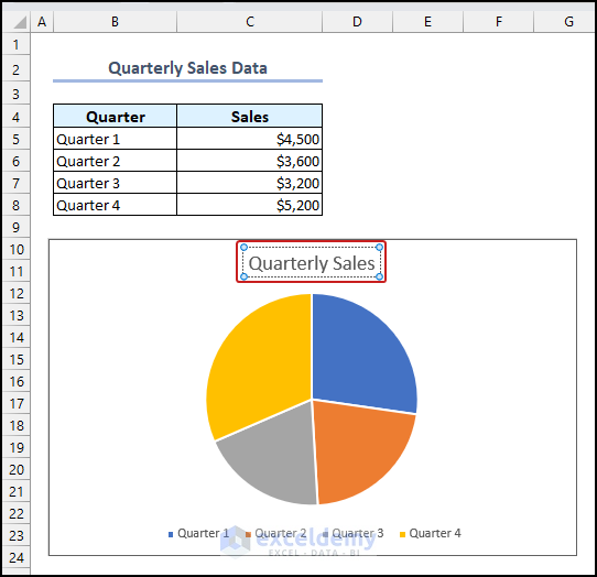
In this article, we will use the following dataset to demonstrate creating a Pie Chart in Excel and different ways to edit the Pie Chart.
The dataset contains the Quarterly Sales Data of a supermarket store.
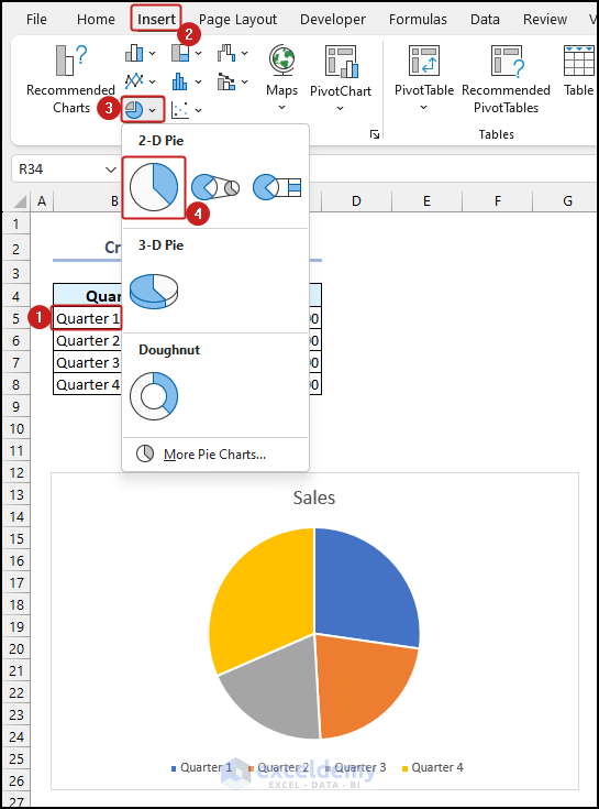
1. Create 2-D Pie Chart
- First, select any cell of the dataset >> go to the Insert tab >> select the Insert Pie or Doughnut Chart option from the Charts group.
- Finally, choose the Pie option from the 2-D Pie section.
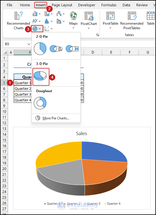
2. Insert 3-D Pie Chart
- First, select any cell of the dataset >> go to the Insert tab >> choose the Insert Pie or Doughnut Chart option from the Charts group.
- Lastly, select the 3-D Pie option.
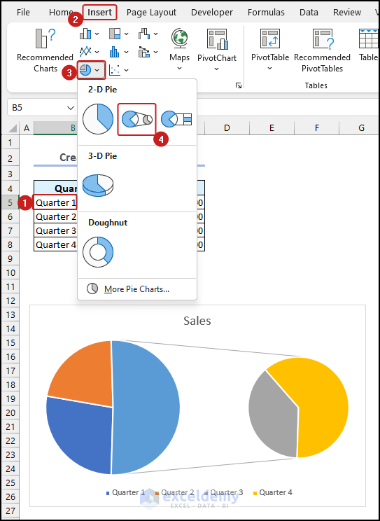
3. Draw Pie of Pie Chart
- Select any cell of the dataset >> go to the Insert tab >> select the Insert Pie or Doughnut Chart option from the Charts group.
- Select the Pie of Pie option from the 2-D Pie section.
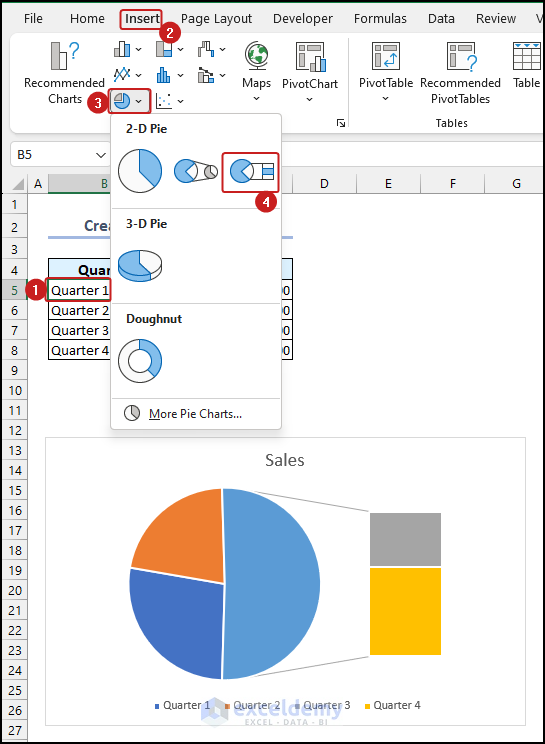
4. Insert Bar of Pie Chart
- First, select any cell of the dataset >> go to the Insert tab >> choose the Insert Pie or Doughnut Chart option from the Charts group.
- Lastly, select the Bar of Pie option from the 2-D Pie section.
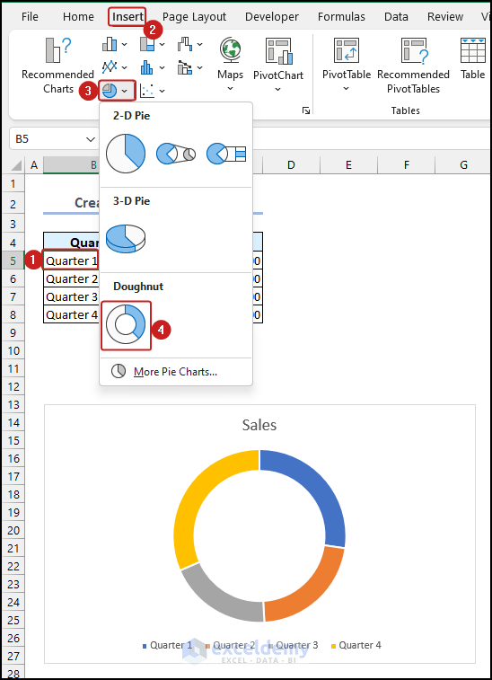
5. Create Doughnut Chart
- Select any cell of the dataset >> go to the Insert tab.
- Choose the Insert Pie or Doughnut Chart option from the Charts group >> select the Doughnut option.
Read More: How to Make Pie Chart by Count of Values in Excel
How to Edit Pie Chart in Excel
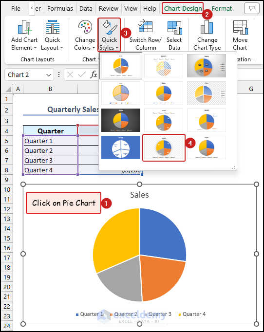
1. Change Styles of Pie Charts
- First, click on the Pie Chart to select it >> go to the Chart Design tab from Ribbon.
- Select the Quick Styles option from the Chart Styles group >> select any style according to your preference.
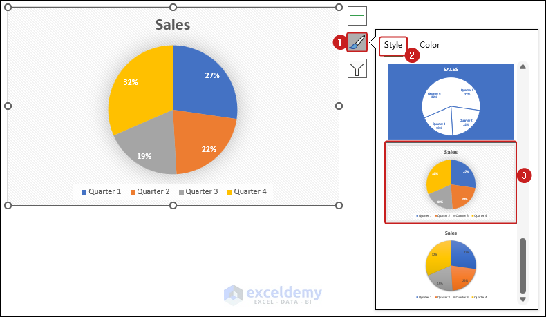
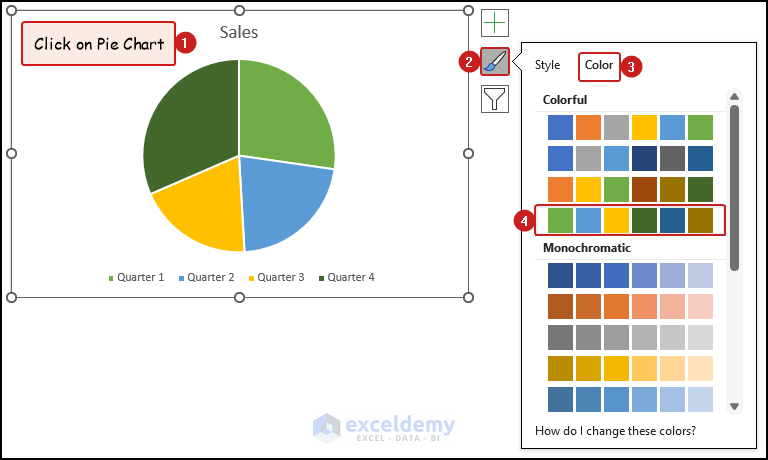
You can also change the color of the Pie Chart by following the steps below.
- Select the Chart Styles option >> click on Style tab >> select your preferred style for the Pie Chart.
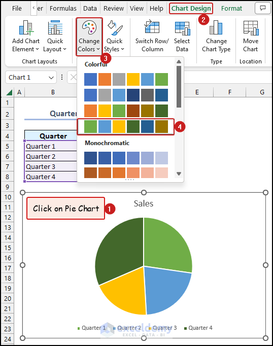
2. Edit Color of Pie Chart
2.1. Change Color of Entire Pie Chart
- Click on Pie Chart to select it >> go to the Chart Design tab.
- Choose the Change Colors option >> select your preferred color for the Pie Chart.
You can also change the color of the Pie Chart by following the steps below.
- Select the Chart Styles option >> go to the Color tab >> select your preferred color for the Pie Chart.
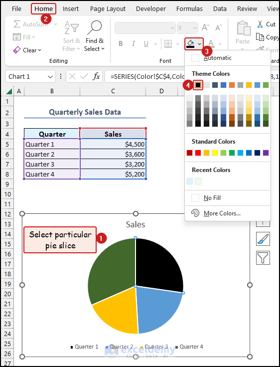
2.2. Change Color of Single Slices of Pie Chart
- First, select a single slice of pie from the Pie Chart >> go to the Home tab.
- Click on the Fill Color option >> select any color as you need.
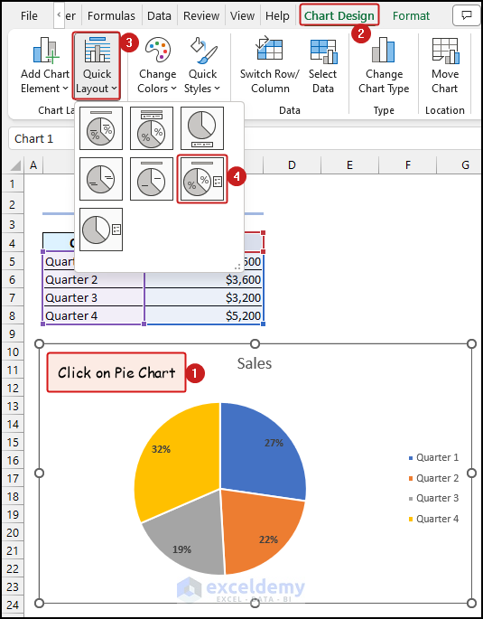
3. Change Chart Layout
- Click on anywhere on the Pie Chart >> go to the Chart Design tab >> select the Quick Layout option.
- Finally, choose your preferred layout from the drop-down.
4. Add Chart Title
- To add Chart Title, simply click on the marked region of the chart and write down the Chart Title.
Here, we used “Quarterly Sales” as the Chart Title.
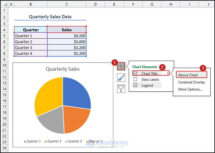
4.1. Change Position of Chart Title
- First, click on the Chart Elements option >> click on the arrow icon beside the Chart Title option >> choose your preferred position for the Chart Title.
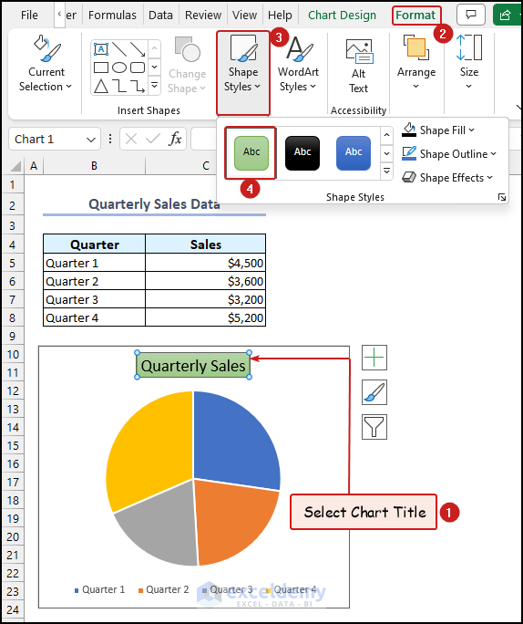
4.2. Edit Style of Chart Title
- Select the Chart Title >> go to the Format Tab >> click on the Shape Styles option >> choose your preferred Shape Style.
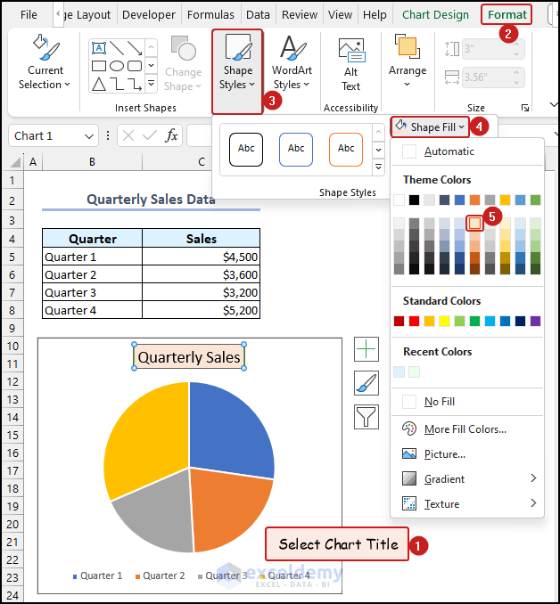
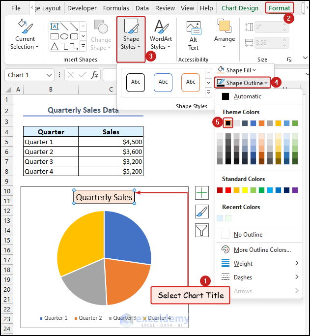
4.3. Change Fill Color and Outline of Chart Title
- Select Chat Title >> go to Format tab >> click on the Shape Styles option.
- Click on the Shape Fill option >> select your preferred color.
To change the Outline of the Chart Title follow the steps mentioned below.
- First, select Chat Title >> go to Format tab >> click on the Shape Styles option.
- Click on the Shape Outline option >> select your preferred color.
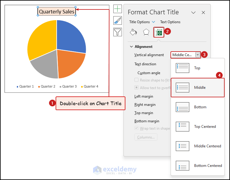
4.4. Edit Text Alignment of Chart Title
- First, double-click on the Chart Title >> go to the Size & Properties tab,
- Click on the drop-down icon beside the Vertical alignment option >> select your preferred text alignment option.
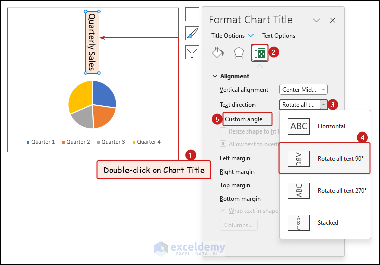
4.5. Rotate Chart Title
- First, double-click on the Chart Title >> go to the Size & Properties tab,
- Click on the drop-down icon beside the Text Direction option >> select your preferred Text Direction option. Here, we selected the Rotate all text 90° option.
- You can also choose any other angle using the Custom angle option.
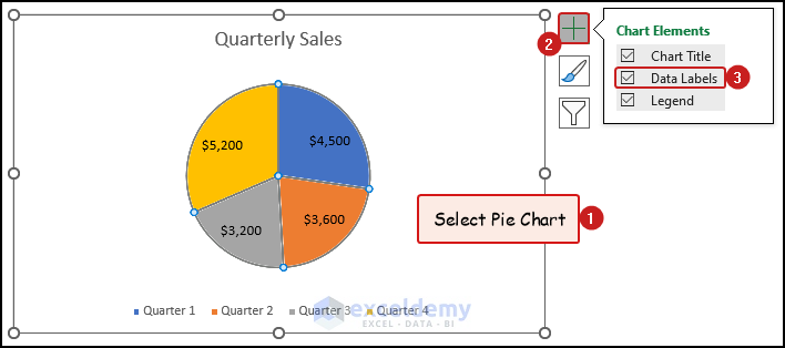
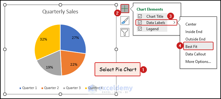
5. Add Data Labels in Pie Chart
- First, click on the Pie Chart to select it >> click on the Chart Elements option.
- Finally, check the box of the Data Labels field.
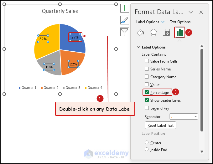
5.1. Change Data Label Values to Percentage
- First, double-click on any Data Label to open the Format Data Label dialogue box.
- After that, click on the Label Options tab >> check the box of Percentage field in the Label Options section.
5.2. Edit Data Label Position
- Select the Pie Chart >> click on the Chart Elements option >> click on the arrow icon beside the Data Labels option.
- Finally, choose your preferred position to show Data Label.
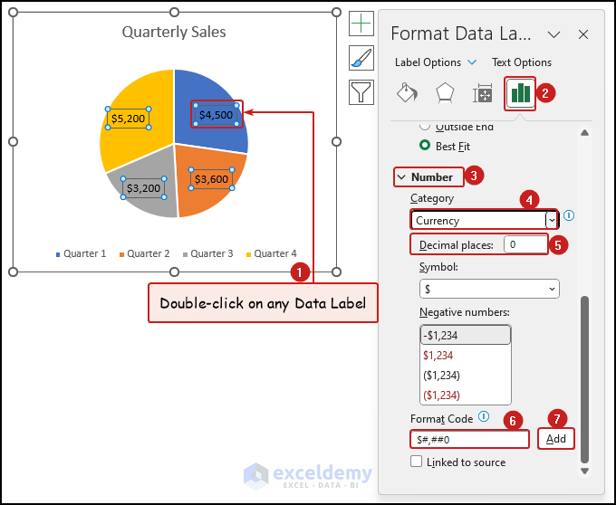
5.3. Format Number Types of Data Label
- First, double-click on any Data Label to open the Format Data Label dialogue box >> click on the Label Options tab.
- Click on the Number option >> select your preferred Category. Here we selected the Currency option >> specify the number of Decimal places.
- You can also write a code to format a number in the Format Code field >> click on Add button.
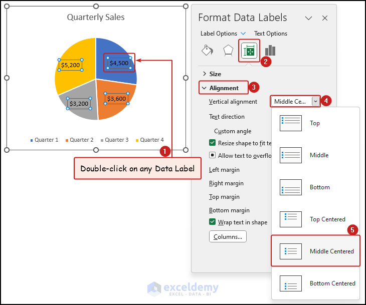
5.4. Edit Text Alignment of Data Label
- First, double-click on any Data Label >> go to the Size & Properties tab from the Label Options group of Format Data Labels window >> click on the Alignment section.
- Click on the drop-down icon beside the Vertical alignment field >> choose the text alignment option you need.
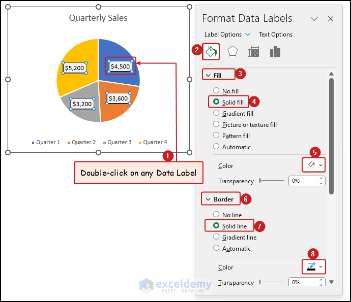
5.5. Change Background Fill Color and Border of Data Label
- First, double-click on any Data Label >> go to the Fill & Line tab >> click on the Fill section.
- Select your preferred Fill option. Here, we selected the Solid fill option >> choose the fill color.
- Click on the Border section >> select any border type from the available options >> choose the border color you need.
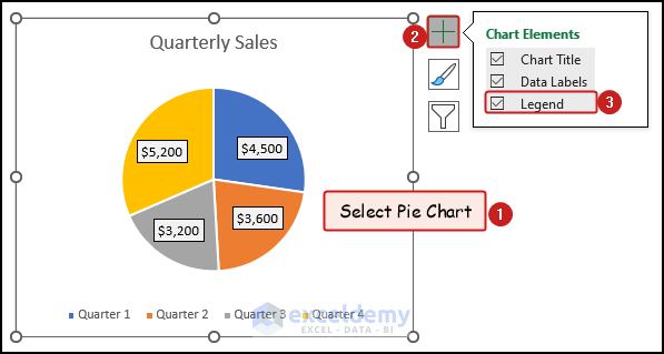
6. Add Legends in Pie Chart
- First, click anywhere on the Pie Chart >> click on the Chart Elements option >> check the box of the Legend field.
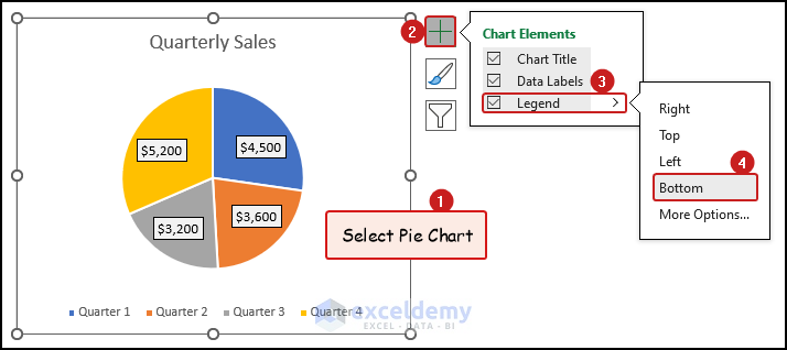
6.1. Change Position of Legends
- Click anywhere on the Pie Chart >> select the Chart Elements option >> click on the arrow icon beside the Legend field.
- Lastly, choose your preferred position to display the Legends. We showed the Legends at the bottom of the Pie Chart.
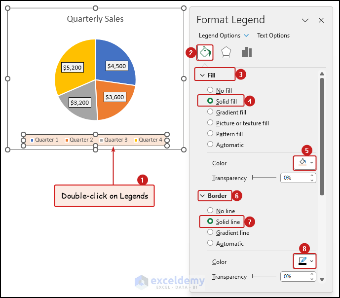
6.2. Change Fill Color and Outline of Legends
- Double-click on any of the Legends >> go to the Fill & Line tab >> click on the Fill section.
- Select your preferred Fill option. Here, we selected the Solid fill option >> choose the fill color.
- Click on the Border section >> select any border type from the available options >> choose the border color according to your preference.
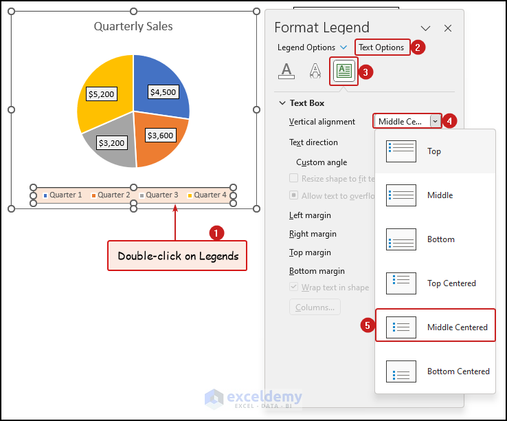
6.3. Edit Text Alignment of Legends
- First, double-click on any of the Legends >> click on the Text Options section >> go to the Textbox tab.
- Click on the drop-down icon beside the Vertical alignment field >> choose your preferred alignment option.
Read More: Add Labels with Lines in an Excel Pie Chart
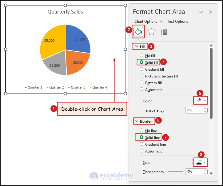
7. Format Chart Area of Pie Chart
- First, double-click anywhere on the Chart Area >> go to the Fill & Line tab in the Format Chart Area dialogue box.
- Click on the Fill section >> choose your desired fill option >> select the fill color.
- Click on the Border section >> select any border type from the available options >> choose the border color according to your requirement.
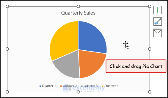
8. Move Pie Chart
- To move a Pie Chart, simply click anywhere on the Chart Area >> drag it to the desired location.
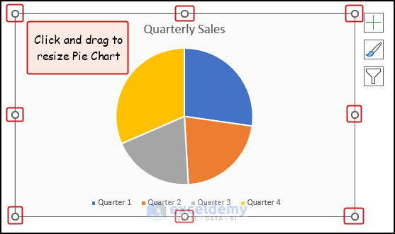
9. Resize Pie Chart
- Click on the Pie Chart >> select any sizing handles marked in the image below and drag them to resize the Pie Chart.
10. Rotate Pie Chart
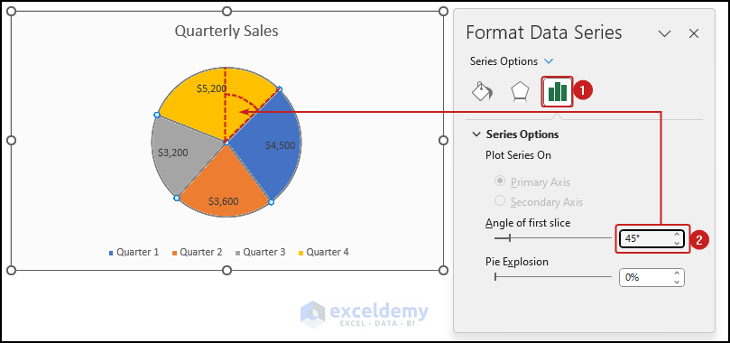
10.1. Change Angle of First Pie Slice
- Right-click on the Pie Chart >> select the Format Data Series option.
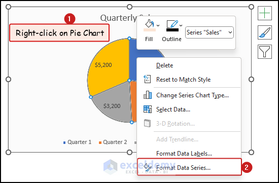
- In the Format Data Series dialogue box, specify the Angle of first slice. Here, we changed the angle to 45°.
As a result, the Blue slice has rotated 45°.
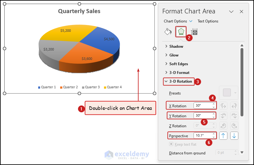
10.2. Edit 3-D Rotation and Perspective for 3D Pie Charts
To change the 3-D rotation and perspective, you need a 3-D Pie Chart in the first place. The following steps do not apply to 2-D Pie Charts.
- First, double-click on the Chart Area >> go to the Effects tab >> click on the 3-D Rotation section.
- Specify the angles of the X Rotation, Y Rotation, and Perspective fields.
11. Explode Pie Chart
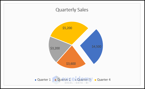
- Select the slice you want to separate from the Pie Chart.
- Click and drag the slice in the outward direction.
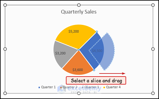
Consequently, the selected slice will move away from the Pie Chart as shown in the following image.
12. Sort Pie Chart Slices by Size
To sort the Pie Chart by size, you just need to sort the source data. The Pie Chart will automatically sort with the source data.
- First, select the cell of the source data that you want to sort.
- Go to the Home tab >> click on the Sort & Filter option in the Editing group >> select your required sort option. Here, we selected the Sort Smallest to Largest option.
As a result, the Pie Chart will be sorted by smallest to largest pie slice.

Read More: Excel Pie Chart Labels on Slices: Add, Show & Modify Factors
Things To Remember
- Try to use a small number of categories while using the Pie Chart. Because a lot of categories make the Pie Chart difficult to interpret.
- Sort the slices of the Pie Chart in a logical order. For example, smallest to largest or largest to smallest. This aids the user to easily compare different categories.
- Use Data Labels and Legends while using Pie Charts. It will make the Pie Chart easier to interpret.
- Try to use the standard 2-D Pie Chart. Although, it is visually less appealing than the 3-D Pie Charts. But, it becomes difficult to accurately interpret data in the 3-D Pie Charts.
Frequently Asked Questions (FAQs)
1. When to Use Pie Chart?
Pie Charts are used to visualize proportions and percentages of data categories. However, if the number of categories becomes too large then it is advised not to use Pie Chart. Because it may become cluttered and difficult to interpret.
2. How to Read Pie Chart in Excel?
Reading data in Pie Charts is quite easy and intuitive. You can get an overall idea about the data just by looking at the Pie Chart. From the Data Labels of the chart, you can get the exact values of the sections of the Pie Chart.
3. What Are the Types of Pie Charts in Excel?
Excel has several types of Pie Charts. Now, we will discuss the types of Pie charts and get a brief idea about them. 2-D Pie Charts are the standard Pie Charts. It is the most common Pie Chart. 3-D Pie Charts bring depth to 2-D Pie Charts. These charts seem better than 2-D Pie Charts. However, a chart with multiple categories may appear cluttered. Pie of Pie Charts are used for categories with very small values. For smaller values, a Secondary Pie Chart is used. Bar of Pie Charts works like Pie of Pie Charts. Bar Charts are used instead of Pie Charts here. Doughnut Charts are pie charts with a hole. This chart shows categories as concentric rings.
Conclusion
In this article, we learned about creating different types of Pie Charts in Excel. We also discussed various ways to edit a Pie Chart. We hope you found this article to be useful. If you have any queries please let us know in the comments section below.
Excel Pie Chart: Knowledge Hub
<< Go Back To Excel Charts | Learn Excel
Get FREE Advanced Excel Exercises with Solutions!
