Looking for ways to know how to make a Venn Diagram in Excel? Sometimes, we want to make a Venn Diagram from a given dataset in Excel. Here, you will find 3 ways to make a Venn Diagram in Excel.
How to Make a Venn Diagram in Excel: 3 Ways
Here, we will show you how to make a Venn Diagram in Excel using SmartArt, Scatter Plot, and adding Shapes.
1. Using SmartArt Feature to Make a Venn Diagram in Excel
In the first method, we will show you how to make a Venn diagram using SmartArt in Excel. Go through the steps given below to do it on your own.
Step-01: Adding SmartArt to Make a Venn diagram
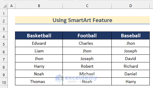
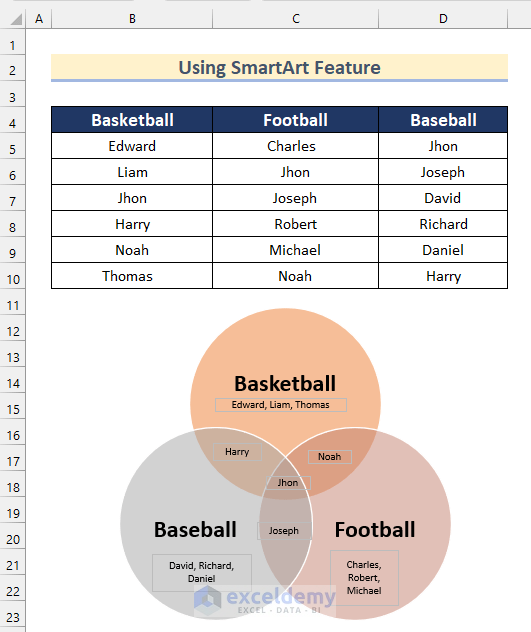
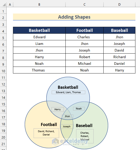
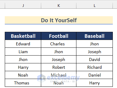
Here, we have a dataset containing the names of players who will play Basketball, Football and Baseball. Now, we will use this dataset to show you how to add SmartArt in Excel to make a Venn Diagram.
Follow the steps given below to do it on your own.
- Firstly, go to the Insert tab >> click on Illustrations >> select SmartArt.
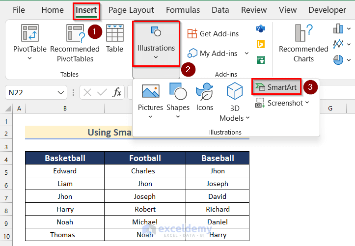
- Now, the Choose a SmartArt Graphic box will open.
- Then, go to the Relations option.
- After that, select Basic Venn.
- Next, click on OK.

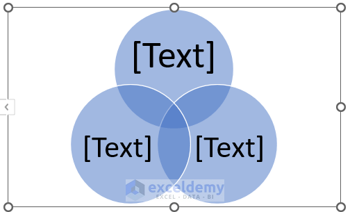
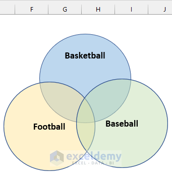
- Now, a Venn diagram will be added in Excel.
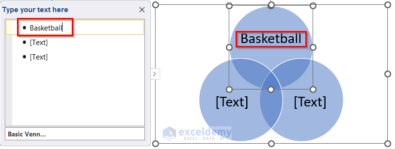
- Then, click on the “>” sign.
- Next, type any Text you want to add in the Type box.
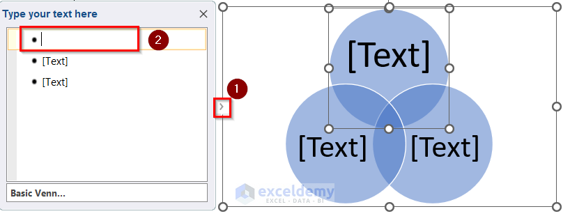
- Here, we will type Basketball in the box to add a Name to the 1st circle.
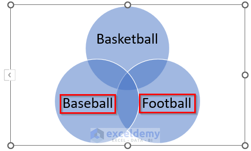
- Similarly, add names such as Baseball and Football to other circles.
Step-02: Formatting Venn Diagram
Next, we will show you how you can format this basic Venn diagram. Go through the steps given below to do it on your own.
- In the beginning, select the Venn diagram and right-click on it.
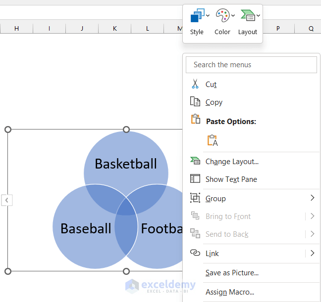
- Then, click on Color.
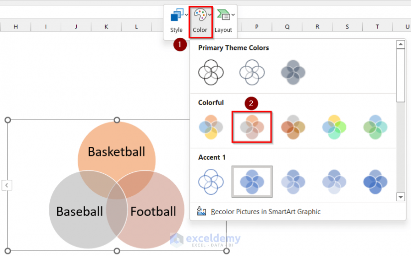
- After that, select any color of your preference. Here, we will select Colorful Range – Accent Colors 2 10 3.
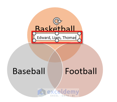
- Then, type the Names of the players who played only Basketball.
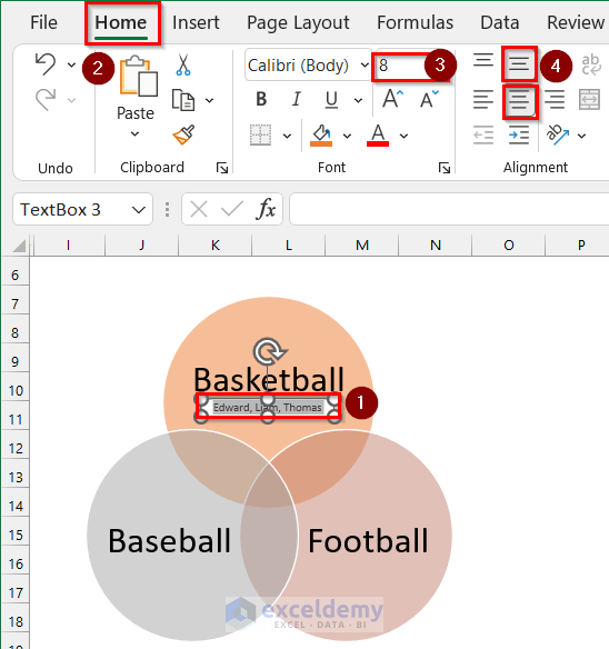
- Now, select the text.
- After that, go to the Home tab >> select 8 as Font Size >> select Middle and Center as Alignment.
- Again, select the Text box and right-click on it.
- Then, click on Format Shape.
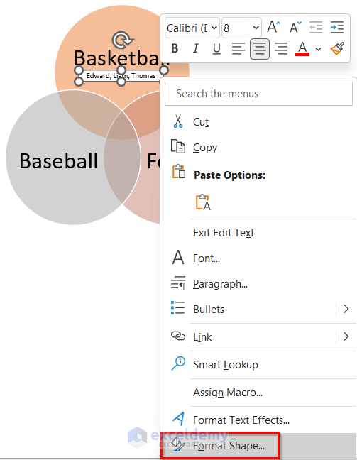
- Now, the Format Shape box will appear.
- Next, select No fill as Fill.
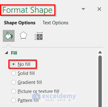
- Then, you will see that the Text box has no fill color.
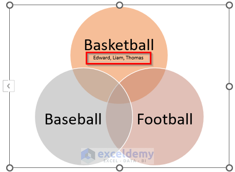
- Similarly, add other Text boxes containing the names of the players.
- Finally, you will get a Venn diagram using SmartArt in Excel.
Read More: How to Add SmartArt Graphics in Excel
2. Use of Shapes Options to Make a Venn Diagram in Excel
We can also make a Venn diagram in Excel by adding different kinds of shapes. Here, we will show you how to make a Venn diagram using oval.
Step-01: Inserting Shapes to Make a Venn Diagram
Firstly, we will show you how to add Shapes to make a Venn diagram. Go through the steps to do it on your own dataset.
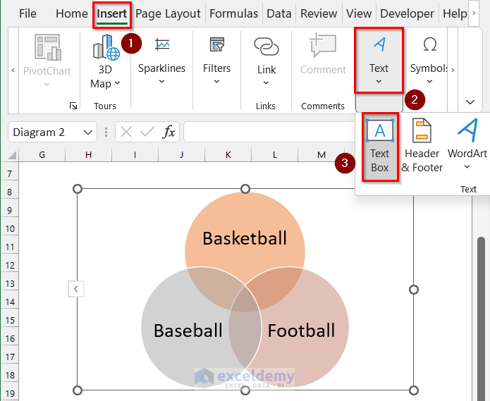
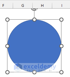
- In the beginning, go to the Insert tab >> click on Illustrations >> from Shapes >> select Oval.
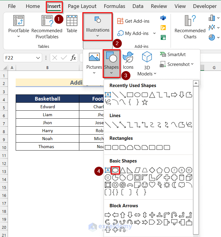
- After that, add an Oval in Excel.
- Then, to add another Oval, select the Oval and press CTRL+C to copy the shape.
- Next, Press CTRL+V to paste it.
- Similarly, add another Oval.
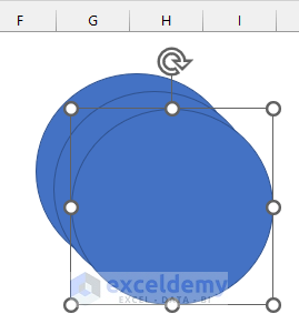
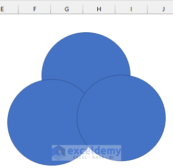
- After that, rearrange the Shapes like a basic Venn diagram.
Step-02: Formatting Shapes to Make a Venn Diagram
Now, we will show you how to format the shapes to make a Venn diagram. Follow the steps given below to do it on your own.
- Firstly, select any oval and right-click on it.
- Then, select Format Shape.
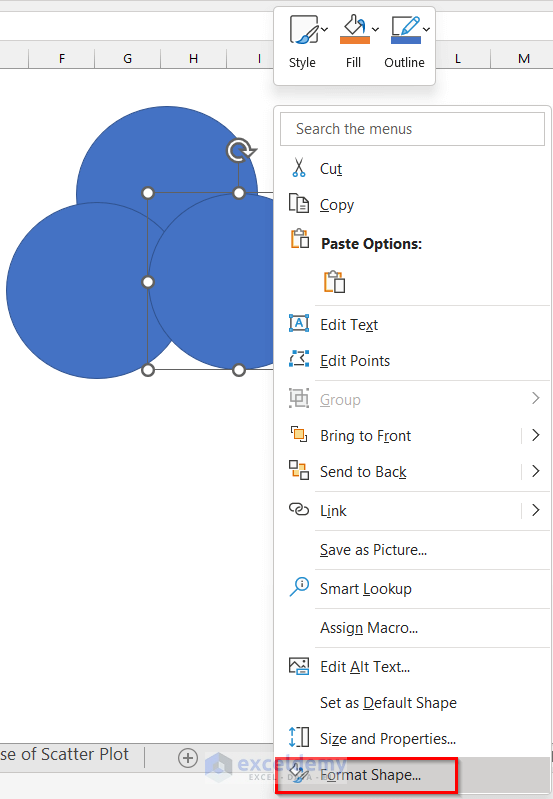
- Now, the Format Shape box will open.
- After that, from the Fill options click on Color.
- Then, select any color of your preference. Here, we will select Green, Accent 6, Lighter 60%.
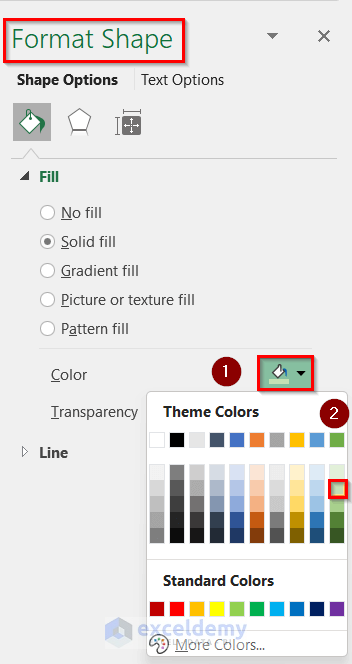
- Next, insert 50% as Transparency.
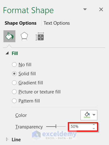
- Now, you will have a shape formatted like the image given below.
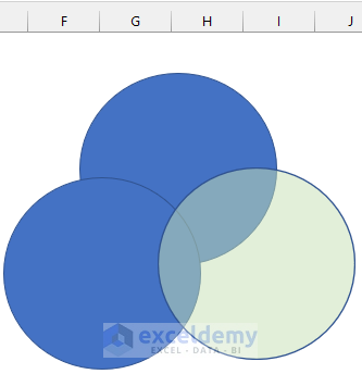
- Similarly, change the Fill color and Transparency of the other two shapes according to your preference.
- After that, select any of the Ovals and Right-click on it.
- Then, click on Edit Text.
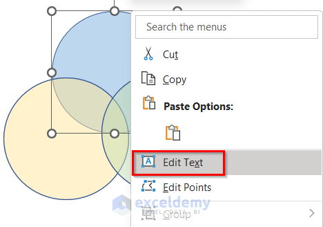
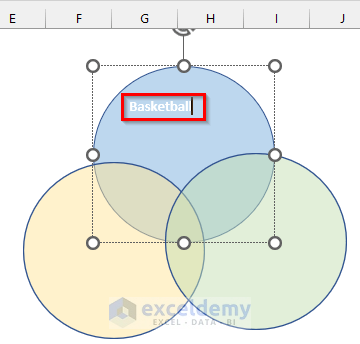
- Now, type Basketball as the label of the oval.
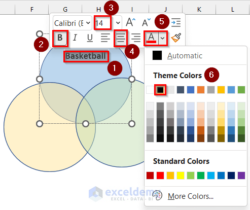
- Next, select the text.
- Then, Bold the text.
- After that, select 14 as Font Size, Middle as Alignment and Black, Text 1 as Font Color.
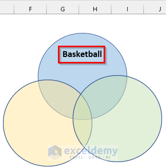
- Now, you will get a Label added to the shape.
- Similarly, add Labels to the rest of the shapes.
- Then, add the names of the players using Text Boxes by going through the steps shown in Method 1.
- Finally, you will get a Venn diagram adding Shapes in Excel.
3. Use of Scatter Plot to Make a Venn Diagram
In the final method, we will use a Scatter Plot to make a Venn diagram in Excel. Go through the steps given below to do it on your own.
Step-01: Preparing Chart Data
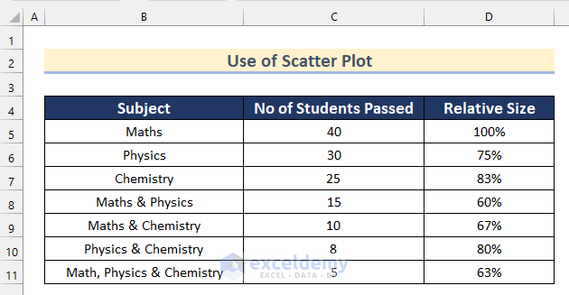
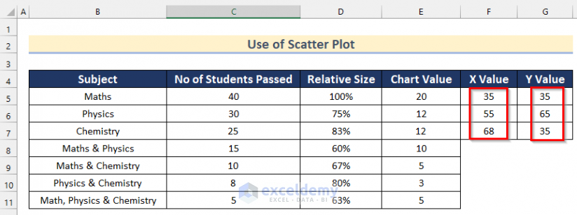
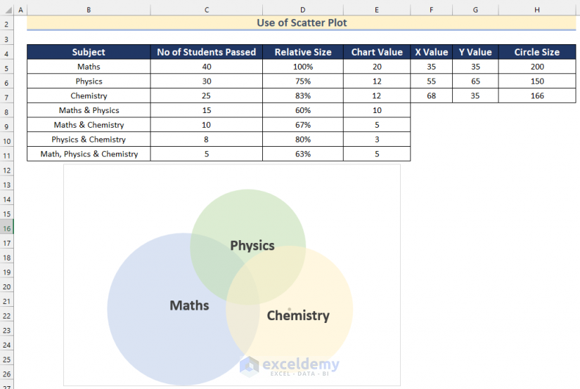
Here, we have a dataset containing the names of the Subjects, No of Students Passed and the Relative Size of some students. Now, we will show you how to prepare the data of the chart to make a venn diagram.
Follow the steps given below to prepare your own dataset.
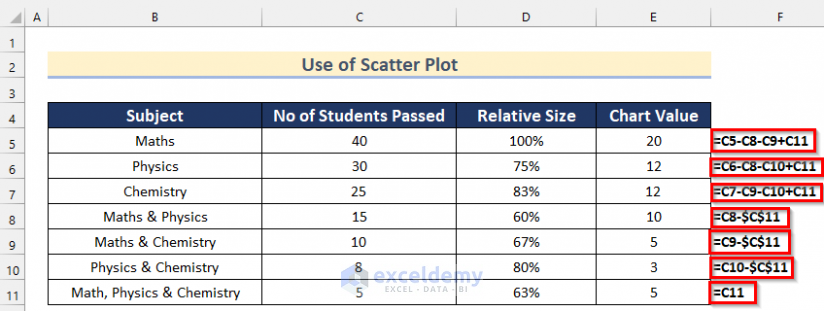
- In the beginning, calculate the chart value using the formulas shown in the image below.
- Then, insert the X Value and Y Value for Maths, Physics and Chemistry according to your preference. You can edit the values if needed later on.
- After that, select Cell H5.
- Now, insert the following formula.
=200*D5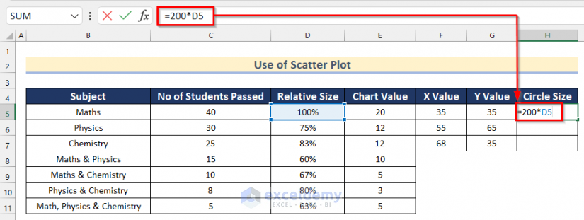
- Next, Press ENTER.
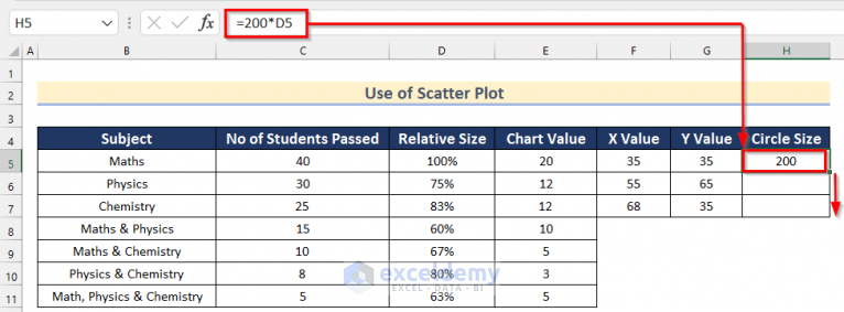
- Then, drag down the Fill Handle tool to autofill the formula for the rest of the cells.
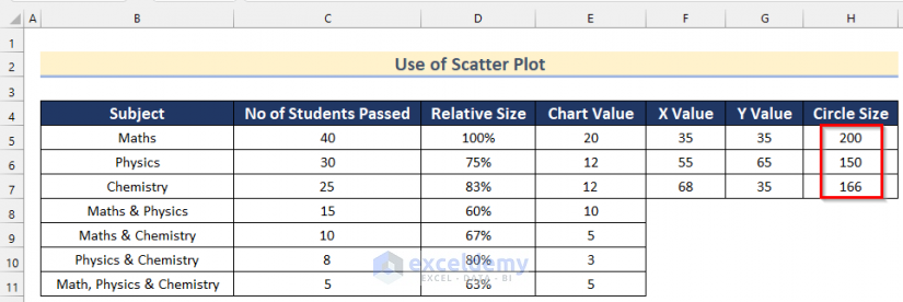
- Finally, you will get all the values of the Circle Size.
Step-02: Inserting Scatter Plot to Make a Venn Diagram
Now, you will find a way to insert a Scatter Plot to make a Venn Diagram in Excel.
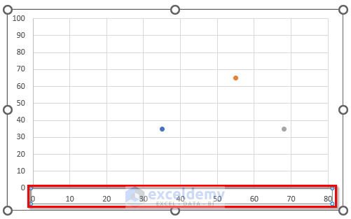
- Firstly, go to the Insert tab >> click on Scatter Plot >> select Scatter.
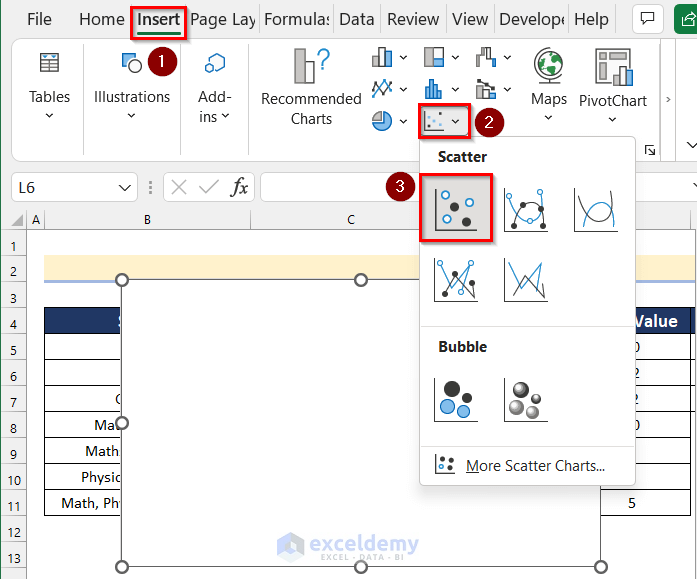
- Then, click on Select Data.
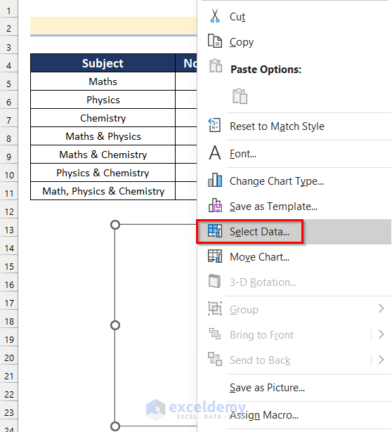
- Now, the Select Data Source box will open.
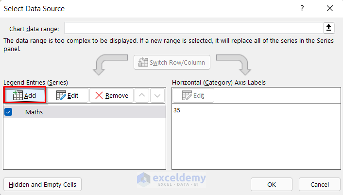
- After that, click on Add.
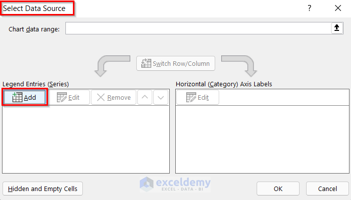
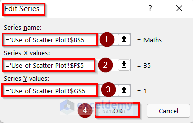
- Then, the Edit Series box will open.
- After that, select Cell B5 as Series name, Cell F5 as X Value and Cell G5 as Y Value.
- Next, click on OK.
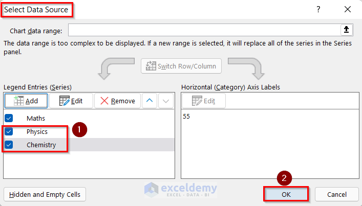
- Again, click on Add to add the data of Physics and Chemistry.
- Now, add the values of Physics and Chemistry going through the same steps shown above.
- Then, click on OK.
Step-03: Formatting Scatter Plot
Next, we will show you how to format the Scatter Plot to make a Venn diagram. Follow the steps given below to do it on your own.
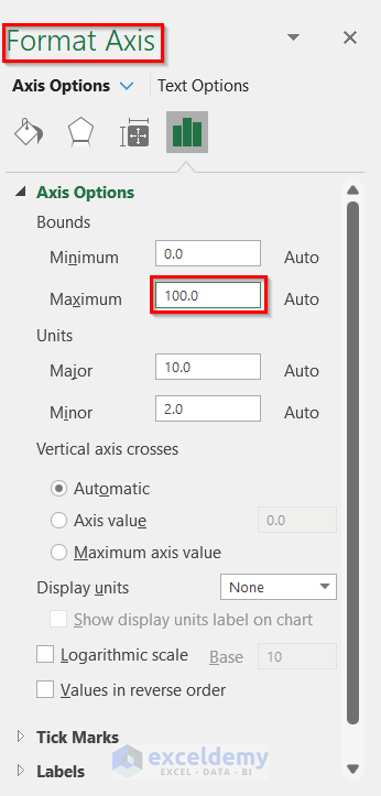
- Firstly, double-click on the Y-axis.
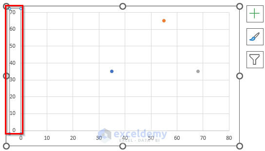
- Now, the Format Axis box will appear.
- Then, insert 100 as the Maximum Bounds.
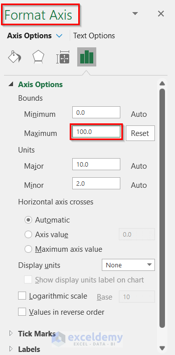
- After that, double-click on the X-axis.
- Again, the Format Axis box will appear.
- Then, insert 100 as the Maximum Bounds.
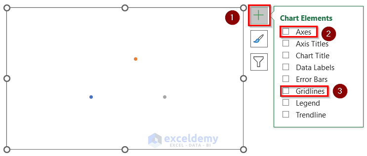
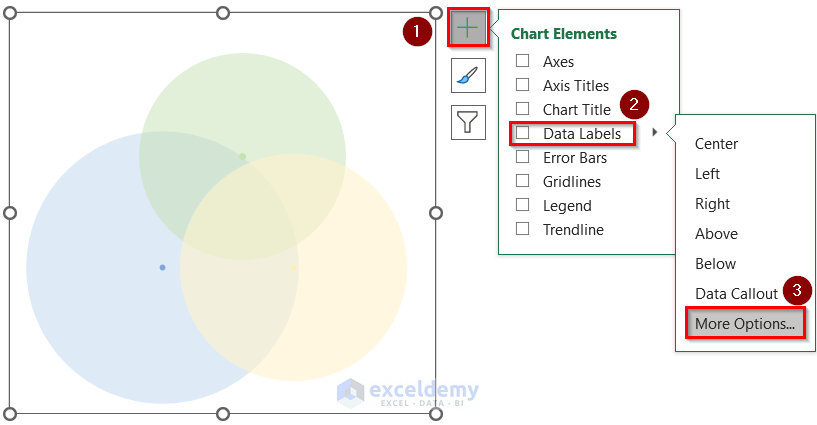
- Next, click on the “+” sign to get the Chart Elements.
- Afterward, turn off Axes and Gridlines.
- Then, double-click on the point representing the value of Maths.
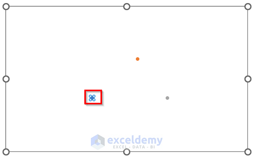
- Now, the Format Data Series box will open.
- Then, click on the box shown below.
- After that, go to the Marker Options >> select Built-in.
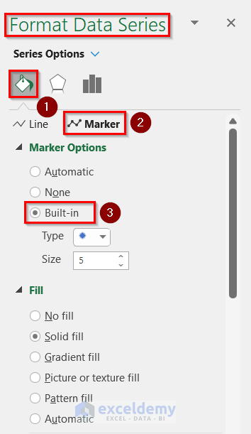
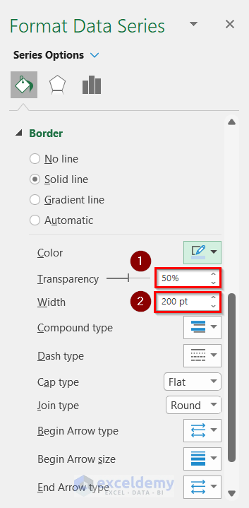
- Next, insert 50% as Transparency and 200 pt as Width which is the Circle Size for Maths.
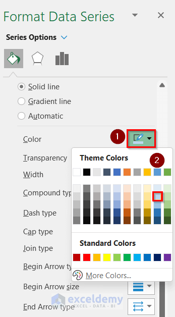
- Then, click on Color >> select Blue, Accent 5, Lighter 60%.
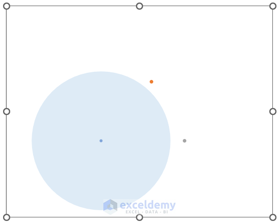
- Now, you will get a Circle representing the value of Maths.
- Similarly, create circles using the values for Physics and Chemistry.
- After that, click on the “+” sign to get the Chart Elements.
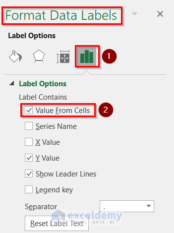
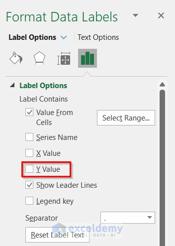
- Then, click on Data Labels >> select More Options.
- Now, the Format Data Labels box will open.
- Next, turn on Value From Cells.
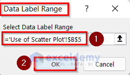
- Then, the Data Label Range box will appear.
- After that, select Cell B5 as the Data Label Range.
- Next, click on OK.
- Now, turn off the Y Value from Label Options.
- Then, select the text.
- After that, click on Bold.
- Next, set 20 as Font Size.
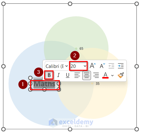
- Thus, you will get Maths as the Label.
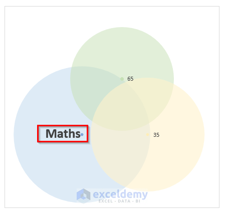
- Similarly, add labels for Physics and Chemistry.
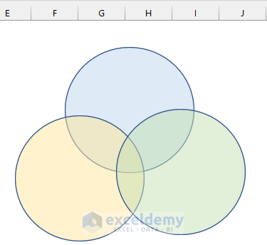
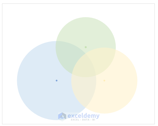
- Finally, you will get a Venn Diagram using a scatter plot in Excel.
Read More: How to Create Venn Diagram from Pivot Table in Excel
Practice Section
In this section, we are giving you the dataset to practice on your own and learn to use these methods.
Download Practice Workbook
Conclusion
So, in this article, you will find 3 ways to make a Venn diagram in Excel. Use any of these ways to accomplish the result in this regard. Hope you find this article helpful and informative. Feel free to comment if something seems difficult to understand. Let us know any other approaches which we might have missed here.
<< Go Back to SmartArt in Excel | Learn Excel
Get FREE Advanced Excel Exercises with Solutions!
