Excel has a number of useful chart types that can be used to show analysis and plot data. Putting X and Y values on an Excel chart to show how they relate to each other is a common task. This can be done with an Excel chart called a Scatter plot. In this article, we will learn how to make a Scatter Plot in Excel.
What Is Scatter Plot in Excel?
Scatter plots in Excel show how two variables are related. In a scatter plot, both of the axes show numbers, independent variable on the X-axis and dependent on the Y-axis. The chart puts together the values on the x and y-axis into a single point.
How to Set Up Data for a Scatter Plot
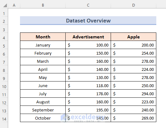
With the Chart templates in Excel, it is easy to make a Scatter plot in Excel. First, we need to put our source data in order. The independent variable should be in the left column. The variable that is dependent should be in the right column and on the y-axis.
In our example, we’ll show the amount spent on advertising and how many apples were sold in a certain month. So we set up the data this way:
How to Make a Scatter Plot in Excel: Step-by-Step Procedures
If the source data is set up correctly, making a scatter plot in Excel is as easy as following steps.
Steps:
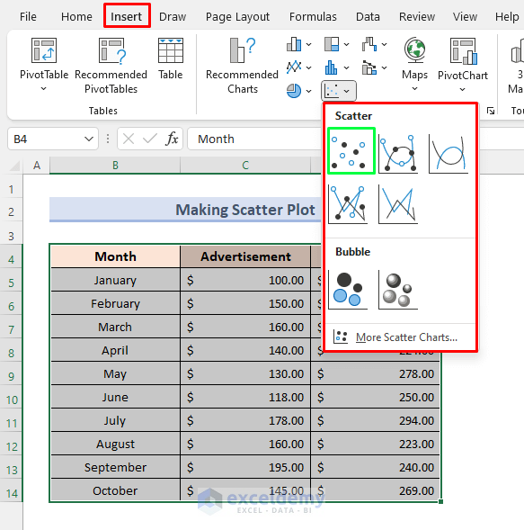
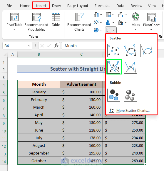
- First, choose three columns, including the column titles. In our case, the range is from B4 to D14.
- Then, click the Charts group under the Insert tab, then click the Scatter chart icon and choose the template you want. Click the first thumbnail to add a simple scatter graph.
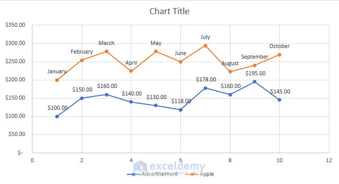
- As a result, the scatter plot will be added to your worksheet:
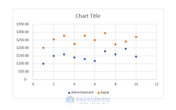
In the plot above, three columns are shown in two separate lines while the x-axis shows the number of months. We can also choose just two columns and get a graph to match. you will get a simple Scatter plot for now. Or, you can change some of your graph’s parts to make it look better according to your needs.
Types of Scatter Plot in Excel
In addition to the classic scatter plot shown above, there are also the following:
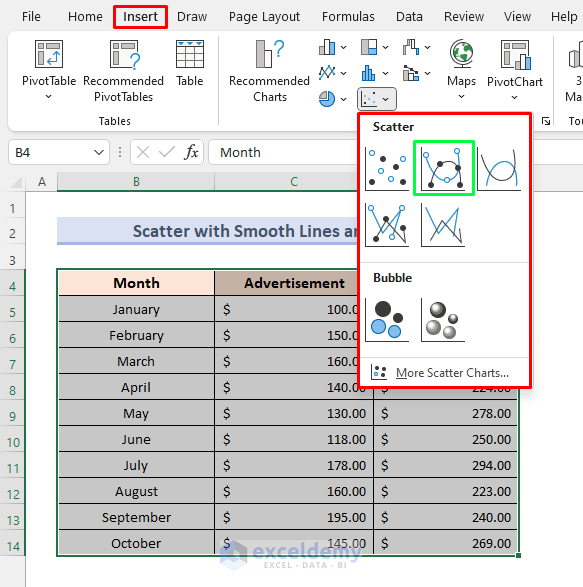
- Scatter with Smooth Lines
- Scatter with Smooth Lines and Markers
- Scatter with Straight Lines
- Scatter with Straight Lines and Markers
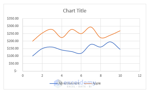
Scatter with Smooth Lines
When you have a lower number of data points, Scattering with Smooth Lines works best. For instance, here’s how the previous set of data can be shown using a scatter graph with smooth lines by following these steps.
Steps:
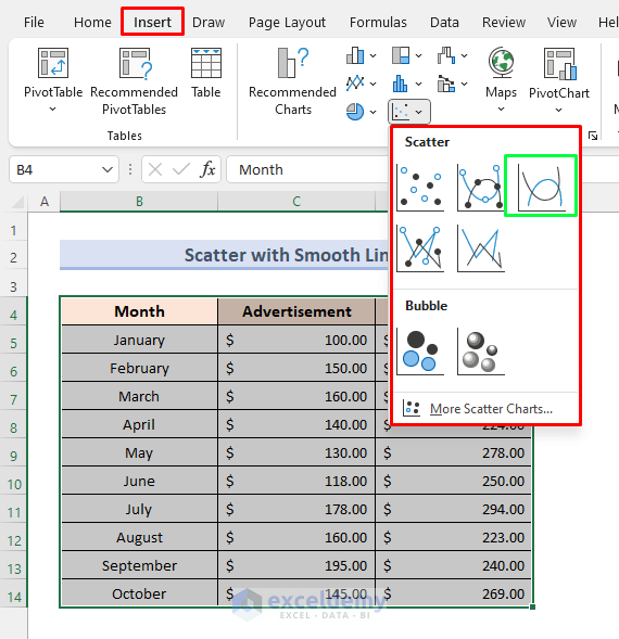
- Initially, pick all columns, including the column titles. The range for us is from B4 to D14.
- go to the Insert tab, click on Scatter chart, and select the following.
- So, this will create a graph plot like the following.
Scatter with Smooth Lines and Markers
By selecting the Smooth Line with Markers option, we can have markers on our known values. To do so, we will follow these simple steps.
Steps:
- At first, select the entire data along with column headings.
- Then go to the Insert tab, and select the Scattering chart option.
- Finally, select the Smooth Line with Markers option.
- Selecting this option will give us the following type of plot.
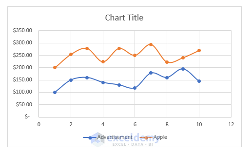
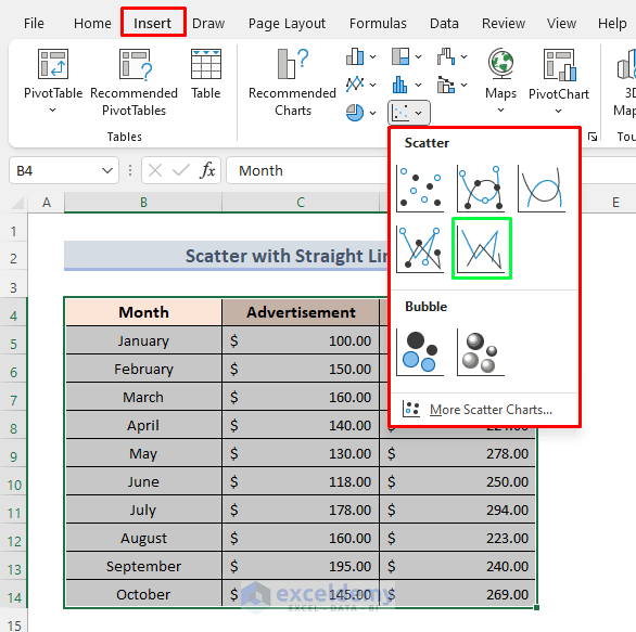
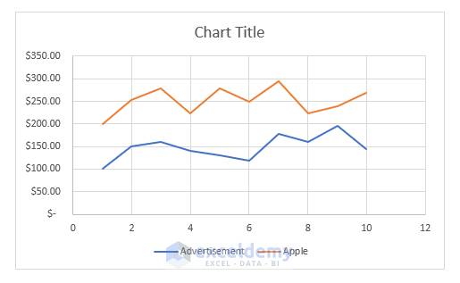
Scatter with Straight Lines
By selecting Scatter with Straight Lines, we can have straight lines from points to the next points. This type of plot is efficient for comparing two plots. To get such a plot, we will follow the steps below.
Steps:
- In the beginning, the steps are the same as creating smooth lines plot. But while selecting the chart type, we will select Scatter with Straight Lines.
- Selecting this will create a graph plot like the following.
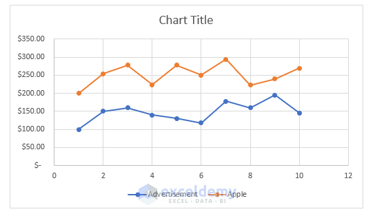
Scattering with Straight Lines and Markers
If we want to select Scattering with Straight Lines and Markers, we will have to select this option like the following.
Choosing the option gives such a graph plot.
Customizing XY Scatter Plot in Excel
Excel, like other kinds of charts, allows you to adjust practically every aspect of a scatter graph. You may simply edit the chart’s title, add names to the axis, conceal the gridlines, customize the chart’s colors, and more after making a scatter plot in Excel.
Here we will discuss these topics specifically:
- Adjust Axis Scale
- Add Labels to Scatter Plot Data Points
- Insert Trendline
- Add Label to Axes
Adjust Axis Scale
You may wish to remove the additional white space if your data points are grouped at the top, bottom, right, or left of the graph. Excel allows us to change the scale of the Scatter Plot. While making a scatter plot In Excel follow these steps to reduce the distance between the initial data point and the vertical axis, as well as the final data point and the graph’s right edge.
Steps:
- Firstly, right-click on the axis you want to adjust the scaling on. Then select the Format Axis option.
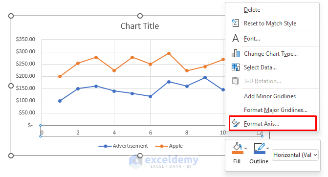
- Secondly, on the Format Axis panel, set the desired Minimum and Maximum limits as your need.
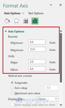
You can also change the spacing between grid lines by changing the Major and Minor values. Here, by setting the Maximum and Minimum to 10 and 5, and decreasing the Major to 1, we will get the following Scattering with Straight Lines and Markers plot.
Add Labels to Data Points
When making a Scatter plot in Excel, you may want to name each point to make the graph easier to understand. To do so, follow the steps below.
Steps:
- First, select the plot and click on the Chart Element button(the ‘+’ button).
- Second, click on Data Labels. This will show the data values on those points. We can select the label placement by selecting the arrow mark in right.
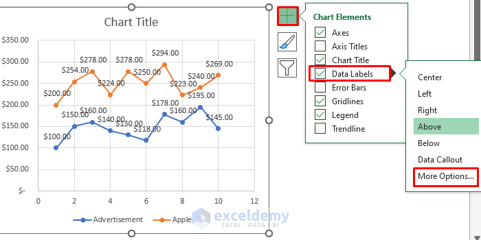
- By selecting More Options, we can go to the Format Data Labels option.
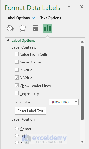
- Then select Label Options. Here we can choose to show the Y-axis value and the label placement.
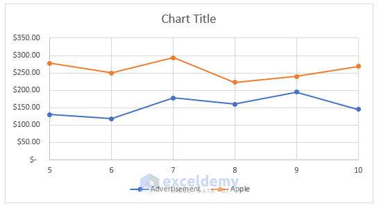
Here, in our Scatter with Straight Lines and Markers, let’s enable the X Value and disable the Y Value for Apple’s line and enable Data Label for Advertisement. We will get the following result.
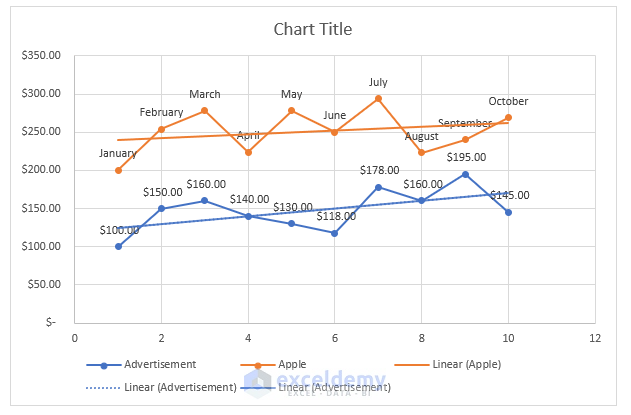
Insert Trendline
Excel offers a feature called Trendline for Scatter plots. This feature enables us to understand the relationship between two different variables more precisely and can be used for Forecasting. Enabling Trendline will give us such results.
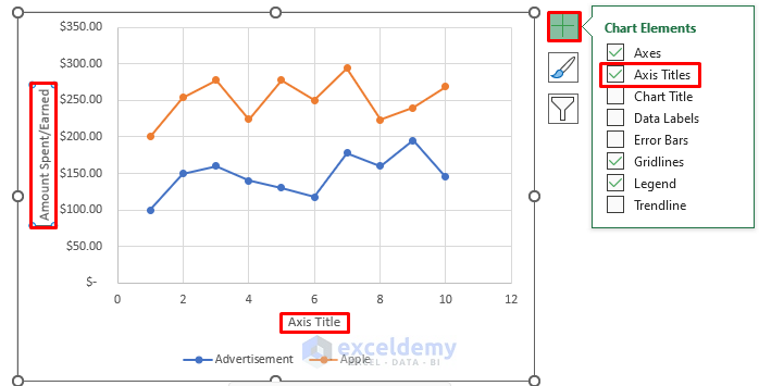
Add Title to Axes
For a better understanding of the Scatter plot in Excel, we can add titles to axes. We need to follow the steps to do so.
Steps:
- At first, select the plot, and click on the Chart Element(the ‘+’ sign on the right) option.
- Then select the Axis Titles option.
- Then edit the axis name by selecting and writing into it.
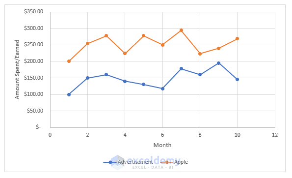
- Here after giving X and Y-axis titles, we get the following result.
Things to Remember
- If your dependent column comes before your independent column and you can’t change this in a worksheet, you can swap the X and Y axes directly on a chart.
- We must remember that the left column data will be on the x-axis and the right column data will be on the Y-axis in the plot.
- Labels for points that are close to each other may overlap. To fix this, click on the labels, then click on the one that overlaps. A four-sided arrow will appear when you point the mouse at the label. After that, move the label.
- For two different lines, all the properties are different. We need to change or modify properties for each of these lines separately.
Download Practice Workbook
You can download the practice workbook from here.
Conclusion
Scatter Plotting is one of the most used features of Excel. In this article, we demonstrated how to easily plot a Scatter Plot. For any kind of data, we can apply these methods keeping in mind the conditions shown in the Things to Remember portion. Still, facing any problems regarding this topic? Feel free to ask through the comment box. Our team will be happy to answer your questions. For any type of Excel-based problem, visit our website Exceldemy.com.
Make Scatter Plot in Excel: Knowledge Hub
- How to Make a Scatter Plot in Excel with Two Sets of Data
- How to Create a Scatter Plot in Excel with 2 Variables
- How to Create a Scatter Plot in Excel with 3 Variables
- How to Create a Scatter Plot with 4 variables in Excel
- How to Make a Scatter Plot in Excel with Multiple Data Sets
<< Go Back To Scatter Chart in Excel | Excel Charts | Learn Excel
Get FREE Advanced Excel Exercises with Solutions!
